
I Painted My Living Room Pink by Accident. Here Is How the Chip Fooled Me.
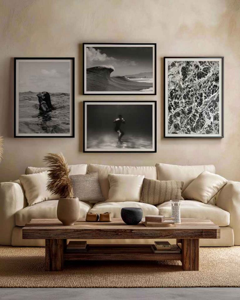
The color was called something like Quiet Stone. On the chip, under the store’s lights, it was the greige everyone wants: warm, soft, the kind of neutral that makes a room look like it has a stylist. I bought two gallons, painted the living room over a long weekend, stood back, and my daughter walked in and said, “Why is it pink?”
It was pink. Not aggressively, but unmistakably, especially at four in the afternoon when the west window did its thing. My husband, to his credit, waited a full day before agreeing with her.
Nothing had gone wrong at the store. The paint was mixed correctly and the chip was printed correctly. What went wrong was me trusting a two-inch card under fluorescent tubes to predict a twelve-foot wall under a west-facing window with an oak floor bouncing orange light up at it. Which, it turns out, is the single most common mistake in house painting, and the reason a painter I later hired told me he now refuses to let clients choose from chips at all.
What the chip cannot tell you
Three things, he explained, and once he laid them out the pink made complete sense.
Scale, first. Color gets stronger as there is more of it. That gentle warmth on the chip is the same warmth multiplied by four hundred square feet, and at that size a whisper of red undertone stops whispering. His rule of thumb, which I now repeat to everyone: whatever chip you love, buy the one a step lighter.
Light, second. Paint does not have a color so much as a color under a particular light. The store is lit cool and flat. My living room in the afternoon is lit warm and from one side. A neutral that behaves itself in the aisle can go green, blue, purple or, apparently, pink at home, depending on the bulbs and the hour.
And the neighbors, third. The chip gets judged against white card. The wall gets judged against the floor, the sofa, the trim and whatever is outside the window. My oak floor is orange. Orange light on a warm greige gives you rose. I could have worked that out with a glass of wine and ten minutes of thought, and I did not.
The screen got closer than the card did
Before repainting I did what I should have done first and used the paint brand’s room visualizer. Upload a photo of the room, click a color, see it applied. I had dismissed these as gimmicks, and the older ones were, because they just tinted the wall a flat shade like a paint bucket tool in a kids’ app.
The current ones are a different animal, and I got curious enough to find out why. They borrow the technology that furniture and materials companies use to make their catalog images, where every surface is defined as a physically accurate material rather than a flat color. The paint is described by how it absorbs and scatters light, the sheen is modeled as actual reflectivity, and the wall is lit roughly the way a room is lit.
The craft behind this is called 3D texturing, the same discipline that makes a rendered linen sofa look like it would feel rough, and it is why a good visualizer can now show you that the same color in matte and in eggshell will not read the same on the same wall.
The better ones also let you drag a slider for time of day. Mine showed Quiet Stone going distinctly warmer in the afternoon, which is exactly what happened in real life, and exactly what the chip could never have told me.
Where the screen still lies
I do not want to oversell it. My monitor is not calibrated and my phone is set to a brightness that would embarrass a lighthouse. Two people looking at the same visualizer see two different colors. It also assumed daylight, and my room runs on warm LEDs after five, which pulls everything yellower than the screen suggests. And it had no idea my floor was orange.
So the visualizer narrowed my list from twenty colors to three. It did not pick the winner. That took boards.
The sample-board routine that finally worked
The painter’s method, which I have since used in two more rooms without a single regret.
Sample pots of the final three. Not chips. Pots. Each one painted, two coats, onto a piece of white foam board about two feet square, and left to dry overnight, because wet paint is darker and sheen shifts as it cures.
Then the boards go on tour. Morning by the window. Noon in the darkest corner. Evening next to the sofa with the lamps on. Held against the floor, held against the trim, held against the fireplace. Two full days of moving them around and looking, which sounds tedious and takes about four minutes each time you walk past.
The white margin around the sample matters more than I expected. Tape a board flat onto a wall that is already a strong color and the old color leaks into how you see the new one. The border keeps the judgment honest.
By the second evening one of the three had quietly won. It was not the one that looked best on the chip. It was not even the one that looked best on the screen. It was the one that survived four in the afternoon.
The sheen mistake nobody warns you about
One more thing the painter told me that I had never heard. Half the “wrong color” complaints he gets are actually wrong sheen. The same tint in flat, eggshell and satin will read as three different colors on the wall, because sheen decides how much light bounces back.
Higher sheen reads lighter and cooler and shows every roller mark. Flat reads deeper and warmer and forgives a bad wall. He decides sheen for how the room gets used, then chooses the color in that sheen, and never the other way round.
What I do now
Use the visualizer to shortlist and to see what the color does across the day. Use the boards to decide. Go a step lighter than instinct says. Pick the sheen before the color. And never, ever choose from the chip in the store, no matter how good it looks in your hand under those lights.
The living room is now a color called something like Pebble, it is genuinely gray at every hour, and my daughter has not commented once.