Choosing a paint color from countless swatches can feel overwhelming. However, selecting the perfect colors for your home’s interior is worth the effort – the right palette can create an inviting atmosphere and completely transform your living space.
Paint colors not only enhance architectural features or define open-plan areas, but they can also affect your mood and how you experience each room.
In this step-by-step guide, we’ll break down how to choose the best interior paint colors based on room function, lighting, color psychology, furniture coordination, and personal style. By avoiding common mistakes and following expert tips, you’ll be well on your way to a beautiful home color scheme.
Step 1: Define Each Room’s Function and Mood
Before you grab paint samples, think about how you use each room and the mood you want to create. A bedroom, for example, is typically a restful space, while a kitchen or living room is more active and social. Colors have a profound impact on emotions, so align your paint choice with the room’s purpose.
Warm colors like reds, oranges, and yellows tend to energize and stimulate. In contrast, cool colors like blues, greens, and purples usually feel calming and serene. For instance, a soft blue or green bedroom can promote relaxation and better sleep, whereas a cheerful yellow breakfast nook might boost morning positivity.
Step 2: Evaluate Your Lighting
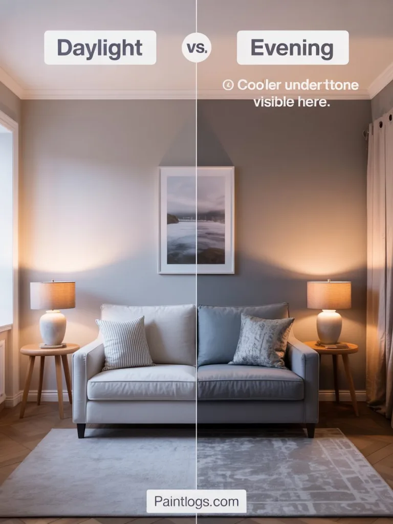
Lighting dramatically affects how paint colors look in a room. A color that appears perfect on a tiny swatch or in a store could look very different under your home’s lighting conditions. Rooms with abundant sunlight can handle cooler or darker colors more easily.
Dim or north-facing rooms might benefit from warmer and lighter hues. Also consider the time of day: natural light shifts from sunrise to sunset, altering the tone of wall colors.
Artificial lighting is key as well – warm incandescent or LED bulbs can bring out warm tones, while cooler fluorescent or LED lighting can cast a bluish tint. Always test how your potential paint colors look in the morning, midday, and evening lighting.
Step 3: Leverage Color Psychology for Effect
Paint color isn’t just decoration – it’s also psychology. Color psychology is the study of how hues influence our emotions and behaviors. Using this to your advantage can help you choose a paint color that supports the purpose and mood of each room.
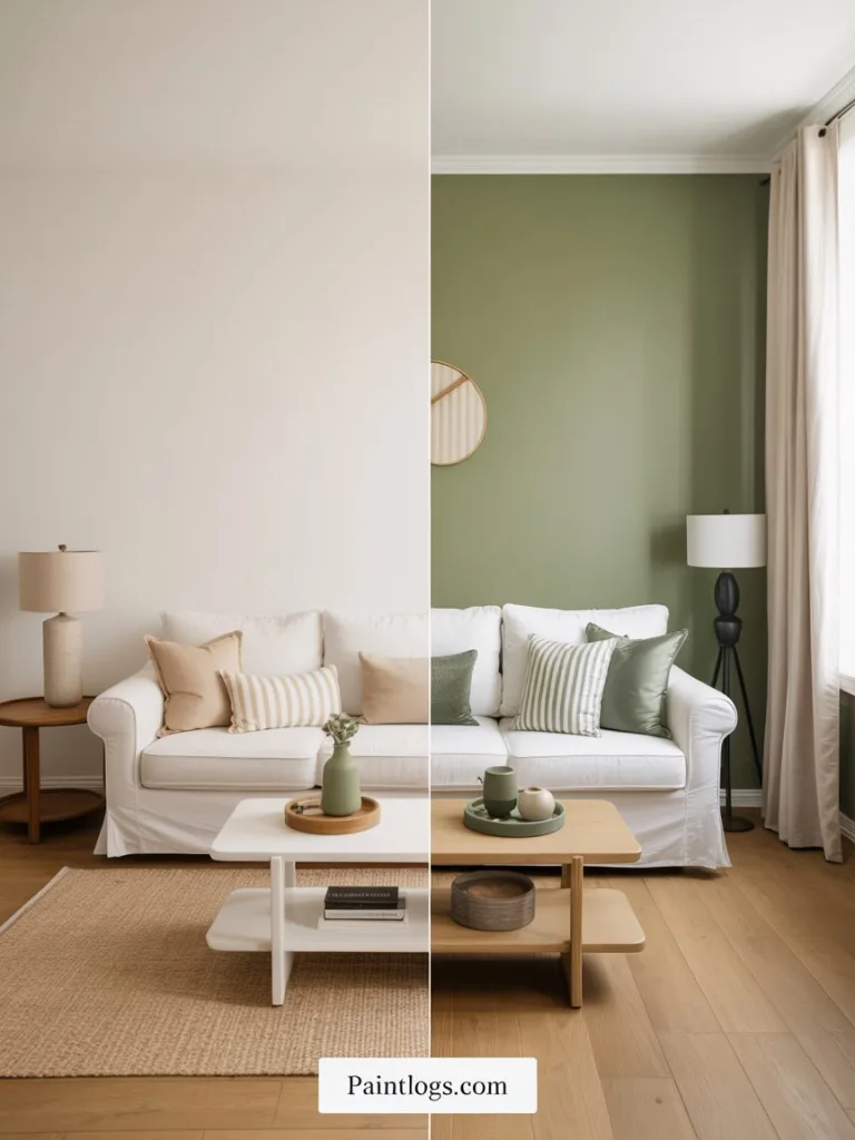
For a tranquil vibe, lean toward cool shades like blues and greens. If you want a space to feel energized or sociable, consider warm hues like red, orange, or yellow. Meanwhile, neutral colors like beige, gray, or taupe provide a versatile backdrop. Neutrals can impart sophistication or coziness depending on their undertones.
Step 4: Coordinate with Furniture and Décor
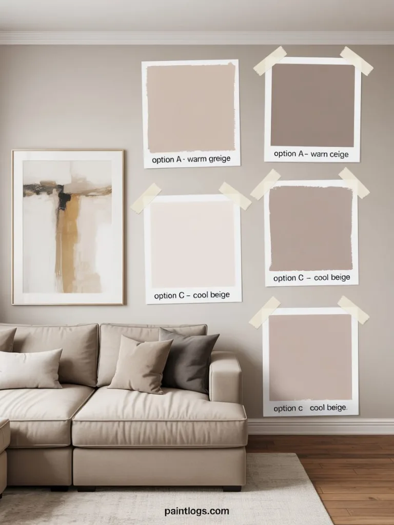
Always consider your existing furniture, flooring, and décor elements when choosing a wall color. Start by taking stock of the dominant colors and finishes in the space. If you have a statement piece, such as an area rug or piece of artwork, use it as inspiration for your paint palette.
Designers often suggest pulling out one of the colors from a patterned fabric or artwork and using it on the walls. Be mindful of color undertones in both your furnishings and the paint. Also, think about trim and ceiling colors as part of your scheme. Finally, consider adjoining spaces to maintain a pleasing flow throughout your home.
Step 5: Choose a Palette and Test Samples in Your Space
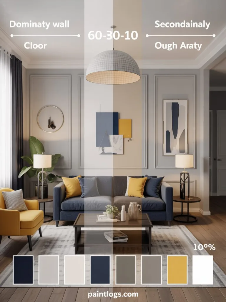
Once you’ve considered function, lighting, psychology, and décor, select the specific paint colors and test them. Narrow down to a cohesive color palette for the room or the whole home. Use the “60-30-10” rule to balance colors. For example, 60% wall color, 30% furniture or upholstery, and 10% accessories.
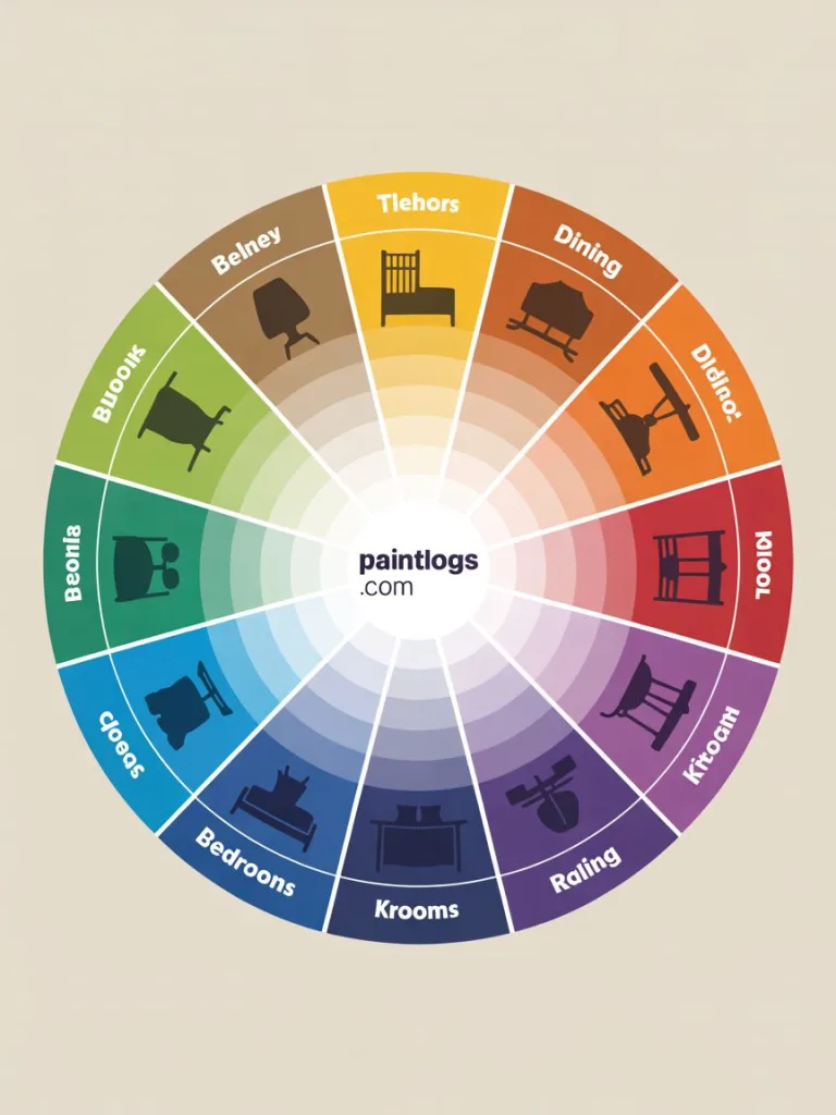
Use the color wheel to select harmonious combinations: analogous colors for a subtle effect or complementary colors for contrast. Most importantly, test your selected color in the actual room. Paint a large swatch on the wall and observe it under different lighting. If painting directly on the wall isn’t practical, use poster boards that can be moved around the room.
Step 6: Infuse Personal Style and Stay True to Your Taste
Ultimately, the paint color should reflect your personal style. Trends come and go, but your home should reflect what you love. If you adore deep teal or coral, find a way to incorporate it, even as an accent. However, balance your preferences with practicality.
A dramatic black wall might work beautifully in a powder room but may feel overwhelming in a family room. Be honest about what colors you can live with every day. Infuse your personality and be selective to create a space that feels truly yours.
Common Mistakes to Avoid
Even with the best guidance, there are a few pitfalls to watch out for when choosing paint colors. Steer clear of these common mistakes so you won’t have regrets later:
1. Rushing the decision:
Don’t grab a gallon of paint on a whim or under time pressure. One of the biggest mistakes homeowners make is rushing the color selection process. Take your time to consider and test colors properly (remember, you’ll be looking at those walls for a long time!).
2. Skipping the sample test:
Never rely solely on a small paint chip or an online photo of a color. Colors often look different on a large scale and under different lighting. Always paint a sample swatch on your wall and observe it over a day or two. This extra step can save you from choosing a color that looked great in the store but feels off in your home.
3. Ignoring lighting and context:
A color that’s beautiful in one room may look awful in another if the lighting is different. Avoid picking colors without checking how they appear in the actual room’s light (both natural and artificial). Also, think about how the new paint will relate to adjacent rooms – a clashing doorway between two bold colors can be jarring.
4. Using overwhelming colors without balance:
Going wild with intense, vivid colors everywhere can overwhelm the senses. If you love bold colors, use them in moderation or balance them with neutrals so the room isn’t visually chaotic. For example, you might paint one focal wall a deep emerald green but keep the other walls a soft cream to let the color “breathe.”
5. Forgetting primer or prep:
If you are drastically changing wall colors (especially light-to-dark or vice versa), not using a proper primer can lead to the old color bleeding through or the new color looking dull.
Primer “ensures there will be no interference from the previous wall color,” one paint expert explained. Skipping necessary prep work can mean your chosen color doesn’t show true or won’t have the expected finish.
6. Letting trends outweigh personal taste:
It bears repeating – don’t paint your walls a color you dislike just because it’s trendy. Falling victim to fads is a quick way to regret your choice. Always filter trends through your own preferences.
If Greige or Millennial Pink is the color of the year but it doesn’t make you happy, feel free to pass. As one designer advises, be honest with yourself to ensure you end up with a scheme you love living in.
By avoiding these mistakes, you’ll greatly increase the odds that your final color decision is one you’ll be satisfied with for years to come.
Designer Tips for Choosing Paint Colors
To further inspire your color selection process, consider these expert tips from interior designers and color consultants:
1. Follow the 60-30-10 rule:
Use 60% one dominant color, 30% a secondary color, and 10% an accent color in a room for a balanced design. This classic rule helps ensure your color scheme feels harmonious and not overwhelming.
2. Start with something you love:
If you’re stuck, take a cue from an item that inspires you. “Take a pillow from your sofa, a favorite scarf, or a piece of art – anything you love – and bring it to the paint store,” advises architectural color consultant Bonnie Krims. From one beloved object, you can pull together a palette of coordinating colors that have personal meaning. Designers say even a single hue in that item could be your wall color, instantly tying the room together.
3. Mind the details (trim and ceiling):
Designer Nicole White points out that ceilings, crown moldings, and trim don’t always have to be plain white. Painting them the same color as the walls or in a complementary shade can create an “elevated and luxe look,” making the room feel designed, not default. Don’t overlook these areas – a colored ceiling or trim can add unexpected character and depth to your space.
4. Test under different lights:
Professional designers always test paint in the client’s home before finalizing. They observe the swatches through cycles of daylight and evening because natural and artificial light can shift a color’s appearance dramatically. Emulate this practice to choose the right shade – it’s a designer-approved step that ensures there are no surprises once the whole room is painted.
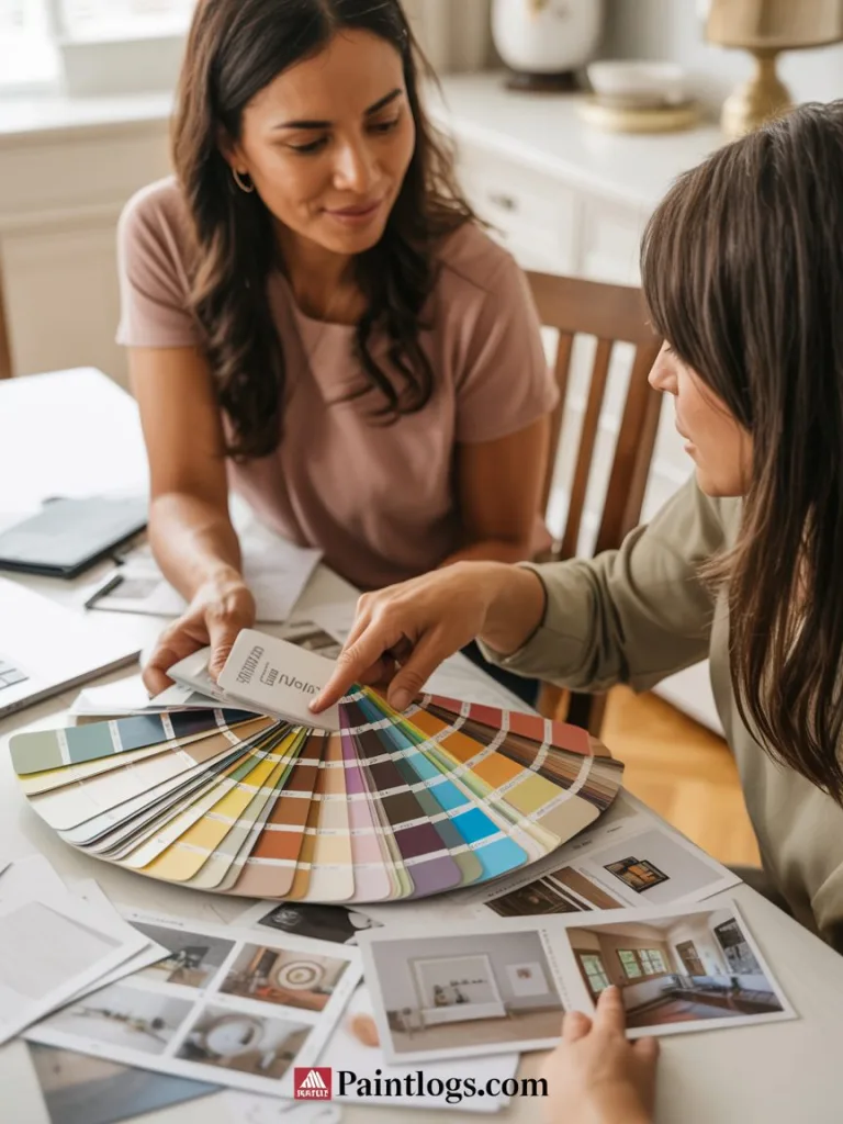
5. When in doubt, consult a pro:
If you’re feeling unsure or stuck between choices, consider calling a color consultant or interior designer for advice. A trained eye can offer creative suggestions and narrow down options.
As expert Michelle Bray notes, a color professional can even come to your home to help figure out the best palette, factoring in your lighting and furnishings. This can be especially helpful if you’re indecisive or if you and a partner disagree on colors – an expert can provide an objective recommendation.
How a Professional Color Consultation Can Help
Choosing paint colors can be daunting, but you don’t have to do it alone. Professional color consultants are specialists who help homeowners select palettes that perfectly fit their space and taste. There are several ways a professional consultation can make a difference:
- Expert Eyes and Ears: A color consultant will evaluate your home’s unique lighting, architecture, and existing décor to propose colors that enhance your space. They are knowledgeable about color theory and the latest design trends, but they also listen to your preferences. The result is a personalized color plan that aligns with your vision while avoiding choices that won’t work. With thousands of shades out there, an expert helps simplify the process and zero in on the right hues, ensuring your final selection truly matches your style and needs.
- Cohesive Results: If you’re painting multiple rooms, a professional can create a whole-home palette that flows beautifully from room to room. They will make sure the colors complement each other and suit each space’s function, achieving a cohesive harmony that you might find hard to pull together on your own. From walls to trim to ceiling, they’ll help you tie everything together so that your home looks thoughtfully designed.
- Avoiding Costly Mistakes: Because of their experience, color consultants know what works and what pitfalls to avoid. They can prevent you from choosing a color that clashes with your flooring or one that turns oddly pinkish in your lighting – mistakes that many DIY decorators learn the hard way. By getting it right the first time, you save time and money (no repainting rooms or buying quarts of wrong-color paint). In the long run, their fee often pays for itself by sparing you from indecision and do-overs.
- Knowledge of Products and Finishes: Beyond just color, professionals advise on the type of paint and finish each room needs. They’ll tell you if that rich navy needs an extra coat, or if you should use an eggshell finish in the bedroom but a scrubbable satin in the kids’ playroom. A consultant’s product knowledge ensures the beautiful color you choose also performs well for its purpose.
Many painting services (like Paintlogs in Miami) offer color consultations as part of their service. It’s an opportunity to have an expert partner in your project, giving you confidence that your home will look its absolute best. If you’re feeling overwhelmed by paint fan decks or just want a second opinion on your ideas, a professional consultation can be incredibly helpful.
Transform Your Home with Paintlogs – Book Your Color Consultation Today!
You’ve learned the key steps to choose the right paint color for your home – now let’s put those ideas into action. Selecting paint should be a fun and fulfilling experience, and you don’t have to navigate it alone. Paintlogs is here to help homeowners in Miami make the best color decisions for their spaces.
Our team of experienced professionals can guide you through every step, from pinpointing the perfect shade to ensuring it complements your lighting and décor. We take the stress out of color selection so you can enjoy the excitement of seeing your home refreshed with a beautiful new look.
Don’t leave your home’s atmosphere to chance – let the experts assist. Book a Paintlogs color consultation today and take the first step toward a stunning interior you’ll love for years to come. We’re excited to work with you to transform your home, one perfect color at a time!