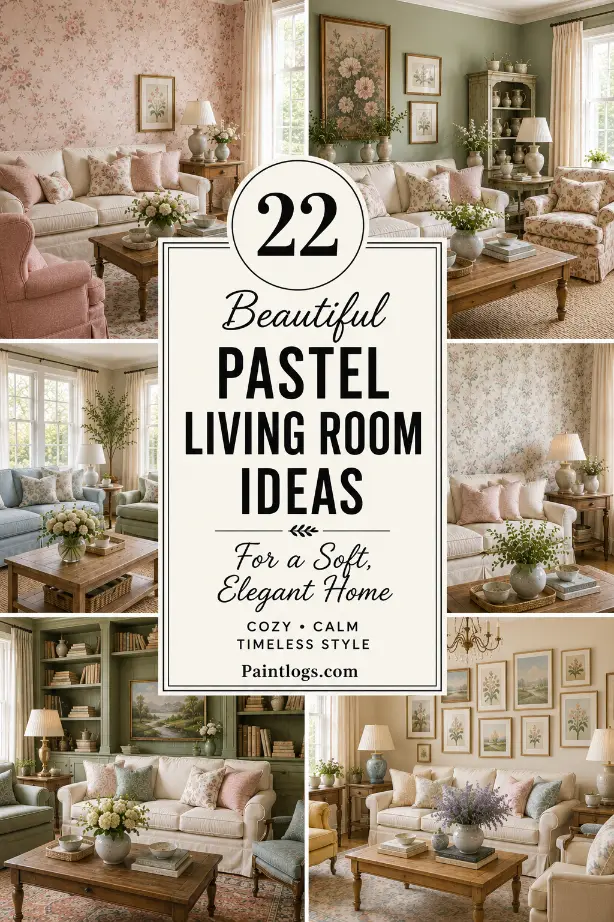
Pastel colors can completely change the feeling of a living room without making it look overly colorful.
I used to think pastel interiors had to be very sweet or feminine, but that really isn’t the case. A dusty blue sofa, soft sage wall, blush cushion, pale yellow accent, or muted lavender chair can add personality while still keeping the room calm.
The trick is choosing slightly softened shades and giving them enough neutral space around them.
You also don’t have to repaint the entire room to bring pastels in. Sometimes a sofa, rug, artwork, curtains, or a few cushions are enough.
Here are 22 pastel color living room ideas that show just how versatile these gentle shades can be.
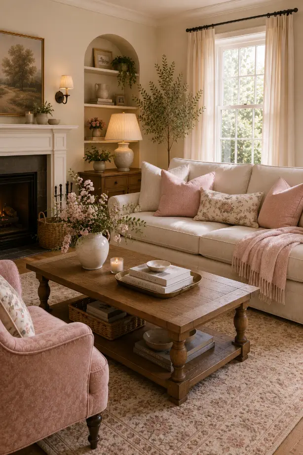
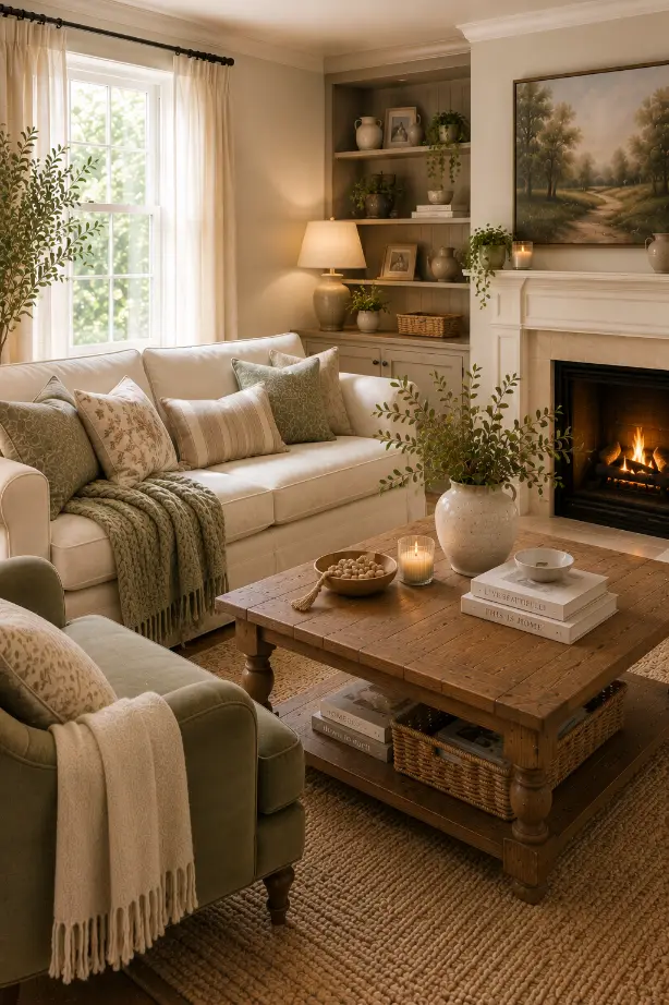
1. Let Soft Pink Warm Up a Neutral Room
A little blush pink can make a neutral living room feel noticeably warmer.
I like using it against cream walls with a beige sofa, light wood furniture, and soft natural fabrics. The pink doesn’t have to dominate the room. A couple of cushions, a throw, or a small accent chair can be enough.
If you’re nervous about pink, start with a dusty blush rather than a bright bubblegum shade.
It feels much more grown-up and is surprisingly easy to live with.
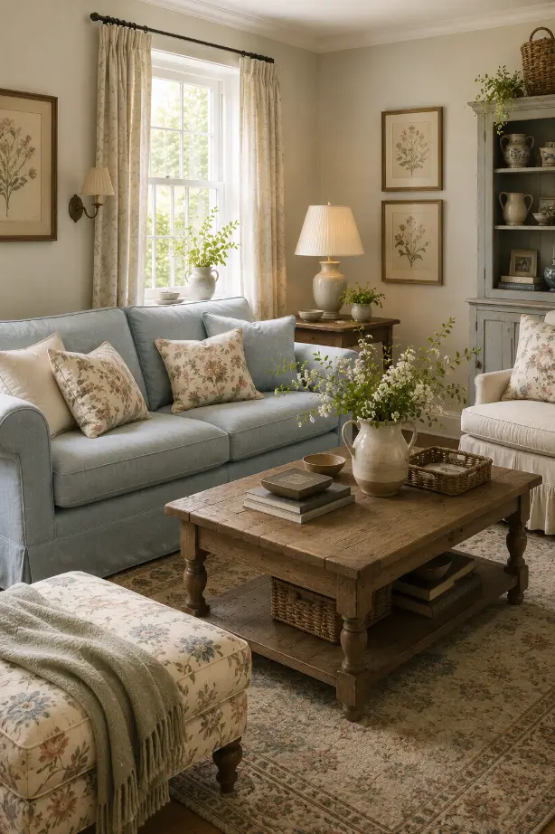
2. Try a Pastel Blue Sofa
A pastel blue sofa can become the color that gives an otherwise neutral living room its personality.
Think powder blue, dusty blue, or a slightly grayish blue rather than a very bright baby blue.
I would pair it with cream walls, natural oak furniture, beige flooring, and soft white curtains.
The result feels fresh without looking like you’ve decorated around one specific color.
And if you eventually want to change the palette, blue is easy to work with.
3. Use Sage Green for a Calmer Feeling
Sage is one of the easiest pastel colors to bring into a living room.
It has enough gray in it to feel sophisticated, but it still brings that gentle connection to nature.
Try sage walls with cream furniture and warm wood.
You can also use sage through cushions, curtains, artwork, or an accent chair if painting the walls feels like too much.
I especially like sage in rooms with plenty of natural light because it changes subtly throughout the day.
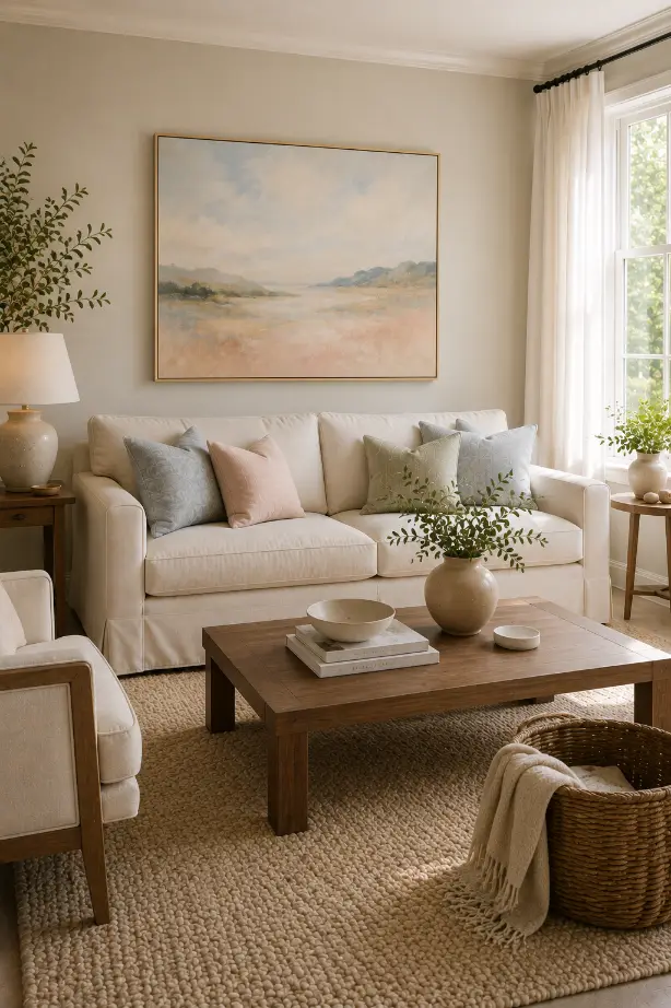
4. Mix Blush Pink With Cream
Blush and cream are a simple combination that rarely feels overwhelming.
Use warm cream as the main color and bring blush in through upholstery, pillows, artwork, or a rug.
Then add natural wood to keep everything grounded.
The wood is important because it prevents the room from feeling too sweet.
A walnut coffee table or oak sideboard can make even very soft pink accents feel much more sophisticated.
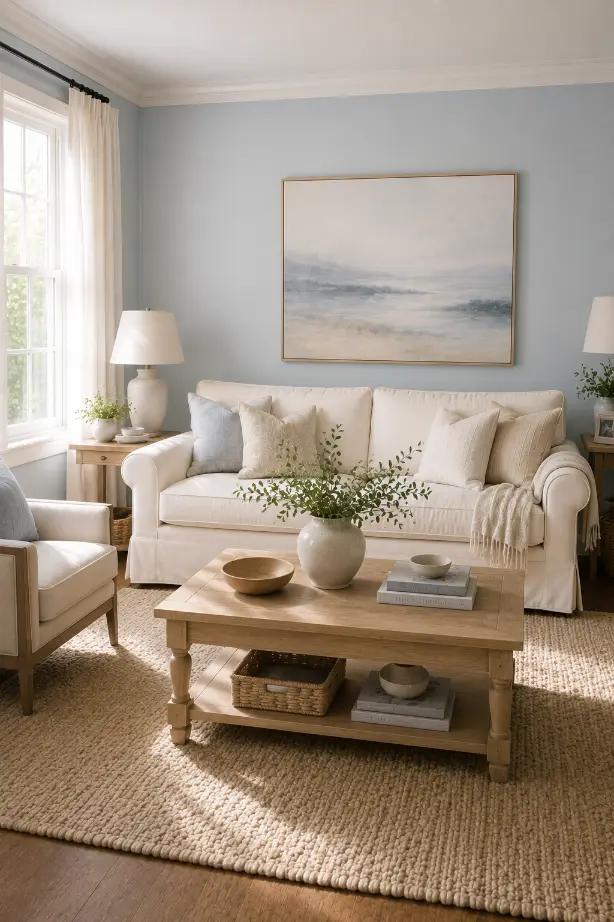
5. Paint the Walls a Soft Pastel
You don’t always need an accent wall.
A pale pastel shade across all four walls can create a much more enveloping atmosphere.
Soft peach, dusty blue, pale sage, muted lavender, or a warm blush can all work.
If you’re painting the entire room, I’d keep the furniture fairly restrained.
Cream upholstery, natural wood, soft beige rugs, and simple artwork give the wall color enough room to breathe.
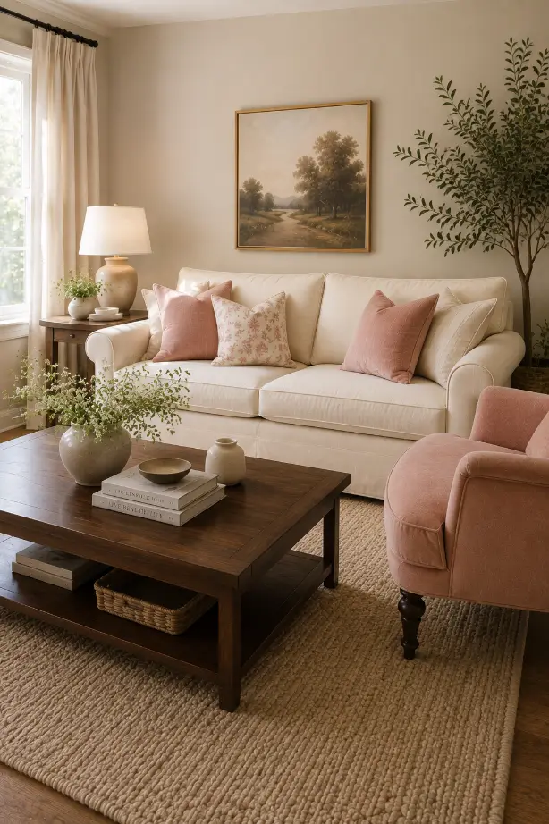
6. Bring in Pastels Through Artwork
If you rent or simply don’t want to repaint, artwork is one of my favorite ways to introduce pastel color.
Look for a large painting containing several soft shades rather than one piece that uses only one pastel.
A landscape with dusty blue, pale green, blush, cream, and muted yellow can become the color inspiration for the entire room.
Then repeat one or two of those shades through cushions or a small decorative object.
It makes the room feel coordinated without being too obvious.
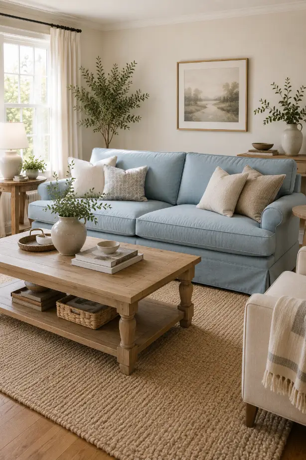
7. Create an English Cottage Pastel Look
Pastels work naturally with cottage interiors.
Try a powder-blue sofa, floral cushions, botanical artwork, an old-looking wood table, and a patterned ottoman.
Don’t make every pattern match.
I actually prefer when the florals and stripes are slightly different. It gives the room that collected feeling that makes cottage interiors so appealing.
Add a few books and personal pieces, and the space starts feeling like somewhere people actually live.
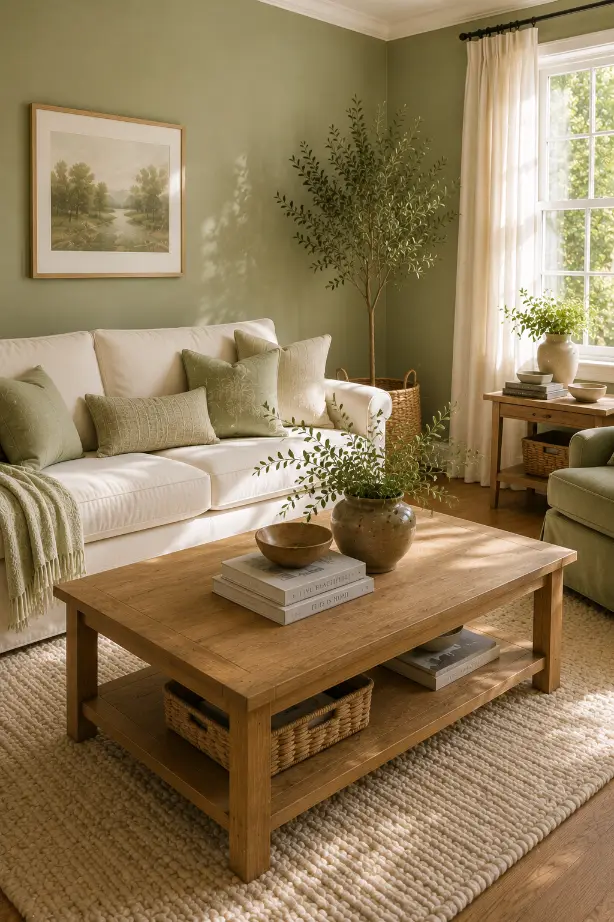
8. Use Pale Green With Floral Details
A pale green living room can feel almost like a garden brought indoors.
Use soft green upholstery or walls with floral cushions, botanical prints, and a few fresh branches.
Keep the larger furniture relatively simple so the flowers don’t become overwhelming.
Cream, beige, and natural wood are particularly useful here.
They create a quiet background that lets the green and floral details do the interesting work.
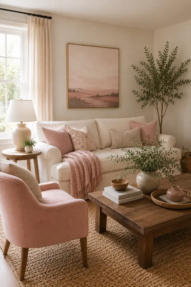
9. Add a Vintage Botanical Feel
Pastels don’t have to look modern.
Soft pink, faded green, dusty blue, and muted cream work beautifully with vintage furniture and botanical artwork.
Try an older-looking wood side table, vintage-style framed prints, a soft upholstered sofa, and a traditional rug.
I like this approach because the slightly faded colors make the room feel as though it has evolved over time rather than being decorated all at once.
10. Try a Pastel Tropical Palette
If you want something more playful, bring pastels together with botanical or tropical details.
A muted green wall mural can work with pale blue seating, cream furniture, and soft coral accents.
The important word here is muted.
You don’t need extremely bright tropical colors. Softer shades create a much calmer room while still giving you that vacation-like feeling.
Add natural wood, woven materials, and plenty of daylight.
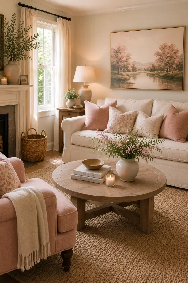
11. Turn One Large Artwork Into the Focal Point
Sometimes one large pastel artwork is all a living room needs.
Instead of decorating every wall, choose one substantial piece with soft pink, lavender, blue, green, or yellow tones.
Place it behind the sofa where it can become the main visual anchor.
Then pull one or two colors from the artwork into the cushions or nearby accessories.
This is an easy way to make pastel colors feel intentional rather than randomly scattered around the room.
12. Make a Pastel Reading Corner
You don’t have to use pastel throughout the entire living room.
A reading corner is a perfect place to experiment.
Try a blush or pale green armchair, a small wood side table, a soft lamp, and a stack of books.
Add a pastel cushion or small rug and keep the surrounding colors neutral.
The result feels personal and cozy without changing the entire room.
13. Use Pastels in a Bright Sunroom
Pastels and natural light are a very good combination.
If your living room gets strong daylight, try pale blue, lavender, soft cream, and gentle green.
Keep the curtains light so the sunlight can move through the room.
You can also add fresh flowers or branches to reinforce the soft spring-like feeling.
I wouldn’t overdecorate a sunroom. The light should remain one of the main features.
14. Give Pastels a Coastal Feeling
Pastel blue is an obvious choice for coastal interiors, but you can make it more interesting by combining it with other soft colors.
Try powder blue with cream, pale coral, sandy beige, and warm wood.
A blue sofa with coral-patterned cushions can look particularly nice against a bright neutral background.
You don’t need seashells and nautical decorations everywhere.
The color palette itself can provide the coastal feeling.
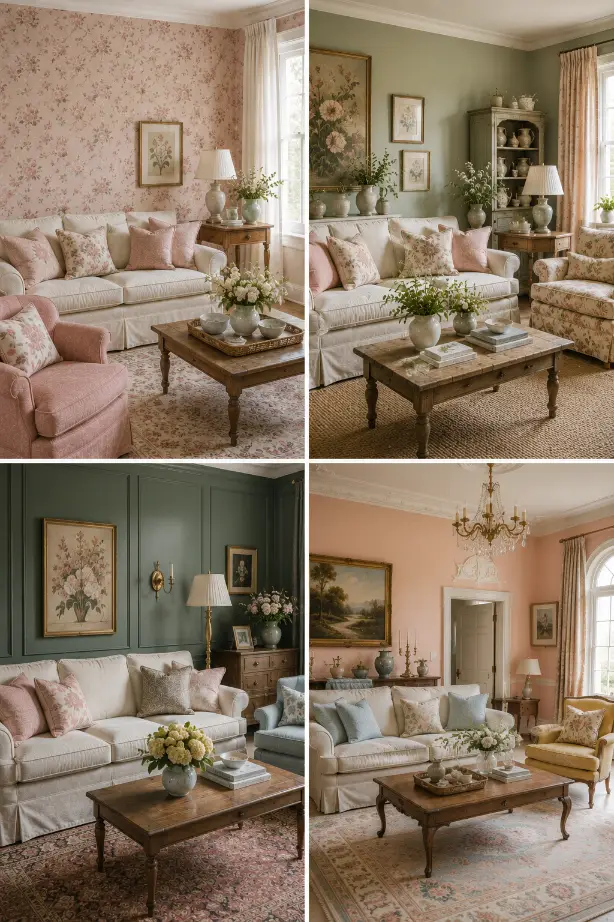
15. Combine Pastel Pink With Floral Wallpaper
If you enjoy pattern, pastel pink works beautifully with delicate floral wallpaper.
The key is controlling the scale.
A small or medium floral pattern can feel charming without taking over the room.
Keep the sofa relatively simple and use solid-color cushions to give your eye somewhere to rest.
Natural wood and cream upholstery can also soften the pattern.
16. Bring in English Garden Charm
Soft green, blush, cream, and floral patterns can create a beautiful English garden-inspired living room.
I like mixing botanical artwork with floral cushions and a pale green chair.
You don’t need everything to be perfectly coordinated.
In fact, slightly mismatched patterns often make the room feel more authentic.
Add old-looking books, a small wooden table, and a vase of flowers to finish the look.
17. Mix Pastels With Darker Green
Pastels don’t have to stay completely pale.
Try pairing soft floral or pastel colors with a deeper green.
For example, pale pink cushions can sit beautifully against a deeper green sofa or wall.
The darker shade gives the lighter colors something to contrast with.
This is one of my favorite ways to keep a pastel room from feeling too sugary.
You get the softness of pastel color without losing depth.
18. Keep a Traditional Room Soft
Pastels work surprisingly well with traditional furniture.
Think cream upholstery, pale peach walls, soft yellow accents, a traditional rug, and an elegant chandelier.
The furniture can provide the formal character while the colors keep the room approachable.
If your home already has traditional architectural details, you don’t necessarily need to make the room modern to refresh it.
Sometimes a gentle color change is enough.
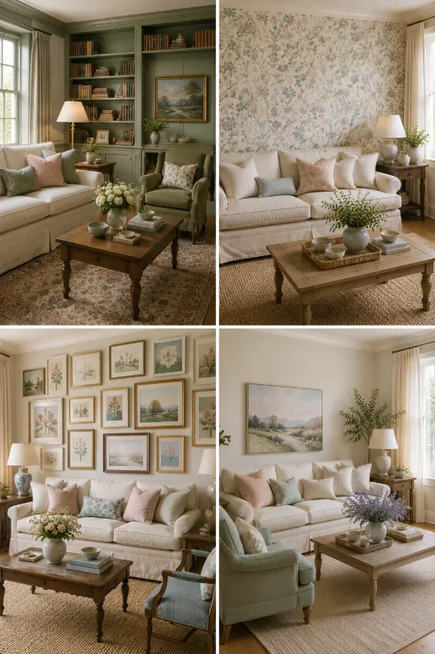
19. Create a Soft Sage Library
If you have a fireplace or built-in bookshelves, consider using pale sage green on the walls.
It creates a quiet, almost library-like feeling.
Add a cream sofa, wooden shelves, books, a comfortable armchair, and a few flowers.
I especially like this combination for rooms intended for reading or relaxing because the color feels restful without becoming bland.
20. Use Pastel Pattern on One Wall
A patterned wallpaper can be an easier way to introduce several pastel shades at once.
Choose a design containing colors such as dusty pink, pale blue, muted green, and cream.
Then keep the furniture simple.
One of the easiest mistakes with patterned walls is adding too many additional patterns elsewhere.
Let the wallpaper do most of the work.
21. Make a Pastel Gallery Wall
Pastel colors can also be introduced through a collection of artwork.
Instead of using one large painting, create a gallery wall with different prints.
Botanical illustrations, landscapes, abstract paintings, and vintage-style artwork can all work together if they share a similar soft color palette.
I would use different frame styles but keep the colors connected.
That gives the wall personality without making it feel chaotic.
22. Mix Pastels With Warm Neutrals
If you’re still unsure about pastel decorating, this is where I’d start.
Use a warm neutral foundation first:
- Cream walls
- Beige sofa
- Natural wood
- Ivory curtains
- Soft textured rug
Then add pastel colors through cushions, artwork, a chair, flowers, or small accessories.
This approach gives you plenty of flexibility.
You can change the pastel colors later without replacing the larger furniture.
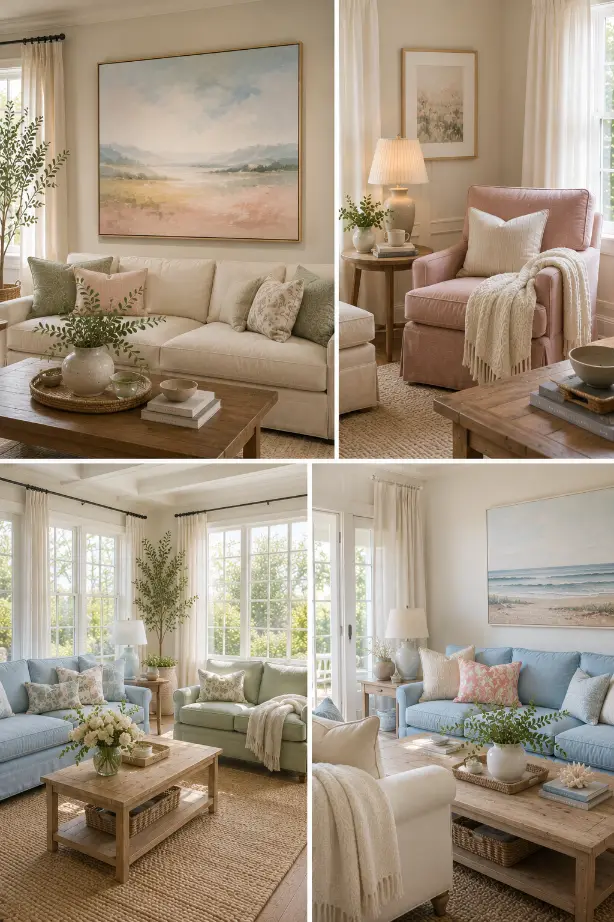
How to Mix Pastel Colors Without Making a Living Room Look Too Sweet
This is probably the biggest concern with pastel decorating.
The answer isn’t necessarily to avoid pastels. It’s to balance them.
I like using one pastel as the main color and then introducing one or two supporting shades.
For example:
Sage + cream + warm wood
Blush + beige + walnut
Powder blue + ivory + natural oak
Lavender + cream + dusty green
Pale yellow + warm white + brown
This keeps the palette connected without making every surface colorful.
What Materials Work Best With Pastel Colors?
Pastels become much more interesting when they’re paired with natural textures.
Try:
- Linen
- Cotton
- Wool
- Natural oak
- Walnut
- Wicker
- Rattan
- Aged brass
- Handmade ceramics
- Stone
- Soft leather
These materials add warmth and prevent pale colors from feeling flat.
For example, a blush sofa can look completely different when it’s surrounded by walnut furniture, a textured wool rug, and aged brass lighting compared with a room filled with glossy white furniture.
My Favorite Way to Start With Pastel Color
I wouldn’t start by buying everything in one pastel shade.
Start with something easy to change.
A couple of cushions, a throw, artwork, a vase, or an accent chair can tell you whether you actually like the color in your room.
Pay attention to it during different parts of the day.
A pastel that looks beautiful in morning sunlight might feel completely different under your evening lamps.
Once you’re comfortable with the color, you can take it further with a painted wall, sofa, curtains, or larger rug.
Final Thoughts
Pastel colors don’t have to make a living room feel childish, overly feminine, or temporary.
When they’re combined with warm neutrals, natural wood, good textures, and thoughtful furniture, they can feel incredibly sophisticated.
I especially like pastels when they’re slightly muted rather than extremely bright. A dusty blue, soft sage, faded blush, or pale lavender gives you color without overwhelming the room.
And you don’t have to commit to an entire pastel living room.
Sometimes one blue sofa, one sage wall, a blush chair, or a piece of pastel artwork is enough to change the mood.
The best pastel living rooms I’ve seen aren’t perfectly color-matched. They have a little variation, plenty of texture, and enough neutral space to let the softer shades stand out.