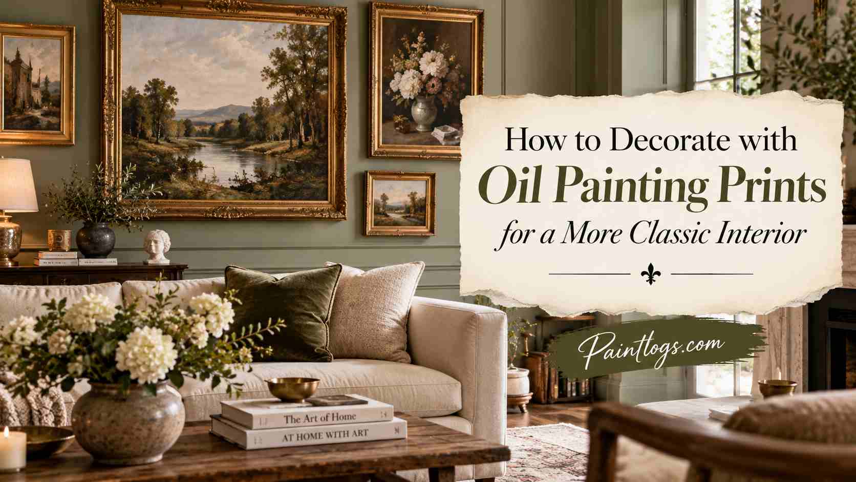
How to Decorate with Oil Painting Prints for a More Classic Interior
A classic interior rarely begins with decoration alone. It begins with proportion, balance, and a disciplined reading of the room itself. Before selecting oil painting prints, study the architecture that already exists, including ceiling height, window placement, moldings, fireplaces, doorways, and built-in cabinetry.
These details determine whether a room can carry a large formal landscape, a restrained portrait, or a series of smaller still lifes. When art responds to the structure of a room, it looks intentional rather than added at the end.
Oil painting prints are especially effective in classic interiors because they bring visual weight without requiring the expense or fragility of original paintings. Their painterly surfaces, even when reproduced on canvas or fine art paper, can echo the texture and depth associated with traditional collecting.
In a room with tall ceilings, a single oversized print above a mantel can establish authority and symmetry. In a smaller room, a pair of prints hung on either side of a mirror or doorway can create a sense of order. The aim is not to fill empty walls but to reinforce the architecture already guiding the eye.
The most successful classic rooms avoid treating art as isolated decoration. A print should relate to the height of the furniture below it, the width of the wall it occupies, and the rhythm of nearby objects.
A painting print hung too high can make even expensive furniture feel disconnected. One hung too low can make the wall feel compressed and awkward. A classic arrangement is usually calmer, with art centered at a comfortable viewing height and aligned with the principal furnishings in the room.
Choose Subjects That Carry Historical Weight
Subject matter is one of the quickest ways to give a room a classic tone. Landscapes, portraits, botanical studies, architectural views, maritime scenes, and still lifes have long histories in traditional interiors. These subjects bring with them the atmosphere of libraries, drawing rooms, old hotels, private clubs, and European apartments.
They do not have to feel old-fashioned, however, when paired with cleaner furniture and modern lighting. The key is choosing imagery with composure rather than novelty.
A landscape can expand a room emotionally, particularly when it shows water, fields, mountains, or distant architecture. A still life can bring intimacy to a dining room, pantry wall, or breakfast nook. A portrait, even a reproduced one, introduces a human presence that can make a hallway or study feel layered and collected.
Botanical and floral oil painting prints work well in bedrooms, sitting rooms, and powder rooms because they soften the space without overwhelming it. The most classic choices often have a sense of restraint, with subjects that invite looking rather than demand attention.
Once the right subject is understood, sourcing becomes the next part of the design decision. Classic rooms need pieces that feel considered rather than generic, and oil painting prints can provide painterly depth without the auction-house barrier.
Curated online art marketplaces are useful in this context, offering a broad selection, dependable formats, and ready-to-hang options for homeowners who want a collected look without starting from scratch. That is where iCanvas, a Chicago-based wall art marketplace featuring work from independent artists, licensed estates, and cultural institutions, can fit naturally into the search.
Its oil painting canvas prints offer an accessible way to bring depth, polish, and a sense of history to traditional interiors, helping a room appear thoughtfully layered rather than overly staged.
Use Scale to Create Formal Presence
Scale is often what separates a room that looks decorated from one that feels designed. Classic interiors tend to use art with confidence, particularly in formal spaces such as living rooms, dining rooms, libraries, and entry halls. A small print on a large wall can look timid, no matter how beautiful the image may be.
By contrast, a properly scaled oil painting print can anchor a room and create the sense of permanence associated with older interiors. When in doubt, many rooms benefit from art that is slightly larger than expected.
Above a sofa, a single large print or a structured grouping should generally span a meaningful portion of the furniture width. Above a mantel, the art should have enough height to hold its own against the fireplace surround and any objects placed on the mantel shelf.
In an entryway, a vertical portrait or architectural scene can draw the eye upward and give the arrival moment a sense of ceremony. Dining rooms can tolerate larger, moodier prints because they are often used in the evening under softer lighting. Bedrooms usually call for calmer scale, but even there, a generous print above a headboard can make the room feel finished.
Large scale does not always mean grand or theatrical. It can also mean disciplined simplicity, such as one serene landscape in a restrained frame. The danger in classic decorating is not that a room becomes too formal, but that it becomes cluttered with undersized pieces that lack hierarchy. A strong focal print gives the rest of the room permission to be quieter. It allows lamps, textiles, books, and antiques to support the composition rather than compete with it. In that way, scale becomes a tool of order.
Build a Palette Around the Print
Oil painting prints often succeed because they contain complex color relationships. Unlike flat graphic art, a painterly image may include dozens of related tones, including softened greens, browned reds, chalky blues, warm creams, umbers, ochres, and smoky grays.
These colors can guide an entire room if they are studied carefully. A classic interior does not need every element to match, but it benefits from colors that appear to belong to the same conversation. Art can provide that conversation in a way that paint chips and fabric samples often cannot.
Start by identifying two or three dominant tones in the print. One may be used in a rug, another in upholstery, and a third in smaller accents such as pillows, lampshades, or ceramics. A landscape with olive, cream, and rust can support a room with linen seating, a muted green chair, and walnut furniture.
A floral print with deep burgundy and dusty pink can enliven a neutral bedroom without making it feel sugary. A maritime image with slate blue, ivory, and brown can bring structure to a study or den.
The background tones of a print are as important as the obvious colors. In many classic images, the most useful design cues are found in shadow, sky, drapery, or tabletop surfaces. These quieter tones help connect the art to wood finishes, metal hardware, stone, and wall color.
A gilt frame may look natural when the image itself contains warm highlights. A dark walnut frame may feel right when the composition includes earthier shadows. When a room borrows color from the print at several levels, the art feels integrated rather than merely hung.
Frame Oil Painting Prints with Discipline
Framing can determine whether an oil painting print reads as sophisticated or casual. In a classic interior, the frame should feel like part of the architecture of the wall. Gold frames, black frames, dark wood frames, and antiqued finishes can all work, but each sends a different message.
A gilded frame brings formality and warmth, while a simple black frame can sharpen a traditional image for a more current room. A walnut or mahogany tone can bridge the gap between old-world subject matter and practical family living.
The frame should also suit the print’s mood and the room’s level of formality. A romantic landscape may benefit from a wider, warmer frame, particularly above a mantel or console. A botanical study may look better in a slimmer frame with a mat, especially in a bedroom or hallway.
A portrait can often carry a more substantial frame because the subject matter has inherent presence. A still life may tolerate either formal or understated framing, depending on the surrounding furniture and lighting.
Consistency matters, but sameness is not required. A classic home can include several frame finishes if they are repeated with intent. For example, black frames may appear in a hallway gallery, gilt frames in the living room, and darker wood frames in the study. What should be avoided is a random mix that looks accidental. The best rooms often appear collected because the frames vary, but the variations are controlled by scale, tone, and placement.
Arrange Prints with Symmetry and Rhythm
Symmetry is one of the foundations of classic decorating. It calms a room, gives the eye a place to rest, and creates a sense of deliberate composition. Oil painting prints lend themselves to symmetrical arrangements because many traditional subjects have strong central balance. A pair of landscapes over matching chests can create a gracious entry. Two still lifes on either side of a doorway can make a dining room feel settled and architectural.
Rhythm is equally important, especially in rooms where perfect symmetry is not possible. A hallway may call for a sequence of related prints spaced evenly along the wall. A stairway can carry a rising arrangement of portraits, landscapes, or architectural scenes that follow the movement of the stairs. A library can mix prints with shelves, sconces, and furniture so that the eye moves naturally from one point to another. In each case, the spacing between works should feel measured, not improvised.
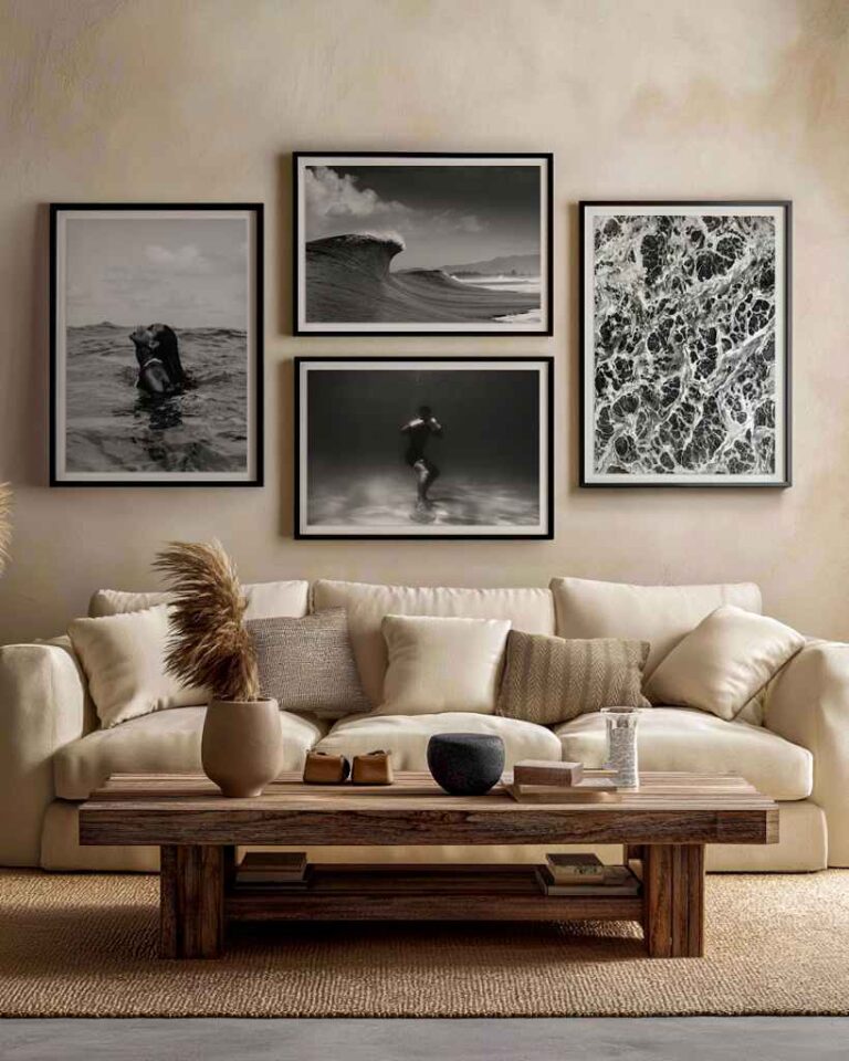
Gallery walls can work in classic interiors, but they require restraint. The most successful ones usually share a common thread, such as subject, palette, frame color, or period mood. A grouping of botanical oil painting prints can feel elegant when arranged in a grid. A salon-style wall of landscapes and portraits can feel rich, but only if the frames and spacing are carefully managed. The goal is to create density without visual noise.
Pair Prints with Traditional Materials
Classic interiors rely on materials that age well. Wood, stone, wool, linen, leather, brass, ceramic, and plaster all have a natural affinity with oil painting prints. These materials provide the depth and tactility that painterly imagery deserves. A print above a polished mahogany console will read differently from the same print above a glossy white cabinet. The former tends to deepen the classic mood, while the latter may produce a more transitional effect.
Textiles play a particularly important role. A muted oil painting print can be strengthened by a wool rug with similar undertones. Linen drapery can soften the edges of a formal landscape. Velvet upholstery can make a portrait or floral print feel more luxurious without becoming theatrical. Leather seating can bring gravity to hunting scenes, maritime works, or architectural imagery. These relationships help the room feel layered rather than staged.
Metal finishes should be handled with similar care. Brass and bronze often suit oil painting prints because they share warmth with traditional frames and lamp light. Nickel and polished chrome can work in a more updated classic room, particularly when the art is framed in black or dark wood. The important point is to avoid treating the print as the only traditional element in the room. When the surrounding materials carry related weight, the art looks at home.
Use Lighting to Give Prints Depth
Lighting is a decisive factor in how oil painting prints are perceived. A poorly lit print can look flat, regardless of its quality or subject. A well-lit print can become one of the most compelling elements in a room. Classic interiors often rely on layered lighting, including table lamps, sconces, chandeliers, and picture lights. This layering gives art dimension and creates atmosphere after daylight fades.
Picture lights can be especially effective above oil painting prints, but they should be chosen carefully. A light that is too bright can make the display feel like a showroom. One that is too small can look decorative rather than functional. The finish should relate to nearby hardware, frames, or lamps. In a traditional room, an aged brass picture light above a landscape or portrait can add a quiet sense of importance.
Natural light also matters, but it should be managed. Prints should not be placed where direct sunlight will strike them harshly throughout the day. Even reproductions can fade or lose richness when exposed to intense light over time. Rooms with filtered daylight, lined drapery, or shaded windows are often ideal for painterly art. In the evening, warm lamps and sconces can restore the depth and intimacy associated with classic interiors.
Mix Old and New Without Losing the Classic Mood
A classic interior does not require every object to be antique or historically correct. In fact, many of the strongest rooms combine older references with contemporary comfort. Oil painting prints are useful in this kind of decorating because they can introduce tradition without making the room feel like a museum. A modern sofa can sit comfortably beneath a large pastoral landscape. A clean-lined dining table can become warmer when surrounded by framed still lifes or portraits.
The balance depends on proportion and restraint. If the furniture is modern, the art can carry more historical character. If the furniture is heavily traditional, the art may need to be calmer or more spare. A room with rolled-arm sofas, patterned rugs, and ornate mirrors may not need a dramatic painting print. It may benefit instead from a quieter landscape or botanical work that adds depth without increasing visual weight.
The most persuasive classic rooms feel accumulated rather than purchased all at once. Oil painting prints can support that impression when they are chosen as though they have meaning, not merely because they fill a wall. A print might relate to a place the homeowner loves, a palette that suits the architecture, or a subject that echoes the function of the room. This sense of personal selection is what keeps classic decorating from becoming formulaic. It also gives a home the quiet authority that fashionable interiors often lack.
Let the Room Mature Around the Art
Decorating with oil painting prints is not only a matter of choosing images. It is a process of allowing the room to develop around them. A strong print can become the starting point for future decisions about furniture, lighting, textiles, and accessories. Over time, the room may gain books, ceramics, family objects, or inherited pieces that deepen its character. The art provides continuity as those layers are added.
Classic interiors benefit from patience. They are rarely completed in a single purchase or weekend installation. An oil painting print may look good on the day it is hung, but it often looks better once the room gains the objects that make it feel lived in. A chair placed nearby, a lamp added below, or a small table introduced to the composition can change the way the art reads. These adjustments create the sense of refinement associated with long-lived interiors.
The final measure of success is not whether the room looks expensive. It is whether the room feels composed, durable, and quietly personal. Oil painting prints can help achieve that effect because they bring history, texture, and recognizable artistic language into everyday spaces.
When chosen with attention to subject, scale, palette, frame, and placement, they can make a room feel more classic without making it feel frozen in time. That is the enduring advantage of decorating with painterly art: it gives a home memory, even when the work itself is newly acquired.