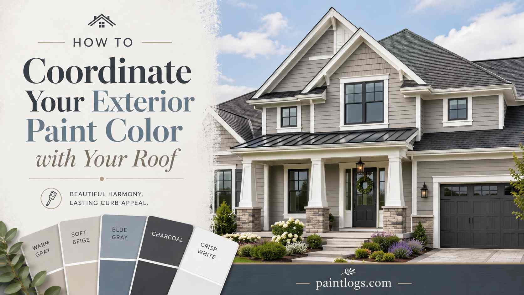
How to Coordinate Your Exterior Paint Color with Your Roof
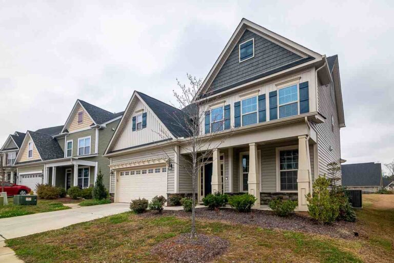
When people plan an exterior repaint, they usually start with the walls. That is the fun part, after all. But the roof is often the largest single block of color on the house, and unlike paint, it is not something you can change on a whim. That makes it the smarter starting point: choose your paint to work with the roof, rather than hoping the roof somehow works with your paint.
Get that order right and the whole house looks pulled together. Get it wrong and even a beautiful color can feel slightly off, without anyone quite knowing why.
Start with the Roof, Not the Walls
Think of your exterior colors as a hierarchy built around what you cannot easily change. The roof sits near the top of that list. Paint is flexible and inexpensive to redo; a roof is neither. So it makes sense to treat the roof as a fixed anchor and choose the body, trim, and accent colors to complement it.
This is especially true when the roof color is strong or distinctive. A deep charcoal, a warm brown, or a terracotta tile roof each pushes your palette in a particular direction, and it is far easier to lean into that than to fight it from the ground up.
Read Your Roof’s Undertone First
Most roofs are not simply “gray” or “brown.” Look closely and you will usually find an undertone: a gray that leans blue or green, a brown that leans red or gold, a black that is really a very dark charcoal with some warmth in it. That undertone is the key to a coordinated palette.
The basic rule is to match temperature. Warm-toned roofs (browns, tans, terracottas) pair most naturally with warm paint colors such as creams, warm whites, soft greens, and earthy tones. Cool-toned roofs (blue-grays, true grays, cool charcoals) sit better with cooler paints such as crisp whites, greige, and slate blues. Mixing a cool paint with a warm roof, or the reverse, is the usual culprit when a color scheme feels vaguely wrong.
This matters just as much if the roof itself is part of an upcoming project. Stone-coated metal roofing, for instance, reproduces a warm, tile-like look in a range of tones, so its undertone can be planned alongside the paint from the start rather than discovered afterward.
Pairing Paint with Common Roof Colors
A few starting points for the roof colors you see most often.
Gray, Charcoal, and Black Roofs
These are the most flexible. Cool neutrals, crisp whites, greige, and soft blue-grays all work, and a dark roof gives you room for a high-contrast white body or a moodier, tonal look. Warm whites can work too, as long as the roof has a touch of warmth in it.
Brown, Tan, and Weathered Roofs
Warm roofs call for warm company. Creams, tans, sage and olive greens, and warm whites all sit comfortably beneath a brown roof. Be careful with stark cool grays here; they can look cold and disconnected against all that warmth.
Terracotta, Red, and Tile Roofs
Common on Mediterranean and Southwestern homes, and throughout Florida, these roofs have a strong warm presence. Warm whites, soft ochres, sand, and earthy greens flatter them, while bright cool grays and blue-leaning whites tend to clash.
Factor in What Surrounds the House
The roof is not the only fixed element worth reading before you pick paint. Brick, stone veneer, pavers, and even mature landscaping all carry their own undertones, and a strong roof color combined with a strong masonry color can pull a palette in two directions if you are not careful.
Take stock of everything that will stay put: the driveway, any stone accents, a brick chimney, the fence, even the dominant greenery in the yard. If your roof leans warm and your stonework leans cool, for instance, your paint often has to act as a bridge between the two rather than matching either one exactly. In a lot of neighborhoods, this is also where checking HOA guidelines pays off, since some communities restrict exterior colors or require approval before a repaint.
Common Coordination Mistakes
A few patterns come up again and again when a color scheme feels almost right but not quite.
Matching the roof instead of complementing it. Paint that is nearly the same color as the roof tends to flatten the house, removing the visual separation between the two. A little contrast, even subtle, usually reads better than trying to blend in.
Ignoring undertones in favor of a single word. “Gray” and “gray” are not the same color once you look closely. Two grays with opposite undertones, one warm and one cool, can clash even though they sound identical on paper.
Choosing paint indoors, under artificial light. A color that looks right on a chip inside a store can shift noticeably once it is on an actual wall under daylight, especially next to the roof it needs to work with.
Forgetting the roof exists at all. It is easy to focus entirely on the walls and trim and treat the roof as a fixed backdrop that does not need consideration. Since the roof is often the largest color block on the house, skipping this step is the single most common reason a scheme feels off.
Don’t Forget the Trim and Accents
Coordinating with the roof is not only about the main body color. A simple way to think about it is one dominant body color, one trim color, and one accent for the door or shutters. The roof influences all three. A white trim reads very differently under a charcoal roof than under a warm brown one, and your front-door color is a chance to either echo the roof or provide a deliberate contrast.
Test in Your Actual Light
Paint colors shift dramatically depending on light, and exterior light is the most demanding of all. This matters even more in strong, bright climates like South Florida, where intense sun can wash a color out and make it read a shade or two lighter than the chip suggests.
Always test large swatches on the actual walls, look at them next to the roof, and check them at different times of day—morning, midday, and late afternoon—before you commit. A color that looks perfect on a cloudy morning can feel glaring by two in the afternoon.
If You’re Replacing the Roof Too
Sometimes the roof and the repaint happen together, or you are re-roofing first. That is actually the ideal scenario, because for once the roof color is on the table rather than fixed.
If you are choosing a new roof, it helps to know that modern materials give you far more control over color than the older options did. Profiled metal, for example, comes in a wide range of metal roof color options, from warm browns and terracottas to cool charcoals and near-blacks, which lets you plan the roof and the exterior palette together instead of working around whatever is already up there. Choosing both at once is the easiest way to get a truly coordinated exterior.
Whatever you pick, look at a real roof sample outdoors next to your paint swatches, in your own light, before deciding.
The Takeaway
A coordinated exterior starts with the thing you cannot easily change. Identify your roof’s undertone, choose paint colors in the same temperature family, and carry that logic through the body, trim, and accents. Then test everything in your real light before you buy.
And if a new roof is part of the project, treat its color as part of the palette from the start; comparing finishes at novatik.us alongside your paint options is a simple way to make sure the two work together rather than merely coexist.