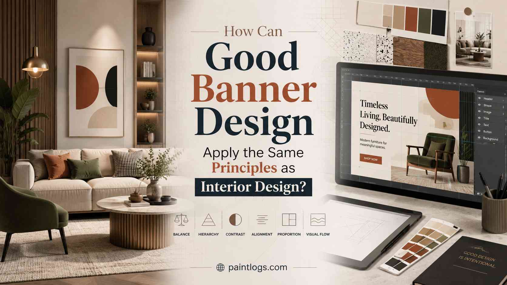
How Can Good Banner Design Apply the Same Principles as Interior Design?
Whether you are decorating a living room or creating a digital banner, the goal is the same. You want to capture attention, guide the viewer’s eye, and leave a lasting impression. Both interior designers and graphic designers rely on proven design principles such as balance, color harmony, contrast, proportion, and focal points to achieve this goal.
Understanding these shared principles helps homeowners, decorators, and designers make smarter visual decisions. This article explores how banner design follows many of the same rules as interior design and explains how these concepts can improve both physical and digital spaces.
What Is Banner Design?
Banner design is the process of arranging text, colors, images, shapes, and white space to communicate a message clearly and attract attention. While banners often appear on websites, social media, storefronts, and events, the design principles behind them are universal.
Just as a well-designed room feels comfortable and organized, a well-designed banner feels clear, balanced, and visually appealing.
Key Takeaway: Banner design and interior design both organize visual elements to guide attention and create a memorable experience.
Why Do Interior Design Principles Matter in Banner Design?
Interior designers carefully consider how people move through a room, where their attention naturally falls, and how colors influence mood. Graphic designers solve similar problems within a limited space.
Instead of arranging furniture, they arrange headlines, images, icons, and buttons. Instead of selecting wall colors, they choose color palettes that reinforce a message.
The shared objective is simple:
- Create visual harmony.
- Direct attention naturally.
- Make information easy to understand.
- Build an emotional connection.
- Leave a lasting impression.
Whether someone enters a beautifully painted home or lands on a webpage, their first impression forms within seconds.
Key Takeaway: Great design always guides the viewer before they even realize it.
How Does Color Psychology Influence Both Banner Design and Interior Design?
Color is one of the strongest emotional tools available to any designer.
Interior designers choose paint colors based on the atmosphere they want to create. Warm colors often make rooms feel inviting, while cool colors create a calm environment.
Banner designers make similar choices. Bright colors grab attention, while softer tones communicate trust, elegance, or simplicity.
For example:
- Blue builds trust and professionalism.
- Green suggests nature, freshness, and balance.
- White creates openness and simplicity.
- Black adds sophistication and contrast.
- Orange encourages energy and action.
Paintlogs regularly explores how paint colors affect spaces. The same psychology helps determine whether a banner feels modern, welcoming, luxurious, or energetic.
Choosing colors that complement each other instead of competing improves readability and user engagement.
Key Takeaway: Color influences emotion in both rooms and banners, making thoughtful palettes essential.
Why Is Visual Hierarchy Important?
Visual hierarchy refers to the order in which people notice design elements.
In a living room, the fireplace, artwork, or statement wall often becomes the focal point.
In banner design, the headline usually serves this purpose.
Designers then use supporting images, subheadings, and calls to action to guide viewers through the content naturally.
Strong hierarchy relies on:
- Font size
- Color contrast
- Spacing
- Image placement
- Alignment
Without hierarchy, viewers feel overwhelmed and may ignore important information.
Definition: Visual hierarchy is the arrangement of elements so viewers naturally notice the most important information first.
Key Takeaway: Every successful design begins with a clear focal point.
How Does Balance Create Better Designs?
Balance prevents designs from feeling cluttered or uncomfortable.
Interior designers balance furniture sizes, wall décor, lighting, and open areas.
Banner designers balance:
- Images
- Headlines
- Empty space
- Brand elements
- Colors
There are two common forms of balance:
Symmetrical Balance
Elements mirror one another, creating a formal and organized appearance.
Asymmetrical Balance
Different elements carry equal visual weight without being identical. This creates a modern and dynamic look.
Many contemporary home interiors combine symmetry with carefully placed accents. Modern banners often do the same.
Key Takeaway: Balanced layouts make both rooms and banners easier to enjoy.
How Does White Space Improve Both Interiors and Banners?
White space is not wasted space.
In interior design, empty areas prevent rooms from feeling crowded.
In graphic design, white space separates information, improves readability, and directs attention toward important content.
Crowded banners are difficult to scan. Similarly, overcrowded rooms feel uncomfortable.
Professional designers understand that leaving space is often more valuable than filling every corner.
Key Takeaway: Space allows every design element to breathe and stand out.
How Does Contrast Improve Readability?
Contrast makes important elements easier to notice.
Interior designers use contrast through:
- Dark furniture against light walls
- Matte and glossy finishes
- Different textures
- Accent walls
Banner designers use contrast through:
- Large headlines
- Bold colors
- Light backgrounds with dark text
- Different font weights
Good contrast also improves accessibility by helping users read content more easily.
According to the Web Content Accessibility Guidelines (WCAG), sufficient color contrast improves usability for people with visual impairments.
Key Takeaway: Contrast improves both beauty and usability.
What Can Homeowners Learn from Banner Design?
Interestingly, the lessons work both ways.
Banner designers focus on communicating one clear message without unnecessary distractions.
Homeowners can apply this thinking by:
- Choosing one focal wall instead of decorating every wall.
- Using a limited color palette.
- Removing visual clutter.
- Creating balance between furniture and open space.
- Highlighting statement décor rather than overcrowding rooms.
Minimalism often creates stronger visual impact than excessive decoration.
Key Takeaway: Simplicity helps every design communicate more effectively.
Practical Tips for Applying These Principles
Whether you are designing a room or creating a banner, remember these best practices:
- Start with one clear focal point.
- Use a consistent color palette.
- Leave enough white space.
- Balance large and small elements.
- Create strong contrast for readability.
- Keep the layout simple.
- Guide the viewer naturally from one element to the next.
- Review the design from the viewer’s perspective.
Key Takeaway: The strongest designs are intentional, balanced, and easy to understand.
Frequently Asked Questions
Can interior design principles improve banner design?
Yes. Concepts like balance, color harmony, contrast, and visual hierarchy help banners become more attractive and easier to understand.
Takeaway: Strong design principles work across both physical and digital spaces.
Why is color important in banner design?
Color influences emotions, reinforces branding, and directs attention toward important information.
Takeaway: Choosing the right colors improves both aesthetics and communication.
What is visual hierarchy?
Visual hierarchy is the arrangement of design elements so viewers naturally see the most important information first.
Takeaway: A clear hierarchy makes information easier to scan.
Does white space improve design?
Yes. White space reduces clutter, improves readability, and helps important elements stand out.
Takeaway: Empty space is an active design tool, not unused space.
Conclusion
Great design is not limited to walls, furniture, or digital graphics. Whether someone is refreshing a bathroom, choosing paint colors, or creating a promotional banner, the same visual principles apply. Balance, color harmony, contrast, proportion, and thoughtful spacing all work together to shape how people experience a design.
For homeowners and designers alike, understanding these shared concepts leads to better decisions, stronger visual communication, and spaces that feel both functional and inviting.
Final Takeaway: The best banner design follows the same timeless principles that make interiors comfortable, balanced, and visually memorable.