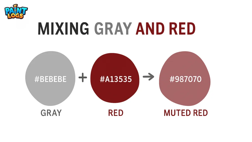
If you’ve ever wondered “what color does red and grey make”, the answer is: a muted, desaturated red. Artists often describe it as dull red, faded red, muted red, or red-grey. Depending on your shades and ratios, the mix can range from dusty rose to brick red, maroon, reddish-brown, or even a soft mauve taupe.
When asked “red and grey make what color” or “what color does grey and red make”, the truth is there’s no single result — the beauty is in the variations.
In this guide, we’ll break down the science, color recipes, HEX codes, and creative uses so you can confidently mix red and grey for stunning results.
Understanding the Science of Mixing Red and Grey
When mixing colors, red is a primary color while grey is neutral (a mix of black and white, sometimes with undertones). Adding grey to red reduces saturation, creating a “tinted” or “toned” red.
- More red than grey → You’ll get warmer, stronger shades like brick red or terracotta.
- More grey than red → The result becomes muted, leaning toward dusty rose, mauve, or even taupe.
This is why artists often use grey to control the intensity of strong pigments.
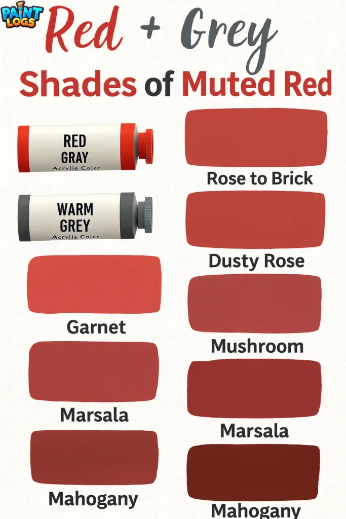
Common Shades Created When Mixing Red and Grey
When you mix different shades of grey with various tones of red, you can produce a surprising variety of muted reds, browns, and blush tones. Artists, designers, and decorators often experiment with these combinations to create elegant, earthy, or vintage-inspired palettes.
The table below shows exactly which shades of grey and red produce specific colors, along with their HEX codes so you can replicate them in paint, design software, or digital art.
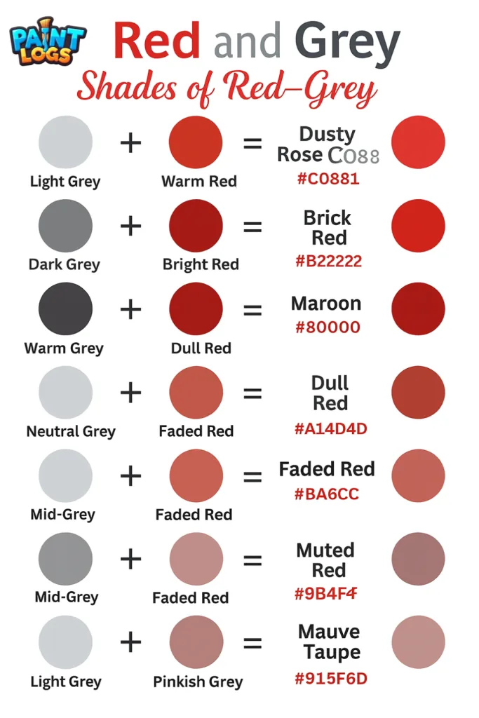
| Shade of Grey | Shade of Red | Resulting Shade Name | Hex Code |
|---|---|---|---|
| Light Grey | Warm Red | Dusty Rose | #C08081 |
| Medium Grey | Bright Red | Brick Red | #B22222 |
| Dark Grey | Crimson | Maroon | #800000 |
| Warm Grey | Bright Red | Reddish-Brown | #8B3F2F |
| Neutral Grey | Red | Dull Red | #A14D4D |
| Light Grey (more) | Red | Faded Red | #BA6C6C |
| Mid-Grey | Mid-Red | Muted Red | #9B4F4F |
| Cool Grey | Pinkish Red | Mauve Taupe | #915F6D |
| Light Grey | Dominant | Pinkish Grey | #C8A0A0 |
| Medium/Dark Grey | Crimson | Smoky Red | #8B4747 |
| Cool Grey | — | Cool Grey | #8C92AC |
| Warm Grey | — | Warm Grey | #A89F91 |
How to Mix Grey and Red to Create Beautiful Shades
Mixing grey and red might sound simple, but the results can be surprisingly varied and beautiful. By adjusting the type of grey (cool or warm) and the strength of red, you can create anything from soft, romantic tones to rich, dramatic colors. The secret is to start with a base color you love, then add the second color slowly until you reach your desired shade. Below, you’ll find step-by-step recipes with exact HEX codes so you can recreate each color with confidence.
Dusty Rose (#C08081)
- Start with 4 parts light grey paint.
- Add 1 part warm red.
- Stir gently until the pinkish red appears.
- Adjust by adding more light grey for a softer tone or more red for a richer hue.
Brick Red (#B22222)
- Pour 3 parts medium grey paint into a mixing bowl.
- Add 2 parts bright red.
- Mix well until the color turns earthy and warm.
- Add a tiny drop of red if you want it deeper.
Maroon (#800000)
- Begin with 4 parts dark grey paint.
- Add 1 part crimson red.
- Stir slowly — the shade will darken quickly.
- For a deeper maroon, add another half part crimson.
Reddish-Brown (#8B3F2F)
- Start with 3 parts warm grey paint.
- Add 1 part bright red.
- Mix well until warm undertones appear.
- For a browner look, add a drop of dark brown paint.
Dull Red (#A14D4D)
- Use 2 parts neutral grey and 2 parts red.
- Stir evenly until the color balances.
- This flat, muted tone will appear quickly.
- Add a touch more grey if it feels too strong.
Faded Red (#BA6C6C)
- Begin with 4 parts light grey.
- Add 1 part red and mix.
- Keep stirring until the aged red tone shows.
- Add extra grey for a softer, weathered look.
Muted Red (#9B4F4F)
- Mix equal parts mid-grey and mid-red (3:3 ratio).
- Stir until the shade looks balanced and calm.
- Add a drop of grey for a more muted finish.
- Perfect for subtle color accents.
Mauve Taupe (#915F6D)
- Use 3 parts cool grey as your base.
- Add 1 part pinkish red.
- Stir until the purple-red tone emerges.
- For a cooler shade, add more grey; for warmer, add more red.
Pinkish Grey (#C8A0A0)
- Start with 5 parts light grey.
- Add just ½ part pinkish red.
- Mix gently until a soft blush-grey appears.
- Adjust with more grey for an airy, light finish.
Smoky Red (#8B4747)
- Begin with 3 parts medium/dark grey.
- Add 1 part crimson red.
- Mix slowly until a smoky red tone forms.
- Add a drop more grey for extra softness.
How Gray Changes Red in the RYB Color Model
In the RYB color model (used in painting), red is a primary color, meaning it can’t be created by mixing other pigments. Grey is made by combining black and white, so adding it to red doesn’t change the hue — it changes the tone.
Why this matters:
- Tone = hue + grey → softer, less vibrant version of the hue
- Tint = hue + white → lighter version of the hue
- Shade = hue + black → darker version of the hue
So, when grey and red make what color in RYB, you’re essentially creating a toned red — its vibrancy is reduced, making it feel more sophisticated and subtle.
Mixing Red and Grey for Painting (Acrylic, Oil, and Watercolor)
When mixing red and grey in paint, it’s important to start small and build gradually. Grey has a surprisingly strong muting effect — even a little can tone down a vivid red.
For Acrylic Paint:
- Start with a blob of red paint.
- Add a small amount of grey and mix evenly.
- Increase grey slowly until you reach your desired muted tone.
For Oil Paint:
- Mix on a palette with a palette knife.
- Use titanium white + ivory black to make your grey for better control.
For Watercolor:
- Mix red with diluted grey in your palette well.
- Test on scrap paper — remember watercolors dry lighter.
Digital Design – Hex Codes for Red + Grey Shades
In digital art or web design, you can’t physically mix paints — you blend colors using RGB or HEX codes. The following table shows popular digital equivalents of red + grey mixes.
Before you look at the table, note that these HEX values are approximations based on standard RGB mixing.
| Shade Name | Approx HEX Code | RGB Value |
|---|---|---|
| Brick Red | #8B3A3A | 139, 58, 58 |
| Dusty Rose | #C08081 | 192, 128, 129 |
| Mauve | #915F6D | 145, 95, 109 |
| Clay Brown | #B66A50 | 182, 106, 80 |
| Warm Taupe | #918678 | 145, 134, 120 |
| Cool Lavender | #A8A2C1 | 168, 162, 193 |
| Burgundy | #800020 | 128, 0, 32 |
| Terracotta | #E2725B | 226, 114, 91 |
| Muted Coral | #D1786E | 209, 120, 110 |
This makes it easy for graphic designers, web developers, and digital illustrators to replicate red+grey mixes without guesswork.
Interior Design & Fashion Uses of Red and Grey Mixes
Red and grey mixes are timeless in both interiors and fashion because they balance warmth and neutrality.
- Interiors: Brick red and clay brown shades add warmth to rustic kitchens and dining rooms. Mauve and dusty rose work beautifully in vintage bedrooms or French-style living rooms.
- Fashion: Burgundy coats, dusty rose blouses, and taupe handbags create a sophisticated muted look that’s easy to accessorize.
- Branding: Brands looking for elegance without overpowering energy often use muted reds for logos and product packaging.
Tip for Decor: Pair red+grey mixes with cream, beige, or charcoal for a balanced, high-end look.
Cultural & Emotional Meanings of Red + Grey Shades
When red and grey meets, the result isn’t just a color — it’s a mood. Red brings energy, passion, and emotion, while grey offers calm, balance, and sophistication. Together, they create tones that feel both grounded and expressive.
- Brick Red & Terracotta → Evoke warmth and tradition, like the comforting feel of old brick buildings or handcrafted pottery. Perfect for spaces or designs that feel welcoming and timeless.
- Dusty Rose & Mauve → Soft, romantic, and nostalgic, reminiscent of vintage fabrics, faded roses, and handwritten love letters.
- Burgundy → Deep and confident, symbolizing luxury, formality, and quiet power — often seen in evening wear, wine labels, and upscale interiors.
- Taupe & Clay Brown → Earthy and dependable, these shades suggest stability, comfort, and a connection to nature.
Designers and artists often choose red + grey mixes when they want color that speaks with warmth but doesn’t shout — perfect for elegant branding, subtle interiors, and timeless artwork.

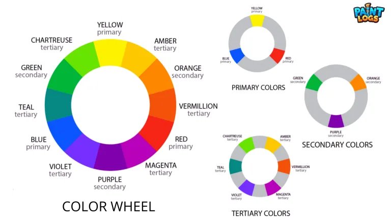
Color Wheel Placement for Red + Grey Shades
Before we get to the color wheel, remember: grey isn’t on the wheel — it’s a neutral. But when combined with red, it shifts the red towards the center, reducing saturation while keeping its warm position.
- Pure Red → sits between red-orange and red-violet on the wheel.
- Adding grey → moves the tone inward towards a muted center.
- Cool greys → pull red slightly toward purple.
- Warm greys → push it toward red-orange.
This means Dusty Rose and Mauve lean toward purple, while Terracotta and Clay Brown lean toward orange.
Comparing Red + Grey with Other Red Mixes
Artists often ask: why not just use red + black or red + white instead of grey?
| Mix | Result | Best Use |
|---|---|---|
| Red + Grey | Muted, balanced tones | Vintage palettes, soft branding |
| Red + Black | Deep, dark shades | Dramatic art, gothic fashion |
| Red + White | Pink shades | Romantic, playful designs |
The advantage of red + grey is subtlety — it keeps red’s richness without going too dark or too pastel.
FAQs
What color does red and grey make?
A muted, desaturated red that can range from dusty rose and brick red to maroon, reddish-brown, mauve-taupe, or pinkish grey.
What color does grey and red make in simple terms?
A toned red — softer and more sophisticated because grey lowers red’s saturation.
What happens if I mix light grey with red?
You’ll often get dusty rose or pinkish grey, as light grey lifts brightness while muting intensity.
What happens if I mix dark grey with red?
The result is deeper, elegant tones like maroon or smoky red. Warm greys can push it toward reddish-brown.
What color do grey and red make at equal parts?
A balanced muted red that feels calm and neutral.
Does the undertone of grey matter?
Yes. Cool greys nudge the mix toward mauve; warm greys lean toward brick or clay.
What HEX code works for a classic dusty rose?
Try #C08081 as a starting point for digital projects.
How do I avoid a muddy result in paint?
Match undertones, add grey slowly, and stop once the red softens — over-mixing creates mud.
Is mixing red and grey different from red + black or red + white?
Yes. Black makes darker reds, white creates pinks, while grey delivers balanced, subtle tones.
Can I create the grey first for consistency?
Absolutely. Mix titanium white with a clean black for a neutral grey, then add it to red in small amounts.