Yellow and Green Make What Color? At first glance, the answer might seem simple — most would say “yellow-green and lime.”
But the reality is far more fascinating. When yellow and green are mixed, especially in paint or pigment, the results can range from vibrant lime to muted olive, depending on the shades and proportions you use.
In this guide, we’ll break down the science and art behind this blend. We’ll look at how yellow and green behave in different color models (RYB, RGB, and CMYK), what hex codes match the results, and how to shift your mix warmer or cooler. We’ll also explore how this hybrid color shows up in design, nature, and psychology.
If you’re mixing paint or picking a palette, this is your complete guide to what yellow and green make — and how to make it work.
What Does Yellow and Green Make? Quick Answer
Yellow + Green = Lime Green #32CD32
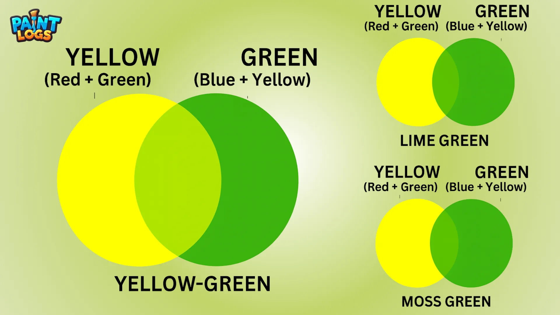
Mixing yellow and green produces yellow-green, often called lime green. In HEX, the classic lime green is #32CD32.
The resulting color can shift:
Toward a softer spring green if more green is added.
Toward a golden citrus hue if more yellow is used.
So while the quick answer is “yellow-green,” its appearance depends on the medium, ratios, and lighting. The color is commonly used in nature art, eco-friendly branding, and playful modern design schemes.
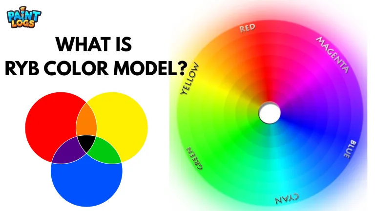
Yellow and Green Make What Color In Paint (RYB Model)
In traditional paint mixing, we use the RYB color model — red, yellow, and blue as primary colors. Within this system, yellow and green fall into a special category: you’re blending a primary (yellow) with a secondary (green). This results in a tertiary color called yellow-green.
The result is usually a bright, grassy tone — think of chartreuse, pear green, or even avocado depending on the pigments. Because green already contains blue, this mix pulls yellow slightly toward cooler territory but still retains its warmth. Artists often use this blend to represent sunlight filtering through foliage or the freshness of early spring.
The key in paint is balance. If you add too much yellow, the color may appear closer to goldenrod. Too much green? It darkens into moss or olive. That’s the nuance the RYB model captures — it’s pigment-based, not digital, and relies on how light absorbs and reflects off paint.
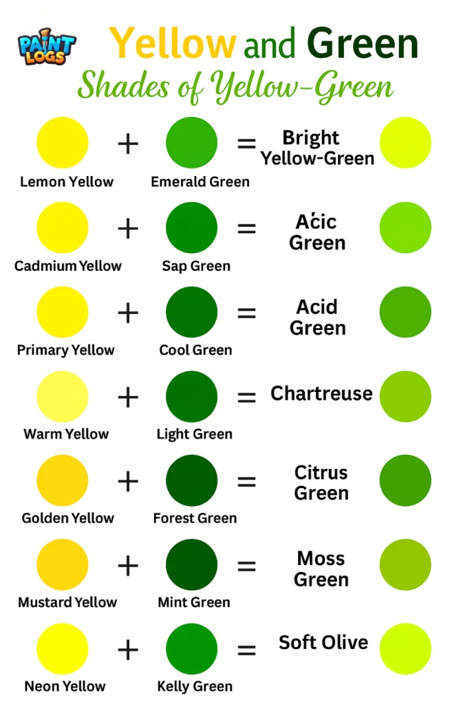
| Yellow Shade | Green Shade | Resulting Color | Visual Description |
|---|---|---|---|
| Lemon Yellow | Emerald Green | Bright Yellow-Green | Vivid, electric lime |
| Cadmium Yellow | Sap Green | Olive Green | Earthy, slightly muted |
| Primary Yellow | Phthalo Green | Acid Green | High contrast, very vibrant |
| Warm Yellow | Cool Green | Chartreuse | Bold, almost neon |
| Pale Yellow | Light Green | Citrus Green | Soft, spring-like tint |
As the table shows, the answer to what does yellow and green make in the RYB model is usually a yellow-green color. However, shifting the shade of yellow or green can change the result dramatically — from fresh lime green to earthy olive green. Artists often test blends first to make sure the mix matches the exact tone they need
How Yellow and Green Mix on the Color Wheel (Warm vs. Cool Shift)
When placed on the color wheel, yellow and green sit beside each other, making them analogous colors. Their mixture doesn’t create contrast — instead, it produces harmony. But interestingly, the temperature of your result depends on how much of each color you use.
A yellow-heavy mix results in a warm yellow-green, similar to young corn husks or sunlit grass. It feels energetic, happy, and slightly golden. More green in the mix cools the tone, shifting it toward mint, olive, or even wasabi green. These cooler versions feel more serene, natural, or earthy.
This warm–cool dynamic is essential in painting. Warm yellow-greens are ideal for light-catching highlights on leaves or botanical art. Cooler versions add depth to shadows, especially in nature scenes. The color wheel helps artists visualize not just hue but emotion and movement in a composition.
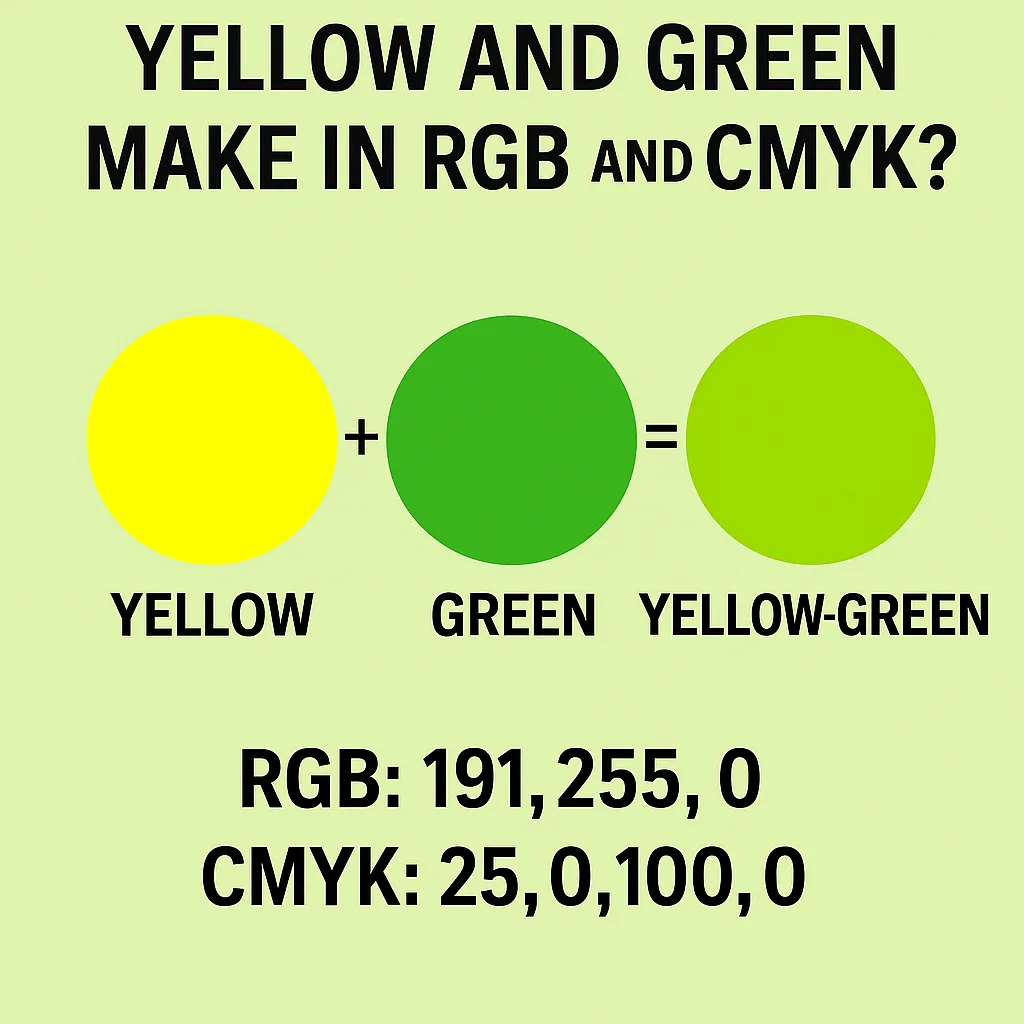
What Color Does Yellow and Green Make in RGB and CMYK?
When working with screens or digital media, color mixing happens with light, not pigment — and that changes everything. In the RGB model, green is a primary color, and yellow is made by mixing red and green. So when you combine yellow and green, you’re essentially mixing red and green twice, which shifts the color toward a brighter green with yellow tint.
On screens, this often appears as a vibrant lime green — close to #CCFF00 or #99FF33 depending on intensity. It’s electric, almost fluorescent, and quite different from the muted tones found in paint.
Vibrant lime green #CCFF00
Vibrant lime green #99FF33
In print, however, CMYK (cyan, magenta, yellow, black) operates subtractively. Here, yellow and green (made from cyan + yellow) also mix to form yellow-green — but results can vary based on ink quality and layering. CMYK blends tend to feel duller than their screen counterparts because ink absorbs more light.
So while the name “yellow-green” stays the same, the way it looks in digital vs. physical media can feel worlds apart.
| RGB Yellow | RGB Green | Mixed RGB Value | Resulting Color | Hex Code |
|---|---|---|---|---|
| (255, 255, 0) | (0, 128, 0) | (128, 192, 0) | Yellow-Green | #9ACD32 |
| (255, 255, 0) | (0, 255, 0) | (128, 255, 0) | Lime | #80FF00 |
| (255, 255, 0) | (50, 205, 50) | (152, 230, 25) | Light Chartreuse | #98E619 |
When it comes to digital art, knowing what color yellow and green make in RGB ensures perfect shade accuracy. The mix often lands between chartreuse and lime green, but adjusting the ratios can bring you closer to a warm spring green or a cooler moss tone depending on your design goals
Is the Result Chartreuse, Lime, or Yellow-Green? (Differences Explained)
Yellow and green can create a variety of hues — but not all of them are the same. So what’s the difference between chartreuse, lime, and yellow-green?
Let’s start with yellow-green, the umbrella term. It’s any hue that falls between yellow and green on the color wheel. Depending on your pigment ratios, it could lean warm like pistachio or cool like fern.
Chartreuse, on the other hand, is a very specific color. It sits nearly midway between green and yellow — not too warm, not too cool. Originally named after the French liqueur, chartreuse has a neon brightness in digital spaces (typically around #7FFF00) but in paint, it can feel more subdued.
Lime green is often mistaken for chartreuse, but it’s typically cooler and bolder, especially in digital design. Think of the inside of a fresh lime — vibrant and zesty. Lime also tends to have more green than yellow, giving it a punchier appearance.
In short:
- Yellow-green = broad category
- Chartreuse = yellowish-green, balanced
- Lime = greenish-yellow, bright and cool
How to Mix Yellow-Green with Paint: Acrylic, Watercolor & Gouache
Mixing yellow-green with traditional paints can give you some wonderfully natural and versatile results. In the RYB model (Red, Yellow, Blue), simply combine a basic yellow with a cool green like phthalo or viridian. The closer your green leans toward blue, the cooler your final yellow-green will look.
- For a bright citrus yellow-green, use lemon yellow + light permanent green.
- For a softer olive tone, try mixing cadmium yellow with sap green.
- For a warm grassy hue, go for Indian yellow + a pinch of chromium green.
In watercolor, yellow-greens can appear more transparent and luminous. Start with a diluted yellow, then slowly add touches of green to reach your desired tint.
Gouache works similarly, but because it’s opaque, yellow-greens will appear more chalky or matte. Try layering for vibrancy or mix with white to pastel it out.

What Is the Yellow-Green Hex Code? (#9ACD32 and Other Variants)
In digital color spaces like HTML and design tools, yellow-green has a distinct identity with its own hex codes. The most recognized is #9ACD32, a soft, slightly warm yellow-green that’s readable and versatile.
Other popular digital versions include:
Chartreuse: #7FFF00
Lime green: #32CD32
Pale yellow-green: #C7EA46
Olive yellow-green: #808000
These hex codes are particularly useful for web designers, digital illustrators, and branding work, where precise color matching is essential. They also help communicate the subtle variations between shades that look similar at first glance but behave differently in layout and contrast.
| Color Name | Hex Code | Use Case |
|---|---|---|
| Yellow-Green | #9ACD32 | Standard digital yellow-green |
| Chartreuse | #7FFF00 | High-contrast web design, fashion |
| Lime Green | #32CD32 | Posters, pop art, energetic palettes |
| Olive Green | #808000 | Nature tones, military, fall palettes |
| Citrus Green | #A1C935 | Branding, spring decor, children’s art |
If you’ve ever wondered yellow and green make what color in web and print design, these hex codes reveal the most common results — from vibrant yellow-green to soft olive green. Using the exact hex code keeps your lime green or chartreuse consistent across all platforms
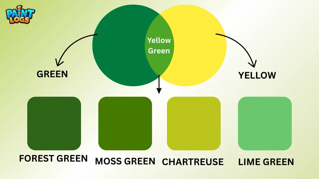
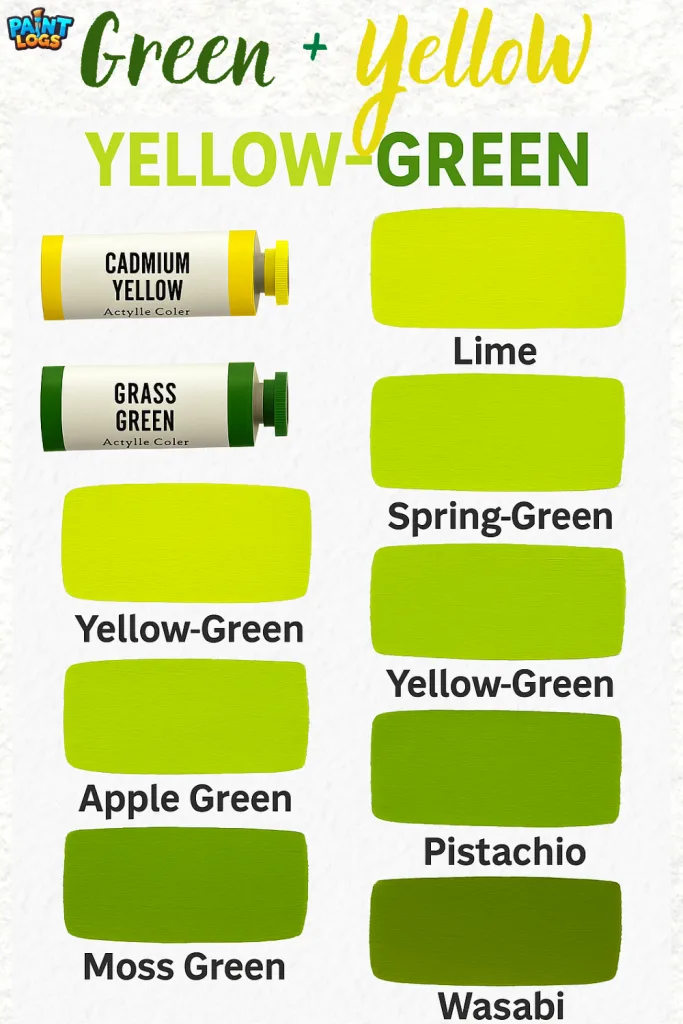
Shades of Yellow-Green: From Soft Citrus to Mossy Olive
Yellow-green isn’t just one color — it’s a whole range of related shades, each with its own personality.
- Citrus yellow-green is vibrant and fresh — great for packaging, activewear, or energetic murals.
- Apple green is cheerful and playful, commonly used in children’s decor or eco-branding.
- Moss green adds more depth and earthiness, ideal for nature-inspired palettes or traditional interiors.
- Olive yellow-green feels mature and grounded, often used in fashion or vintage color schemes.
Each shade of yellow-green balances a different amount of warmth (from yellow) and coolness (from green). Artists and designers often choose a shade based on the mood they want to convey — from light and optimistic to earthy and quiet.
Pro Tips for Mixing Yellow-Green in Paint:
- Always start with yellow and slowly add green — it’s easier to darken than lighten.
- Use a palette knife for even mixing, especially in acrylics and gouache.
- Test your mix on scrap paper or canvas before committing to your artwork.
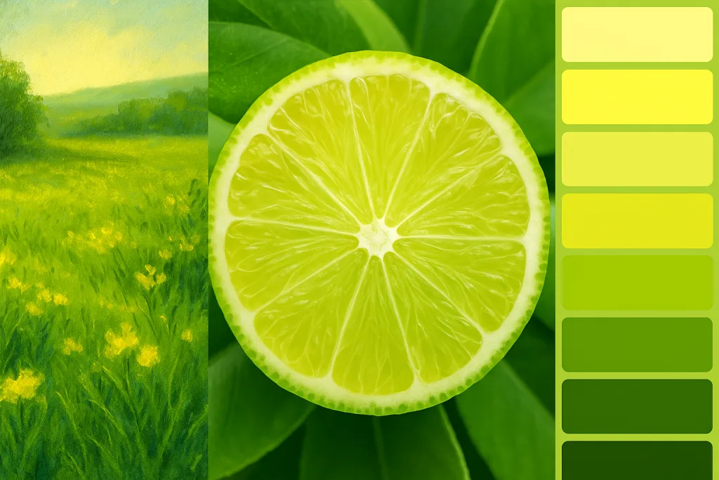
Where You’ll See Yellow-Green in Nature and Design
Yellow-green shows up in some of the most comforting and refreshing parts of the natural world. Think of:
- Spring leaves just budding on a tree
- Unripe bananas or pears
- Grass after rain
- Zucchini skins and lime rinds
Because of its connection to renewal and early growth, yellow-green is often used in interior design to create peaceful, uplifting spaces. In branding, it’s used for anything health-related — teas, smoothies, wellness products — to signal freshness and vitality.
It also pairs beautifully with wood tones, neutral beiges, and deep blues, making it flexible for modern decor, art, and illustration.

Meaning and Color Psychology of Yellow-Green
Yellow-green is often associated with youthful energy, creativity, and healing. It blends the happiness and optimism of yellow with the growth and harmony of green, making it a powerful emotional color in both art and design.
Psychologically, it can symbolize:
- Fresh starts – like budding leaves in early spring
- Balance – a midpoint between warm and cool tones
- Curiosity and learning – commonly seen in education branding
- Health and wellness – used in smoothie shops, skincare lines, and eco-packaging
However, yellow-green can also appear sour or sickly if overused, especially in overly saturated forms. That’s why many designers tone it down with softer shades or pair it with neutrals for grounding.
Whether you’re painting a lively forest scene or designing a modern wellness logo, yellow-green conveys a message of hopeful forward motion.
Best Color Pairings with Yellow-Green in Art, Fashion, and Decor
Pairing yellow-green with the right colors can either highlight its vibrancy or soften its intensity, depending on your creative goals.
Some excellent pairings include:
- Deep navy blue or indigo – for contrast and balance
- Soft beige or warm taupe – to mellow it out in home interiors
- Bright coral or peach – adds energy and flair in fashion palettes
- Muted purple or plum – creates tension and visual interest
- White or pale gray – gives a clean, airy feel in graphic design
Yellow-green is especially popular in mid-century modern, tropical themes, and boho interiors. It works equally well as an accent or a main character, depending on your color scheme.
When in doubt, look to nature — think of how green leaves pair effortlessly with flower petals, earth, and sky.
Conclusion: Yellow and Green Make More Than Just a Color
So, what color do yellow and green make? The answer is more than just yellow-green. It’s a spectrum of possibility — from zesty lime to soft moss, fresh chartreuse to golden pistachio. The blend is alive with emotion, rooted in nature, and deeply useful in everything from fine art to home decor.
Whether you’re painting a lively spring meadow, designing a fresh eco-brand, or decorating a modern space, yellow and green can bring a unique mix of optimism and harmony. With just a shift in ratio, you can go from zesty lime (#32CD32) to earthy olive (#808000) — each telling a different story.
Try experimenting with different shades and mediums to see which version of yellow-green fits your vision best. The possibilities aren’t just colorful — they’re endless.
FAQs About Yellow and Green Color Mixing
What color does yellow and green make?
When mixed, yellow and green typically produce yellow-green, a tertiary color that sits between the two on the color wheel.
Is yellow-green the same as lime?
Not quite. Lime is usually brighter and closer to neon, while yellow-green has a more natural and muted look depending on the mix.
Can you make yellow-green without using green paint?
Yes — you can create a green by mixing blue + yellow, then adjust by adding more yellow to shift it toward yellow-green.
What happens if I add white to yellow-green?
You’ll get a pastel, more muted version — something like pistachio or celery green, depending on your original mix.
Does the shade change in different lighting?
Absolutely. Under warm light, yellow-green appears warmer and more golden. Under cool light, it can lean toward mint or spring green.