
What Color Do Red, Green, and Blue Make?
Mixing red, green, and blue is the foundation of the additive color model used in light-based systems like displays, televisions, and digital art. These three colors, often abbreviated as RGB, are the primary colors of light and play a crucial role in creating all the colors you see on your screen. Understanding how these colors interact allows you to control and manipulate colors in digital design, art, and even lighting.
In the RGB color model, when red, green, and blue are mixed together in varying intensities, they produce a vast array of colors, from vibrant hues to subtle tones. The combination of these primary colors is used in everything from digital screens to stage lighting, making it one of the most important color models in both the digital and physical world. But, what happens when red, green, and blue are mixed together?
In this guide, we’ll break down the science of mixing red, green, and blue, explore the outcomes, and show you how this color combination is applied in different creative fields.
Quick Answer: What Color Do Red, Green, and Blue Make?
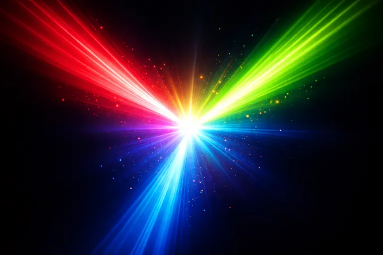
When you mix red, green, and blue in the additive color model, the result is typically white light. This is because in additive mixing, each color adds light to the mixture, and when combined in equal parts, they create the full spectrum of white light. The more intense the red, green, and blue light sources are, the brighter and more vibrant the resulting white light will be.
However, if the proportions of these colors are not equal, the result may vary. Adjusting the intensity of each color can produce different hues, including a wide range of secondary and tertiary colors, such as cyan, magenta, and yellow.
Here’s a quick overview:
- Equal amounts of red, green, and blue = white light.
- More red = Results in a warmer tone or a more red-dominant color.
- More green = Creates a brighter, more vibrant green or yellow.
- More blue = Produces a cooler, bluer tone or purple.
The RGB model is based on light, and white light is the sum of all visible wavelengths. In contrast, the subtractive color model (such as with paints) works by absorbing light, and the resulting color is much different from additive mixing.
The Science Behind Mixing Red, Green, and Blue
Additive Color Mixing (Light / Digital)
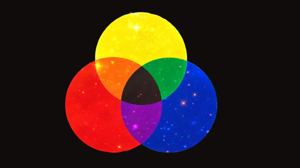
The RGB color model is based on additive color mixing, which refers to the process of creating new colors by combining various intensities of light. In this model, red, green, and blue are the primary colors of light, much like how red, yellow, and blue are primary colors in traditional art or paint mixing (the RYB model).
In additive color mixing, light is added together to create different colors. When you combine equal parts of red, green, and blue light, the result is white light, as it contains all the visible wavelengths. Each of the colors—red, green, and blue—represents a specific wavelength of light, and when combined, they form the full spectrum of light that we see as white.
How does it work?
- Red light has a wavelength of around 620–750 nanometers.
- Green light has a wavelength of around 495–570 nanometers.
- Blue light has a wavelength of around 450–495 nanometers.
When combined in the right proportions, these three colors create pure white light. This is why all colors on a digital screen—whether it’s a phone, computer, or TV screen—are produced by varying the intensities of these three primary colors.
How Intensity Affects the Outcome
The beauty of RGB mixing lies in its ability to produce a wide range of colors by simply adjusting the intensity of each color. In digital art or on displays, the amount of light emitted from each color channel determines how the colors mix together.
- High intensity of red and blue creates a vibrant purple.
- High intensity of green and blue creates cyan.
- High intensity of red and green creates yellow.
- Mixing equal intensities of all three results in white light.
Creating Secondary and Tertiary Colors
By adjusting the intensity of red, green, and blue, you can produce secondary colors:
- Red + Green = Yellow.
- Red + Blue = Magenta.
- Green + Blue = Cyan.
When you combine different amounts of these secondary colors, you can get tertiary colors such as orange, purple, or lime green.
The Role of Intensity in Color Mixing
The intensity or brightness of the colors plays a crucial role in determining the final shade. Here’s how adjusting intensity can impact your mix:
- Full Intensity (255 in digital terms): The colors are brightest and produce the most vibrant results.
- Partial Intensity: Dimming or reducing the brightness of a color makes the resulting color appear darker or more muted.
- No Intensity (0): If a primary color has zero intensity, it’s effectively removed from the mix, leading to a new outcome based on the remaining colors.
This system is used in a variety of creative fields, including graphic design, digital art, web design, and lighting design. The combination of red, green, and blue at different intensities allows for a huge range of vibrant, soothing, or bold colors to be created.
Common Colors Created When Mixing Red, Green, and Blue
While red, green, and blue primarily create white light when mixed in equal amounts, adjusting the intensity of each color will produce different shades. Here are some of the most common colors created when mixing red, green, and blue:
1. White Light
- The standard result when red, green, and blue are combined at equal intensity.
- Result: White light, which contains all visible wavelengths.
- Use in: Screens, displays, and lighting designs.
2. Cyan
- Created by mixing green and blue light at full intensity, with no red. This is a blue-green color.
- Result: A bright, vibrant cyan.
- Use in: Web design, graphics, and lighting effects.
3. Magenta
- A mix of red and blue light at full intensity. This color is a purple-pink hue.
- Result: A bold, vibrant magenta.
- Use in: Art, digital design, and lighting.
4. Yellow
- Created by mixing red and green light, and no blue. This color is warm and bright.
- Result: A rich yellow.
- Use in: Screen design, digital art, and color printing.
5. Orange
- Mixing red and green light at varying intensities can create a warm orange.
- Result: A bright orange.
- Use in: Graphic design, product displays, and art.
6. Greenish Yellow
- Adding green to yellow light will create a yellow-green shade, often used in eco-friendly designs.
- Result: A greenish yellow.
- Use in: Branding, eco-friendly packaging, and digital media.
Below is a table summarizing the common colors created by mixing primary colors like red, green, and blue, with their resulting hues and typical uses.
| Shade of Red | Shade of Green | Shade of Blue | Result |
|---|---|---|---|
| Crimson Red | Forest Green | Midnight Blue | White Light |
| Scarlet Red | Lime Green | Royal Blue | Yellow |
| Cherry Red | Emerald Green | Cobalt Blue | Magenta |
| Tomato Red | Olive Green | Turquoise Blue | Cyan |
| Burgundy Red | Sea Green | Azure Blue | Orange |
| Rose Red | Yellow-Green | Teal Blue | Greenish Yellow |
What Happens When You Mix Red, Green, and Blue with Other Colors?
When mixing red, green, and blue with other colors, the results can be exciting and dynamic. Depending on the additional colors you mix with the primary trio, you can get a wide range of hues, shades, and tones. Whether you’re working in art, digital media, or lighting design, these combinations can yield vibrant, muted, or even neutral results. Here’s a look at what happens when you mix red, green, and blue with other colors.
1. Red + Green + Blue + White = White Light (If Balanced)
When red, green, and blue are mixed with white in a balanced ratio, the result is white light—a combination of all visible wavelengths. If white is added and the intensity of red, green, and blue is kept equal, the light will appear bright white. However, if one of the primary colors is reduced or dimmed, the final outcome may look softer or more muted.
- Result: White light that represents the full spectrum of visible color.
- Use in: Display screens, lighting design, and television.
2. Red + Green + Blue + Purple = Violet Light
When purple (which is made by mixing red and blue) is added to the mix of red, green, and blue, the result is violet light. This outcome is similar to the blue light created when red and green light are combined in the RGB model, but it has an additional purple undertone due to the purple added.
- Result: A violet light that combines blue and purple hues.
- Use in: Stage lighting, visual effects, and digital art to create dynamic, rich purple-blue effects.
3. Red + Green + Blue + Black = Darker Shades
Adding black to the mix of red, green, and blue light creates darker, muted shades. The more black is added (or the lower the intensity of the primary colors), the darker the color becomes. This is how we can produce darker versions of any color in the RGB model.
- Result: A darker, more muted color or deep shadow.
- Use in: Digital design, web backgrounds, and lighting effects that require a softer or darker tone.
4. Red + Green + Blue + Yellow = Bright Cyan
When you mix yellow with the primary colors of red, green, and blue, the result is typically cyan. Yellow acts as a secondary color in the RGB model, and when combined with green and blue, it creates a bright cyan. This color is often used in vibrant designs, posters, and graphics.
- Result: A bright cyan with a vibrant blue-green hue.
- Use in: Digital media, advertisements, and screen designs.
5. Red + Green + Blue + Orange = Warm Tones
When orange is introduced into the mix of red, green, and blue, the result is a warm and earthy tone. Orange is a secondary color made from red and yellow, so adding it to the mix creates a more warm and balanced color. The resulting color is earthy and inviting, ideal for rustic designs or autumn-inspired art.
- Result: A warm, earthy orange or a muted orange shade.
- Use in: Interior design, autumn-themed branding, and rustic fashion.
6. Red + Green + Blue + Pink = Light Magenta
Adding pink to the mix of red, green, and blue can create a light magenta or soft purple hue. Since pink is created by mixing red and white, this addition adds a softer, more romantic touch to the vibrant magenta colors.
- Result: A soft magenta or light purple-pink.
- Use in: Romantic art, feminine designs, and soft digital effects.
Using Red, Green, and Blue in Design
Fashion
In fashion design, red, green, and blue can be used together to create bold, vibrant outfits, as well as subtle, earthy tones for more natural styles. These primary colors can be combined to form vibrant, dynamic color schemes for activewear, casual fashion, and seasonal collections. The muted tones that come from mixing these colors also work well for creating rustic or vintage-inspired looks.
Bold & Vibrant Fashion
Primary colors like red, green, and blue are often used in streetwear and sportswear to create dynamic, energetic looks. For example, a combination of these colors can form bright and playful designs for activewear or summer outfits.
- Example: Red, green, and blue are mixed to form vibrant summer shirts or sports team jerseys.
Earthy Tones for Casual Fashion
These colors can also be mixed to create earthy tones, perfect for bohemian, retro, or autumn fashion. Shades of brown, mustard yellow, or olive can be created when red, green, and blue are adjusted in the mix.
- Example: Olive or terracotta tones are perfect for vintage jackets or earthy scarves in fall collections.
Interior Design
Red, green, and blue are incredibly useful in interior design, where these colors can be combined to create bold, vibrant rooms or calming, neutral spaces. Using these colors effectively can help designers craft environments that are modern, cozy, or even earth-inspired.
Bright & Bold Designs
By adjusting the intensity of the primary colors, you can create a bright and lively atmosphere in a room. This is especially effective in playrooms, kitchens, or offices where high-energy designs are needed.
- Example: Cyan and yellow accents create a fresh, youthful look in children’s rooms.
Muted Earthy Spaces
On the other hand, using the muted tones created from these colors can help design calming, earth-toned spaces. Olive greens, warm browns, and soft yellows are all results of mixing red, green, and blue with natural colors.
- Example: Muted olive walls with warm brown furniture create a natural, earthy vibe in a rustic living room.
Branding & Packaging
The combination of red, green, and blue can also be used in branding and product packaging to evoke specific emotions. For example, brands in the tech or electronics industries often use RGB combinations to convey a modern, futuristic feel, while earthy tones made from these colors work well for organic or eco-conscious brands.
Tech and Digital Branding
Colors like cyan, magenta, and bright blue are often used in the tech industry to create a dynamic, cutting-edge image for companies involved in technology, electronics, or digital services.
- Example: A tech brand uses cyan and magenta for their website and product packaging to look innovative and forward-thinking.
Eco-Conscious Packaging
Olive or earthy brown shades created by red, green, and blue can help convey a brand’s commitment to sustainability and natural products.
- Example: Organic skincare brands using olive green packaging to evoke natural beauty.
Tips for Mixing Red, Green, and Blue in Digital Art or Design
Mixing red, green, and blue in digital art and design is a key technique used to create vibrant, dynamic, and subtle colors. Understanding how to adjust the intensity of each color is essential for controlling the final outcome. Here are some helpful tips for getting the best results when working with RGB color mixing:
1. Start with Equal Proportions
When you start mixing red, green, and blue, begin with equal amounts of each color to achieve a neutral result. This will give you a starting point of white light. From there, you can adjust the intensity of each primary color to achieve the desired hue.
- Example: Begin with an equal mix of red, green, and blue to create white, then experiment by adjusting each color’s intensity to find your ideal tone.
2. Adjusting Intensity for the Desired Color
Once you have your base color, you can increase or decrease the intensity of each of the primary colors to achieve different effects. For instance, increasing the intensity of green while keeping the red and blue at a low level will result in bright green. Similarly, red can be increased to make the color warmer.
- Example: To create a cyan color, increase the intensity of green and blue, and lower red to zero.
3. Using RGB Sliders in Software
In digital tools (like Adobe Photoshop, Illustrator, or web design platforms), you’ll usually find RGB sliders that allow you to control the intensity of each primary color individually. These sliders are a powerful way to experiment with different shades and fine-tune the color mix to your exact preference.
- Example: In Photoshop, adjust the RGB sliders to control the mix of colors for creating vibrant designs.
4. Create Gradients and Shadows
When working with light-based design, adding gradients and shadows can make your colors appear more dynamic and realistic. Use RGB mixing to create soft transitions from one color to another and enhance the depth of your design.
- Example: A cyan gradient can smoothly transition to blue or green, adding dimension and depth to a digital artwork.
5. Be Mindful of Over-Saturation
While it can be tempting to add a lot of bright colors to a design, over-saturation can lead to colors looking harsh or unnatural. Keep your color mixes balanced by controlling the intensity and experimenting with different levels of brightness.
- Example: Avoid using full intensity red with green and blue unless the design calls for a very bold, primary color palette.
Common Mistakes to Avoid When Mixing Red, Green, and Blue
Even though mixing red, green, and blue seems straightforward, there are several common mistakes that can lead to unintended results. Being aware of these mistakes can help you achieve the best colors for your project.
1. Overuse of One Color
A frequent mistake is using too much of one primary color. For example, adding too much blue can create a cool or purple-toned result, while too much green may overpower the mix and make it look more like cyan. This imbalance can throw off the desired color palette.
- Solution: Start with equal amounts of red, green, and blue, then adjust gradually. This allows you to control the outcome without overdoing any one color.
2. Not Testing the Mix
When working with digital designs, it’s easy to overlook how colors will appear in real-time on the intended screen. Sometimes, a color may look good in your design tool, but it might look completely different when viewed on a monitor or printed. Always test your color mixes on the platform or screen you’re designing for.
- Solution: Use test swatches or preview modes to check your colors in different lighting conditions or on different screens.
3. Ignoring Color Brightness
Adjusting the intensity of red, green, and blue can drastically change the brightness of your mix. A darker tone can result from too little intensity, while a bright color can emerge from too much. Not accounting for how this affects the final output can lead to colors that are either too dim or too intense.
- Solution: Experiment with the brightness and saturation sliders to find the right mix for your design.
4. Forgetting to Adjust the Alpha (Transparency)
When mixing colors digitally, don’t forget about the alpha channel or transparency setting. Sometimes, opacity or transparency can affect how the colors look, especially when layering multiple colors. If the colors seem off, you might need to adjust the transparency of one of the layers.
- Solution: Ensure that the alpha/transparency settings are set appropriately, especially when layering RGB colors to create blended effects.
Conclusion
Mixing red, green, and blue is fundamental to creating all the colors you see on your digital screens, lighting designs, and even in modern art. By understanding the science behind additive color mixing, you can control and manipulate colors in a wide variety of creative fields. Whether you’re working with digital art, fashion, or interior design, the RGB model gives you the tools to produce vibrant, dynamic, and even subtle hues by adjusting the intensity of each color.
Remember that mixing red, green, and blue results in white light when the colors are equally balanced. However, the beauty of RGB mixing lies in the ability to adjust each primary color to produce a wide spectrum of colors that can fit any creative project. Testing your mixes, adjusting intensities, and experimenting with different combinations will help you create the perfect shades for your designs.
FAQs
What color do red, green, and blue make when mixed?
Red, green, and blue mixed together create white light in the additive color model.
Can I create other colors by mixing red, green, and blue?
Yes, by adjusting the intensity of each color, you can create vibrant secondary colors like cyan, magenta, and yellow.
How do I create purple with red, green, and blue?
Purple can be created by mixing red and blue in the additive color model. Green should be kept to a low intensity or zero.
Why do red, green, and blue make white light?
When red, green, and blue are combined in equal parts, they create the full spectrum of light, which results in white light.
How do I make a more vibrant color in RGB mixing?
Increase the intensity of the color channels to create a brighter, more vibrant color.
How can I mix RGB for digital art?
Use RGB sliders or color pickers in digital tools to adjust the intensity of each primary color.
Can RGB be used for physical paints?
No, RGB is specifically used for light and digital displays. For paint mixing, the RYB model (Red, Yellow, Blue) is used.
What happens if I use more yellow in the mix?
Yellow is created by mixing green and red in the additive model. Adding yellow to the mix will make the color look more greenish or yellowish.
Can RGB be used for lighting design?
Yes, RGB lights are commonly used in stage design, visual effects, and interactive lighting installations.
How do RGB screens display colors?
RGB screens mix red, green, and blue light at varying intensities to produce the full spectrum of visible colors.
How do I achieve a pure green in RGB mixing?
Set the green to its highest intensity and reduce red and blue to zero to create pure green.
How does adding black affect RGB mixing?
Adding black reduces the brightness of the color, making it appear darker or closer to shades of gray.