What Color Does Blue and White Make? Mixing blue and white is one of the simplest and most common color combinations used in various design and art projects. Whether you’re painting a piece of artwork, designing a logo, or picking out clothes, the combination of blue and white results in a stunning range of lighter blues that evoke feelings of calmness, serenity, and freshness. The mix typically produces soft and soothing shades that work beautifully in both fashion and interior design.
In this guide, we’ll explore what happens when blue and white are mixed, the shades that emerge from this combination, and how you can use these colors in various creative fields like art, fashion, and branding.
Quick Answer: What Color Do Blue and White Make?
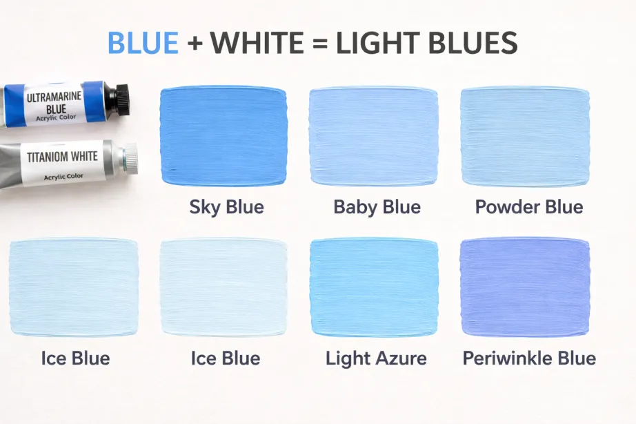
Blue + White = Sky Blue, Baby Blue, Powder Blue, Ice Blue, Light Azure, Periwinkle Blue
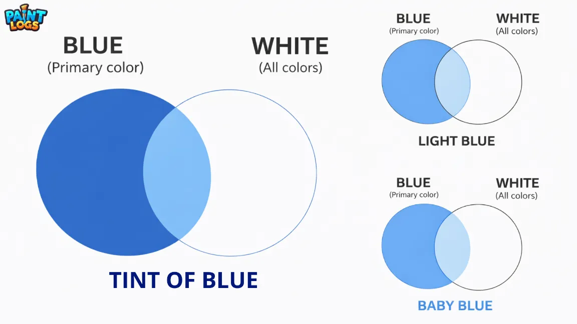
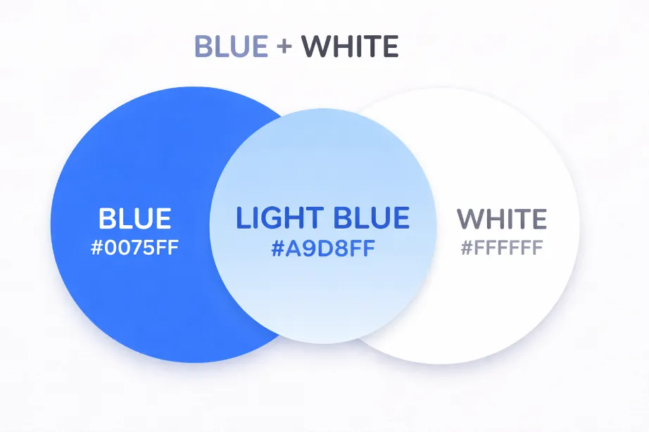
When you mix blue and white, the result is generally a lighter shade of blue. The final color depends on how much blue or white is added:
- More blue will create a deeper, richer blue like azure or periwinkle blue.
- More white will create a softer, paler blue, resulting in shades like sky blue, baby blue, or powder blue.
This mix is perfect for creating pastel blues, which are commonly used in designs that aim to convey lightness, calm, and serenity. Depending on the amount of blue and white, you can easily adjust the final tone to suit your specific project needs.
The Science Behind Mixing Blue and White
Subtractive Color Mixing (Paint & Pigments)
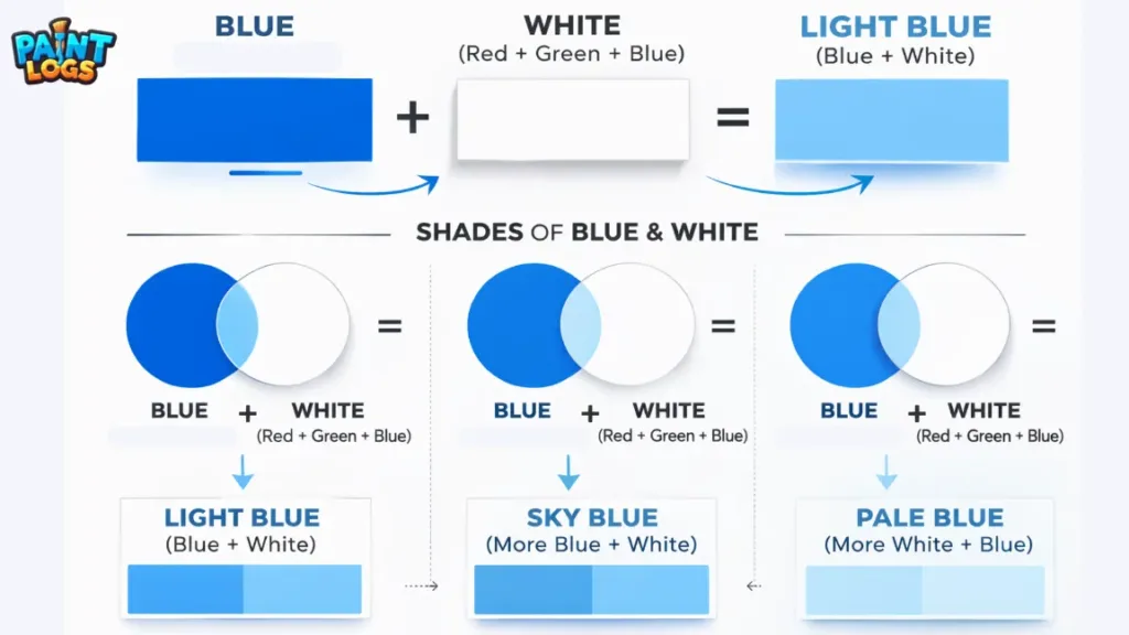
When mixing blue and white in traditional paint or pigments, you’re working with subtractive color mixing. This means that each pigment absorbs certain wavelengths of light and reflects others. The more pigment you add, the more light is absorbed, and the result becomes darker and less vibrant.
- Blue is a primary color in the subtractive model and reflects blue wavelengths of light.
- White is the lightest color, which means it reflects almost all wavelengths of light and lightens any color it’s mixed with.
When you combine blue with white, the white pigment lightens the blue, resulting in various shades of pale blue. The more white you add, the lighter and softer the blue becomes, resulting in muted, pastel shades of blue. If you add more blue, the color remains more vibrant and rich.
Additive Color Mixing (Digital / Light)
In digital design and other forms of light-based color mixing (such as on screens), the process is known as additive color mixing. Unlike subtractive mixing, where colors are combined by subtracting light, additive mixing creates new colors by adding light.
- Blue is one of the primary colors in the RGB (Red, Green, Blue) system used in digital screens and light.
- White is the combination of all colors of light, so adding white to blue in this model will lighten the blue without changing its basic hue.
When you mix blue and white in a digital setting, the result is a lighter blue that appears less intense than pure blue but still retains its blue identity. This is ideal for designs that need a gentle, subtle tone, such as in web design, digital illustrations, or graphic design.
Common Shades Created When Mixing Blue and White
The combination of blue and white leads to several familiar shades of light blue. These shades can vary from a soft pastel to a more vibrant tone depending on the ratio of blue to white. Here are some of the most common shades created when mixing blue and white:
1. Sky Blue
- Sky blue is one of the most iconic shades of light blue created by mixing blue and white. It’s the color of a clear daytime sky, and it brings a sense of calm and openness to any design.
- Result: A soft, light blue, reminiscent of a bright sky.
- Use in: Interior design, children’s clothing, and summer fashion.
2. Baby Blue
- Baby blue is a very pale version of blue, often associated with softness, innocence, and tranquility. It’s commonly used for baby clothing, nursery designs, and light, feminine fashion.
- Result: A very light, soft blue.
- Use in: Baby wear, soft furnishings, and pastel-themed art.
3. Powder Blue
- Powder blue is a dusty, slightly muted shade of light blue. It has a vintage, classic feel and is often used in formal fashion and elegant designs.
- Result: A soft, powdery light blue, slightly toned down.
- Use in: Vintage fashion, bridal wear, and elegant interior designs.
4. Ice Blue
- Ice blue is a very pale, almost frosted version of blue. It has a cool, refreshing quality and is perfect for creating winter-themed designs or minimalist art.
- Result: A very pale, frosted blue, reminiscent of ice or snow.
- Use in: Winter fashion, modern interiors, and minimalist art.
5. Light Azure
- Azure is a brighter, more vibrant blue, but when mixed with white, it becomes a lighter, softer version. It’s often used in designs that need a fresh, clean, and crisp tone.
- Result: A softened azure, a vibrant yet light blue.
- Use in: Summer fashion, beach themes, and clean, fresh branding.
6. Periwinkle Blue
- Periwinkle blue is a combination of blue and purple. When mixed with white, it creates a light purple-blue that’s both gentle and calming. It’s often used in romantic, vintage-inspired designs.
- Result: A soft lavender-tinged blue.
- Use in: Romantic fashion, vintage art, and wedding décor.
Below is a table showcasing the common shades created when mixing blue and white.
| Shade of Blue | Shade of White | Result |
|---|---|---|
| Sky Blue | White | Sky Blue |
| Baby Blue | White | Baby Blue |
| Powder Blue | White | Powder Blue |
| Ice Blue | White | Ice Blue |
| Light Azure | White | Light Azure |
| Periwinkle Blue | White | Periwinkle Blue |
What Happens When You Mix Blue and White with Other Colors?
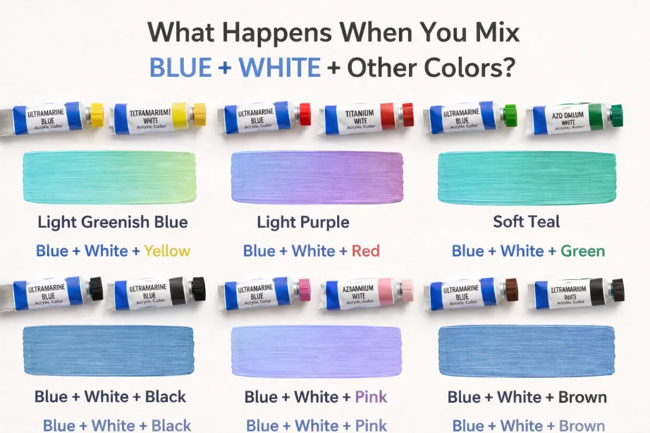
When you mix blue and white with other colors, you can create a variety of exciting shades and tones. These combinations allow you to expand the color palette, adding warmth, coolness, or richness to the mix. By adjusting the amounts of each color, you can experiment with different outcomes to suit your design needs. Here are some exciting results from mixing blue and white with other colors:
1. Blue + White + Yellow = Light Greenish Blue
Adding yellow to the blue and white mix results in a greenish blue or a soft aqua shade. This combination is perfect for earthy designs, beach themes, or nature-inspired color schemes. The yellow introduces a warmth that softens the coolness of blue while still maintaining its fresh and calming qualities.
- Result: A greenish blue, often resembling a light teal or aqua.
- Use in: Beach-themed designs, eco-friendly branding, and natural art.
2. Blue + White + Red = Light Purple
Mixing red with blue and white creates a lavender or light purple-blue shade. The amount of red added determines whether the mix becomes more violet or stays closer to a blue-lavender tone. This combination is often used for designs that need a soft, romantic feel or feminine touch.
- Result: A light purple or lavender hue with blue undertones.
- Use in: Feminine fashion, wedding décor, and romantic art.
3. Blue + White + Green = Soft Teal
Adding green to the mix of blue and white results in a soft teal or blue-green. This combination is perfect for creating relaxed, calming atmospheres, often found in spa designs, nature-themed projects, and modern interiors. Teal combines the soothing qualities of blue with the earthy feel of green, making it a versatile color.
- Result: A muted teal, a balance of blue and green with a softer, calming appearance.
- Use in: Nature-inspired designs, home décor, and relaxing spaces.
4. Blue + White + Black = Steel Blue
When you add black to blue and white, the result is a muted steel blue. This dark blue has gray undertones and creates a more industrial, sophisticated look. Steel blue is often used in modern design, corporate branding, and formal wear, providing a serious, elegant feel while maintaining a cool tone.
- Result: A darkened blue with gray undertones, resembling a steel or metallic blue.
- Use in: Industrial design, corporate logos, and formal fashion.
5. Blue + White + Pink = Light Periwinkle
Adding pink to blue and white results in a periwinkle blue, which is a light, soft purple-blue. This combination creates a gentle, dreamy effect and is ideal for romantic designs, wedding themes, or vintage-style projects.
- Result: A light purple-blue, often referred to as periwinkle.
- Use in: Wedding décor, vintage fashion, and romantic art.
6. Blue + White + Brown = Dusty Denim
When brown is added to the blue and white mix, the result is a dusty denim color. This shade has a more earthy, natural feel, often seen in boho or rustic-themed designs. It’s a perfect tone for adding a warmth to the coolness of blue, creating a balanced and comfortable color.
- Result: A brownish-blue that resembles denim or washed-out jeans.
- Use in: Rustic interiors, boho-style fashion, and earth-toned designs.
Using Blue and White in Design
The combination of blue and white is a classic pairing, often used in fashion, interior design, and branding. These colors evoke a sense of freshness, comfort, and sophistication, making them versatile for various design applications.
Fashion
The combination of blue and white is widely used in fashion to create a fresh, classic look. Soft blue shades, like baby blue, sky blue, and powder blue, are perfect for spring collections, casual wear, and formal outfits. These colors evoke a sense of lightness and comfort while maintaining a sophisticated aesthetic.
- Examples:
- Sky blue dresses paired with white accessories for a fresh, summery look.
- Powder blue suits paired with white shirts for a classic, elegant business outfit.
Interior Design
In interior design, the mix of blue and white is often used to create calm, inviting spaces. Light blue shades are perfect for bedrooms, living rooms, or bathrooms where a serene atmosphere is desired. Whether it’s a sky blue wall or baby blue curtains, these colors work well to create an airy, light-filled space.
- Examples:
- Sky blue walls with white furniture for a refreshing, open living room.
- Baby blue bed linens and powder blue pillows for a calm, soothing bedroom.
Branding & Packaging
The blue and white combination is commonly used in branding to convey trust, reliability, and cleanliness. Many brands in healthcare, tech, and finance use these colors to evoke feelings of professionalism and clarity. The color pairing also works for minimalist packaging designs, offering a clean and straightforward aesthetic.
- Examples:
- Tech brands using light blue logos and white backgrounds for a modern, clean look.
- Healthcare products using blue and white packaging to evoke a sense of trustworthiness.
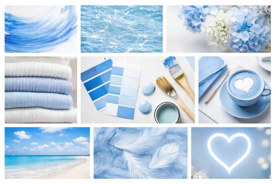
Tips for Mixing Blue and White in Paint or Digital Art
Start Small
- When mixing blue and white, always start with a small amount of white. It’s easier to lighten the blue gradually than to correct a mix that’s too pale.
Adjust with Other Colors
- If you want to introduce new tones, experiment with mixing yellow, green, or red into the blue-white mixture to create a range of shades, from light teal to lavender blue.
Test Under Different Lighting Conditions
- Colors may look different under natural and artificial light, so always test your mix in the intended environment to ensure it matches your expectations.
Use High-Quality Materials
- Whether you’re working with digital tools or physical paints, make sure to use high-quality materials to achieve accurate and consistent shades.
Real‑Life Examples of Blue and White in Design, Art & Fashion
Fashion
- Sky blue blouses paired with white trousers or powder blue skirts with white tops create a light, fresh look, perfect for spring fashion.
Interior Design
- Blue and white combinations are popular in creating seaside or nautical themes, using sky blue walls paired with white accents for a bright, airy living room or bathroom.
Art & Illustration
- Soft blue skies and cloudy whites are common in landscape art, creating serene, peaceful scenes.
Common Mistakes to Avoid When Mixing Blue and White
1. Using Too Much White
- Adding too much white can result in a washed-out, almost pastel version of blue that may appear too light for your project.
2. Not Testing the Mix
- Test your mix before applying it to a larger project. What looks good on a palette might look different once applied to your walls, clothing, or digital art.
3. Ignoring Undertones
- Pay attention to the undertones of both blue and white. Cool-toned blue mixed with cool white creates a different effect than warm-toned blue mixed with warm white.
Conclusion
Mixing blue and white is a simple yet powerful way to create a variety of lighter blue shades. From sky blue to powder blue, this combination can be used to create calm, fresh, and elegant tones that are perfect for a range of creative projects, from fashion and interior design to branding and art.
By understanding how to control the amount of blue and white you mix, as well as paying attention to undertones and proportions, you can easily create the perfect shade of blue for your project. Whether you’re creating a soft pastel blue for a bedroom or a rich azure for a summer dress, the possibilities are endless.
FAQs
What color do blue and white make when mixed?
Blue and white create various lighter shades of blue, such as sky blue, baby blue, or powder blue.
Can I make other colors by mixing blue and white?
Yes, by adding yellow, red, or green, you can create new shades such as light teal, lavender, or soft greenish blue.
How do I make a darker blue with blue and white?
You can create a darker blue by mixing in more blue or adding a small amount of black or green.
Is baby blue a cool or warm color?
Baby blue is a cool color, often associated with softness and calmness.
Can blue and white be used in branding?
Yes, blue and white combinations are often used in branding for companies in healthcare, technology, and finance to convey trust and professionalism.
Is periwinkle blue made with blue and white?
Yes, periwinkle blue is a mix of blue and white with a slight hint of purple.
What is the difference between powder blue and sky blue?
Powder blue is a darker, dustier shade of blue, while sky blue is a lighter and brighter shade.
How do I make a pastel blue?
You can make a pastel blue by adding white to blue in a high ratio.
How is ice blue different from regular blue?
Ice blue is a very light, cooler version of blue with a frosted appearance.
Can blue and white be used in modern interior design?
Yes, light blue and white combinations are often used to create fresh, airy, and open spaces in modern interior design.
What happens if I add too much white to blue?
Adding too much white can result in a washed-out or overly pale version of blue, making it look like a pastel.
Is blue and white a good combination for clothing?
Yes, blue and white are timeless colors used in casual fashion, summer clothing, and formal outfits.