

A lot of homes do not actually look bad.
They just look unfinished.
The layout may be fine. The furniture may be good. The rooms may even be clean and bright. But a few builder-grade details can make everything feel flatter, cheaper, or less intentional than it really is.
I notice this most with things that were chosen because they were easy, standard, and inexpensive to install quickly: basic doors, tiny ceiling lights, thin trim, short backsplashes, plain cabinet ends, wire closet shelving, and generic bathroom mirrors.
None of these things are necessarily ugly on their own.
The problem is that when too many of them are used together, the house can start to feel like a template.
What makes a home feel more expensive is usually not adding more decor.
It is replacing those default details with something that feels more deliberate.
Here are 25 builder-grade features that can make a home look cheaper than it is, plus what I would do instead.
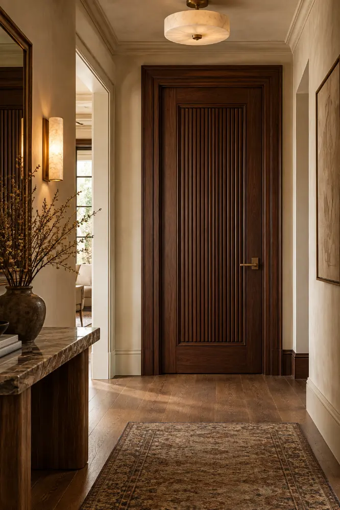
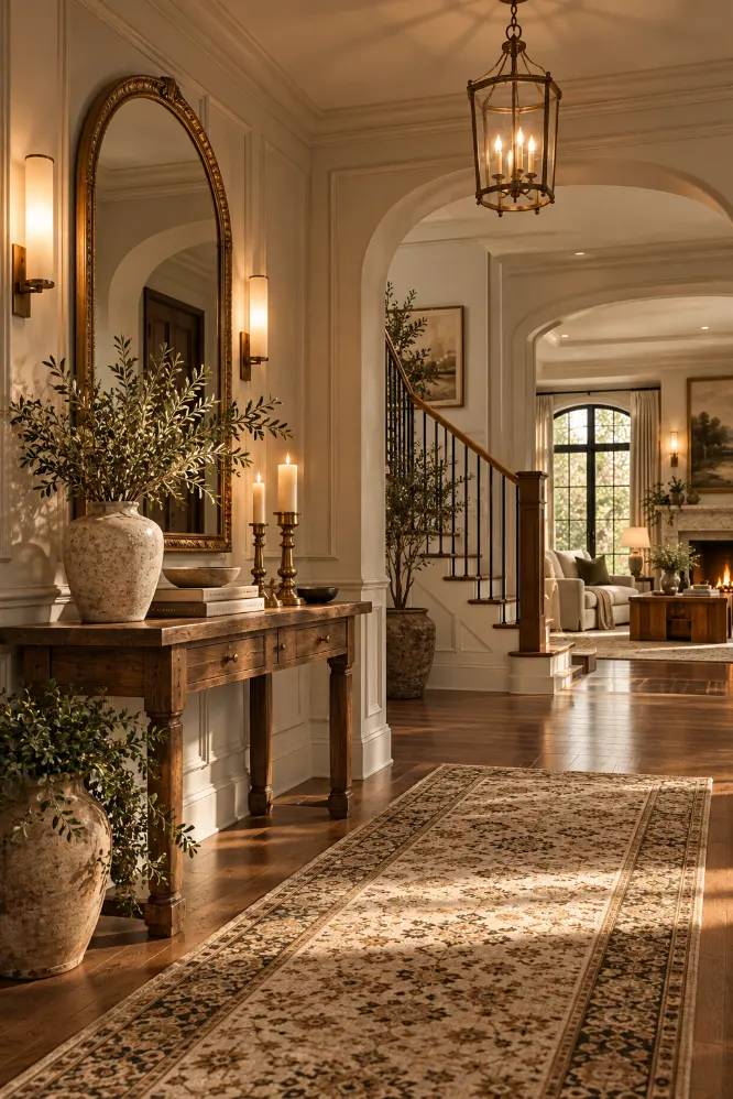
1. Basic Flush Interior Doors
Flat hollow-core doors are one of the quickest ways to make a hallway feel generic.
They do their job, but visually they add almost nothing.
I would replace the most visible doors first rather than changing every door in the house.
A simple paneled door, fluted door, or even a plain door with applied molding can make the hallway feel much more finished.
Deep paint can help too.
A dark olive, warm brown, burgundy, or charcoal door with matching trim often looks far richer than standard white.
The goal is not to make the door ornate.
It is simply to make it feel intentional.
2. Tiny Flush-Mount Ceiling Lights
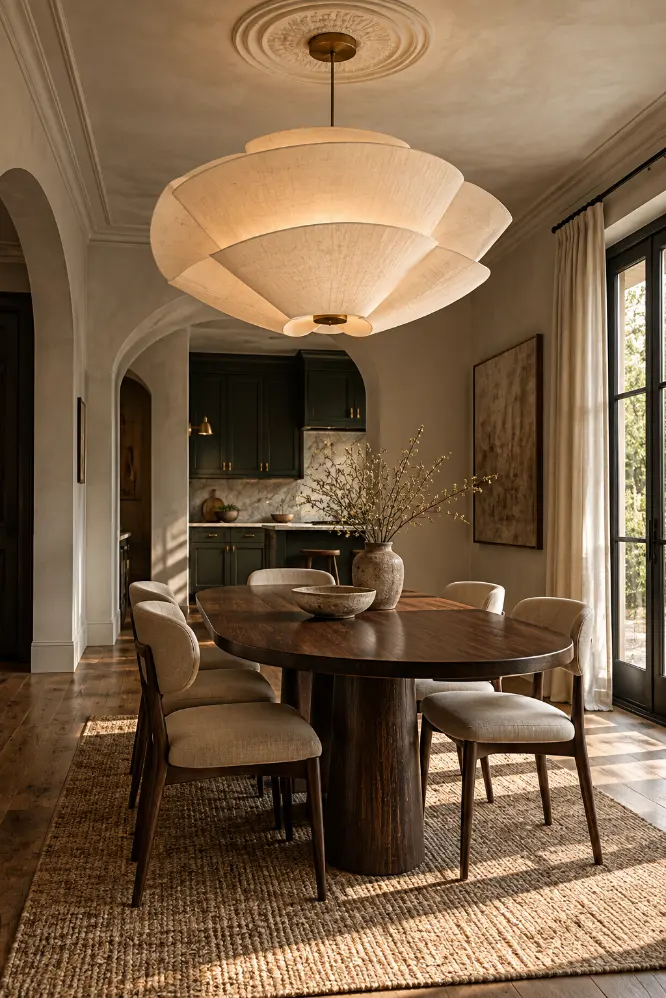
Small builder-grade ceiling lights often make a room feel temporary.
They are usually undersized and sit awkwardly in the middle of the ceiling.
I would replace them with one fixture that has more presence.
That could be a large opal globe, ceramic pendant, linen shade, or sculptural flush mount.
Scale matters more than price here.
A simple oversized fixture can look more expensive than a complicated small one.
I especially like doing this in entries, dining rooms, bedrooms, and hallways where one light can completely change the mood.
3. Thin Baseboards
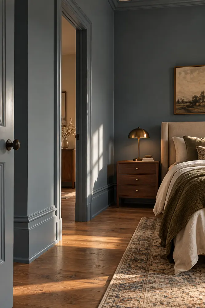
Very narrow baseboards can make walls feel unfinished, especially in rooms with taller ceilings.
I would upgrade to taller, simpler trim.
You do not need highly decorative molding.
A clean 5- or 6-inch baseboard often looks far more substantial than a thin one.
If the room has crown molding or picture rails, keep the profiles simple so everything works together.
Paint the baseboards the same color as the walls for a modern look, or use a soft contrast if you want the trim to stand out.
4. Small Builder-Grade Bathroom Mirrors
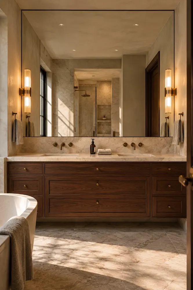
A small framed mirror floating above the vanity can make a bathroom feel disconnected.
I usually prefer a mirror that feels more integrated.
A full-width mirror, a mirror fitted between two walls, or one surrounded by matching tile can make the vanity look much more custom.
The mirror does not need to be expensive.
The difference comes from scale and placement.
A larger mirror also reflects more light and makes the room feel more spacious.
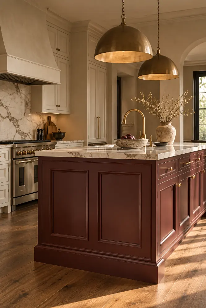
5. Flat Kitchen Island End Panels
The side of a kitchen island is often just a plain flat board.
That is practical, but it can make the island look like a large cabinet box.
Adding a simple furniture-style panel can change that immediately.
I would match the panel profile to the cabinet doors so it looks like it was part of the original design.
Shaker-style panels work especially well.
This is a small upgrade, but it makes the island feel more like furniture and less like cabinetry pushed into the middle of the room.
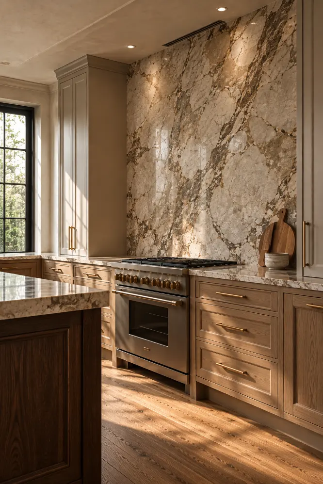
6. Short Kitchen Backsplashes
A backsplash that stops only a few inches above the counter often looks unfinished.
I prefer taking tile or stone much higher.
Run it to the bottom of the upper cabinets or, where possible, all the way to the ceiling.
This creates a stronger visual surface and makes the kitchen feel more complete.
The material does not need to be expensive.
Simple cream tile can look beautiful when it is used generously.
The way the material is installed often matters more than the material itself.
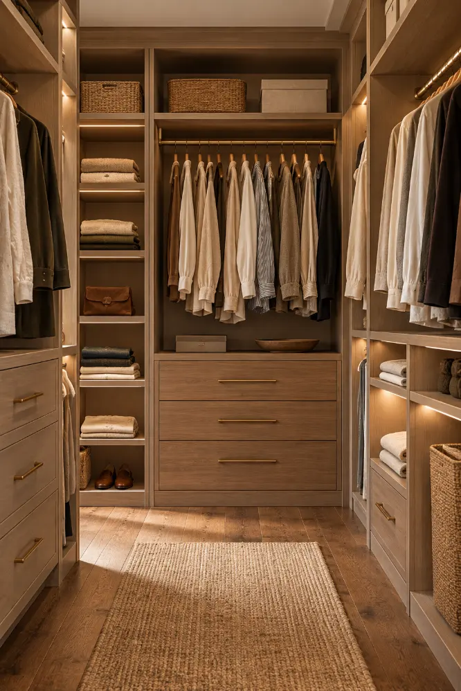
7. Wire Closet Shelving
Wire shelves are practical, but they can make even a large closet feel temporary.
I would replace them with simple built-in wood or painted shelving.
You do not need a luxury closet system.
Basic shelves, drawers, and hanging rails arranged properly can make the space feel much more organized.
If the closet is small, I would focus on using the full height of the wall.
Add shelves above the hanging rail and use drawers or baskets below.
The goal is function first, but cleaner materials make the closet feel better too.
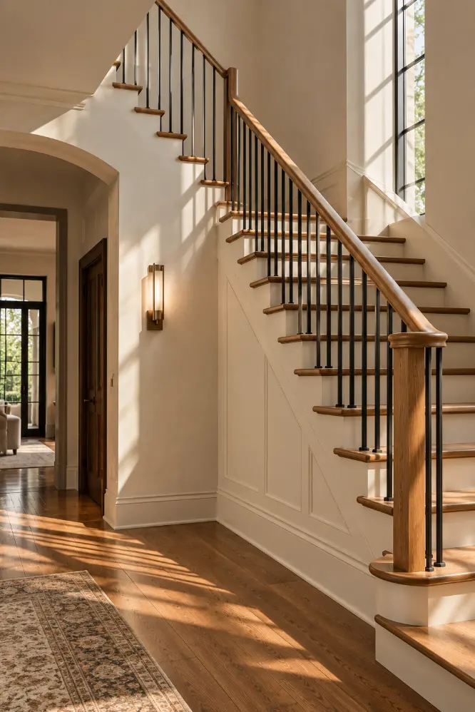
8. Basic Stair Railings
A builder-grade stair railing can dominate a room in the wrong way.
Heavy profiles, overly traditional spindles, or dated wood finishes can make the staircase feel older than the rest of the house.
I would simplify the railing.
That might mean a slimmer wood handrail, cleaner balusters, or a darker painted finish.
You do not need to replace everything.
Sometimes repainting the railing and removing overly decorative details is enough.
The staircase should feel architectural, not busy.
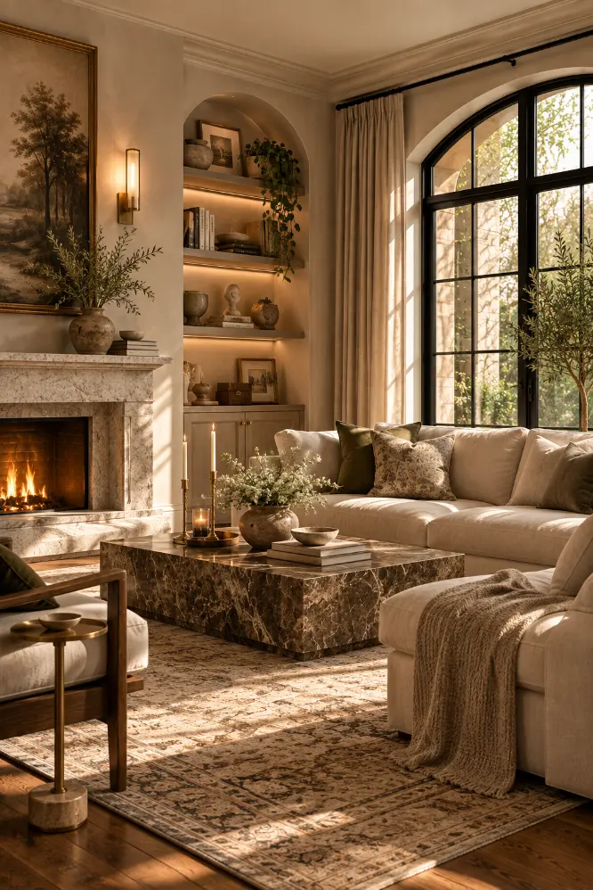
9. Flat Fireplace Surrounds
A basic tile border around a firebox can make the fireplace feel like an appliance instead of part of the room.
I prefer a more continuous surround.
Plaster, limestone, microcement, or simple stone can make the fireplace feel built into the architecture.
You do not need a huge mantel.
In fact, a simple thick surround often looks more expensive than a decorative one.
The key is to make the fireplace wall feel deliberate from floor to ceiling.
10. Cheap-Looking Closet Doors
Sliding mirrored doors and thin bifold doors can make a bedroom feel dated.
I would replace them with full-height paneled doors or, in some cases, a ceiling-mounted curtain.
Curtains can work especially well when the closet opening is wide.
Use a substantial linen or cotton fabric rather than something lightweight.
If you prefer doors, choose simple panels and paint them to match the wall.
The closet should feel like part of the room, not a separate utility feature.
11. Bathroom Vanity Lights That Look Too Small
Tiny vanity bars or exposed bulb fixtures can make the bathroom feel harsh.
I prefer lighting that feels balanced with the mirror.
Two sconces on either side of the mirror can look much more intentional than one small light above it.
If there is not enough space, one wide fixture that matches the mirror width can work.
Warm, diffused light usually looks better than bright exposed bulbs.
This is one of those upgrades that changes both the look and the way the room feels.
12. Plain Hollow-Core Doors Everywhere
Even if you do not replace the doors, you can still improve them.
Add applied molding to create panels.
Paint them a deeper color.
Upgrade the hinges and handles.
These small changes can make a cheap door look far more substantial.
I would start with doors in the most visible areas: hallway, pantry, powder room, or bedroom entry.
There is no need to change every door at once.
13. Tiny Rugs in Large Rooms
A rug that is too small can make a room feel cheaper because it visually separates the furniture instead of connecting it.
I would rather use no rug than one that is obviously undersized.
In a living room, the front legs of the main seating should usually sit on the rug.
In a dining room, the rug should be large enough that chairs stay on it when pulled out.
A larger simple rug often looks more expensive than a small decorative one.
Scale matters more than pattern.
14. Random Cabinet Filler Panels
Kitchen cabinets often end with awkward filler strips.
Sometimes they are unavoidable, but they can make a cabinet run look unfinished.
If there is enough space, I would turn that gap into something useful.
A narrow tray cabinet, pull-out spice rack, open shelf, or decorative end panel can make the transition feel intentional.
Even a small change is better than a wide blank filler strip.
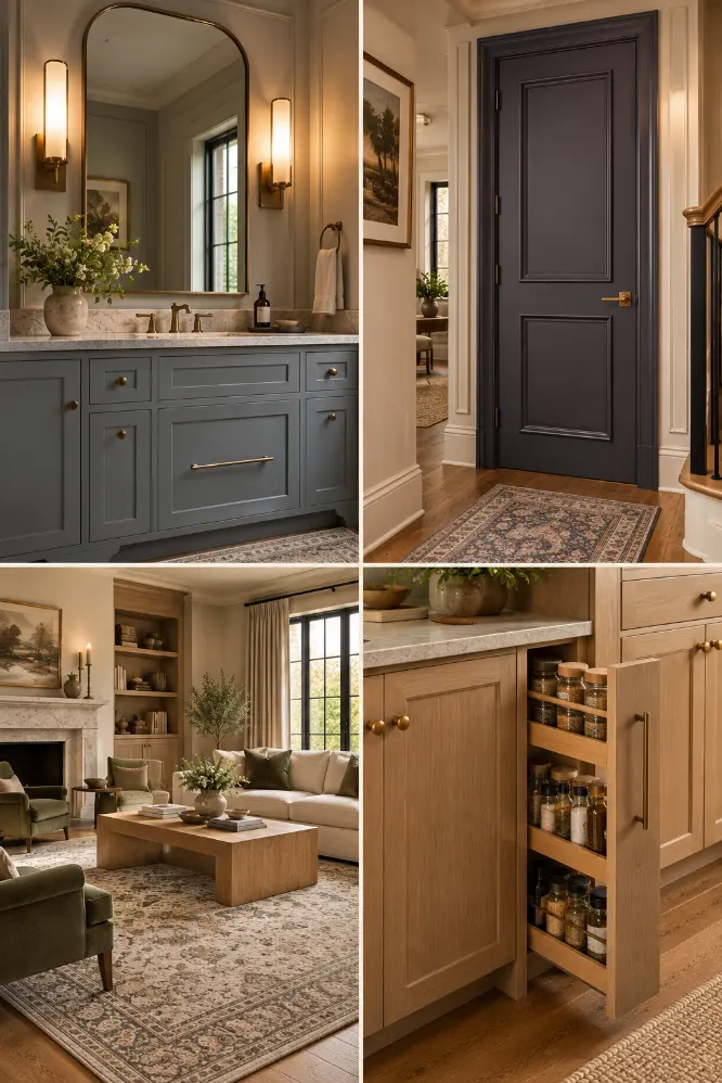
15. Cheap Plastic Switch Plates
Switch plates are small, but you see them everywhere.
Bright white plastic plates on darker or more refined walls can stand out in the wrong way.
I would use cleaner, more substantial plates in a finish that works with the room.
Paintable plates can also disappear into the wall.
This is not a dramatic upgrade, but it is exactly the kind of detail that makes a room feel more finished.
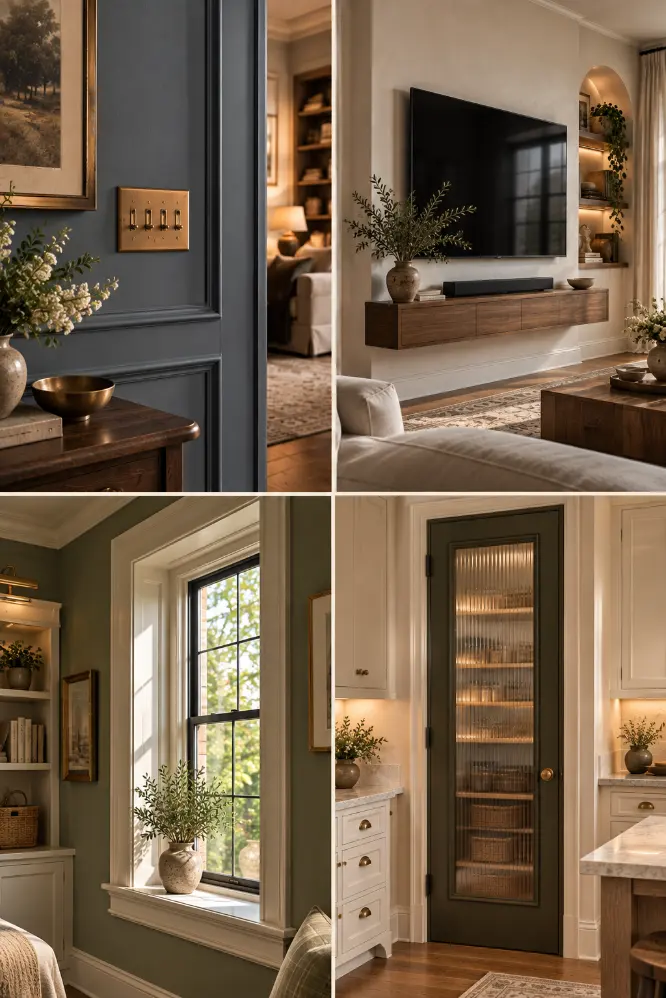
16. Visible TV Wires
Nothing makes a carefully designed living room feel unfinished faster than visible cables.
I would hide them inside the wall where possible or use a simple cable channel painted to match the wall.
If you need storage, add a very shallow console beneath the television.
The goal is not to build a huge media wall.
It is just to remove visual clutter.
A clean wall always feels more expensive.
17. Basic Window Trim
Very thin or incomplete window trim can make windows feel disconnected from the room.
I would add a slightly more substantial casing.
Again, simple is enough.
You do not need ornate molding.
A clean surround painted the same color as the wall or in a soft contrast can make the window feel much more architectural.
If the sill is very narrow, consider deepening it slightly too.
18. Plain Pantry Doors
A pantry door is often treated like an afterthought.
But because it is usually in the kitchen, it is highly visible.
I would use the pantry door as an opportunity.
Paint it a deep contrasting color, add fluted glass, use a paneled wood door, or match it to the cabinetry.
A good pantry door can become part of the kitchen design instead of something you try to ignore.
19. Ceiling Fans That Are Too Small or Too Busy
A ceiling fan can make a room feel cluttered if the scale or style is wrong.
I prefer simple fans with clean blades and minimal hardware.
The fan should match the size of the room.
A tiny fan in a large room looks cheap, while an oversized fan can overwhelm the ceiling.
If you do not use the fan often, a pendant or flush mount may look better.
20. Exposed Curtain Rods Mounted Too Low
Curtains mounted just above the window can make the ceiling feel lower.
I would move the rod or track closer to the ceiling.
Extend it wider than the window too.
That allows the curtains to frame the opening instead of covering it.
A ceiling-mounted track can look especially clean.
Longer curtains usually feel more polished than short ones.
21. Basic Vanity Fronts
A bathroom vanity with flat builder-grade doors can make the whole bathroom feel plain.
You can upgrade the look without replacing the vanity.
Add simple shaker trim, new hardware, or paint it in a deeper color.
A warm walnut finish can also look beautiful if you want more texture.
The vanity is often the largest piece in the room, so improving it has a big effect.
22. Blank Stair Walls
A large empty wall beside a staircase can make the space feel unfinished.
I would avoid filling it with random decor.
Instead, add one architectural feature.
That could be shallow paneling, a picture rail, recessed niches, or one long piece of artwork.
The wall should feel designed as one surface.
That usually looks more expensive than a collection of small unrelated objects.
23. Flat Cabinet Ends
The exposed side of a cabinet can look unfinished when it is just a flat panel.
Add matching trim or paneling.
This works on kitchen cabinets, bathroom vanities, and built-ins.
Even one simple frame can make the cabinet feel more like custom millwork.
This is especially noticeable at the end of an island or tall cabinet run.
24. Builder Beige Everywhere
Neutral walls are not the problem.
The problem is when every room uses the same flat beige without contrast.
I would keep neutral walls where they work, but introduce depth elsewhere.
Paint doors darker.
Use a stronger trim color.
Add one deeper room.
Or color-drench a small space.
You do not need bright color.
Even subtle contrast makes the house feel more designed.
25. Undersized Hardware
Tiny cabinet knobs can make large cabinet doors feel cheap.
The scale of the hardware should match the scale of the cabinetry.
Longer pulls can make drawers and doors feel more substantial.
You do not need expensive hardware.
Even simple black, brass, nickel, or bronze pulls can look better when they are proportioned correctly.
I would keep the style consistent throughout the room.
Final Thoughts
Most builder-grade features are not actually bad.
They are just generic.
That is why a few thoughtful changes can make such a big difference.
You do not need to renovate the entire house.
Start with the details that are most visible.
Doors.
Lighting.
Trim.
Mirrors.
Cabinet ends.
Fireplaces.
Backsplashes.
Stair railings.
These are the things that shape how finished a room feels.
For me, the best upgrades are the ones that make the house feel more intentional without making it feel overdesigned.
The goal is not to make every room luxurious.
It is to make fewer things feel accidental.