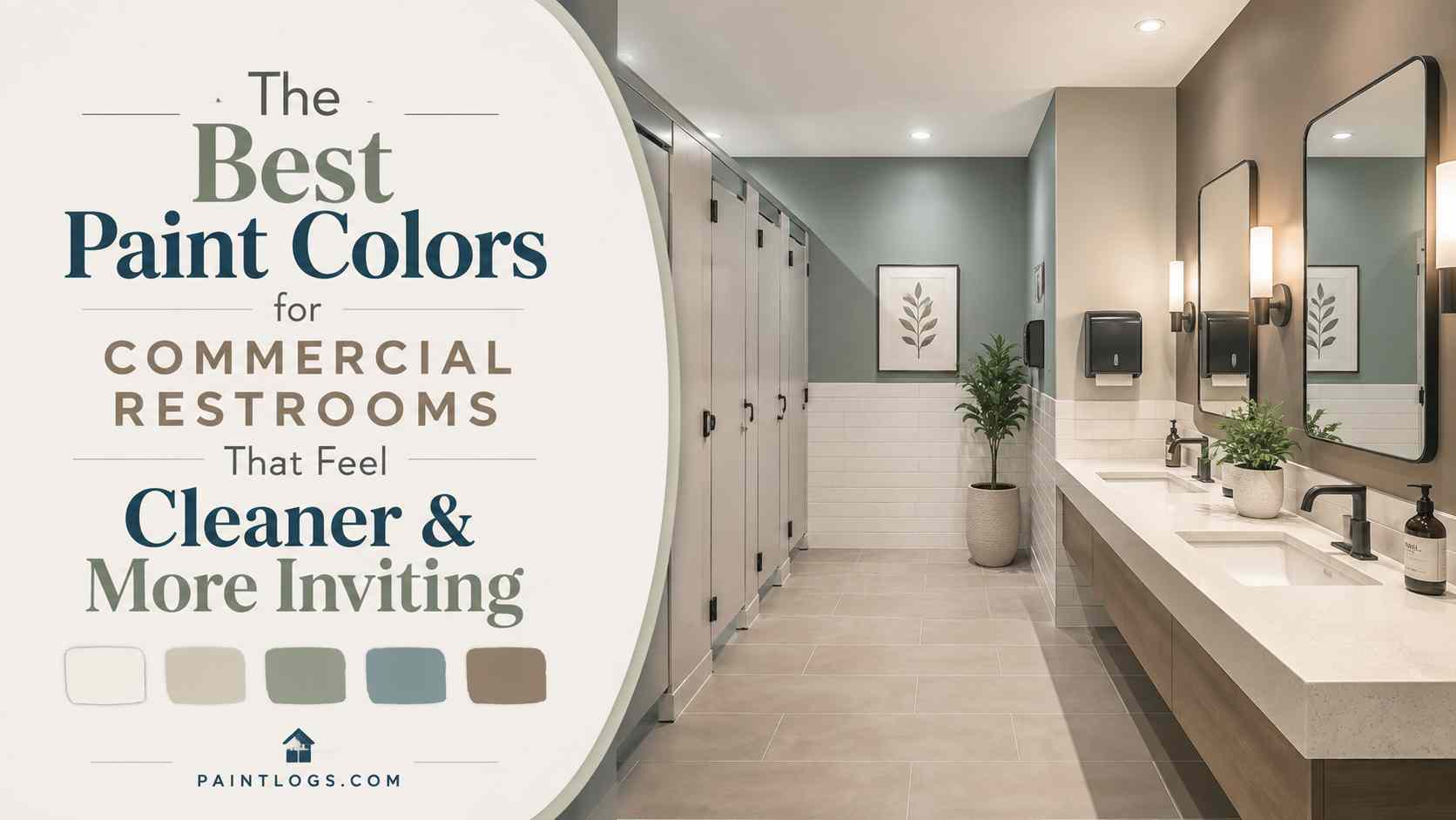
The Best Paint Colors for Commercial Restrooms That Feel Cleaner and More Inviting
Commercial restrooms are practical spaces, but that does not mean they have to feel cold, dull, or forgotten. The right paint color can make a restroom look brighter, cleaner, and more comfortable, even before any major renovation takes place.
Color changes how people experience a room. A dark shade can make a small restroom feel tighter, while a soft, balanced color can make the same space feel more open. Some colors create a calm mood. Others bring warmth or energy. And in a commercial setting, where first impressions matter, those details can influence how visitors feel about the entire building.
Think about it. Have you ever walked into a restroom and immediately felt that it was clean and well cared for, even before looking closely at the fixtures or floors?
Paint often plays a part in that reaction.
Choosing the best paint colors for commercial restrooms is not only about personal taste. You also need to think about lighting, maintenance, traffic levels, moisture, fixtures, partitions, and the type of people using the space. When all of those elements work together, the restroom feels polished and inviting rather than purely functional.
Why color affects how clean a restroom feels
People tend to connect certain colors with cleanliness, freshness, and order. Light neutrals, pale blues, soft greens, and clean whites often create a sense of calm and hygiene. These shades reflect more light and help surfaces appear brighter, which can make the room feel better maintained.
That does not mean every restroom needs to be completely white.
In fact, too much bright white can sometimes feel harsh or clinical, especially under strong overhead lighting. It may also show every mark, splash, and scuff. The goal is not to create a sterile room. It is to choose colors that support a clean appearance while still feeling comfortable.
Lighting matters here too. A color that looks fresh in a paint store may appear dull under fluorescent fixtures. Warm lighting can bring out yellow or beige undertones, while cooler lighting may make blue and gray shades feel stronger. Before painting the entire room, test samples on different walls and look at them throughout the day.
A little planning makes a big difference.
Crisp white keeps things bright and simple
White remains one of the most common choices for commercial restroom walls, and there is a good reason for that. It reflects light, makes small rooms feel more spacious, and creates an immediate sense of freshness.
Crisp white works especially well in healthcare facilities, professional offices, modern retail spaces, and buildings with limited natural light. It also gives you flexibility because it pairs easily with nearly any floor, countertop, fixture, or partition color.
Still, pure white is not always the easiest option to maintain. It can show fingerprints, water spots, scratches, and dirt more quickly than deeper shades. In a high traffic restroom, that may mean more frequent cleaning and touch ups.
A softer white can offer a practical middle ground. Look for shades with light gray, cream, or warm undertones. These colors still feel bright, but they are less severe and often more forgiving.
White works best when it is intentional. Pair it with warm lighting, textured materials, or darker accents so the room does not feel flat.
Soft gray offers a clean and modern look
Soft gray is a strong choice for commercial restrooms because it feels modern without attracting too much attention. It works with stainless steel, chrome, black hardware, wood finishes, and a wide range of flooring materials.
Gray also hides minor marks better than pure white. That makes it useful in offices, hotels, restaurants, retail stores, and other spaces where the restroom needs to look polished throughout the day.
The key is choosing the right gray.
Some grays have blue undertones and can feel cool. Others lean beige or brown and create a warmer effect. A small restroom with limited lighting may benefit from a light warm gray, while a bright space can handle a slightly cooler shade.
Avoid going too dark unless the restroom is large and well lit. Deep charcoal can look stylish, but it may make a compact room feel closed in. It can also show water marks and dust on certain surfaces.
Used carefully, soft gray creates a balanced backdrop that feels clean, calm, and professional.
Warm beige and greige make the room more welcoming
Beige was once seen as a safe but boring choice. That has changed. Today, warmer neutrals are popular because they make commercial spaces feel more relaxed and approachable.
Greige, which blends gray and beige, is especially useful. It offers the modern appearance of gray with the warmth of beige. This makes it easy to use in restaurants, hotels, salons, offices, and retail environments where comfort is part of the customer experience.
Warm neutrals pair well with stone floors, wood tones, brushed metal, and cream colored fixtures. They also tend to hide light dirt and scuffs better than bright white.
But be careful with shades that contain too much yellow. Under artificial lighting, they may look dated or dingy. Choose muted tones and test them next to the restroom flooring and counters before making a final decision.
A good beige or greige should feel soft, not muddy.
Soft blue creates a calm, fresh atmosphere
Blue is often linked with cleanliness, water, and calm surroundings. That makes it a natural fit for commercial restrooms.
Soft blue can work well in healthcare settings, wellness centers, spas, hotels, offices, and family restrooms. It brings color into the space without feeling loud or distracting.
Pale blue also reflects light well, which helps smaller restrooms feel more open. Pair it with white fixtures, silver hardware, and light gray flooring for a fresh appearance. For a warmer look, combine it with natural wood accents or beige surfaces.
The shade matters. A very cold blue can feel harsh under fluorescent lighting. A blue with a slight gray undertone is often easier to live with and looks more sophisticated.
Blue does not have to dominate the entire room. It can work as an accent wall behind sinks or mirrors, while the remaining walls stay neutral.
Sage green brings a natural, refreshing feel
Sage green has become a popular interior color because it feels calm, grounded, and easy on the eyes. In commercial restrooms, it can create a more natural and relaxing environment.
This shade works especially well in cafes, wellness businesses, eco friendly offices, hotels, schools, and healthcare spaces. It pairs nicely with white, beige, charcoal, wood, and brushed metal.
Green can also help a restroom feel less clinical. That is useful in spaces where comfort matters, especially clinics, care facilities, and family focused businesses.
Choose a muted green rather than a bright or highly saturated one. Strong lime or emerald shades may feel overwhelming in a small room. Sage, eucalyptus, and soft olive tones are easier to combine with existing materials.
The result feels fresh without trying too hard.
Paint finish matters as much as color
A beautiful color will not perform well if the finish is wrong for the space. Commercial restrooms deal with humidity, frequent cleaning, water splashes, and constant use. The paint needs to handle all of that.
Flat and matte finishes are usually not the best choice. They can absorb moisture and are harder to wipe clean. They also tend to show stains in busy areas.
Satin paint offers a soft sheen and is easier to clean than matte paint. It works well on many restroom walls, especially in areas that do not receive direct water contact.
Semi gloss paint is even more durable and moisture resistant. It is a practical choice for high traffic restrooms, areas near sinks, and walls that need frequent cleaning. The stronger shine can reveal surface imperfections, though, so proper wall preparation is important.
Some manufacturers also offer commercial bathroom coatings designed to resist mold, mildew, moisture, and repeated scrubbing. These products may cost more at first, but they can reduce maintenance problems over time.
The right finish protects the color and helps the room stay presentable.
Match the paint with the rest of the restroom
Paint should not be chosen on its own. It needs to work with the flooring, counters, lighting, fixtures, hardware, and bathroom partitions.
Start with the fixed elements that are expensive or difficult to replace. Flooring and partitions often stay in place for years, while walls can be repainted more easily. Choose a wall color that complements those permanent features rather than competing with them.
For example, stainless steel partitions pair well with soft gray, pale blue, white, and muted green. Dark partitions can look striking against lighter walls. Beige or warm gray partitions often work best with cream, greige, or earthy colors.
When comparing partition styles, colors, and materials, design teams may also review resources such as onepointpartitions.com while deciding how the finished surfaces should work together.
The aim is simple. Every element should feel like part of the same design.
You do not need an exact color match. In fact, too much matching can make the room feel flat. A better approach is to choose colors with similar undertones and enough contrast to create visual interest.
Avoid colors that make the space feel smaller or dirtier
Some colors look appealing in photographs but create problems in real commercial restrooms.
Very dark shades can make small rooms feel cramped, especially when lighting is limited. Black, deep navy, and dark brown may also show dust, dried water spots, and soap residue more clearly than expected.
Bright yellow can feel cheerful, but certain shades may make white fixtures look dull. Strong red can create energy, but it may feel intense in a restroom where people expect privacy and calm.
Overly trendy colors can also date quickly. A bold shade may look exciting now, but repainting a large commercial restroom after a short period can be expensive and disruptive.
That does not mean you should avoid personality. Use stronger colors in smaller doses. An accent wall, painted door, decorative panel, or trim color can bring character without taking over the room.
Balance is usually the safest choice.
Choose colors based on the type of business
The best restroom color depends partly on where the restroom is located.
An office restroom may benefit from soft gray, greige, or pale blue because these shades feel professional and calm. A restaurant can use warmer colors that connect with the dining area. A school may need cheerful colors, but they should still be durable and easy to maintain.
Healthcare restrooms often use white, blue, green, or light neutral tones because these colors support a clean and reassuring atmosphere. Retail stores may choose colors that reflect the brand while keeping the space comfortable. Hotels can use richer neutrals and carefully selected accent shades to create a more refined experience.
The restroom should feel connected to the rest of the building.
A luxury hotel restroom painted in a harsh institutional white may feel out of place. A busy warehouse restroom painted in a delicate designer shade may require too much maintenance. Context matters.
Keep painted walls looking fresh
Even the best paint color will lose its effect if the walls are dirty, damaged, or peeling.
Good ventilation is one of the most important protections. Moisture that remains in the room can lead to bubbling paint, mildew, and unpleasant odors. Exhaust systems should be checked and cleaned regularly.
Maintenance teams should also use cleaning products that are suitable for painted walls. Harsh chemicals may damage the finish or cause uneven fading. Regular light cleaning is usually better than waiting until stains become difficult to remove.
Keep a record of the paint brand, color name, finish, and batch information. That makes future touch ups easier. Store a small amount of leftover paint in a sealed container and label it clearly.
High contact areas may need occasional attention. Walls near doors, sinks, hand dryers, and waste bins are more likely to collect marks. A simple touch up schedule can keep the room looking cared for without requiring a complete repaint.
A better color choice creates a better experience
Commercial restroom paint may seem like a small design decision, but it affects how the entire room feels. The right color can make a space appear cleaner, brighter, calmer, and more welcoming. It can also support the building’s style and make daily maintenance easier.
White offers brightness. Soft gray brings a modern feel. Greige adds warmth. Blue creates calm, while sage green introduces a natural touch. There is no single perfect color for every restroom.
The best choice is the one that fits the space, lighting, materials, traffic level, and people who use it.
So, before reaching for the first neutral paint chip you see, take a closer look at the room as a whole. Think about how visitors will feel when they walk in, how the surfaces will age, and how easily the walls can be maintained.
A thoughtful paint choice will not solve every restroom design challenge. But it can change the mood immediately.
And sometimes, that simple change is exactly what the space needs.