
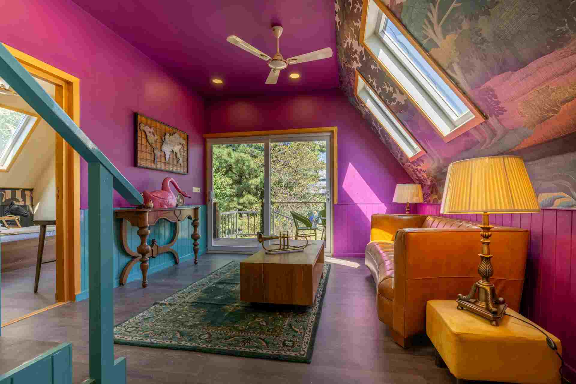
Interior Paint Ideas That Elevate Modern House Plans
Paint choices rarely seem important until you’ve already made a few that don’t sit right. What seemed like a safe neutral can end up feeling flat. A bold choice you liked online might feel out of place once it’s on your wall. In modern homes built with open layouts and clean lines, paint ends up doing more than just sitting in the background. It quietly shapes how everything connects.
1. Using Paint to Define Open Living Spaces
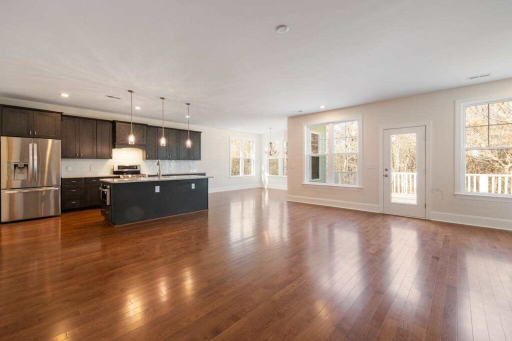
Open layouts sound great on paper. Then you move in and realize it’s all just… one big space. No clear edges, no obvious “this is where this ends.” That’s where paint starts doing the heavy lifting.
Rather than sticking to a single color, try small shifts. Keep the tones close, just not identical. A softer white where you lounge, a slightly warmer shade where you eat. Enough to separate things without making it obvious.
This matters a lot in modern house plans. The space is meant to flow, but it still needs something to visually define it.
2. Highlighting High Ceilings Without Making Them Feel Distant
High ceilings are great until the room feels a little too open. Sometimes even cold. It usually comes down to how the paint is handled.
Covering everything in plain white can make the height feel exaggerated. You get space, yes, but not much comfort.
A small tweak helps. Use two closely matching shades and let the ceiling color run down onto the wall just a little. Not much, just enough to blur that sharp line. It pulls the space together.
You could also darken the ceiling slightly. Nothing dramatic. A muted greige or soft taupe against lighter walls can make the room feel more complete without drawing attention upward.
3. Keeping Rooms Connected Without Matching Everything
A lot of people pick paint room by room. It makes sense at the time, but once everything comes together, the house can feel slightly disconnected.
The issue is usually the undertones. Two colors might look neutral on their own, but one has a warm yellow hue, while the other leans toward the cooler side. Side by side, the difference is obvious and distracting.
The easiest way around this is to stick with one undertone family across connected spaces. Warm stays warm. Cool stays cool. The shades can shift, but the base should feel related.
It also helps to look at samples together instead of individually. Move them around. Look at them throughout the day as natural light changes. If they still feel right in changing light, you’re on the right track.
4. Rethinking Accent Walls So They Actually Work
Accent walls used to be bold and obvious. Now they work better when they feel intentional rather than attention-seeking.
Instead of a sharp contrast, go for depth. A deeper tone behind a bed can make a room feel grounded. A muted color in a reading corner can add warmth without taking over. The difference is in how naturally it fits.
Placement matters more than the color itself. If a wall already draws your attention, that’s usually the right one. Choosing a random wall often ends up looking exactly like that, random.
Even the finish can shift the feel. A matte finish absorbs light and feels calm. A slight sheen reflects more, adding a bit of movement even if the color stays the same. Not every room needs this, though. Some spaces feel stronger when everything stays consistent.
5. Making Mixed-Use Spaces Feel Intentional
When living areas sit next to more practical spaces, things can get tricky. You want them to connect, but not blur into each other completely.
This shows up a lot in shouse floor plans, where a home might include a workshop or a more rugged section alongside the main living area.
When colors change too drastically, the transition can feel sharp. Keeping things within the same color family softens that shift.
You might have a lighter gray where you relax, and a darker version of that same gray where things get a bit messier, like a workspace. It’s still one palette, just adjusted for what happens in each area.
And yeah, finish matters. The more a surface gets touched, the more you’ll appreciate paint that doesn’t hold onto every mark.
6. Making Natural Light Work With Your Paint Choices
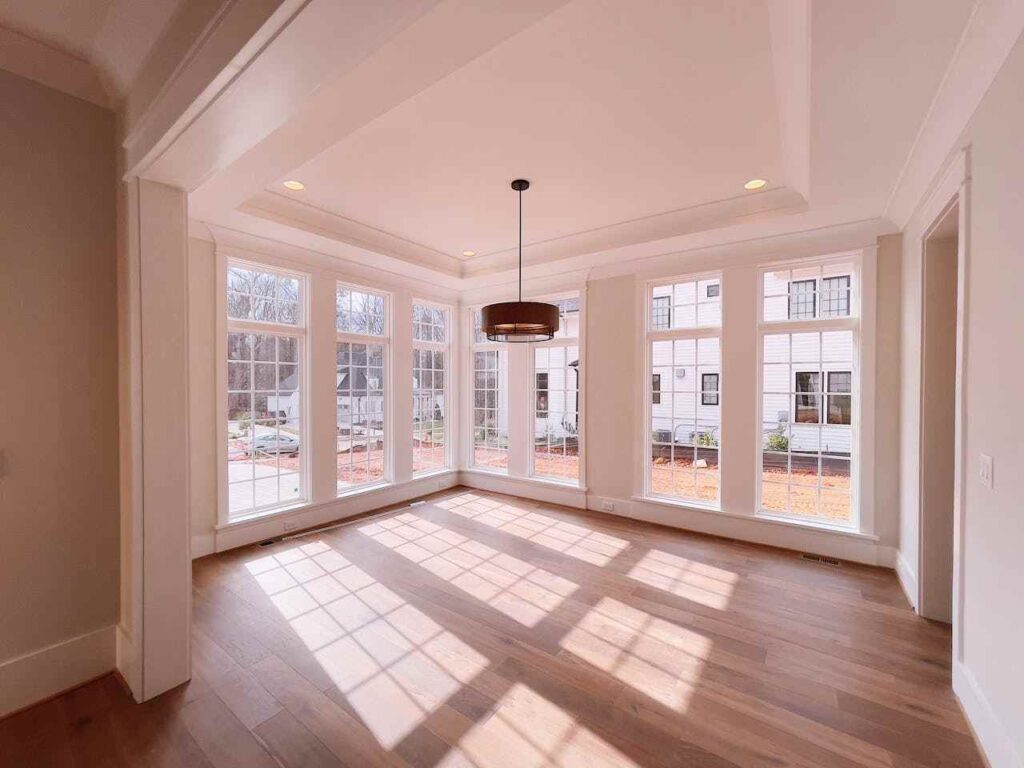
Light has a way of messing with color. A shade that looked soft in the store can turn sharp or dull once it’s on your wall, and a lot of that comes down to where your windows sit.
Rooms that don’t get much daylight can feel a bit cold, even when the color itself isn’t. That’s where warmer shades help. Brighter spaces are more forgiving. They can handle cooler tones or slightly deeper colors without closing in.
Small swatches also don’t tell you much. A larger patch on the wall does. Leave it there and check it at different times of day. What looks right in the morning might feel off by evening.
Artificial lighting plays its part too. A warm bulb can pull out the richness in colors like beige, while cooler light tends to highlight gray undertones.
7. Choosing Finishes That Support Daily Living
Color gets all the attention, but the finish is what you notice over time.
Matte walls look soft and hide a lot, which makes them ideal for bedrooms or low-traffic areas. The downside is they’re not the easiest to clean.
Add a bit of sheen, like eggshell or satin, and things change. Wiping marks off becomes much easier, so those finishes make more sense in kitchens or hallways.
Glossy finishes behave differently altogether. They reflect a lot, including every bump or uneven patch, so they’re better suited for trim, doors, or cabinets.
Conclusion
In a modern home, paint isn’t just a finishing touch. It plays a quiet role in how spaces connect and how light moves across the room throughout the day.
Once you start noticing undertones and how one area meets the next, your choices get easier. You don’t end up with odd contrasts or colors that fight each other. Everything just sits right without you having to force it.