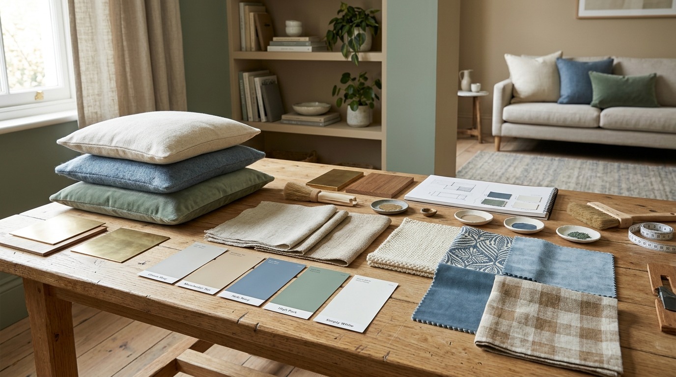
How To Create A Balanced Color Palette Using Paint And Textiles
Selecting colors for a space is more than simply picking a paint color that catches your fancy. While walls are a big visual canvas, furniture, drapes, carpet and other textiles can really define how that color feels in the finished space. Paint and textiles bring cohesion to a space, so a room can utilize these items without concern that everything has to match.
A harmonious palette does not have to be with a limited number of colors. It means ensuring that the main, background and accent colours weave a coherent relationship across the space. Focusing attention to paint, fabrics, patterns, lighting and existing furnishings together enables homeowners to create interiors that are visually pleasing and feeling convinced in a well-organized fashion.
It Will Kick-Start You On The Colors Already In The Room
Take A Look At The Existing Elements Before Picking A New Paint Color Anything from flooring to furniture, cabinetry, countertops, curtains and upholstery may affect the palette.
A room that has warm wood flooring naturally pairs well with warm whites, beige, terracotta or even muted browns (or olive too! If you have gray flooring and cooler colored furniture, the space can lend itself to blue-gray, soft green, charcoal or cooler neutrals.
It should be noted that textiles are especially relevant as their colors and patterns may become important visual features. Instead of choosing wall paint in a vacuum, think about how a particular shade will work with your existing fabrics.
Understand Basic Color Relationships
If you have a basic understanding of how colours interact, it makes planning a palette much easier. The color wheel characterizes a few helpful methodologies.
Complementary colors sit across on the other side to one another and can create quite a striking contrast. They work well when one color is used almost exclusively with the complementary shade sprinkled in.
Analogous colors are found next to one another on the color wheel. For more aesthetically pleasing combinations, you can go with blue blue green green.
Monochromatic color palettes take one base color and create different shades, tints or tones. This creates a quiet elegance and still offers some visual interest.
Triadic palettes utilize three colors relatively evenly spaced around the color wheel. One can often go for the dominance of one color as others are more energetic in nature and work better as accents.
Create A Primary, Secondary And Accent Color
Color segregation is one of the simplest strategies to create an interior palette.
As a rule, the most common color takes up the biggest space. In some rooms, this can be the wall color.
Your secondary colour can come in the form of furniture, curtains, rugs or larger textile pieces like bedding.
The accent color should fill a smaller space in the room. This may be visible in things like cushions, artwork, decorative objects, or smaller fabric accessories.
This method does not let any color compete with another. A soft neutral wall, for instance, can serve as a background color for a deeper blue couch and accents of blue, cream and warm touches in pattern elements.
Match Paint With Textile Patterns
Patterned textiles can be important sources of color ideas. You can find a lot of different hues in one fabric to use as a springboard to create the rest of the room.
Imagine a patterned textile of soft greens, cream, tan and rust. Choose a dominant supporting color between the four colors instead of introducing each color evenly.
Pattern scale also matters. This massive, stunning pattern can act like a statement piece and smaller prints add visual details. If a number of big textiles utilise competing designs, the space might seem visually cluttered.
We should, however, combine scales. You can pair any of large patterns with a small print based on geometry and one to two solid color fabrics.
It works for most textile accessories, including printed scarves or bandanas. As a case in point, the selection of cotton and silk textiles and decorative patterns offered by 4inbandana shows how varied visual impressions can stem from different materials and printing techniques.
Test Paint Colors Alongside Fabrics
Surrounding colors and lighting can make paint samples look shockingly different. A color that looks great on a tiny paint swatch can look warmer, cooler, lighter or darker once you put it up on a wall.
This is why you should always test paint samples alongside all of the textiles that you’ll have in the room.
Put the sample next to curtains, upholstery, rugs or cushions and examine the combination at different times of day. Various approaches to exploring how color is perceived as influenced by morning sunlight, afternoon light, evening lamps and cooler artificial lighting.
Testing the entire combination is more helpful than testing just the paint alone.
Balance Warm and Cool Colors
Although warm and cool colors can be blended, the undertones must be taken into account.
Basically warm colors are reds, oranges, yellows and most earthy neutrals. Cool colors are blues, greens and sometimes grays.
Neutral colors work to bridge the gap between these two groups. A bedroom with chilly blue walls, for instance, might be warmed by way of herbal wood, beige upholstery or terracotta-hued fabric.
It is not about avoiding the mixture of warm and cool colors. Instead, determine the primary temperature and introduce, with intent, the contrasting one.
Use Contrast Without Creating Clutter
Contrast gives an interior depth. A fully monochromatic room can sometimes feel dull without it.
Contrast also comes from more than color. You can use light and dark tones, solid and pattern fabrics, soft and rough surfaces or saturated and muted textures for your diversity.
On the other hand, contrast is more effective when there is some repetition. But if there is a dark accent in a large room and that same colour is used only once, it will be disconnected. Using that tone a few times in smaller elements can give agency and ensure your design is intentionalographs.
Repeat Colors Throughout the Space
Color repetition is one of the easiest ways to deliver cohesion.
A potentially patterned cushion will subtly echo a wall colour. A hue of color in a rug could be the same hue that exists somewhere in the art. For example, a small decorative textile may repeat an accent color in the room.
The goal is not to create duplicates. Being too matchy matchy can make a room feel contrived. Instead, do repeated tonal shades but use different materials/locations.
Timed changes and slight adjustments can make the palette feel less stiff and more founded.
Think About Texture As Well As Colour
Two textiles can have the same base color and yet look totally different due to texture and finish.
For a more casual look, the same color in linen may appear further away than in velvet one. Some textiles provide a visual depth such as woven fabrics, where smooth grained materials give it a cleaner aesthetic.
When working with neutral palettes this is crucial! When there are many beige, cream or gray items in place, texture and pattern differences can ensure that the room does not suffer from monotony.
Common Mistakes to Avoid
Of course there are a few common mistakes that can lead to an unbalanced paint-and-textile palette:
- Selecting wall paint without actually thinking about current fabrics
- Overseas accent colors of no relation
- Matching every item too precisely.
- Ignoring paint and fabric undertones.
- Neglecting to Test Colors Under Different Lighting Conditions.
- Combining several large, high-contrast patterns.
- Incorporating bold colors without adequate neutral space.
- Focusing on color while neglecting texture and material.
Choosing health not only works in this instance from a preventative perspective, it is more often than not ten times more impactful than opting for a trending color.
Four Practical Palette Examples
Soft and Neutral Walled in warm off-whites, beige textiles, lighter wood, and muted greens for a subliminal chilled environment.
Blue-gray walls with cream fabrics, charcoal accents and natural wood will keep the look calm and cool.
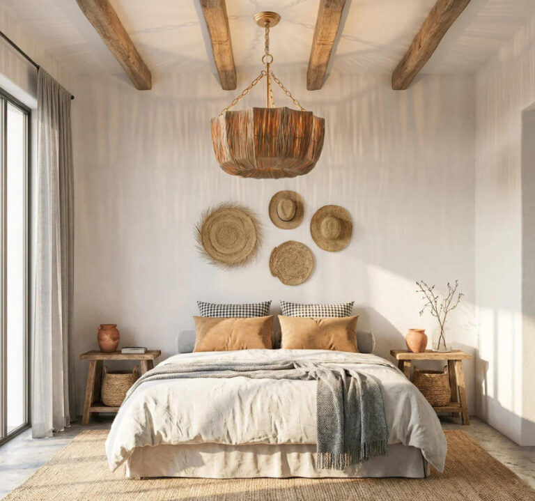
Warm and Earthy: A pale terracotta wall can style up tan and cream items, olive touches, complemented by natural woven products.
Neutral walls can set up a quiet backdrop, while deeper blue, green, or rust textiles can bring in bolder color in smallish doses.
A Simple Approach to a Palette Design Curation
Find the colors that will be difficult to change. Then, select a dominant color for the walls that pairs well with those elements.
Then, pick a secondary fabric color and one or two accent colors. Be cautious of adding patterns, and ensure their colors connect to the overall palette.
Get test paint samples next to fabric samples, and see how they change in different light. last, meander around the room and see where you can carry a select color over without matching everything exactly.
Final Thoughts
The interior palette works less on the basis of matching individual objects but rather about how they relate to one another. While Paint provides a broad visual foundation, Textiles introduce ink, color, pattern and texture while also providing flexibility.
Selecting these elements in tandem can elevate the most basic of rooms with a sense of completion. Stick with what you already have, create an overarching colour and secondary hierarchy, test in natural light, and use repetition to tie two or more parts of the room together.
The result is a color scheme that looks thought out (not “too” coordinated; one can totally have too much of a good thing) , something manageable and reasonably simple to make the space appear more livable and inviting.