How to Coordinate Living Room Paint with Carpets
Stepping into a beautifully designed living room brings an instant sense of comfort and style. The secret behind this structural harmony lies in matching your walls with your flooring choice. Creating a unified look makes the entire space feel much more inviting.
Finding the right paint color to coordinate living room paint with carpets is a fun, creative process. Balancing these two major design elements creates a welcoming space for your family to enjoy. A thoughtful combination serves as the foundation for your entire home design.
Start With The Rug First
Designing a beautiful room is much simpler when you establish a clear visual anchor early – starting with a solid foundation makes it easy to coordinate your wall paint. Many interior design experts prefer to choose the flooring before opening any paint cans.
Decorating a home starts from the ground up to create a balanced look. Selecting pieces from a high-quality living room rugs collection helps anchor the space and guides your paint choice. This cohesive base allows you to pick wall shades with confidence and ease.
Carpet fibers reflect natural light differently from flat drywall surfaces. By choosing the carpet beforehand, you avoid the headache of mismatched colors when the project wraps up. This simple order of operations sets up your design project for success from day 1.
Understand Your Carpet Undertones
Carpets are rarely a single pure color and often contain hidden underlying shades. A beige floor might look yellow or pink depending on the manufacturing batch. Recognizing these subtle tones prevents major painting mistakes before you buy your supplies.
Identifying these subtle base shades requires close inspection under different light sources. Look closely at the fabric under various lighting conditions throughout the morning and afternoon. Here are a few common undertones you might find in popular neutral carpets:
- Cool grey carpets with blue or purple hints
- Warm beige fibers with soft gold or peach hues
- Neutral tan flooring with subtle green backdrops
Matching warm paint with cool carpet undertones can make the room look chaotic and messy. Stick to the same temperature family to keep the look clean and intentional. A unified temperature creates a pleasing visual flow across the entire room.
Use The 60-30-10 Rule.
Decorators rely on a classic formula to balance interior spaces beautifully. This simple ratio divides your room colors into dominant, secondary, and accent categories. Following this guide prevents 1 single shade from overpowering your entire seating area.
Your walls typically represent the dominant 60 percent of the color in the room. The flooring acts as the secondary 30 percent of your overall palette. The remaining 10 percent belongs to small accents like throw pillows and books.
Applying this ratio guarantees your paint choice does not compete with the floor. If your carpet is bold, keep the walls neutral to maintain a peaceful atmosphere. This structured approach simplifies your decision-making when looking at hundreds of paint swatches.
Try Out Physical Samples In Your Space
Light behaves differently in a retail showroom compared to your actual living room. Testing products in your own environment is a key step in the decoration process. A carpet retailer suggested that just like you acquire carpet samples to see them in your home, you should bring home paint samples that you love.
Place these paint swatches directly against the carpet to see how they interact. Watch how the colors shift as natural sunlight moves through the space during the day. Swatches can look completely different at noon than they do under warm night lamps.
Paint large poster boards and move them around the room for several days. This trial period protects you from investing in gallons of a color you dislike. Testing your options first removes the guesswork and builds confidence in your final selection.
Play With Contrasting Values
Creating contrast keeps your living room from looking flat or completely boring. Value refers to how light or dark a specific color appears on a surface. Mixing light and dark tones brings depth and visual interest to your seating area.
Adjusting these values helps highlight your favorite furniture pieces. You can achieve different moods by changing the contrast level between your surfaces. Consider these straightforward styling paths for your next update:
- Light walls paired with deep dark carpeting for dramatic flair
- Dark, moody walls with a bright cream rug to lift the space
- Soft medium tones on both surfaces for a cozy cocoon effect
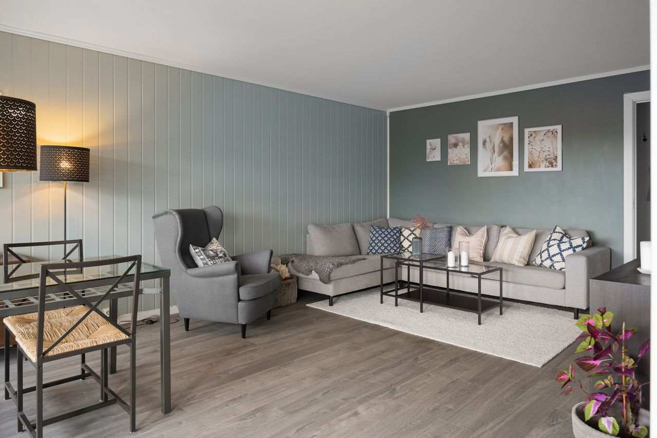
Avoid matching the exact shade of your carpet to your paint color. Doing this makes the room feel small and lack any clear definition. Contrast defines the boundaries of the room and makes your artwork stand out beautifully.
Select Neutrals For Ultimate Flexibility
Neutral tones offer a timeless look that adapts easily to changing styles. Shades like ivory, taupe, and soft grey never go out of fashion. They provide a calm backdrop that lets your personal decor take center stage.
Greige is a popular choice that blends warm beige with cool grey. This versatile shade matches almost any carpet texture or color you put down. It serves as a beautiful bridge between different wood tones and metal finishes in the room.
Choosing neutral paint allows you to swap out accessories easily over the years. You can update your seasonal blankets and pillows without needing to repaint. This flexibility saves valuable time and money as your personal tastes evolve.
Creating a beautiful living room is all about balance, testing, and patience. Taking the time to match your wall color with your floor pays off in the end.
With a few simple samples, you can transform your space into a cozy haven. Trust your personal eye and enjoy the process of building your perfect home.