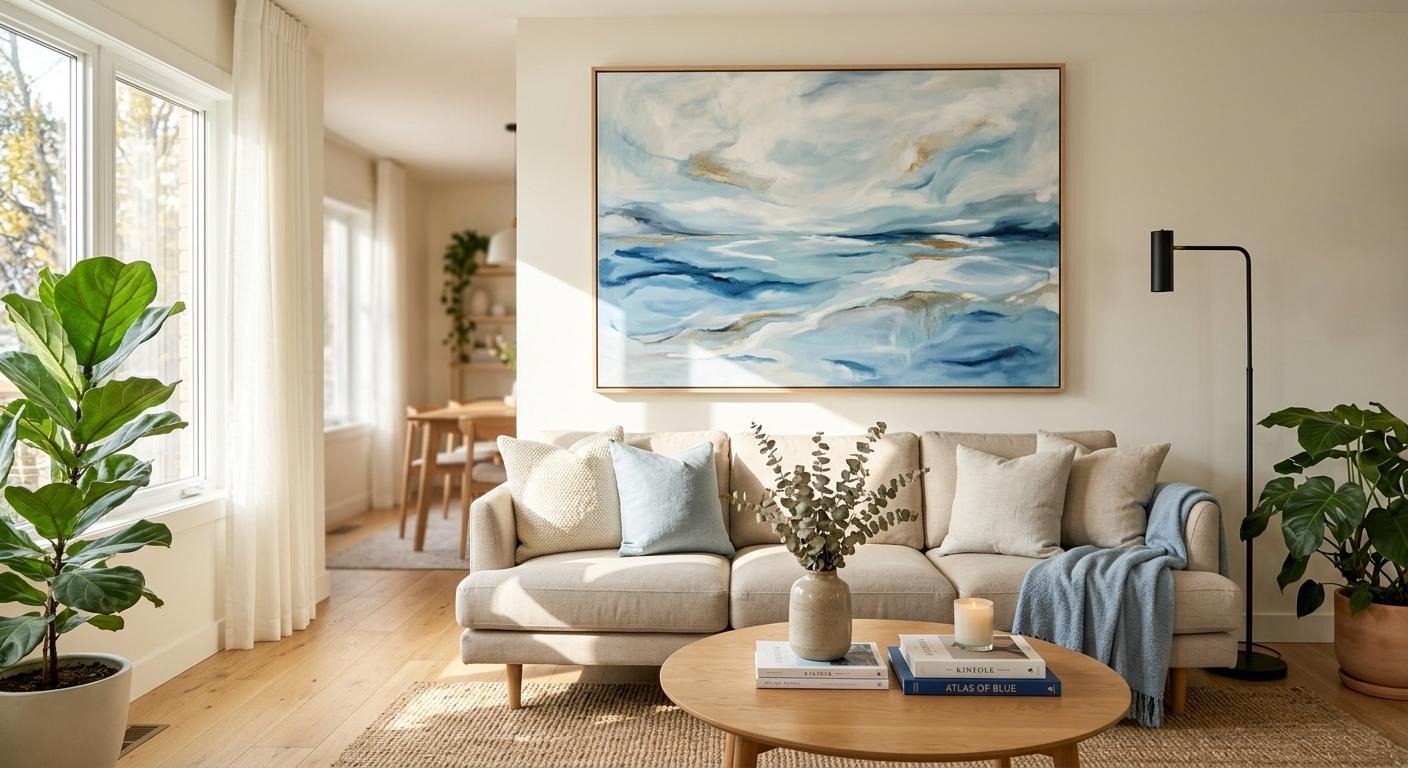
How to Use Wall Art to Set the Mood in Every Room
Most people choose wall art last. They pick the sofa first, then the rug, then the lamps, and whatever empty wall space remains gets filled with whatever’s available. It works well enough – but it misses what art actually does to a room.
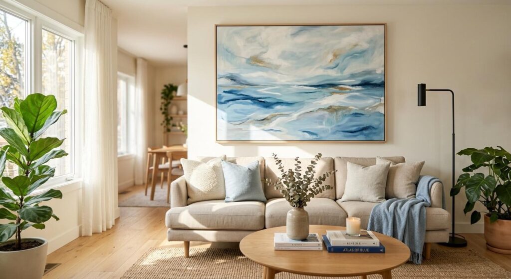
Wall art isn’t decoration in the passive sense. The colors, scale, and subject matter of what hangs on your walls directly shape how you feel in a space. That’s not a stylistic opinion – it’s grounded in color psychology research that interior designers have applied for decades. The global wall art market hit $63.61 billion in 2024, according to Fortune Business Insights, and it’s projected to reach $118.79 billion by 2032. People are investing more in their walls because they’re realizing they’re doing emotional work, whether they planned for it or not.
This is a practical room-by-room guide on How to Use Wall Art the intentional way: by deciding how you want a space to feel, then working backward from color.
Why Color Is the First Decision, Not the Last
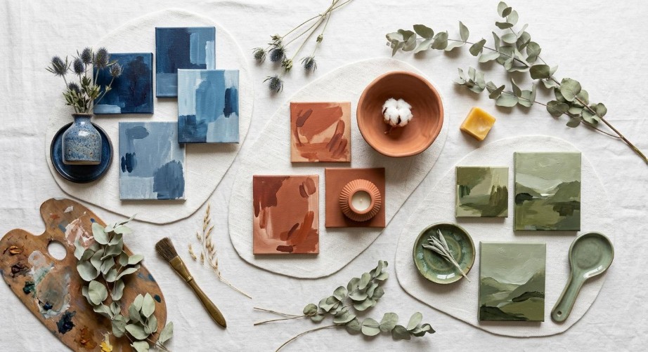
Choosing your wall art color before furniture selection keeps the room’s emotional tone consistent from the start.
Colors trigger predictable emotional responses. That’s not mystical – it’s physiological. Cool tones like blue and blue-green tend to lower perceived stress and promote focus, while warm tones like terracotta and amber feel energizing and social. Earthy neutrals and greens read as grounding and restorative. You already respond to these without thinking; the goal is to start thinking about them before you buy.
Research published in Nature’s Scientific Reports found that blue workspace walls generated the highest positive mood scores among tested colors. A separate University of Texas study found that blue-green combinations outperformed white and red for workplace productivity. These are workspace findings, but the mechanism carries to any room where you want people to feel settled and capable.
The Houzz 2025 Emerging Trends Report found that searches for cool-toned color palettes surged 206% year-over-year. That’s a huge shift, and it tracks with what interior designers are seeing in client requests: people want calm, not stimulation, from their homes right now.
For a low-commitment starting point, a blue artwork canvas lets you test the effect of cool tones in a room before committing to paint or new furniture. Hang it, live with it for a week, and see how the room feels. If it works – and for most neutral spaces it does – you build from there.
A useful guideline for introducing color through art without overwhelming a room is the 60-30-10 rule: 60% dominant neutral, 30% secondary tone, 10% accent. Art is the natural home for that 10% accent, which is why a single well-chosen piece punches well above its visual weight.
Room-by-Room Guide: Matching Art Colors to the Mood You Want
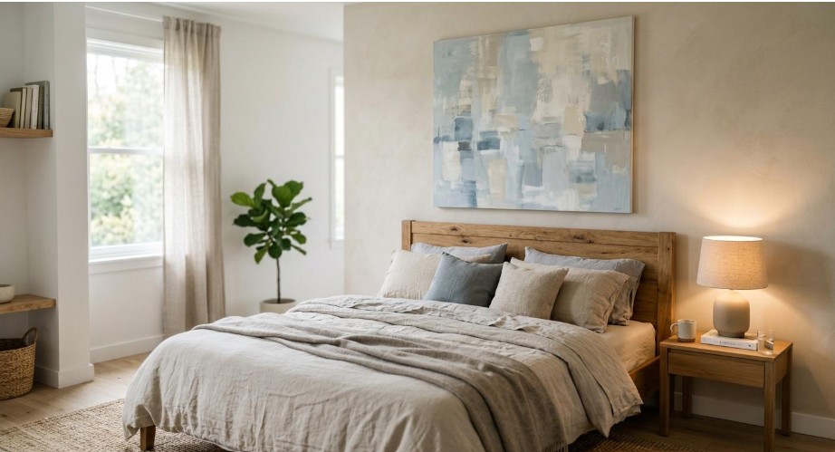
Swapping wall art color alone shifts a room from restful to energetic – no paint required.
Color psychology doesn’t apply uniformly across rooms because each room has a different job. Here’s how to think about each space.
Bedroom: Calm Over Everything
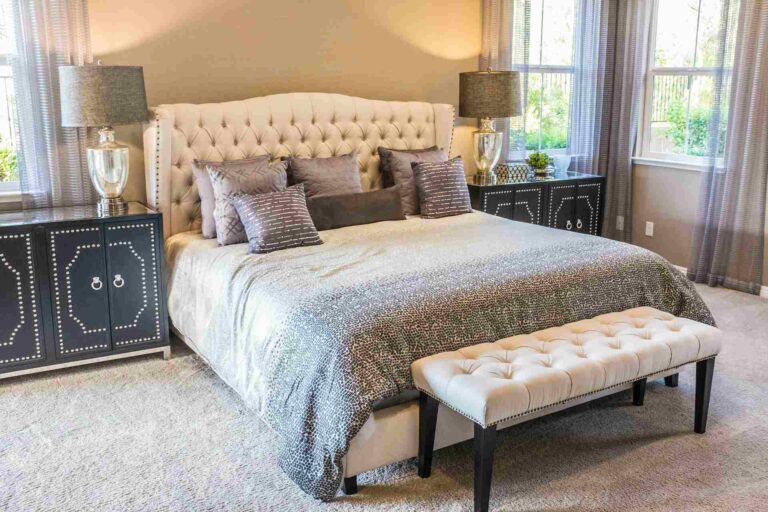
The bedroom should be the easiest room to art-shop for, because the goal is almost always the same: lower visual stress, support sleep, and keep the energy quiet. Blue and soft green canvases do this well. Busy abstract work in high contrast – the kind that looks great in a living room – tends to work against you here.
Zillow’s 2025 research found that navy blue bedrooms added an average of $1,815 to home sale prices. That’s a useful proxy for how strongly buyers respond emotionally to calm, cool bedroom tones.
For sizing above a headboard, the artwork should span roughly two-thirds of the bed’s width. Going narrower makes the piece look lost; going wider than the bed itself can feel oppressive.
Living Room: Energy and Conversation
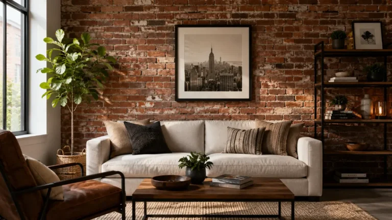
The living room tolerates – and benefits from – warmer tones and more dynamic compositions. This is where abstract art earns its keep. Larger pieces work especially well here; oversized statement canvases are a top 2026 trend according to Printful’s wall art trend report, and the visual logic makes sense: a single large piece reads more confidently than a cluster of small frames fighting for attention.
One practical guideline: the art center should sit at approximately 57 inches from the floor, which roughly matches average eye level while standing.
Home Office: Focus Without Rigidity
The University of Texas research mentioned earlier is directly applicable here. Blue-green combinations for your home office art aren’t just trendy – they give your brain visual rest without the disconnecting effect of a completely bare wall. Keep the composition relatively simple. Busy, chaotic abstract pieces compete with concentration rather than supporting it.
A single large-format piece outperforms a gallery wall in workspaces, where multiple competing focal points fragment attention.
Kitchen and Dining: Appetite and Warmth
Terracotta, warm amber, and botanical prints work well in eating spaces because they feel social and organic rather than corporate. Keep framing in mind in kitchens specifically – humidity and grease are real, and unprotected canvas in that environment won’t age well. Glass-fronted frames or proper canvas protection are worth thinking about before you hang anything near the stove.
How ambient lighting interacts with your art color matters more than people expect, particularly in kitchens and dining areas where the light temperature shifts throughout the day. The principles around lighting and living space apply directly to how the same canvas reads under warm versus cool bulbs.
Size, Scale, and Placement: Getting the Basics Right
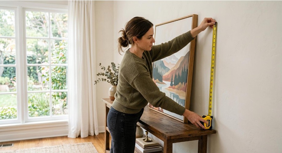
Measuring before you hang prevents the most common wall art mistake: pieces that look right in the store but feel wrong on the wall.
The most consistent mistake people make with wall art isn’t color – it’s scale. Pieces that look substantial in a store can disappear on a full-sized wall, particularly in rooms with high ceilings or large furniture.
A reliable guideline: art should occupy roughly 60-75% of the available empty wall space above a piece of furniture. If your sofa is eight feet wide, you’re looking for artwork that spans five to six feet, whether that’s a single large canvas or a grouped arrangement. Leave 8-10 inches between the bottom of the artwork and the top of the furniture below it.
For multi-panel or grouped arrangements, 2-4 inches between pieces keeps the grouping cohesive without crowding. Plan your arrangement on the floor before putting a single nail in the wall – photograph it, live with how the layout looks in the photo, then hang.
Gallery walls deserve their own note: they work best when there’s a consistent element tying the pieces together, whether that’s matching frames, a repeating color in each piece, or a consistent subject matter. Without that anchor, a gallery wall can read as clutter rather than curation.
Once your canvas pieces are hung, proper handling matters for the long term. If you’re rotating pieces seasonally or storing originals, storing your valuable art safely covers the practical side of canvas care and protection.
How to Build Around a Piece You Already Love
A lot of people come to wall art backward – they have one piece they’ve always loved, maybe something they’ve moved from apartment to apartment, and they don’t know how to make a whole room work with it. That’s actually the easier problem to solve.
Start with the art. Pull one or two accent colors from the piece and repeat them in smaller decor objects: a cushion, a lamp shade, a ceramic vase. You don’t need an exact match – a tone in the same family reads as intentional without looking like a kit room. If your canvas has cobalt in it and you bring in a deep blue cushion, the room looks considered.
One thing to avoid: matching the art to the wall color exactly. Contrast is what makes art readable on a wall. A canvas that blends into the background ceases to function as a focal point and becomes wallpaper. Some contrast – in tone, hue, or value – keeps the piece visually active.
When your artwork is doing the emotional heavy lifting in a room, let the surrounding decor stay quieter. Art that competes with a busy pattern in the rug, a bold wall color, and statement furniture tends to cancel everything out. The room that works is usually the one where one element is given permission to lead.
The color psychology framework from homedesigns.ai’s room-by-room guide is a useful reference if you want to go deeper on how specific hues interact with different room functions and natural light conditions.
Making It Personal: When Art Tells Your Story

Mixing custom-painted pieces with personal photographs creates a gallery wall that feels lived-in rather than catalog-perfect.
The biggest shift in wall art over the past few years isn’t a color trend or a style trend – it’s about ownership. People want walls that look like theirs, not a floor model at a furniture store. The 2025 wall art market report from Accio identifies personalization as the dominant consumer driver right now, and you can see it in how people are shopping: fewer generic prints, more custom pieces that connect to specific places, people, and moments.
One approach that’s grown sharply in popularity is to turn your photos into wall art using custom paint-by-numbers kits. You choose a photograph that means something – a place you’ve been, a person you love, a moment worth keeping – and work through the painting process yourself. The finished piece is hand-painted, which means no two are identical, and the act of making it adds a layer of meaning that a purchased print can’t replicate.
There’s also a sustainability dimension worth mentioning. According to Accio’s 2025 data, 83% of consumers say they’ll actively choose brands with better sustainability records. Handcrafted and custom art fits that preference naturally – you’re not contributing to mass-produced print runs, and you end up with something that lasts.
For those thinking about the broader choices behind what goes on their walls, making eco-conscious choices in your renovation offers a wider perspective on sustainable decision-making in home improvement.
The practical benefit of personalizing your art is straightforward: when you look at your walls and recognize the places and people in them, the room feels like yours. That emotional return is something a trend-driven print simply can’t deliver.
Start With One Wall
You don’t need to approach this as a whole-house project. Pick one room, pick one wall, and decide deliberately how you want that space to feel. Then choose art that supports that intention rather than filling the gap.
Most people find that one intentional choice changes how they think about everything else in the room. It’s a different experience from shopping for something that fits a color scheme or matches the furniture. Start with the feeling you want, work backward through color, then find art that does that work. The rest tends to follow.