
What colors make white? In light, pure white appears when red, green, and blue light are combined at full intensity. On a computer screen or stage, these three colors overlap perfectly to create that bright, neutral glow our eyes recognize as white. In paint, however, it’s a different story — you can’t mix other colors to get pure white.
Instead, artists rely on pigments like titanium dioxide or zinc oxide as a base. In printing, white isn’t even “made” at all; it’s usually just the paper showing through.
But here’s where it gets interesting — the way we perceive white changes with the medium, lighting, and even the colors around it.
In this guide, you’ll learn why white works differently in light and pigment, how it’s created in digital and print formats, and how to mix stunning shades of white that bring depth and beauty to your art or design.
What Two Colors Make White?
The answer depends entirely on whether you’re talking about light or pigment.
- In light: Yes, some pairs of complementary colors can create white. For example, magenta light paired with green light can appear white to our eyes.
MAGENTA LIGHT + GREEN LIGHT = WHITE
- In pigment: No — if you mix two paint colors, you won’t get white unless one of them is already white paint.
- In printing: No — you can’t mix inks to get white unless you’re using a specialty white ink.
It’s important to remember that light mixing and pigment mixing are opposites. In light, adding more colors brightens the result. In paint, adding more colors darkens it.
What Three Colors Make White?
Here’s where the difference between light and pigment is clearest.
- In light (additive): Absolutely. Equal amounts of red, green, and blue light make pure white. This is how every digital screen works.
RED + GREEN + BLUE = WHITE
- In pigment (subtractive): No. Mixing three paint colors usually results in a dark neutral, not white, because each pigment absorbs more wavelengths of light.
- In printing (CMYK): Also no. White is still the paper itself, not the result of mixing cyan, magenta, and yellow inks.
So three colors can make white — but only in a medium where colors are made of light.

Shades of White and How to Make Them
White isn’t just one flat color — it’s a whole family of shades with subtle undertones that can change the mood of a space or design. In paint, all shades of white begin with pure white pigment (like titanium dioxide). You then add the tiniest hint of another color to create the undertone. Always add color gradually, because even one extra drop can overpower the white.
Here’s how to create popular shades of white in both paint and digital formats:
Pure White (#FFFFFF) = white only
Ivory (#FFFFF0) = white + tiny drop yellow
Snow (#FFFAFA) = white + tiny drop blue
Cream (#FFFDD0) = white + yellow ochre + hint burnt sienna
Antique White (#FAEBD7) = white + raw umber + yellow ochre
Eggshell (#F0EAD6) = white + yellow ochre + tiny hint gray
Alabaster (#F2F0E6) = white + tiny drop neutral gray
Pearl White (#F8F6F0) = white + warm beige + pearlescent medium
Chalk White (#F5F5F5) = white + tiny drop cool gray

The Theory of White: Light vs. Pigment
Color theory changes completely depending on the medium.
In the additive color model, used for things that give off light like screens or stage spotlights, the primary colors are red, green, and blue. When all three are shining at full brightness, you see pure white. Adding more colors here makes the light brighter.
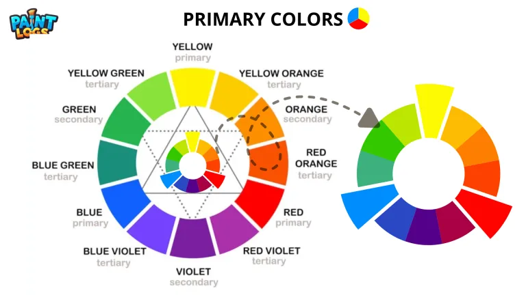
In the subtractive color model, used for paint, dyes, and inks, colors are created by mixing pigments that absorb (or subtract) certain wavelengths of light. The traditional artist’s primaries are red, yellow, and blue. Printing uses cyan, magenta, and yellow.
The key difference?
- Additive mixing (light) can make white by combining colors.
- Subtractive mixing (pigment) can’t — white must already be present as a base.

White in Light: The RGB Additive Model
Think about sunlight streaming through a window. It looks white to your eyes, but if you pass it through a prism, it splits into all the colors of the rainbow. That’s because white light is actually made up of every visible wavelength.
The human eye sees white when all three types of color-sensitive cone cells — the ones tuned to red, green, and blue — are stimulated equally. That’s exactly what happens in the RGB system:
Red light + Green light + Blue light = White light
If you’ve ever looked closely at a phone screen, you might have noticed that each pixel is actually three tiny dots: one red, one green, and one blue. When they’re all lit at full brightness, the pixel looks white. Stage lighting works the same way — three colored beams overlapping can make a single bright white spot.

Two-Color White in Light
Although RGB mixing is the standard, you don’t always need three light sources to make white. Certain complementary light pairs can do the job too.
For example:
- Cyan and red light together can create white.
- Magenta and green can as well.
- Even yellow and blue in light (not paint!) can mix to white under the right conditions.
These combinations work because each pair contains the wavelengths that fill in the missing primary, giving your eyes the same balanced stimulation they get from full RGB light. But there’s a catch — if one light is brighter than the other, the white will shift toward that color.
White Without Light: The Subtractive Model
In the world of paint and pigments, white works very differently. Pigments don’t emit light; they reflect some wavelengths and absorb others. The more pigments you mix, the more wavelengths get absorbed, and the result gets darker.
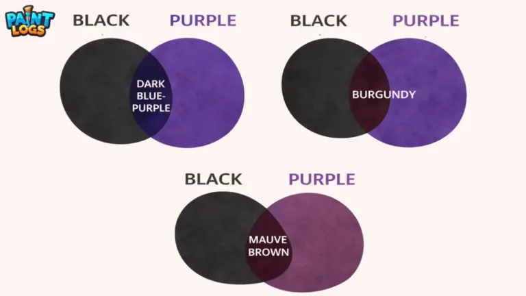
That’s why mixing colors in paint will never give you pure white — in fact, the more you mix, the more you move toward a muddy brown or gray.
Instead, white in pigment form comes from special materials. Artists often use titanium white (bright and opaque) or zinc white (softer and more transparent). These aren’t made by mixing colors but are mined or manufactured pigments that already have a white appearance.
Once you have a white pigment, you can create tints by adding small amounts of other colors — but you can’t go the other way and “mix” your way back to pure white.

White in Printing: The CMYK Model
When you look at a printed magazine or flyer, the white areas aren’t made by mixing ink at all — they’re just the natural color of the paper showing through.
Printing uses the CMYK color model: cyan, magenta, yellow, and black inks. By layering these colors in tiny dots, printers can create almost any shade. But white works differently — there’s no “white ink” in standard printing. Instead, the printer simply leaves those spots unprinted.
In specialty printing (like on colored paper or dark materials), a separate white ink can be used. This white is still pigment-based, made from titanium dioxide or another bright white pigment, and it’s applied like any other ink layer.
So in CMYK, white isn’t made — it’s either already there in the material or added with a special pigment layer.
Digital White: RGB, Hex, and Brightness
In the digital world, white isn’t subjective — it’s defined by numbers.
In the RGB model, pure white is represented by the maximum value of each channel:
- Red: 255
- Green: 255
- Blue: 255
In web design, the same white is written as a hex code: #FFFFFF.
From here, you can create different “temperatures” of white. Adding a touch more red and green creates a warm white with a slightly yellow glow (#FFF8E7). Boosting blue gives you a cool white with a hint of icy tone (#F0F8FF).
Because digital color is based on light, these values guarantee consistency — the white you see on your screen is the result of all three primaries at full brightness.

Off-Whites and White Tints in Paint
In paint, even though you can’t create pure white from scratch, you can start with a white base and change its character by adding very small amounts of other colors. These variations are called tints or off-whites.
A warm white can be made by adding a touch of yellow ochre or raw sienna to white paint, giving it a creamy, inviting tone. A cool white might have just the faintest touch of ultramarine blue, which creates a cleaner, more crisp look. You can even make subtle pink-tinged whites with a hint of permanent rose or light beige tones with a dab of burnt umber.
The key is moderation — with white tints, a single extra drop of pigment can completely change the feel. Artists often mix off-whites intentionally to avoid the stark, almost blinding quality of pure titanium white, especially in naturalistic paintings and interior design.
Human Perception and White Balance
White isn’t just about pigment or light — it’s also about how our eyes and brains interpret color. What looks white in one setting might look yellow or blue in another. This is because of white balance — the way our eyes (or a camera) adjust to different lighting conditions.
Under warm indoor lighting, pure white may look creamier. Under daylight, it may look cooler and bluer. Photographers and filmmakers often adjust white balance so that whites appear neutral no matter the light source. Painters use a similar principle when choosing warm or cool whites depending on the atmosphere they want to create in a scene.
This means that “white” is not a fixed experience — it’s influenced by the colors around it, the lighting, and even your own perception.
Common Myths About White
There are a few persistent misunderstandings about making white:
- “Mixing all colors makes white.” True in light, false in paint. In pigment, mixing all colors creates a dark, muddy tone.
- “Two colors can make white paint.” Not unless one of them is already white.
- “You can lighten a color back to pure white.” Once you’ve added pigment to white paint, you can lighten it with more white, but you can’t return it to pure white.
- “White is always the same.” Not true — lighting conditions, surroundings, and undertones can make one white look completely different from another.
Understanding these myths helps avoid frustration, especially for beginners trying to mix colors for the first time.
Quick Reference Table: How White Is Made in Different Mediums
Here’s a simple comparison to see at a glance how white works in light, paint, printing, and digital design:
| Medium | Color Model | How White Is Made | Example |
|---|---|---|---|
| Light | Additive (RGB) | Red + Green + Blue light at full intensity | TV pixels, stage lights |
| Paint | Subtractive (RYB) | Only with white pigment (e.g., titanium white) | Acrylic or oil painting |
| Printing | CMYK | Paper’s color showing (no ink applied) | Magazine page |
| Digital Art | RGB/Hex | (255,255,255) / #FFFFFF | Website background |
| Specialty Printing | CMYK + White Ink | White pigment ink layer on colored paper | Packaging design |
This table makes one thing clear — the way you create white depends entirely on the medium you’re using.
Applying The Knowledge Of White Color in Art and Design
Knowing the difference between additive and subtractive mixing can save you a lot of time (and materials).
If you’re painting, remember that you can’t “mix” white from other colors. Keep a high-quality white pigment on hand and learn to create off-whites for realism.
If you’re working with light, such as photography or stage design, you can create white by balancing red, green, and blue light sources or using complementary pairs.
If you’re designing digitally, stick to RGB values or hex codes for precise whites, and adjust them warmer or cooler to fit the mood.
And if you’re printing, plan for white as the base material unless you’re using a special white ink process.

Why White Matters
White might seem like the absence of color, but in many ways, it’s the most important color in an artist’s toolkit. It creates contrast, gives breathing room in a composition, and acts as a foundation for other colors to shine.
In light-based art, white can be the climax of brightness. In painting, it can bring highlights to life. In design, it can make layouts feel clean and minimal. And in printing, it’s often the default “canvas” everything else rests on.
Conclusion
The answer to “What colors make white?” is simple in theory but complex in practice. In light, it’s the combination of all colors. In paint, it’s the absence of color and only comes from a white pigment. In printing, it’s usually just the paper. And in digital design, it’s a specific set of RGB or hex values.
Understanding how white works in each medium allows you to control it better — whether you’re mixing paints, setting up stage lighting, designing for print, or creating digital art.
White may not be the flashiest color, but it’s the one that quietly shapes how all other colors are seen. Master it, and your work will instantly look more professional and intentional.
FAQs
Which two colors make white?
In light, complementary pairs like magenta and green can make white. In paint, no two colors make pure white.
What three colors make white?
In light, red, green, and blue at full brightness make white.
Can blue, green, and red make white?
Yes — in light, these three create white when balanced equally.
How is white made in printing?
White is usually the paper showing through; special white ink can be used on colored materials.
Can you mix all colors to get white?
Yes in light, but in paint it creates a dark, muddy color instead.
What RGB values make white?
White is RGB (255, 255, 255) or hex code #FFFFFF.
What is the best white paint for artists?
Titanium white for opaque coverage, zinc white for softer effects.