Flower Window Box Ideas That Complement Your Paint Colors
Your window box is a design decision that can either pull your home’s exterior together or quietly throw it off. Most people pick flowers they love in the nursery, bring them home, and wonder why something feels slightly off.
The wall color was already part of the equation all along, and most people just don’t realize it. Scroll down for fresh flower window box ideas that actually work with your paint, not against it.
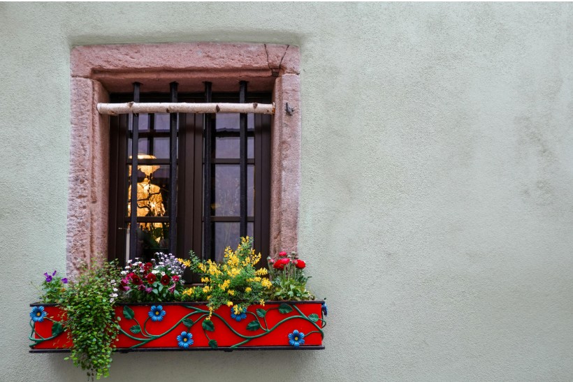
Warm-Toned Walls
Terracotta, burnt sienna, and creamy yellow exteriors all fall into the warm category, but they don’t all want the same flowers.
- Terracotta or red walls: Go adjacent on the color wheel. Marigolds, burnt-orange zinnias, and deep burgundy dahlias create a rich, sun-baked look without clashing.
- Butter or creamy yellow walls: Cool things down slightly. White alyssum, pale blush geraniums, or soft lavender keep the facade from feeling too heavy. Avoid bright yellows in the box, though. Everything will blur together.
- Copper or burnt sienna walls: Chocolate cosmos and smoky purple verbena work beautifully here. Add dusty miller as a foliage filler. The silver acts as a visual separator between the wall and your blooms.
Plenty of homeowners have already tried these warm-toned pairings with great results. Browsing real flower window box ideas and pictures from actual customers can give you a clearer sense of what works on a real facade. Seeing them on PVC window boxes, which won’t rot or warp, makes the inspiration even more practical.
When in doubt with warm walls, think about contrast in temperature rather than contrast in brightness. A slightly cooler bloom against a warm wall tends to look polished, while matching warmth to warmth can easily tip over into being overwhelming.
Cool-Toned Walls
Cool walls give you more flexibility than you’d think, but the wrong flower colors can make the whole facade feel cold.
- Pale grey or slate-blue walls: Jewel tones are your best friend. Deep violet salvia, magenta petunias, or cobalt lobelia echo the blue undertones in the paint without fighting them.
- Navy or deep blue exteriors: Keep it light. White million bells, or trailing bacopa, prevent visual heaviness. A single pop of lemon yellow works well, too, but don’t overdo it.
- Sage green or olive walls: More green in the box risks monotony. Warm up the facade instead with coral impatiens, peachy begonias, or terracotta-toned calibrachoa.
The common thread with cool-toned walls is that they reward intentional contrast. A window garden with warm or saturated blooms keeps the exterior from reading as flat or uninviting.
Neutral and White Walls
Neutral walls sound easy, but they’re actually where most window box mistakes happen.
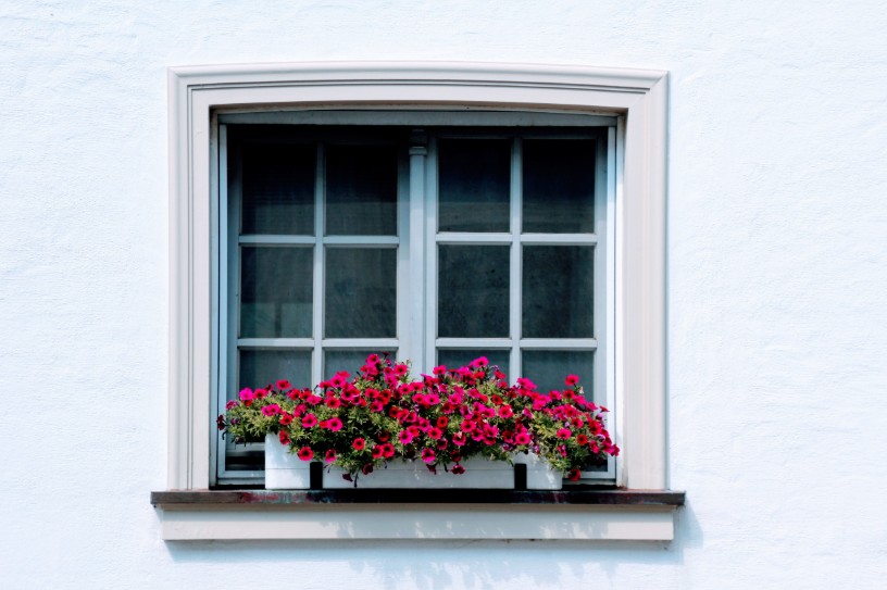
Bright white walls are unforgiving. A timid flower palette will look washed out against all that white. Go bold with red geraniums, vivid fuchsia, or deep purple heliotrope. Anchor everything with hanging foliage, like black sweet potato vines.
Greige and warm beige walls respond better to dusty, muted tones than bright primaries. Dusty-rose dianthus, soft-peach trailing petunias, and silver foliage look intentional on a beige exterior. Bright colors tend to look accidental on these walls.
Charcoal or dark grey walls flip the usual logic entirely. Light and airy plantings work best. Try white blooms with chartreuse sweet potato vines or pale yellow snapdragons for contrast without competition.
Don’t Ignore the Trim
Most flower window box ideas only talk about wall color. But the trim sits closest to the box, making it just as important.
White Trim
The most forgiving option. Your window planter box can echo the wall color, contrast it, or go in a completely different direction.
Black or Dark Trim
Dark trim frames the window box like a painting. Even simple plantings look curated. Pair white or cream blooms for a high-contrast effect, or go with jewel tones for drama.
Colored Trim
When the trim is green, navy, or red, it becomes part of the color equation too. Pull one accent color from the trim and repeat it in the blooms. That repetition creates cohesion instead of chaos.
The Box Itself Matters
The container is the third color in the mix, right alongside the wall and the flowers.
Unpainted wood or cedar adds warmth and texture. It suits container gardens with a cottage-inspired arrangement and complements warm-toned walls especially well. White or painted boxes that match the trim create a built-in, seamless look where the flowers become the only visual variable.
Matte black boxes are underused but incredibly effective on light walls. They make any planting feel modern and deliberate, whether the blooms are vivid or pastel.
Terracotta-colored boxes can bridge a warm wall to a warm palette, but be careful. If the wall already has strong orange or red undertones, the box might tip the whole exterior into sensory overload.
Conclusion
Good flower window box ideas start at the paint store, not the nursery. Before picking a single stem, take a photo of your exterior or bring a paint chip with you when shopping for plants. It’s a small step that makes a surprisingly big difference. Beautiful window boxes look expensive and intentional because every element, from the container to the blooms, feels like it was chosen with the wall in mind.