Quick Answer
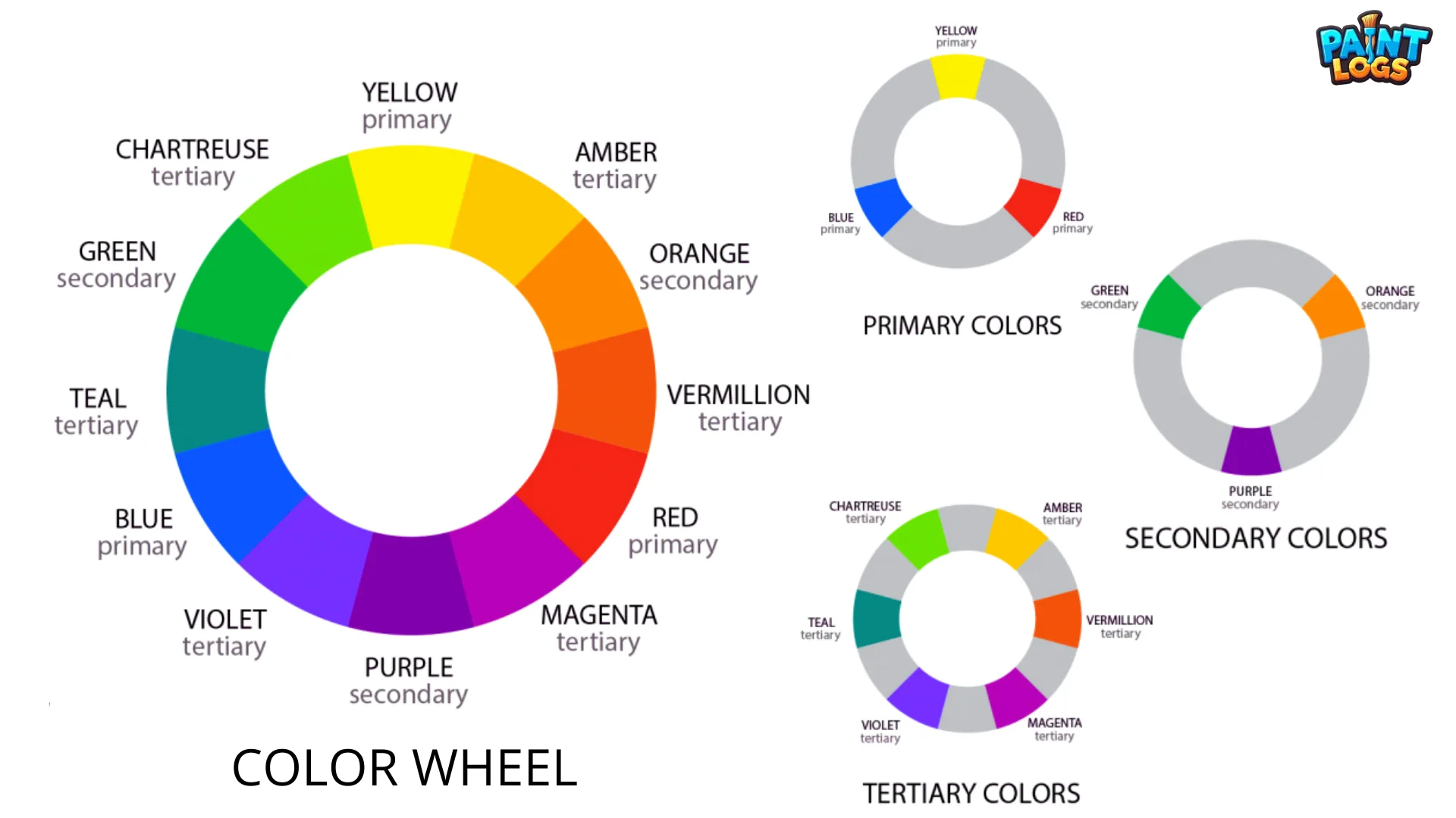
The color wheel is a circular chart that organizes colors by their visual and mixing relationships. The traditional RYB color wheel, used in painting and art, contains three primary colors (red, yellow, blue), three secondary colors (orange, green, purple), and six tertiary colors (red-orange, yellow-orange, yellow-green, blue-green, blue-purple, red-purple).
In modern applications, the RGB wheel is used for digital screens, while the CMYK wheel is used in printing. Regardless of the system, the color wheel shows how colors mix, contrast, and harmonize.
Introduction: Why the Color Wheel Matters
The color wheel has been a central tool in art and design for centuries. It was first introduced by Isaac Newton in 1666, who mapped colors into a circle to show their natural relationships. Since then, artists, scientists, and designers have refined the wheel to suit different mediums.
At first glance, the wheel may look like a simple rainbow arranged in a circle. But in practice, it is a visual roadmap for anyone working with color. It explains why red and green clash or attract, why blue and yellow feel balanced, and why some palettes feel harmonious while others feel chaotic.
In painting, the wheel allows artists to predict how colors will mix on the palette or canvas. In design, it helps create palettes that look professional and consistent. In everyday life, interior decorators, fashion stylists, and even marketing experts use the wheel to influence mood and perception.
The Basic RYB Color Wheel
The RYB color wheel is the version most people encounter first, especially in school art classes or painting studios. It is built from:
- Primary colors: red, yellow, blue
- Secondary colors: orange, green, purple
- Tertiary colors: red-orange, yellow-orange, yellow-green, blue-green, blue-purple, red-purple
Primary Colors
Primary colors are the foundation because they cannot be made by mixing other hues. In the RYB system, these are red, yellow, and blue. When mixed in different combinations, they give rise to every other color on the wheel.
Secondary Colors
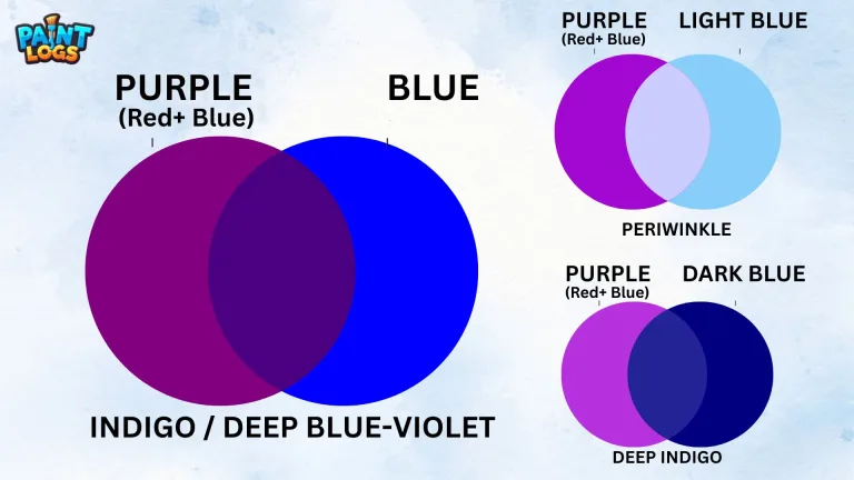
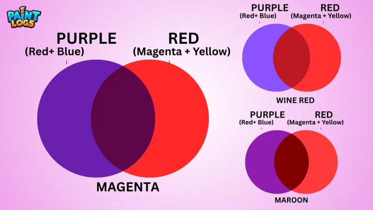
Secondary colors are created when two primaries are combined. Red and yellow create orange, yellow and blue make green, and red and blue blend into purple. They sit directly between their parent primaries on the wheel.
Tertiary Colors
Tertiary colors come from mixing a primary with its neighboring secondary. This creates six “in-between” hues: red-orange, yellow-orange, yellow-green, blue-green, blue-purple, and red-purple. These tones are essential for natural-looking palettes, since most colors in the real world fall between the boldness of primaries and secondaries.
The RYB wheel is often called the artist’s color wheel, and it remains the most practical for painters, illustrators, and anyone working with pigment.
Other Types of Color Wheels
Although the RYB wheel is the most traditional, modern technology introduced two other major systems: RGB for screens and CMYK for printing.
The RGB Color Wheel (Additive Mixing)
The RGB color wheel is based on light. Its primaries are red, green, and blue. When light mixes additively, the result is brighter.
For example, red and green light combine to make yellow, green and blue create cyan, and red and blue form magenta. When all three RGB primaries are combined at full strength, they produce white light.
This model explains how televisions, monitors, cameras, and digital design software display color. Designers working in web and UI design rely on the RGB wheel to ensure colors appear correctly on screens.
The CMYK Color Wheel (Subtractive Mixing)
The CMYK color wheel is used in printing. Its primaries are cyan, magenta, and yellow, with black (K) added for depth and contrast. Unlike RGB, this model is subtractive. Instead of adding light, you are layering inks that absorb wavelengths.
Mixing cyan and yellow makes green, magenta and yellow create red, and cyan with magenta produces blue. When all three are combined, the result is a muddy neutral that becomes black with the addition of the K channel.
Printers, packaging designers, and anyone preparing digital art for print must understand CMYK. Otherwise, a design that looks bright on a screen may appear dull once printed.
Warm and Cool Colors on the Wheel
The wheel also divides into warm and cool colors, which dramatically affect mood and perception.
Warm Colors
The warm side runs from red through orange to yellow. Warm colors are often associated with energy, heat, sunlight, and excitement. They feel bold and stimulating, making them effective in advertising, food packaging, and spaces where activity is encouraged.
Cool Colors
The cool side includes greens, blues, and purples. These colors are linked to water, sky, calmness, and stability. They are relaxing and often used in healthcare, tech branding, or interior spaces where focus and calm are needed.
The warm–cool divide is one of the most practical takeaways from the wheel. By choosing one side over the other, you can instantly set the tone of a painting, a design, or even a living room.
Color Harmonies and Schemes
One of the most powerful uses of the color wheel is in creating color harmonies—combinations that look pleasing to the eye.
Complementary Colors
Complementary colors sit opposite each other on the wheel. Examples include red and green, blue and orange, or yellow and purple. They create the strongest contrast and can be used to grab attention or balance each other in a design.
Analogous Colors
Analogous colors are neighbors on the wheel. A scheme of blue, blue-green, and green feels natural and harmonious because the hues share undertones.
Triadic Schemes
Triadic schemes are built by selecting three colors evenly spaced on the wheel, such as red, yellow, and blue. These palettes are vibrant and balanced, making them popular in logos and brand identities.
Tetradic and Split-Complementary Schemes
More advanced schemes include tetradic palettes (two pairs of complements forming a rectangle) and split-complementary palettes, where a color is paired with the two hues on either side of its complement. These provide variety while maintaining harmony.
By understanding these relationships, you can design palettes that feel intentional rather than accidental.
Additive vs Subtractive Mixing
A common source of confusion comes when colors mix differently in paint versus screens. This is explained by additive and subtractive mixing.
In additive mixing (RGB), adding more light produces brighter colors, and combining all primaries results in white. In subtractive mixing (RYB and CMYK), adding more pigment absorbs more light, and combining all primaries leads to black or muddy tones.
This explains why a bright red and green make brown on a palette but produce yellow on a screen. Understanding this difference is essential for artists moving between mediums.
Practical Uses of the Color Wheel
The color wheel is applied daily across creative fields. Painters use it to control mixing and avoid muddy results. Graphic designers use it to build balanced palettes for branding and websites. Interior designers apply it to create harmony in rooms, balancing warm and cool tones.
Fashion stylists rely on it to put together outfits that are bold yet cohesive. Even marketers use complementary and analogous schemes to influence consumer emotions.
By using the wheel, choices become predictable and consistent. Instead of guessing whether purple and yellow will clash, you can see they complement each other. Instead of wondering why green feels calming, the wheel shows its cool placement between blue and yellow.
Simple Activity: Make Your Own Color Wheel
The most effective way to learn the wheel is to make one yourself. Start with red, yellow, and blue spaced evenly in a circle. Mix them to create secondaries: orange, green, and purple. Then, mix tertiaries like yellow-green or red-purple to fill the gaps.
When finished, you will have a 12-color wheel that mirrors the traditional artist’s wheel. Doing this by hand reinforces the theory—you see how colors naturally connect, and how tertiaries bridge primaries and secondaries.
Conclusion
The color wheel is the foundation of color theory and practice. The RYB wheel organizes paint pigments into primaries, secondaries, and tertiaries. The RGB wheel applies to digital screens, while the CMYK wheel governs printing.
Beyond mixing, the wheel explains warm and cool divisions, guides harmonious color schemes, and ensures balance and contrast in any creative work.
By mastering the wheel, artists and designers can work with color intentionally. From realistic paintings to bold brand logos, from calming interiors to striking advertisements, the wheel remains the most powerful visual tool for color.
FAQs About the Color Wheel
What is the color wheel used for?
It helps visualize color relationships for mixing and harmony.
Who created the color wheel?
The first version was created by Isaac Newton in 1666.
How many colors are on the traditional wheel?
The RYB wheel has 12 colors: 3 primaries, 3 secondaries, and 6 tertiaries.
What’s the difference between RYB, RGB, and CMYK wheels?
RYB is for paint, RGB for light and screens, CMYK for ink and printing.
Why is the color wheel important in design?
It ensures balanced palettes, guiding designers toward complementary, analogous, or triadic schemes.