
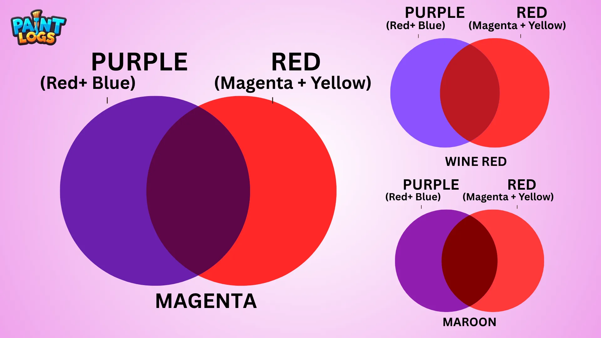
What Do Red and Purple Make When Mixed? When red and purple are mixed, the result is often a rich, dramatic blend—think burgundy, maroon, or deep magenta. These colors sit close together on the color wheel, so their combination creates a smooth, harmonious transition that leans toward the red-violet or wine family. But the final shade depends on the specific hues you use—scarlet vs. crimson, lilac vs. plum—and how much of each is added.
In this complete color mixing guide, we’ll explore what color red and purple make, how to shift the results using other colors like pink or yellow, and how this combination works in both traditional paint and digital design. Whether you’re mixing acrylics, experimenting with RGB on screen, or creating a color palette for art or decor, this guide will help you understand every variation red and purple can produce.
Let’s break it down and see what shades are possible when red and purple come together.

Quick Answer: What Do Red and Purple Make When Mixed?
When you mix red and purple, you usually get a deep reddish-violet—a shade that sits somewhere between burgundy, plum, and maroon depending on the balance of pigments. If you use more red, the mix leans toward rich crimson or wine red. If purple dominates, it may shift into eggplant or dark magenta tones.
This color blend works beautifully in painting, fashion, makeup, and interior design because of its bold and moody feel.
Quick tip: Red is a primary color, and purple is a secondary color (red + blue). So adding red to purple strengthens the red bias, giving you a warmer, more intense hue.
🔻 Common results: burgundy, plum, wine red, deep mauve

Why Do Red and Purple Make This Color?
To understand the result, let’s break it down: Red is a primary color in the RYB color model, while purple is a secondary color, made by mixing red and blue.
When you mix red and purple:
- You’re essentially adding more red to a red-blue combo.
- This shifts the color closer to red-violet (a tertiary color).
- The more red you use, the more the purple becomes muted and earthy.
Temperature also plays a role. Cool reds (like crimson) mixed with blue-heavy purples can lead to richer plums or berry tones, while warm reds (like scarlet) can give you shades closer to maroon or claret.
This is why the resulting shade always sits in that wine-hued, moody middle zone.
What Happens When You Mix Different Shades of Red and Purple?
Not all reds and purples are created equal. Here’s what happens when you mix specific shades together:
| Red Shade | Purple Shade | Mixed Color Result | Description |
|---|---|---|---|
| Scarlet Red | Lilac | Rosy Mauve | Light, floral tone |
| Crimson | Violet | Burgundy | Deep, wine-like red |
| Rose Red | Lavender | Dusty Pink-Violet | Soft, muted and vintage |
| Cherry Red | Plum Purple | Maroon | Rich, dramatic earth tone |
| Tomato Red | Royal Purple | Warm Eggplant | Moody, bold, warm |
This table shows how the outcome shifts depending on the lightness or darkness of both base colors. Lighter purples (like lilac or lavender) will soften the red, while darker purples (like plum or royal) will deepen it.
🎨 Want to explore more blends? Don’t miss What Colors Make Purple and What Colors Make Red.

Red and Purple in Paint: RYB Color Model Results
In traditional painting, we use the RYB (Red, Yellow, Blue) color model—especially in acrylics, watercolors, and gouache. When mixing red and purple in this system, the result is a red-violet or burgundy-like tone.
Here’s how to mix it smoothly on your palette:
- Start with purple (e.g., dioxazine or cobalt violet).
- Gradually add in small amounts of red (e.g., cadmium or alizarin crimson).
- Blend well to avoid streaks or muddying.
Acrylic artists often use this blend for dramatic shadows or florals.
Watercolorists might water it down to make soft mauves or rosy neutrals.
Tip: Always test on a scrap surface first—pigments can behave differently depending on brand or binder.
Digital vs. Traditional: Mixing in RGB & CMYK
In digital art, the results of mixing red and purple differ significantly from paint. On screens, we use the RGB color model (red, green, blue), where blending colors involves light, not pigment. When red and purple (which already contains blue and red) are combined in RGB, the result often shifts toward magenta or fuchsia, depending on brightness levels.
In contrast, the CMYK model (cyan, magenta, yellow, black), used in printing, produces deeper berry or wine-like tones when red and purple are mixed. Since CMYK ink works subtractively like paint, you get closer to burgundy, claret, or mulberry—especially if using more cyan-heavy purples.
These differences are important for graphic designers, digital painters, and printers who want color consistency across mediums. What looks like a rich burgundy in gouache might appear more neon-like or pinkish when created digitally.

How Red + Purple Work in Color Theory
In color theory, red and purple sit close to each other on the color wheel. Red is a primary color, while purple is a secondary color made by combining red and blue. When you mix them, you’re creating a tertiary color known as red-violet.
Red-violet is often described as a warm, passionate, and intense color. It’s found in everything from royal robes to rose petals. Because this color is made from two adjacent hues on the wheel, it’s classified as an analogous combination—ideal for creating rich, harmonious designs.
This blend doesn’t clash the way complementary colors do. Instead, it deepens into layered, sophisticated shades, perfect for moody art pieces, romantic designs, or expressive fashion palettes.
Understanding how this red-purple pairing behaves in color theory helps artists and designers make intentional, impactful color choices.

Artistic Uses of Red and Purple Together
Red and purple used together create powerful emotional responses in artwork and design. These colors share intensity but contrast in meaning—red suggests passion, power, and energy, while purple conveys mystery, luxury, and creativity. Together, they create tension and elegance.
In fine art, this duo is often used to add drama to floral compositions, abstract backgrounds, or surreal portraits. In interior design, red and purple are paired in bohemian, gothic, or maximalist spaces where bold expression is key.
Fashion designers frequently combine wine reds and plum purples in fall and winter collections for their richness and depth. Even in makeup, red lips with purple eyeshadow create a bold, editorial look.
Real-life inspiration includes orchids, pomegranates, red grapes, sunsets, and precious stones like garnet and amethyst—all examples of how red and purple naturally harmonize.

How to Adjust the Mix: Add White, Black, or Yellow
Once you’ve mixed red and purple, you can take it further by adjusting the value and tone. Adding white will soften the mixture, giving you shades like dusty rose, pastel mauve, or blushed plum—perfect for romantic themes or soft florals.
Mixing in black darkens the tone, shifting it toward plum, eggplant, or deep burgundy. These shades are moody, dramatic, and often used for shadows or depth in painting.
Adding yellow, however, is more unpredictable. Because yellow is the complementary color of purple, it neutralizes the mix. You’ll often get brownish or muddy tones, especially if the yellow is warm. This can be useful if you’re trying to tone down a palette, but it’s not ideal when you want to keep the richness of red and purple intact.
This section is essential for artists looking to control their color mixing results with precision.
What Happens When Red and Purple Are Mixed with Other Colors?
Blending red and purple with a third color opens up a whole new world of tones—some rich and elegant, others neutral or surprising. The resulting colors depend heavily on proportions, pigment temperature, and medium (paint, digital, or print). Here’s what happens with some of the most common third-color additions:
What Happens When You Mix Red, Blue, and Purple
Since purple already contains blue, adding more blue to red and purple deepens the coolness. This often results in blue-violet, indigo, or even midnight plum, especially in paint. The mix becomes more mysterious and moody—perfect for shadows, night skies, or abstract backgrounds.
What Color Does Red, Purple, and Pink Make?
Adding pink (which is just red + white) to red and purple lightens and softens the mix. The result is usually a dusty rose, rosy mauve, or romantic lilac. This combination is ideal for florals, vintage designs, or soft feminine themes. The more pink you add, the closer you get to pastel shades.
What Color Does Red, Purple, and Orange Make?
Red and orange are neighbors on the color wheel, so when mixed with purple, the result leans warm. You’ll get reddish-plum, warm burgundy, or even burnt rose tones. This trio creates earthy, rich hues that work beautifully in autumn palettes or bold compositions.
What Color Does Red, Purple, and Yellow Make?
Adding yellow into red and purple often neutralizes the mix. Since yellow is opposite purple on the color wheel, the blend usually turns brownish. Depending on the shades and amounts, you could get marsala, muted brick, or dusty terracotta. These tones are more grounded, making them useful for naturalistic or rustic palettes.
Red + Purple Color Mixing Chart (Visual)
To help visualize how red and purple mix together across different combinations, here’s a color mixing chart that shows the transition from pure red to pure purple, and the resulting tones in between:
| Color Ratio | Approx. Shade Name | HEX Code |
|---|---|---|
| 100% Red | True Red | #FF0000 |
| 75% Red + 25% Purple | Warm Red-Violet | #B1366D |
| 50% Red + 50% Purple | Red-Violet / Burgundy | #8B1C62 |
| 25% Red + 75% Purple | Plum / Mulberry | #6E1F6E |
| 100% Purple | True Purple | #800080 |
This gradient-style transition helps artists and designers pick the right tone for their creative needs, whether it’s a bold wine red or a soft mauve-violet.
You can create this same effect with paints, digital brushes, or even markers by slowly blending one color into the other, paying close attention to how the tone shifts.
Conclusion: So, What Does Red and Purple Make?
When you mix red and purple, you’re working within the same warm family of colors—so the result stays rich, bold, and expressive. Most often, you’ll get a red-violet, burgundy, maroon, or deep plum, depending on the exact shades you use.
This isn’t a mix that turns muddy or gray. Instead, it deepens or softens based on your pigment bias and whether you tweak it with white, black, or even yellow. Whether you’re painting floral shadows, mixing lipstick tones, or building mood in an abstract piece, this combo adds emotional depth and artistic flair.
Still experimenting? Try pairing red and purple with other colors to explore surprising blends—like mauve, wine, and rosy neutrals.
FAQs – Red and Purple Color Mixing
Does red and purple make maroon?
Yes, especially if you’re using a darker red like crimson or cherry red with a deep purple like plum. You’ll get a rich, brownish-red tone close to maroon.
Is burgundy made from red and purple?
Burgundy can be made by mixing red and purple, especially if you lean toward cooler purples and rich reds. Adding a bit of black or blue can deepen the shade further.
Can I mix red and purple to make violet?
Not quite. Violet typically has more blue. Red and purple together make red-violet—a warmer, richer tone, not true violet.
What happens if I mix pink with purple and red?
You’ll get a softer, more romantic version of red-violet—like dusty rose, rosy mauve, or berry pink, depending on the mix ratio.
What if I mix red, purple, and yellow?
That’s a trickier combo. Because yellow is the complement to purple and opposite red-orange, it will start to neutralize the mix. You may end up with a warm brown, taupe, or even muted plum.
Can you make purple by adding red to blue?
Yes! Red + blue = purple. That’s the basic formula, though the exact shade of purple depends on which red and blue you use.
What are examples of red-purple shades in real life?
Think of orchids, lipsticks, plum fabric, sangria wine, and even some types of sunset skies.
What’s the difference between magenta and red-violet?
Magenta leans more balanced between red and blue, while red-violet is warmer, with more red dominance. Red-violet tends to look richer and moodier.
Is red-violet a warm or cool color?
It’s considered a warm tertiary color, because it contains more red than blue.


