Quick Answer
In the RYB color model, the six tertiary colors are:
- Red-Orange
- Yellow-Orange
- Yellow-Green
- Blue-Green
- Blue-Purple
- Red-Purple
👉 Tertiary colors are created by mixing a primary with a neighboring secondary on the color wheel.
Introduction
Tertiary colors are often called the “in-between” hues. They fill the gaps between primaries and secondaries on the color wheel, adding richness and subtlety to color palettes.
Unlike the bold primaries or the straightforward secondaries, tertiaries create more nuanced shades that appear frequently in nature, art, and design. From the fresh tones of yellow-green in spring leaves to the deep sophistication of blue-purple in night skies, tertiary colors help us move beyond the basics of color mixing.
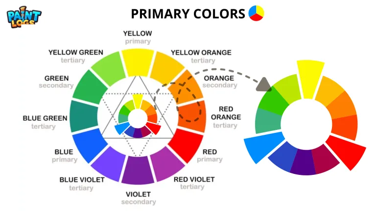
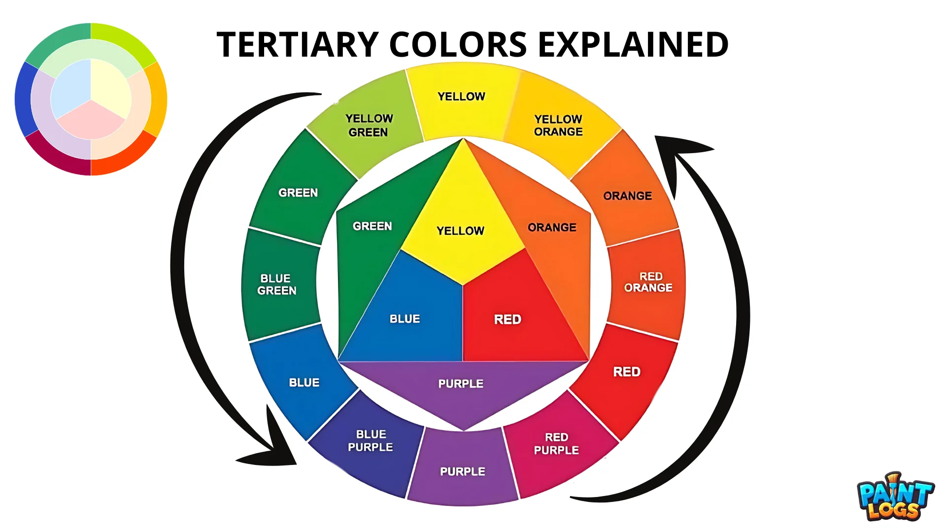
The Six Tertiary Colors (RYB Model)
In the traditional RYB color wheel, there are six tertiary colors:
- Red-Orange – A fiery, warm hue that carries the energy of red and the brightness of orange.
- Yellow-Orange – Sunny and cheerful, often linked with warmth, summer, and optimism.
- Yellow-Green – Fresh and natural, commonly seen in spring leaves and young plants.
- Blue-Green – Calm and refreshing, close to teal or turquoise, popular in design and interiors.
- Blue-Purple – Deep and cool, often associated with elegance and night skies.
- Red-Purple – Bold and dramatic, carrying the power of red with the creativity of purple.
Each tertiary color combines qualities of its parent hues, making them versatile for both artistic expression and practical design choices.
Tertiary Colors in RGB and CMYK
Just like primaries and secondaries, tertiary colors vary across models.
- In RGB (digital screens):
In RGB color model, tertiaries are formed by mixing a primary light (red, green, or blue) with a neighboring secondary (cyan, magenta, or yellow). For example:- Red + Yellow = Orange
- Green + Cyan = Spring Green
- Blue + Magenta = Violet
- In CMYK (printing):
Printers layer inks (CMK color Model), so tertiaries are created by combining one primary ink with part of another. This produces subtle hues such as warm reds, olive greens, or turquoise tones, depending on the mix.
👉 The principle is the same: a primary combined with an adjacent secondary. But the exact color depends on whether you’re working with pigment, ink, or light.
How to Mix Tertiary Colors in Paint
Mixing tertiaries by hand is straightforward, but achieving clean results takes care:
- Start with a Primary. Choose red, yellow, or blue.
- Add a Neighboring Secondary. Mix in just enough orange, green, or purple to shift the hue.
- Adjust Ratios. More primary keeps the color stronger, more secondary softens and neutralizes.
- Test Swatches. Always sample on paper or canvas before committing to your painting.
Example:
- Red + Orange = Red-Orange
- Yellow + Green = Yellow-Green
- Blue + Purple = Blue-Purple
Related: Primary, Secondary & Tertiary Colors: The Complete Guide – a full overview of the color hierarchy.
Practical Uses of Tertiary Colors
Tertiary colors are prized for their versatility and realism.
- In painting: They help capture lifelike tones — for example, yellow-green in foliage or blue-purple in shaded skies.
- In graphic design: Tertiaries provide subtle palettes that avoid the harshness of pure primaries or secondaries.
- In interior design: Warm tertiaries (red-orange, yellow-orange) bring energy, while cool tertiaries (blue-green, blue-purple) create calm and sophistication.
- In branding: They can make a logo stand out by blending vibrancy with nuance.
👉 Tertiaries give your palette depth, balance, and a more natural feel compared to only using primaries and secondaries.
Simple Activity: Create a Tertiary Color Wheel
Here’s a quick way to practice mixing tertiary colors yourself:
- Start with the three primaries — red, yellow, and blue.
- Mix them in pairs to create the secondaries — orange, green, and purple.
- Now, mix each primary with its neighboring secondary to form six tertiaries:
- Red + Orange = Red-Orange
- Yellow + Orange = Yellow-Orange
- Yellow + Green = Yellow-Green
- Blue + Green = Blue-Green
- Blue + Purple = Blue-Purple
- Red + Purple = Red-Purple
- Arrange them in a circle to complete a 12-color wheel.
This exercise helps you see how tertiaries fit naturally between primaries and secondaries on the wheel.
Conclusion
Tertiary colors add richness and nuance to the color wheel.
- In the RYB model, there are six: red-orange, yellow-orange, yellow-green, blue-green, blue-purple, and red-purple.
- In RGB and CMYK, the idea is similar, though the exact hues vary depending on whether you’re mixing light or ink.
By using tertiaries, artists and designers can create more realistic, balanced, and versatile palettes. They are the shades that bring depth to paintings, subtlety to design, and vibrancy to everyday visuals.
For a full overview of color relationships, see our guide: Primary, Secondary & Tertiary Colors.
FAQs About Tertiary Colors
What are the 6 tertiary colors?
The six tertiaries in the RYB model are red-orange, yellow-orange, yellow-green, blue-green, blue-purple, and red-purple.
Are tertiary colors the same in RGB and RYB?
Not exactly. The principle is the same — mixing a primary with a secondary — but the actual colors differ because RGB uses light and RYB uses paint.
Why use tertiary colors instead of just primaries and secondaries?
Tertiaries provide more subtle, natural, and versatile tones, helping to create palettes that look balanced and realistic.
Do tertiary colors appear in nature?
Yes. Examples include yellow-green leaves, blue-green seas, red-orange sunsets, and blue-purple evening skies.
How do you avoid muddy tertiaries?
Use clean, vibrant primaries and mix carefully. Too much of the wrong pigment can dull the result.