
What Color Do Black and Yellow Make? When you mix black and yellow together, the result isn’t simply a darker version of yellow — instead, you end up with a muted green‑ish color, most commonly described as olive green or a dark yellow‑green.
Many people expect black to just darken yellow, but because of how pigments work together — especially in traditional subtractive color mixing used in paint — the outcome shifts toward the green spectrum rather than just a darker yellow or brownish tone.
This article will help you understand why black + yellow produces this unexpected result, break down the shades it creates, explain how it works in different mediums (like paint vs. digital), and show how artists and designers use this mix in creative projects.
Quick Answer: What Color Does Black and Yellow Make?
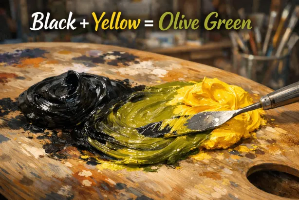
Black + Yellow = Olive Green (muted greenish tone)
When combined, black, which is essentially a very dark mixture of pigments, and yellow, a bright primary color, interact to create a greenish hue rather than a simple darkened yellow. In paint, this often looks like an olive green or dark yellow‑green shade.
This result might seem surprising at first, but it makes sense when you learn how color mixing works on a pigment level. Let’s take a deeper look.
Why Do Black and Yellow Make Olive Green?
Subtractive Mixing in Paint
When mixing colors in paint or pigment, you’re using subtractive color mixing, meaning pigments absorb (subtract) parts of light and reflect others. Black paint absorbs most wavelengths of light, while yellow paint reflects red and green wavelengths.
In many artistic contexts, black paint actually contains tiny amounts of blue or green bias pigments in addition to red and yellow. When you mix this with yellow (which reflects more green wavelengths), the combined result often leans toward green, usually a dull, earthy green like olive.
This is why, in practice, black + yellow paints typically produce olive green, rather than just a darker or more muted yellow.
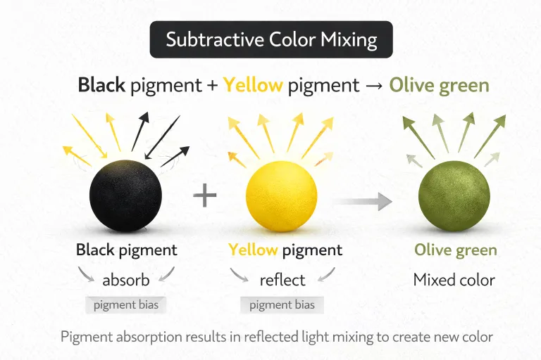
Understanding Yellow and Black Individually
Before exploring the mix further, it helps to look at each color:
- Yellow is a bright, warm primary color that reflects a lot of light and has high visibility on the color wheel.
- Black isn’t technically a color on the traditional color wheel, it represents the absence of reflected light and absorbs most wavelengths.
When you combine something that reflects green‑rich wavelengths (yellow) with something that absorbs most light but often contains slight blue bias in pigment, the reflected result often moves toward a muted green tone.
Common Shades Created When Mixing Black and Yellow
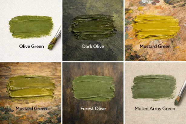
Depending on the exact paints you use and the ratios, mixing black and yellow typically produces shades closer to olive green. Here are some common variations:
| Shade Name | Description |
|---|---|
| Olive Green | Muted green or dark yellow‑green. |
| Dark Olive | More black added makes a deeper, more subdued green. |
| Mustard Green | A slightly brighter yellow‑leaning green. |
| Forest Olive | A very dark, earthy green. |
| Muted Army Green | A deep green with grayish tones. |
These shades are often seen in natural settings, camouflage patterns, earthy design palettes, and muted decor tones.
How Ratios Affect the Result
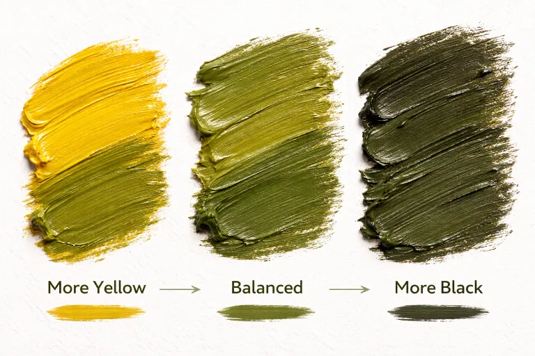
The balance between black and yellow affects the final shade:
- More yellow than black: The color looks closer to a lighter olive or mustard green.
- More black than yellow: The shade becomes darker and more subdued, sometimes resembling forest or army green.
Since black can vary depending on pigment composition (some blacks have more blue or brown bias), the exact outcome might differ slightly from brand to brand, but the shift toward green is consistent.
The Science Behind the Unexpected Result
Color mixing isn’t always intuitive, especially with neutral tones like black. In pigment mixing:
- Yellow reflects red and green light.
- Black absorbs most light but often contains trace hues in actual paint pigments (e.g., blue or green biases).
- When mixed, the reflection and absorption often result in a muted hue that leans toward green — because the yellow’s green wavelengths dominate the reflected light we see.
So instead of a straightforward “dark yellow,” your retina perceives a greenish tone (often an olive or muted green).
What Happens in Digital vs. Physical Mediums?
Physical Paint (Subtractive)
In traditional painting, black mixed with yellow typically results in an olive green because:
- Real pigments aren’t pure; black paint often has hidden undertones.
- Yellow reflects green wavelengths while black absorbs light.
Digital (Additive / RGB)
On screens, colors work via additive mixing — blending light instead of pigment. In this model:
- Black is no light.
- Yellow is created by equal parts red + green light.
- Superimposing black with yellow in light still produces a desaturated/darker yellow, visible as a deeper color but not truly “olive” because black in light means absence of light.
In other words, on screens you’ll often see a darker, less vibrant yellow rather than full olive green, but in physical paint you will see the shift toward green.

Black and Yellow in Paint: How Different Color Models Explain the Mix
When you mix black and yellow in paint, the result is usually olive green or a muted green‑ish tone rather than just a darker yellow. This can seem surprising until you look at how different color models work.
RYB Color Model (Paint – Subtractive Mixing)
In traditional art and painting, we use the RYB color model, where red, yellow, and blue are considered primary colors. Black and white are added separately to make shades and tints.
- Yellow is a primary pigment that reflects light strongly.
- Black pigment absorbs most wavelengths of light but isn’t pure absorption in real paints — it can have subtle biases (e.g., slight blue/green hints).
When you mix yellow and black paint, instead of simply making a darker yellow, the interaction of the pigments often shifts the hue toward olive green — a muted tertiary color with depth and earthiness.
This happens because yellow reflects wavelengths that overlap with green, and the way black darkens the mix tends to emphasize the green spectrum rather than pulling the hue into orange or brown.
CMYK Color Model (Printing – Subtractive Mixing)
In printing, colors are created using cyan, magenta, yellow, and black (K) inks. When you mix black and yellow inks, you are still working with subtractive color mixing — the inks absorb certain wavelengths and reflect others.
Because black absorbs light and yellow reflects light in the longer wavelengths, combining them essentially darkens the yellow and shifts its perception toward a greenish tone. The result in print often resembles olive green, especially when the amounts of yellow and black are balanced
RGB Color Model (Digital – Additive Mixing)
In digital art and screens, color mixing happens via light, known as additive mixing:
- Black in light is the absence of light.
- Yellow on screens is made by combining red + green light at full intensity.
When you try to “mix” black and yellow on a screen, what you’re really doing is lowering the brightness of the yellow — because you can’t actually add black light (black is no light). The effect looks like a darker, desaturated yellow, not a pure olive green.
In other words, black makes yellow darker on a digital display, but unlike paint, it doesn’t physically alter the hue into green because screen mixing doesn’t involve pigment interactions.

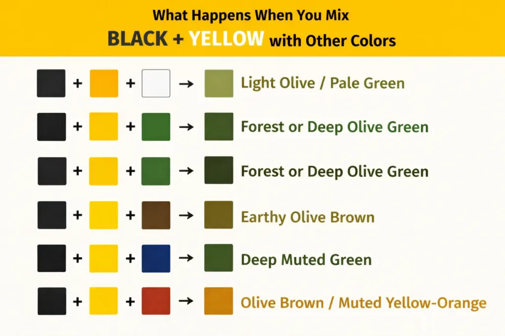
What Happens When You Mix Black + Yellow with Other Colors
Adding a third color to black and yellow expands the range of possible hues, especially in paint.
Black + Yellow + White → Light Olive / Pale Green
Adding white lightens and desaturates the olive tone, creating softer, pastel olive greens or pale mustard greens. It’s ideal when you want a gentler, airier shade. While black darkens and yellow creates the base, white brings balance and softens the result.
Black + Yellow + Green → Forest or Deep Olive Green
When you add a true green pigment to the mix, the dominant base shifts toward deeper green tones such as forest green or deep olive. This makes the green richer and more saturated, perfect for natural landscapes or earthy designs.
Black + Yellow + Brown → Earthy Olive Brown
Adding brown introduces warm, neutral earth tones. The mix becomes a green‑brown hue, still grounded but with a slightly warmer, more organic flavor. This combination works well for backgrounds, natural elements, and rustic palettes.
Black + Yellow + Blue → Deep Muted Green
Blue strengthens the green tendency by pulling the mix firmly into the green quadrant of the color wheel. With both yellow and blue present alongside black, the resulting color is a dark, muted green — excellent for shadows and deep natural tones.
Black + Yellow + Red → Olive Brown / Muted Yellow‑Orange
Adding red creates a warm shift, mixing into the olive base and producing a muted brownish‑green or earthy mustard tone. This color is less vibrant and more subdued, making it suitable for fall palettes and vintage designs.
Tips for Mixing Black and Yellow Successfully
Mixing black and yellow — whether in paint or digital art — can give surprising results. Here are some tips to work with these colors more intentionally:
1. Start with Small Amounts of Black
Even a tiny bit of black can dramatically darken yellow paint. Start with small amounts and adjust gradually until you reach your desired shade of olive green or muted yellow‑green.
2. Use High‑Quality Pigments for Predictable Results
Different brands of black and yellow paint can have subtle undertones. Some blacks lean slightly blue or green, which will affect the final greenish tone. Using quality paint makes the outcome more consistent.
3. Lighten with White for Softer Shades
Adding white to your mixture can create lighter tones like pale olive or mustard green, which are useful for backgrounds and soft palettes.
4. Test Small Swatches First
Always test your mix on a scrap surface before committing to a larger project. Drying can slightly change the appearance of the color, especially in paint.
5. Consider Lighting Conditions
Colors can look different under daylight, artificial light, or shadow. Check your sample under multiple lighting conditions to ensure the olive or muted green tone reads the way you want it to.
Understanding Why the Hue Shifts Toward Green
The shift toward an olive green tone when mixing black and yellow comes down to how pigments blend in the subtractively mixed paint medium (like oils, acrylics, or watercolors). Yellow itself reflects light wavelengths that are closer to green than red or blue, and black pigment can have underlying biases that amplify this effect.
In practical paint mixing, the combination of yellow and black doesn’t just make a darker yellow — it alters the reflective properties and moves the perceived hue toward the green spectrum. That’s why many artists intentionally use a bit of black with yellow to produce muted greens like olive or army green.
Real‑World Examples of Black + Yellow Color Mixes
When artists mix black and yellow paint, the result is commonly a muted olive‑green tone rather than an expected darker yellow. This surprising mix shows up in real creative fields — here’s how:
Painting Landscapes & Nature Scenes
Artists often use olive or muted greens created from black + yellow to depict grass, trees, foliage, and moss. These subdued greens feel more natural and realistic than bright greens, especially in landscapes with shadows or earth tones.
Camouflage & Military Tones
The color commonly used for camouflage — like olive drab — can be made by mixing black with yellow and adjusting with other colors. Hobby painters and model makers frequently start with black + yellow mixes as a base for army green hues.
Home Décor & Interior Paint
Muted olive and earthy greens are popular in interior design for creating calm, grounded spaces. Mixing black into yellow paint produces deeper, less saturated greens that work well on accent walls or rustic décor.
Fashion & Textile Design
Earth tones like olive green and muted moss are fashion staples, especially in fall/winter collections or utilitarian styles. Designers sometimes mix black and yellow dyes digitally to plan fabric palettes before production.

Common Mistakes When Mixing Black and Yellow
Even though the fundamental result Black + Yellow = Olive Green, many people get unexpected outcomes because of the way pigments behave.
1. Using Different Shades of Black or Yellow
Not all black paints are identical — some have a cool (bluish) bias and others a warm (brownish) undertone. Cool blacks can make the mix look greener because the subtle blue in the black combines with the yellow to pull the hue toward green.
2. Adding Too Much Black Too Fast
Black is a dominant pigment — even a small amount can overpower yellow and shift the shade dramatically toward dark greens. Always add black incrementally.
3. Ignoring Lighting Conditions
A mixed olive‑green swatch can look quite different under natural daylight versus artificial light. Test your mix under the lighting where the final piece will be displayed.
4. Skipping Test Swatches
The exact outcome of black + yellow depends on the pigment base of each paint. It’s best practice to test a small sample first before committing to a large surface.
Tips for Mixing Black and Yellow Successfully
Here are some practical tips artists and designers use to get the hue they want:
1. Start With Yellow as the Base
Mix yellow first and then slowly add black to control how muted or dark the olive green becomes.
2. Adjust With White for Lighter Greens
If your olive green turns out too dark, adding white lightens and softens the tone toward pale olive or light moss.
3. Add Other Colors for Variation
- Adding green pigment can deepen the olive into forest green.
- Adding brown warms the hue into an earthy olive brown.
- Adding a bit of red or orange can shift it toward more rusty or amber olives.
These adjustments help customize the green for specific artistic needs.
Conclusion
To sum it up, when you mix black and yellow in paint, the result is not just a darker yellow — it’s typically a muted green‑ish tone, most often described as olive green. This happens because black pigments usually contain slight blue or green biases, and yellow naturally reflects wavelengths closer to the green spectrum.
This olive green range is widely used in everything from landscape painting to interior design, fashion, and camouflage palettes. By adjusting the proportions and considering pigment undertones, you can go from pale olive to deep forest green and everything in between.
Understanding this color interaction helps artists and designers make confident choices when combining black and yellow — especially since the outcome might surprise those expecting simple darkened yellow shades.
FAQs
What color do black and yellow make when mixed?
Black + yellow paint typically makes an olive green, not just dark yellow.
Why does black and yellow make green?
Most black pigments have a slight blue or green bias, so when mixed with yellow (which reflects green), the result leans toward greenish hues.
Can you mix black and yellow digitally?
In digital art (RGB), black reduces brightness and desaturates yellow, often looking like a darker, muted yellow but not true olive green.
Does paint brand affect the outcome?
Yes — different brands use different pigment formulas, so the shade can vary even with the same black and yellow.
Why isn’t the result a brown?
Though darkened yellows can sometimes appear brownish, the tendency for black + yellow paint is toward greenish tones in most traditional pigments.
What color does black + yellow + white make?
Adding white typically gives lighter olive or pale green shades.
Can black and yellow make any other colors?
With other colors added (like green or brown), you can create forest green or olive brown.
Is olive green considered a tertiary color?
Yes — it’s a subdued tone between yellow and green on the color spectrum.
How do lighting conditions affect the result?
Different light sources can make the mix appear lighter or darker, so always test in the final environment.
Can adding more yellow make the olive greener?
Increasing yellow shifts the mix toward brighter, lighter olive tones.
Is olive green good for interior design?
Yes, olive tones are popular for calm, earthy design schemes.
Does black always darken colors?
In paint, black generally darkens colors, but in the case of yellow, it also shifts the hue toward green.