What Color Does Black and White Make? When you mix black and white, the result is not as vibrant or dynamic as you might expect. Instead of creating bold, bright colors, this combination produces a range of gray tones. These shades can vary from soft, light grays to deep, dark grays, depending on the balance of black and white. The more white you add, the lighter the gray becomes, while adding more black results in a darker, more intense shade.
This simple yet versatile mix plays a crucial role in a variety of creative fields, including art, design, and fashion. From minimalist designs to timeless black-and-white photography, the different shades of gray created by mixing black and white offer the perfect neutral base or accent in countless applications.
This guide will help you explore the science behind mixing black and white and how these shades are used to create depth, contrast, and elegance in various artistic and design contexts.
Quick Answer: What Color Does Black and White Make?
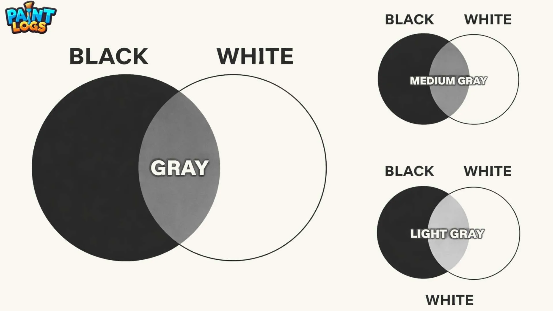
The result of mixing black and white is straightforward: it creates various shades of gray. The specific shade of gray depends on the ratio of black and white in the mix. Here’s how it works:
Black + White = Gray
- If you add more white, you get a lighter gray.
- If you add more black, you get a darker gray.
These shades of gray are neutral and not overly vibrant, making them ideal for minimalist design, monochrome photography, and elegant fashion choices. Gray is also the perfect background color or accent for other vibrant hues, as it provides a balanced and subtle foundation.
Want to experiment with your own red and black mixes? Try our color mixing tools to see the results instantly!

The Science Behind Mixing Black and White
Subtractive Color Mixing
When we mix black and white, we are engaging in a subtractive color mixing process. In subtractive mixing, each color that is added absorbs (or subtracts) certain wavelengths of light and reflects others. In this case, black is essentially the absence of light, while white reflects all light wavelengths. When you mix black and white, the resulting color (gray) is created by the balance between the wavelengths absorbed by black and those reflected by white.
In paint or physical pigments, this process occurs because black pigments absorb more light, and white pigments reflect more light. The more black you add to the mix, the darker and more muted the resulting gray becomes. Conversely, the more white you add, the lighter and more luminous the gray tone will be.
Additive Color Mixing
In digital media or light sources, the process of mixing black and white works differently. This is known as additive color mixing, and it’s based on light rather than pigment. In the RGB color model (used for digital screens), adding red, green, and blue light together creates new colors. When you mix black and white light in this model, you produce different shades of gray. Black represents the absence of light, while white light is the full intensity of all colors of light.
In digital art, mixing black and white often produces a desaturated, less vibrant tone of gray because light is being mixed rather than pigment. This means that the final gray tone will depend on the intensity of the white light, and the gray tone can vary based on the ratio of light to darkness.

Common Shades Created When Mixing Black and White
The mix of black and white produces several shades of gray. Depending on the ratio of black to white, the resulting shades can range from light to dark gray, each with its own unique tone. Here are the common shades created when mixing these two colors:
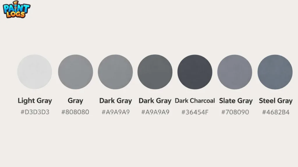
1. Light Gray
Light gray is the softest shade that results from mixing black and white. It is a gentle, pale tone that can create a subtle, sophisticated effect.
- Equation:
Black + White (more white) = Light Gray - HEX Code: #D3D3D3
- Description: Light gray is ideal for creating a calm, neutral atmosphere in design and works well as a background color in web design and minimalist spaces. It can also add a subtle accent to fashion choices.
2. Medium Gray
Medium gray represents a perfect balance between black and white. It is not too light and not too dark, making it a versatile shade used in various applications.
- Equation:
Black + White = Medium Gray - HEX Code: #808080
- Description: This neutral tone is widely used in both art and design. It’s ideal for creating balanced, versatile compositions in graphic design and can be paired with both bold and soft colors.
3. Dark Gray
Dark gray is a deeper, richer shade of gray created by adding more black to the mixture. It has a strong, dramatic feel.
- Equation:
Black + White (more black) = Dark Gray - HEX Code: #A9A9A9
- Description: Dark gray is commonly used for contrast in design, adding depth and mood. It’s perfect for creating a sophisticated or formal aesthetic in branding and interior design.
4. Charcoal Gray
Charcoal gray is a very dark shade of gray, almost verging on black. It’s rich, deep, and highly dramatic.
- Equation:
Black + White (lots of black) = Charcoal Gray - HEX Code: #36454F
- Description: Charcoal gray is often used for high-contrast designs or as a dramatic accent color in both fashion and interior design. It gives off an intense, moody vibe, especially when paired with lighter colors.
5. Steel Gray
Steel gray has a subtle blue undertone, making it a cooler version of gray. It’s often used in modern design, especially in technology and corporate branding.
- Equation:
Black + White (with a hint of blue) = Steel Gray - HEX Code: #4682B4
- Description: Steel gray works perfectly in corporate settings where a clean, professional image is needed. It pairs well with metallic tones like silver and platinum, making it a great choice for futuristic designs.
6. Slate Gray
Slate gray is another dark shade of gray with a slight blue-green tint. It is often used in architecture and natural designs.
- Equation:
Black + White (slight hint of blue or green) = Slate Gray - HEX Code: #708090
- Description: Slate gray is commonly used in home décor and landscape design. It’s an excellent choice for adding depth and sophistication to outdoor spaces or as a subtle accent in interior design.
| Shade | Equation | HEX Code |
|---|---|---|
| Light Gray | Black + White (more white) | #D3D3D3 |
| Medium Gray | Black + White | #808080 |
| Dark Gray | Black + White (more black) | #A9A9A9 |
| Charcoal Gray | Black + White (lots of black) | #36454F |
| Steel Gray | Black + White (with blue) | #4682B4 |
| Slate Gray | Black + White (slight blue/green) | #708090 |
Black and White in Paint: RYB and CMYK Color Models
The results of mixing black and white in paint can be explained using color models. Paint uses subtractive color mixing, meaning that pigments absorb certain wavelengths of light while reflecting others. The mix of black and white in the context of paint is different from how light interacts in digital art. Let’s explore how black and white work together in different color models like RYB and CMYK.
RYB Color Model: Traditional Paint Mixing
The RYB color model (Red, Yellow, Blue) is one of the most common models used in traditional painting. In this model, red, yellow, and blue are considered primary colors, and mixing them with black and white can create a variety of shades and tones. When you mix black and white in the RYB model, the result will primarily be different shades of gray.
- What Happens in RYB with Black and White:
- Mixing black and white in paint will produce a neutral gray scale. This process absorbs and reflects light to create different shades.
- Light Gray is produced with more white.
- Dark Gray is produced with more black.
- Use in Traditional Art:
Artists use these shades in traditional painting to create subtle depth and contrast. Shades like charcoal gray or slate gray are used to add shadow, texture, and dimension to paintings.
Example:
- When creating a landscape or still life, gray tones are used to define the mood of the scene and to create depth in the foreground and background.
- HEX for Dark Gray: #A9A9A9
- HEX for Light Gray: #D3D3D3
CMYK Color Model: Black and White in Printing
The CMYK color model stands for Cyan, Magenta, Yellow, and Key (Black). It is used in printing, where colors are layered on top of each other to create various hues and shades. When you mix black and white in this model, it results in different shades of gray or neutral tones.
- How Black and White Work in CMYK:
- Black (Key) is the darkest color used in printing.
- White is represented as the absence of ink (blank paper).
- Mixing black and white in CMYK will give you grayscale results.
- Adding more black will result in darker shades of gray, while adding white lightens the gray.
Application in Print Design:
Gray tones are used in professional printing for logos, brochures, and documents. When you need a professional and elegant design, combining black and white in printing can create a neutral, sophisticated feel.
- HEX for CMYK Black (K): #000000
- HEX for CMYK White (W): #FFFFFF

What Happens When You Mix Black and White with Other Colors?
When you mix black and white with other colors, the result can change dramatically. The color combination shifts depending on the additional colors mixed in, which leads to new shades and tones. Let’s explore some common mixes:
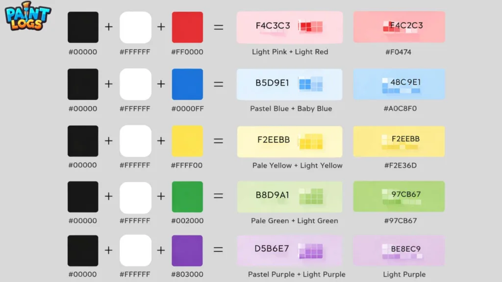
Black + White + Red = Light Pink or Light Red
When red is mixed with black and white, the result is typically a range of light red or light pink shades. The more white you add, the lighter and softer the resulting color becomes.
- Equation:
Black + White + Red = Light Pink/Light Red - HEX Code for Light Red: #F8C8DC
- HEX Code for Light Pink: #FFB6C1
This combination is often used in fashion and art to create soft, feminine tones. Light pink is often associated with romance and gentleness, while light red can be used to add vibrancy without being too intense.
Black + White + Blue = Light Blue or Baby Blue
When blue is mixed with black and white, the result is often a pastel light blue or baby blue. This is a soft, calming color used in various design applications.
- Equation:
Black + White + Blue = Light Blue/Baby Blue - HEX Code for Baby Blue: #A1CAF1
- HEX Code for Light Blue: #ADD8E6
This mix is ideal for soothing, cool-toned designs in interior décor and fashion, especially in baby clothing and spring fashion collections.
Black + White + Yellow = Light Yellow or Pale Yellow
The mix of yellow with black and white results in a soft, pale yellow tone. This combination is perfect for subtle designs where you want a light, airy feel.
- Equation:
Black + White + Yellow = Light Yellow/Pale Yellow - HEX Code for Pale Yellow: #FFFFE0
- HEX Code for Light Yellow: #FAFAD2
This tone is often used in interior design for creating cheerful yet gentle spaces or in fashion for a fresh spring vibe.
Black + White + Green = Light Green or Mint Green
Mixing green with black and white creates a light green or mint green shade, often associated with calm, nature-inspired designs.
- Equation:
Black + White + Green = Light Green/Mint Green - HEX Code for Mint Green: #98FF98
- HEX Code for Light Green: #90EE90
Mint green is a popular color in eco-friendly branding and is often used in health-related or sustainable fashion designs.
Black + White + Purple = Lavender or Light Purple
When purple is mixed with black and white, the result is a light, muted version of purple, such as lavender or light purple. The more white added, the lighter and softer the purple becomes.
- Equation:
Black + White + Purple = Lavender/Light Purple - HEX Code for Lavender: #E6E6FA
- HEX Code for Light Purple: #D8BFD8
These shades are ideal for creating calming, relaxing atmospheres in interior design, or for romantic themes in fashion.
Black and White in Art and Design
Monochrome Art
Black and white have been used for centuries in art, particularly in monochrome works. This style, which employs only varying shades of black, white, and gray, is popular for its minimalist and timeless appeal. Famous artists such as Pablo Picasso and Ansel Adams used black and white extensively in their art.
In monochrome art, artists use the contrast between black and white to create mood, depth, and texture. This approach helps the viewer focus on the form, contrast, and texture of the subject, rather than being distracted by color.
Photography
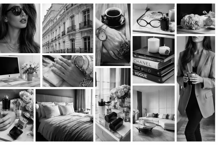
In photography, black and white photography removes the distraction of color and focuses purely on light, shadow, and composition. Using various shades of gray, photographers can emphasize texture and detail that might otherwise be lost in a color image. Whether capturing portraits, landscapes, or abstract shots, black and white photography helps convey deep emotions and timeless beauty.
Interior Design
Black and white are considered the foundations of minimalist design. In interior décor, black and white create a sense of space and balance, allowing for contrast and drama without overwhelming the senses. In rooms like the living room, bedroom, or kitchen, black and white can provide a modern, sleek look.
- Use of Light and Dark: Balancing light gray walls with black accents or dark gray floors with white furniture creates a contemporary and chic aesthetic that suits modern tastes.
Common Mistakes to Avoid When Mixing Black and White
Although mixing black and white is relatively straightforward, there are some common mistakes people often make that can lead to unexpected or undesirable results. Here are a few tips to help you avoid those mistakes and achieve the perfect shade of gray:
1. Adding Too Much White
One common mistake is adding too much white when mixing with black. While white is useful for lightening the mix, too much white can result in an overly bright or washed-out color, especially if you were aiming for a more muted or deeper tone. Always start slow and add white gradually to avoid this problem.
2. Adding Too Much Black
Adding too much black can lead to a dark, overpowering shade of gray that may appear too heavy or harsh. If you’re looking for a softer gray, avoid overwhelming the mix with black, and instead, add small amounts of black until you achieve the desired tone.
3. Not Testing the Mix
Before committing to your color mix, it’s always a good idea to test it on a small surface. Paint, especially, can appear much darker or lighter once it dries. Testing will help you gauge the final color and make any necessary adjustments.
4. Ignoring Lighting Conditions
Lighting can significantly affect how your color mix will appear. What looks like a perfect gray during the day might appear too dark or even muddy under artificial light. Always check the color under different lighting conditions to ensure it looks good in all settings.
Tips for Using Black and White Together in Design
Black and white are incredibly versatile in design, and when used correctly, they can create striking visual effects. Here are some tips for using these two colors together:
1. Start with a Balanced Base
When using black and white together, it’s essential to maintain a balanced base. If you’re using more black, it can make the design feel too dark and heavy, while more white can make it feel too sterile. Aim for a perfect balance where the shades of gray are just right.
2. Add Accent Colors
Although black and white are beautiful on their own, adding accent colors can make your design pop. Colors like red, yellow, or blue can provide contrast and vibrancy, making the design more dynamic.
3. High Contrast for Impact
If you want to create a bold, eye-catching design, use high contrast between black and white. This will make the elements in your design stand out. It’s especially effective for creating logos, websites, or any form of visual content that needs to be attention-grabbing.
4. Soft Grays for Elegance
If you’re aiming for elegance or sophistication, soft grays are a great choice. These tones are often used in luxury and minimalist designs, providing a calm and refined aesthetic.
Conclusion
In conclusion, mixing black and white results in various shades of gray, ranging from light gray to dark gray. These shades are incredibly versatile and widely used in design, photography, fashion, and art. Whether you’re using black and white for contrast or to create timeless monochrome works, these shades of gray serve as the foundation for a wide range of visual expressions. By adjusting the balance of black and white, you can achieve a variety of shades suited to your creative needs, from subtle pastels to deep, dramatic tones.
FAQs
What color do black and white make when mixed?
Mixing black and white creates various shades of gray, ranging from light gray to dark gray.
What is the result of mixing black and white in hair dye?
Black and white mixed in hair dye creates gray or silver shades, ideal for a natural look or for covering gray hair.
How do black and white work in photography?
Black and white photography uses shades of gray to create depth, contrast, and timeless aesthetic in images.
What happens when black and white are mixed with red?
Mixing black, white, and red creates light pink or muted red tones, often used in soft, feminine designs.
Can I use black and white for interior design?
Yes, black and white are often used in minimalist and modern interior design, creating sophisticated and elegant looks.
Can I mix black and white to create any color?
No, mixing black and white doesn’t create any new colors but instead creates various shades of gray, depending on the ratio of the two.
What happens when black and white are mixed with blue?
Mixing black, white, and blue produces a soft pastel blue or light blue, often used in soothing design or fashion.
Can black and white be used for branding?
Yes, black and white branding creates strong, memorable logos for luxury brands or minimalist companies.
What happens when you mix black, white, and yellow?
The result of mixing black, white, and yellow creates light yellow or pale yellow tones, often used for subtle accents.
Does the mix of black and white change in digital art?
Yes, in digital art, mixing black and white results in shades of gray but with more control over brightness and contrast due to light absorption.
What is the difference between mixing black and white in paint and light?
In paint, it’s a subtractive process, resulting in darker shades, while in light, it’s an additive process, where the result is lighter gray tones.
How can I use black and white in fashion?
Black and white can be used for timeless, classic looks in formal wear or street fashion, providing strong contrast and elegance.