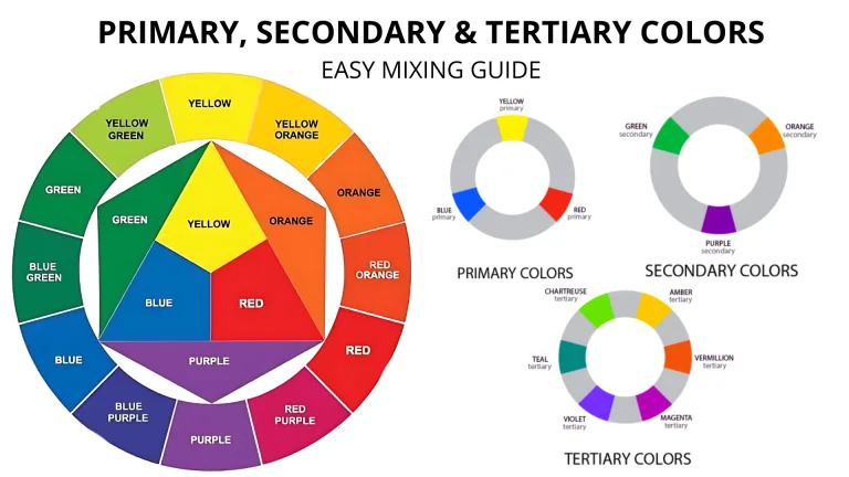
You know how mixing blue and yellow makes green, or red and yellow makes orange, right? But What Colors Make Red? Is it even possible to make red by mixing other paints? Let’s dive in and figure it out!
Let’s be totally honest here: if you want that bright, pure red hue and have access to a paint store, just buy the red paint. It saves time and guarantees you’ll get the vibrant color you’re dreaming of.
But what if heading to the store isn’t an option? Maybe you’ve got an entire rainbow of colors in your kit… except red. The big question arises: Can you mix other colors to create red?
While creating a pure red from scratch is tricky (spoiler alert: red is a primary color!), there are ways to mix other paints to approximate red tones. Plus, if you already have red, you can adjust it to create unique shades.
Below, I’ll walk you through 6 different ways to mix red: one that explores how to mimic red with two colors and others that tweak your red paint to create specific shades for your next masterpiece.
Can You Make Red from Other Paints?
Let’s face it—red is the diva of the color world. It’s bold, vibrant, and completely unapologetic. But can you actually create red by mixing other paints? The short answer is no—pure red is a primary color, meaning you can’t blend your way to it using other pigments.
Subtractive Mixing with Magenta and Yellow
By mixing magenta and yellow, you can create a shade of red in subtractive color mixing.
Creating Variations of Red
You can create various red shades by mixing red with other colors, such as blue for purple-red or white for pink.
Muting Red Color by Mixing with Green
Mixing red with its complementary color, green, can mute the intensity of red.
Changing the Value of Red Using Black and White
To adjust the lightness or darkness of red, add black or white to the mix.
However, that doesn’t mean you’re out of luck! While you can’t make a true red, there are plenty of ways to mix and tweak colors to get red-like shades or variations of red for your artwork. Let’s explore some fun and creative ways to work with red tones!
RED MIXING GUIDE 1: How to make Red from Mixing Magenta and Yellow
Imagine this: you’re halfway through a painting project, and you realize you’re out of red paint. Panic mode? Nope! If you’ve got magenta and yellow, you can still create a stunning red-like color. Let me show you the easiest way to mix these two colors to get a vibrant red without needing red paint itself!
Step-by-Step Guide to Mixing Magenta and Yellow to Create Red-Like Color
This is the perfect method when red paint is missing but magenta and yellow are ready to save the day. Follow these simple steps:
- Prepare Your Paints
- Place your magenta and yellow paints on a palette or mixing tray.
- Keep a palette knife or brush handy for blending.
- Start with Magenta
- Scoop out a generous amount of magenta onto your mixing area. This will be your base color.
- Add Yellow Gradually
- Add a small dab of yellow to the magenta. The key here is to use more magenta than yellow—start with a 3:1 ratio.
- Mix Thoroughly
- Use your palette knife or brush to blend the two colors together until they’re smooth and even. Watch as a red-like hue starts to form!
- Adjust the Mix
- If the color leans too orange, add a bit more magenta.
- If it’s too purple or dark, add a touch more yellow. Blend after each adjustment to fine-tune the shade.
- Finalize Your Shade
- Once the color looks right to you, it’s ready to use. Test it on a scrap piece of paper or canvas to see how it appears when dry.
Pros and Cons of Basic Color Mixing
Pros:
- Easy and Quick: Just two colors and a palette—no fuss!
- Customizable Shades: You can tweak the mix to suit your project.
- Practical Use of Color Theory: It’s a fun way to apply what you’ve learned about primary and secondary colors.
Cons:
- Not a Pure Red: The result may not have the full vibrancy of store-bought red paint.
- Trial and Error: It might take a bit of practice to get the perfect balance.
- Paint Quality Matters: The richness of your mix depends on how pigmented your paints are.
Pro Tip for Extra Vibrancy
Got a bright neon color, like Reflex Rose? Adding a small amount to the mix can create an even more vibrant red. This is especially handy for painting bold, eye-catching details like the petals of a red rose.
What About Deep Reds?
Need those rich, dark red hues for shadows or depth? Don’t worry—I’ve got you covered! Stay tuned, because I’ll explain how to create deeper shades of red next. 🙂
RED MIXING GUIDE 2: How to Make Red Deeper in Color
Looking to make your red color deeper and more dramatic? It’s simple! By mixing red with darker shades like blue, black, or brown, you can create rich, shadow-like tones that add depth and intensity. Here’s a quick guide on how to achieve the perfect deep red. Ready to dive into it? Let’s go!
Step-by-Step Guide:
- Prepare Your Red Paint: Place red as your base color.
- Choose a Dark Color: Select blue, brown, or black to deepen the red.
- Add Dark Color Sparingly: Add just a little of the dark color and mix.
- Mix Evenly: Blend until you get your desired deep shade.
- Adjust as Needed: Add more red to lighten if it’s too dark or more dark color for further depth.
Pros:
- Creates Rich, Deep Tones: Perfect for adding shadows and richness.
- Adds Dimension: Great for adding depth to your artwork.
- Flexible: Allows you to control the shade for the right balance.
Cons:
- Easy to Overdarken: Too much dark color can overwhelm the red.
- Hard to Control: Fine-tuning the exact depth can be tricky.
- Red Can Lose Intensity: Too much darkening can dull the vibrancy of the red.
RED MIXING GUIDE 3: How to Mute Your Red Using Green
Want to tone down that bright red and make it more subtle? Mixing red with green, its complementary color, can help mute the intensity for a more balanced hue. This is a great trick to use when you want your reds to blend better or become softer without completely changing the color. Ready for this? Let’s dive into how it works!
Step-by-Step Guide:
- Prepare Your Red and Green Paints: Place red on your palette and have green on hand.
- Add Green Slowly: Add a small amount of green to your red.
- Mix Gently: Blend until the red becomes more muted and toned down.
- Adjust the Shade: Keep adding small amounts of green until you achieve the desired muted look.
Pros:
- Subtle Adjustments: Helps you control the intensity of your red.
- Wide Range of Muted Reds: Create soft, natural tones.
- Balance in Artwork: Great for creating harmony in your piece.
Cons:
- Easy to Overdo: Too much green can dull the red too much.
- Requires Precision: Mixing requires care to maintain a balanced hue.
- Risk of Neutralization: Over-mixing could turn the red into a grayish or brownish tone.
RED MIXING GUIDE 4: Making Red Darker or Lighter Using Black and White/Yellow
Ready to adjust the lightness or darkness of your red without changing its hue? Mixing red with black, white, or yellow can help you achieve just the right value. Whether you want to darken your red for drama or lighten it for softness, this guide will walk you through the process! 🙂
Step-by-Step Guide:
- Darken with Black: Start by adding a tiny bit of black to your red for a deeper shade.
- Lighten with White or Yellow: Mix in a small amount of white to make it lighter. Yellow gives a warmer lightening effect.
- Balance for Desired Value: Adjust the mixture until you get your preferred contrast.
Pros:
- Versatile Adjustments: Easily change the shade and tone of red.
- Ideal for Adding Depth or Softness: Perfect for shading and highlighting.
- Customizable Hue: Change the temperature of the red with yellow or cool it down with black.
Cons:
- Too Much Black Can Overwhelm: Adding too much black can make it muddy.
- Excessive White Turns it Pink: Adding too much white may turn red into a lighter pink shade.
- Balance is Key: Overdoing either can result in unappealing tones.
RED MIXING GUIDE 5: How to Make Red Warmer in Shade
Want to add warmth to your red? This can be easily done by mixing your red with shades of yellow or orange. It’ll bring out a fiery, more vibrant red—perfect for creating energy in your artwork. Want to see how? Let’s go further and brighten up that red with some warmer hues! 🔥
Step-by-Step Guide:
- Choose Your Warm Color: Pick yellow or orange for a warmer look.
- Mix Gradually: Start by adding a little yellow or orange to your red.
- Blend Evenly: Keep mixing until you achieve the desired warmer shade.
Pros:
- Vibrant and Bold: Warmer reds can make your artwork pop.
- Great for Highlights: Adds a fiery touch to areas needing emphasis.
- Enhances Warmth: Perfect for conveying warmth or passion.
Cons:
- Can Become Too Intense: Over-mixing can turn the red into a bright, overwhelming color.
- Can Lose Subtlety: Might overpower other colors in the artwork.
- Requires Balance: Too much yellow can lead to orange tones.
RED MIXING GUIDE 6: How to Make Red Cooler in Shade
Looking for a cooler red for a more muted or calm effect? Mixing red with blue or purple is the way to go. These colors can give your red a cooler, more subdued look, perfect for creating dramatic or atmospheric pieces. Ready to cool down your red? Let’s mix!
Step-by-Step Guide
- Pick Your Cool Color: Choose blue or purple to cool down your red.
- Add Cool Color Gradually: Mix in small amounts of blue or purple into your red.
- Adjust the Tone: Keep adding until you achieve the desired cool red.
Pros
- Calming Effect: Cool reds are perfect for a more subdued, atmospheric feel.
- Great for Mood Pieces: Ideal for creating emotional depth in cooler tones.
- Adds Sophistication: Cool red tones can be more sophisticated and subtle.
Cons
- Can Turn Purple: Too much blue may give you a purple tone.
- Subtle Adjustment Needed: A delicate touch is necessary for the perfect balance.
- Less Vibrancy: Cool reds may lack the punch of warm reds.
By experimenting with these mixing guides, you’ll master the art of mixing red in a variety of ways to create stunning effects. Happy painting!
Mixing Purple and Yellow: Does This Make Red?
No, mixing purple and yellow doesn’t make red. These are complementary colors, and when mixed, they cancel each other out, creating a brown or muddy tone instead of red.
Why Not Red?
- Red is a primary color and can’t be made by mixing other colors.
- Purple (red + blue) and yellow include all primary colors, resulting in neutral tones like brown.
Better Option:
To get a red-like shade, mix magenta and yellow instead. Purple and yellow are better for creating earthy tones, not vibrant reds.
Experiment and have fun, but for true red, stick with red paint or magenta + yellow!
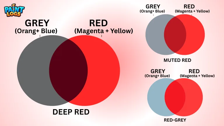
Sometimes, your red mix doesn’t turn out the way you hoped. It might look dull, muddy, or just… off. Don’t worry! Here’s how to fix the most common problems when mixing red shades.
How to Fix Dull or Muddy Red?
- Check Your Base Colors
- If your red looks dull, it might be because the paints you’re using (like yellow or magenta) aren’t vibrant enough.
- Fix It: Use high-quality, richly pigmented paints for better results.
- Avoid Over3mixing
- Mixing too many colors or overworking your paint can lead to muddy results.
- Fix It: Stick to two or three colors max when mixing red, and blend lightly.
- Too Much Complementary Color
- Adding complementary colors like green or too much blue can neutralize red, making it brown or grayish.
- Fix It: Add more red or magenta to bring back the vibrancy.
- Adjust the Lighting
- Paint colors can look different under certain lighting.
- Fix It: Test your mix in natural light to see the true shade.
Pro Tips for Vibrant Reds
- Use magenta and yellow for mixing instead of trying to create red from unrelated colors.
- To brighten red, mix in a small amount of white or yellow.
- For deep reds, use a touch of blue or black—but sparingly!
Adjusting Red for Specific Projects
Red is versatile and can be tailored to fit your artistic needs. Whether you’re aiming for bold and vibrant or soft and muted, adjusting red is all about mixing and experimenting to achieve the perfect shade.
Using Red in Different Art Forms
Red in Painting
- For dramatic effects: Add a touch of black or blue to create deep, moody reds like burgundy.
- For lighter tones: Mix red with white for pinks or coral shades.=
- Adjust saturation and brightness in your software for precise reds.
- Use red sparingly as it grabs attention—perfect for highlights or focal points.
Red in Interior Design and Fashion
- Interior Design: Deep reds like maroon or terracotta add warmth and luxury. Bright reds can energize a space but should be balanced with neutral tones.
- Fashion: Pair bold reds with black or white for classic looks, or explore muted reds for softer, earthy vibes.
Pro Tips for Red Adjustments
- Always test your shade in the project’s lighting conditions.
- Combine red with complementary colors (like green or brown) to create balanced tones.
- For fashion and design, consider the emotional impact of red—bold, passionate, and confident.
No matter the medium, red is a powerful color that, when adjusted correctly, can make your work truly stand out!
Trending Topics in Red Mixing
Red has always been a hot topic in the art and design world, but recent trends are putting a fresh spin on this classic color. Let’s explore what’s buzzing right now!
The Latest Tools or Apps for Color Mixing
Digital tools are making it easier than ever to mix and match colors, including red shades. Here are some trending apps and tools:
- Adobe Color: Perfect for creating red-based palettes and exploring harmonious combinations.
- Coolors: A user-friendly app for experimenting with shades of red and other colors.
- Procreate: Offers real-time color blending for artists who want to see how red interacts with other pigments.
- Blendoku (Game): A fun way to understand color relationships and practice mixing reds in a puzzle format.
How Red Interacts with Other Design Elements
Red’s versatility makes it a standout color in design, but how it interacts with textures and patterns can change its effect:
- With Textures: A glossy red conveys luxury (think red lacquered furniture), while matte reds feel more modern and approachable.
- With Patterns: Red stripes or polka dots evoke playfulness, while intricate red florals or geometric designs add elegance.
- With Neutral Tones: Pairing red with beige, gray, or white helps tone down its intensity, making it more balanced.
- With Metallics: Red with gold screams opulence, while red with silver feels sleek and contemporary.
Real-Life Examples of Successful Red Usage
Famous Artworks
- “The Red Studio” by Henri Matisse: A celebration of red’s power to dominate and unify a space.
- Mark Rothko’s Abstract Reds: Rothko used rich reds to convey deep emotion and introspection.
Iconic Brands
- Coca-Cola: The bold red logo is instantly recognizable and evokes energy, happiness, and nostalgia.
- Target: Their signature red circles convey focus, excitement, and reliability.
- Supreme: The bright red logo represents exclusivity and boldness in streetwear culture.
Pro Tip for Using Red in Your Work
Stay updated on how red is trending by exploring digital art communities like Behance or Dribbble. Studying how professionals incorporate red into textures, palettes, and layouts can inspire your next masterpiece!
Whether you’re painting, designing, or branding, red continues to prove it’s more than a color—it’s a statement.
Conclusion: Can We Truly Mix Red, or Does It Always Exist?
In conclusion, red is a primary color in traditional color theory and cannot be directly created by mixing other colors. However, you can manipulate shades, tones, and variations of red by combining it with other colors. The ability to adjust red by adding colors like yellow, green, blue, or white allows for a wide range of creative possibilities. Ultimately, while red exists as a pure color, its diverse mixes enable artists to explore different depths, warmth, and coolness.
FAQs
What Colors Make Red Pop?
To make red stand out, pair it with green (its complementary color), use black and white for contrast, or mix in neon pigments like Reflex Rose for an ultra-bright red.
What Colors Make Red Orange?
Red-orange comes from red and yellow. More yellow creates a fiery tone, while more red makes it richer.
What Colors Make Red Violet?
Red-violet is made by mixing red and blue. More red gives a warmer tone, while more blue creates a cooler hue.
What Colors Make Red and Blue?
Mixing red and blue results in purple. More red creates a red-violet shade, while more blue gives a blue-violet hue.
How to Make Red When You Don’t Have Red?
If red isn’t available, mix magenta and yellow to create a red-like shade for your project.
What Made the Color Red?
In nature, red comes from iron oxide pigments or natural dyes, like cochineal insects. In art, it’s a primary color defined by color theory.
What Makes Red Special?
Red is bold, versatile, and evokes strong emotions. It’s a primary color used to create many other colors and holds significant cultural meanings.