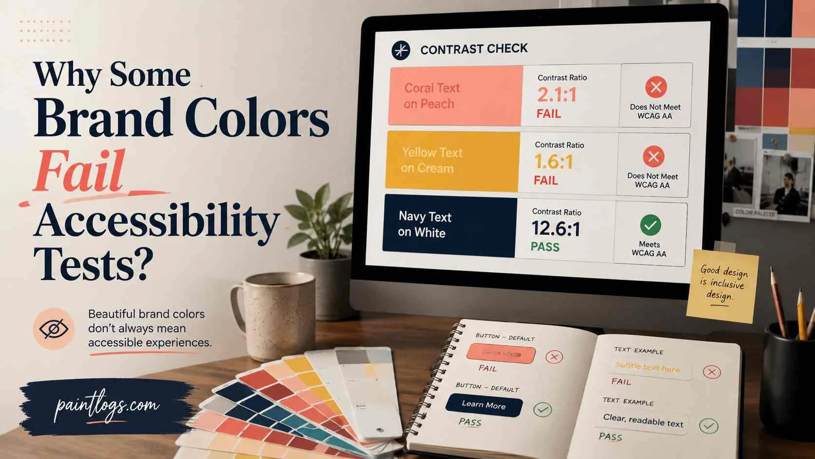
You finally picked the color. It’s on the new sign out front, the accent wall behind the register, the awning.
And now it needs to go on the website too, because a rebrand only works if the color actually matches everywhere.
Then someone runs it through a contrast checker, and the number comes back ugly. On a screen, as text, that same bright color turns out to be close to unreadable.
Nobody warns you about this because paint swatches don’t come with a contrast rating. Websites do.
The 4.5:1 Rule, Briefly
The 4.5:1 standard has been around since 2008, baked into WCAG 2.1’s official success criteria for both text and buttons and icons, and nobody’s touched the number since. It comes from vision research, not a designer’s gut feeling.
Roughly 3:1 is what a person needs to read comfortably. Bump that up 50% for moderate low vision, and three times 1.5 lands right on 4.5. Big text gets to use the lower 3:1 bar instead, since larger letters are easier to make out anyway.
There’s one relief built into the rule. Logos and brand names are specifically exempt, since WCAG treats a logotype as an identity mark rather than a sentence someone needs to read. The actual logo can stay exactly as bright as it’s always been.
The 4.5:1 rule only kicks in once that same color gets reused somewhere it’s doing the job of text, like a button label, a headline, or a line of body copy. Honestly, the result matters more than how it’s calculated. Two colors either clear the number or they don’t.
Why Your Storefront Yellow Might Fail Online
Some hues can’t hit 4.5:1 against white no matter how you tune them, not while they still look like that color. Small businesses rarely find this out until the site is already built.
Here’s how the main hue families perform against a white background, at the brightness most brands pick:
| Hue Family | Typical Ratio on White | Passes 4.5:1? |
| Yellow | ~3.3:1 or lower | Fails even large-text 3:1 |
| Light green, mint | Similar to yellow | No |
| Cyan, light blue | 3:1–4:1 | Large text only |
| Pink, light red | Slightly better than yellow | Usually no |
| Orange | ~3.5:1 | Close, still short |
| Purple | 5:1 or higher | Often yes |
| Navy, forest green, burgundy, charcoal | Well above 4.5:1 | Yes, easily |
Darken any of the failing colors enough to pass, and it stops reading as the original hue. Push yellow dark enough for 4.5:1, and it becomes mustard or olive.
The pattern has nothing to do with which colors look “accessible” and everything to do with how close a hue’s natural luminance sits to whatever it’s placed against.
What to Substitute Instead
Keep the color. Just build a second version of the same hue that sits at a deeper luminance, one that clears the threshold without wandering into a different hue entirely.
Here’s what that looks like for each problem hue:
- Yellow: Stays bright for the sign, the awning, and big digital headlines. Body copy and small labels need something closer to #B8860B, a deeper gold or amber, checked against the actual ratio instead of eyeballed.
- Light blue or cyan: Usually just needs more saturation and less lightness. A shade that reads as confidently blue instead of pastel sky clears 4.5:1 most of the time, without losing brand recognition.
- Mint or light green: Needs the same shift, just toward forest or emerald wherever the color has to function as text. Save the paler original for backgrounds, illustrations, or big decorative headings, where the lighter 3:1 rule applies instead.
A companion swatch works better here than a straight swap. The sign out front keeps its bright original. The website text gets a deeper sibling shade. Anyone looking at both still reads them as the same brand color. If the palette needs more accent tones beyond that pairing, analogous color schemes are the easiest way to pick neighbors that won’t clash with either version.
Painters already do this with two-tone rooms. One shade covers the statement wall. A deeper or lighter cousin covers trim and ceiling, so the whole space still feels unified. A brand color needs that exact pairing worked out once, then reused, instead of re-guessed every time someone builds a new page.
How to Check Your Colors
A paint chip can look perfect under fluorescent store lighting and turn out completely different on a wall at home under warm bulbs. Eyeballing a hex code runs into the same problem. A color that looks dark enough next to your logo can still fail the math, since relative luminance has little to do with how bold or saturated a color looks on screen.
The fix is the same discipline you’d use with paint. Get an actual reading instead of trusting your eyes. Run the hex code from your paint-to-digital conversion through a contrast checker before the site goes live. A good checker shows the exact ratio instantly, along with whether it passes AA for normal text, large text, and UI components.
That check needs to happen for every pairing on the page, including the ones that seem fine at a glance. Test each pairing exactly as it appears, against its real background rather than a placeholder.
A button using light text on a colored background is one of those less obvious pairings. It needs its own 4.5:1 check that has nothing to do with whatever ratio the paragraph text next to it uses.
When It’s Worth Bringing In Help
If the rebrand includes a full new website, not just a color swap on an existing one, this is where the checklist gets longer. Fixing one button is a quick job. Rebuilding an entire site is not. The standard applies to every page a visitor might land on, including the ones nobody previews before launch. Old blog posts. Seasonal landing pages. A contact form built two redesigns ago. All of it needs the same check.
Skip that legwork, and a new site can end up with the same failing yellow buried three pages deep, the exact mistake the rebrand was supposed to fix.
Someone has to find every spot the brand color appears, note which ones need the text-safe version, and write that decision into the design system so future pages inherit it automatically. That kind of audit is exactly what studios that build content-heavy, high-traffic sites get hired for as part of a rebuild, the same way they’d audit load times or broken links, just applied to color instead.
The color itself stays the same. It just gets built correctly everywhere it shows up, so the sign out front and the site behind it actually match the way the rebrand was supposed to make them.
FAQs
Can a bright yellow ever pass 4.5:1 against white?
Not at the lightness most brands use. Yellow’s natural luminance sits too close to white’s. You’d have to darken it into mustard or olive territory to pass, at which point it stops reading as yellow.
What contrast ratio does large text need instead of 4.5:1?
3:1, as long as the text is 18pt regular or 14pt bold and larger. That’s why bright brand colors often work fine in a big headline but fail in body copy.
Is a website even required to meet WCAG contrast standards?
In the US, it depends on the business and how the site is used, but EU businesses fall under EN 301 549 and the European Accessibility Act, which reference the same 4.5:1 standard directly.
Do I have to give up my brand color if it fails?
No. Keep the original for signage, logos, and large headlines, and create a deeper “text-safe” version of the same hue for body copy and small labels on the site.