
What Color Does Yellow and Gray Make? Mixing yellow and gray creates soft, earthy colors that are perfect for a calm and balanced look. When mixed, yellow becomes more muted, and the result is usually a toned-down color like olive gray or smoky chartreuse. These colors are often used in interior design, fashion, and art to add warmth and sophistication without being too bright or overpowering. The combination works well for creating subtle backgrounds, modern interiors, or elegant fashion.
In this guide, we will explore the most common shades created when mixing yellow and gray, how to adjust them for your needs, and where they are best used.
Quick Answer: What Color Do Yellow and Gray Make?
Yellow + Gray = Olive Gray, Muted Mustard, Smoky Chartreuse, Grayish Yellow, Pale Sage, Charcoal Yellow
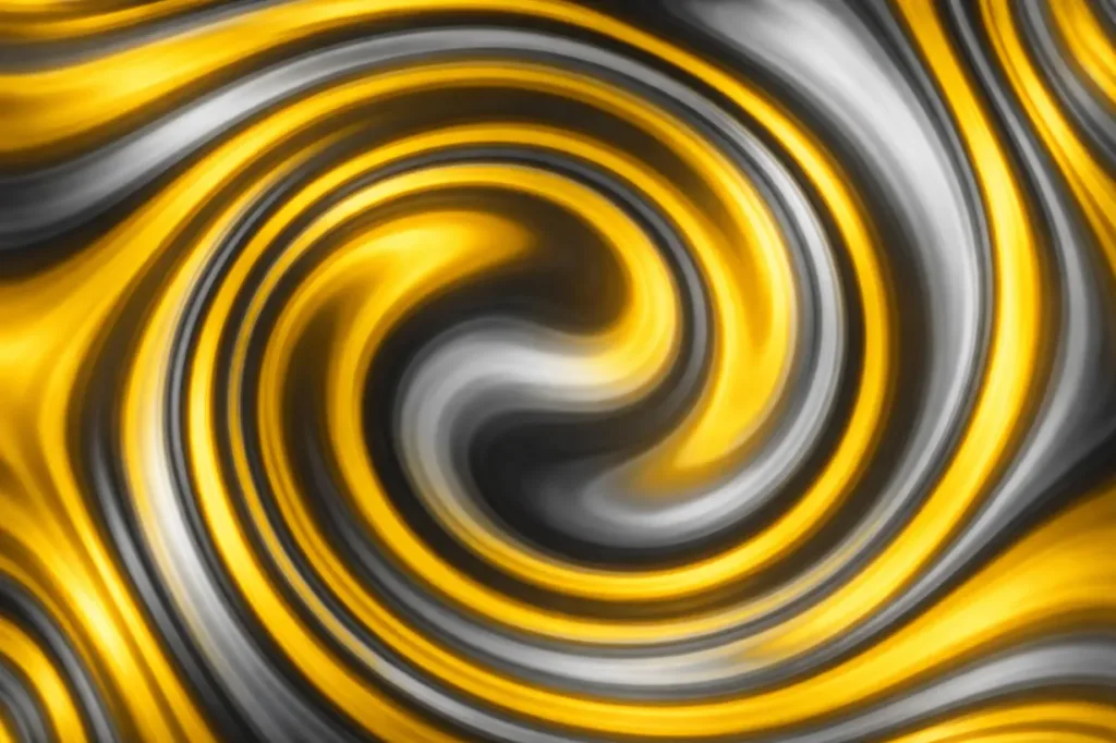
When you mix yellow and gray paint, the result is usually a muted, olive‑greenish tone, basically a yellow that’s been toned down and softened by the neutral gray. This happens because gray doesn’t add new color; it reduces the brightness and saturation of the yellow, shifting it toward a duller, earthier hue.
You might expect something bright or pastel, but instead you often get this more subtle shade that can be really useful in art and design.
The Science Behind Mixing Yellow and Gray
Subtractive Color Mixing (Paint & Pigments)
When you mix physical paints, you’re working with subtractive color mixing. That means each pigment you add subtracts (absorbs) some light and reflects a limited range of wavelengths back to your eyes.
- Yellow paint reflects mostly yellow wavelengths and absorbs others.
- Gray paint reflects all colors more equally but at a lower intensity than white, that’s what makes it muted.
So when you mix gray with yellow physically, the gray essentially “dulls” the brightness of the yellow and brings it closer to a toned‑down, greenish olive shade. This is because yellow sits closer to green on the color spectrum, and the lowered saturation makes that undertone easier to see.
This is the basic idea behind why many artists describe a mix of yellow and gray as resulting in olive green or a gray with green tint — even if it doesn’t seem obvious just from the names of the two starting colors.
Additive Color Mixing (Digital / Light)
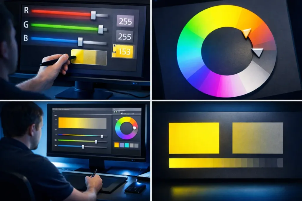
In digital color mixing (like screens and light), gray isn’t really a color that exists on its own, it’s just every RGB value at a balanced, lower brightness. So you can’t “mix” yellow and gray light in the same way you do with paint. Instead, designers simulate the look by choosing a desaturated yellow tone alongside gray in digital art tools.
This article is focused on paint or pigment mixing, so the additive explanation mainly matters if you’re working on screens rather than physical paints.
Common Shades Created When Mixing Yellow and Gray
When different amounts of yellow and gray are mixed, you’ll see a range of muted tones. These aren’t bright or vibrant, but they’re lovely for subtle, earthy palettes.
1. Olive Gray
With more gray than yellow, you often get a soft olive‑gray, a cool, earthy tone that’s great as a background shade.
2. Muted Mustard
Adding a bit more yellow brings out a muted mustard, darker and less saturated than pure mustard.
3. Smoky Chartreuse
When yellow is still stronger, but gray is present, the result can lean toward a smoky chartreuse, somewhere between green and gray.
4. Grayish Yellow
If you start with a light gray and a strong yellow, you may see more of a grayish yellow, a mellow, soft hue.
5. Pale Sage
Balanced mixes can look like pale sage, a soft yellow‑green tone that’s gentle and calming.
6. Charcoal Yellow
With a lot of gray and a touch of yellow, colors can get very muted, sometimes resembling a dark charcoal‑tinted yellow.
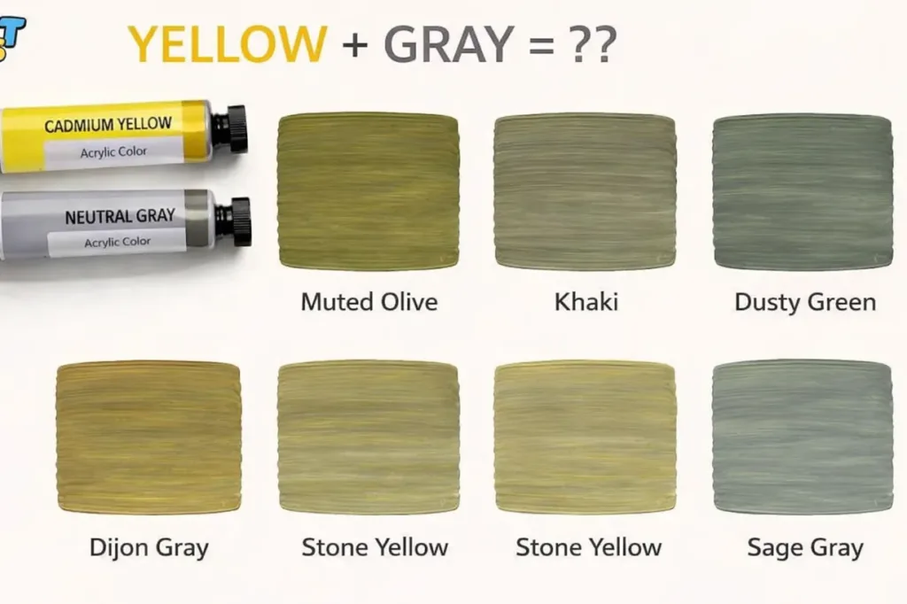
These names help you imagine the kinds of tones that emerge, especially if you’re experimenting with paints in your studio.
Below is a table showcasing the common shades created when mixing yellow and gray.
| Shade of Yellow | Shade of Gray | Result |
|---|---|---|
| Olive Yellow | More Gray | Olive Gray |
| Mustard Yellow | More Gray | Muted Mustard |
| Chartreuse Yellow | More Gray | Smoky Chartreuse |
| Light Yellow | More Gray | Grayish Yellow |
| Soft Yellow | More Gray | Pale Sage |
| Dark Yellow | More Gray | Charcoal Yellow |
How to Control the Outcome
When you mix yellow and gray paint, you might not always get the exact shade you want the first time. The final color depends on proportions, undertones, and even the type of paint you use. But there are some simple ways to guide the result:
1. Start With Small Amounts
Always begin with a small amount of gray or yellow and add more gradually. This gives you more control and prevents overshooting your target hue. Too much gray too quickly will mute the yellow heavily and make it look duller.
2. Adjust With White or Black
Once you’ve mixed your base, you can lighten or darken it:
- Add white to make the shade lighter and softer.
- Add black to darken the tone and deepen the gray influence.
3. Test First on a Palette
Before applying the mix to your artwork or wall, try a small swatch on a palette or scrap board. Lighting and surface can change how the color looks once dry.
4. Observe Undertones
Yellow paints have different undertones, some lean warmer (toward orange) while others lean cooler (toward green). Gray also varies: warm grays have brown or beige hints, while cool grays have blue or violet undertones. The undertones of each will affect the final mix.
With these tips, you can achieve a controlled, predictable result — whether you’re painting fine art or designing a room palette.
Yellow and Gray in Paint: RYB, CMYK & Digital Color Models
Understanding different color models helps you know why yellow and gray look the way they do when mixed and how results differ across mediums.
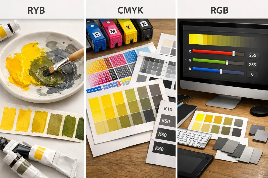
RYB Color Model (Paint – Subtractive Mixing)
The RYB model — standing for Red, Yellow, Blue — is classic for painters and artists. In this subtractive system, colors are created by mixing pigments that absorb (subtract) certain wavelengths of light.
In RYB theory:
- Yellow is one of the primary colors.
- Gray isn’t a true color on the traditional wheel — it’s a neutral achieved by combining black and white, or from desaturated mixes of other colors.
So when you mix yellow and gray in paint, the gray “takes away” some of the yellow’s brightness and saturation. You often get a muted greenish tone because the gray influences the yellow toward a less vibrant, more subdued hue.
CMYK Color Model (Print – Subtractive Mixing)
CMYK stands for Cyan, Magenta, Yellow, Black and is used in printing. In this model:
- Gray is created by balancing cyan, magenta, and yellow inks with black.
- Mixing gray with yellow ink will reduce the intensity of yellow and shift it toward neutral — often producing a tone similar to olive or dirty yellow depending on ratios.
Though CMYK behaves differently from the RYB model, the same basic idea applies: adding a neutral dulls and desaturates the yellow.
RGB Color Model (Digital – Additive Mixing)
RGB (Red, Green, Blue) is all about light, not paint. When colors are mixed through light (like on a screen), gray isn’t actually a color — it’s simply a balance of red, green, and blue at a similar brightness.
That means you can’t physically mix a “gray light” with yellow light the way you would paint. In digital art, artists achieve a similar look by choosing a desaturated yellow tone (low chroma) and placing it next to gray. The effect mimics what happens with pigment but is visual mixing, not physical.
What Happens When You Mix Yellow and Gray With Other Colors?
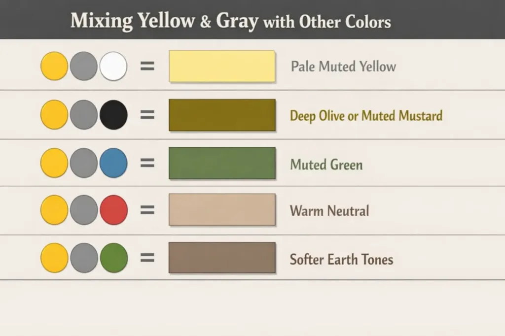
To take your color game further, here’s what you can expect when adding a third color to a yellow‑gray mix — useful for artists, designers, and decorators:
Yellow + Gray + White = Pale Muted Yellow
Adding white lightens the mix and makes the greenish‑gray color soft and pastel‑like. Great for highlights and airy designs.
Yellow + Gray + Black = Deep Olive or Muted Mustard
Black deepens the shade and can turn it into a darker olive tone — almost earthy or mustard‑like, especially in paint.
Yellow + Gray + Blue = Muted Green
Since blue is adjacent to green on the wheel, mixing it with yellow‑gray tends to push the color more toward muted green or sage. Artists often use this combination for foliage or natural landscapes.
Yellow + Gray + Red = Warm Neutral
Adding red warms things up, which can neutralize the greenish tint and produce a warm neutral tone — sometimes slate‑brown or dusty tan.
Yellow + Gray + Green = Softer Earth Tones
More green tends to reinforce the olive aspect, creating soft earthy hues that read as natural and calming.
These combinations help you expand your palette while keeping harmony — especially in art projects or color schemes.
Tips for Mixing Yellow and Gray in Paint or Digital Art
Whether you’re working with real paints or digital tools, mixing yellow with gray can be fun but needs some care to get the right shade.
Start With Small Additions
When you’re mixing physical paints, always start with small amounts of gray added to yellow (or vice versa). Gray is a neutral color, and even a little can dramatically reduce brightness and saturation. Add it slowly, so you can stop when you reach the hue you like.
Test on a Palette or Sample Area
Before applying the mix to a final canvas or surface, test it on a scrap piece of canvas, paper, or sample board. Colors can look very different once dry or on a wall, so this step helps you avoid surprises.
Adjust With White or Black for Lightness or Depth
Once you have a base mix:
- Add white to make the color lighter and softer.
- Add black to make it darker and more muted.
White and black influence tone and value without altering the base hue so much, letting you fine‑tune the look.
Consider Lighting Conditions
Yellow and gray react differently under light — bright, natural light can make any yellow appear more vibrant, while dim light can make gray seem dominant. Always check your color under the lighting where it’ll be seen most.
Use High‑Quality Pigments or Digital Calibration
Better paints and digital tools with accurate color profiles will give you more predictable results. Cheap pigments might shift unpredictable undertones, and uncalibrated screens can show colors differently than they actually print or display.
Real‑Life Examples of Yellow and Gray in Design, Art & Fashion
Yellow and gray are used together in many creative spaces because they offer contrast and balance.
Fashion
Designers love pairing yellow with gray because the bright optimism of yellow contrasts beautifully with gray’s calm neutrality. For example:
- Charcoal gray trousers with a mustard yellow sweater make a stylish, grounded outfit.
- Soft pastel yellow accessories against a gray blazer bring warmth to business wear.
This combination can make outfits look fresh without being overly bold.
Interior Design
Yellow and gray are classic interior colors that suit many styles — from modern to cozy. In home decor:
- Light gray walls act as a calm background.
- Pops of yellow in cushions, throws, or accent pieces add energy.
- Mustard or ochre yellows paired with deeper gray elements create a sophisticated, earthy look.
Designers often use these colors to:
- Brighten up living rooms with subtle pops of yellow against calm gray backgrounds.
- Combine warm gray and buttery yellow for cozy kitchen or bedroom palettes.
This duo is flexible — from soft and minimal to rich and moody.
Branding & Packaging
Graphic designers use yellow and gray to communicate a positive but grounded message. Yellow carries enthusiasm and attention, while gray conveys professionalism and steadiness. This mix works well in branding projects that want a friendly but serious feeling.
Art & Illustration
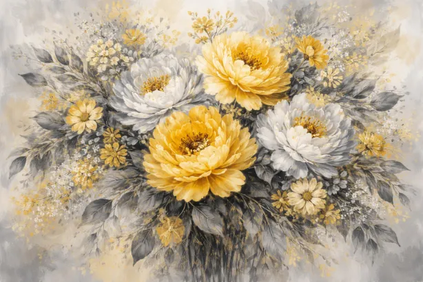
Even fine artists use yellow and gray together. In paintings by some modern artists, you’ll see warm yellow fields balanced with gray areas that calm the composition. This technique helps direct the viewer’s eye and create emotional contrasts on the canvas.
Common Mistakes to Avoid When Mixing Yellow and Gray
Here are a few pitfalls to watch out for when working with these two colors:
1. Using Too Much Bright Yellow
Too much bright yellow can overpower gray and make the mix feel too strong or garish. Instead, balance is key — use gray in small increments to tone yellow without killing its warmth.
2. Ignoring Undertones
Not all grays are the same. Some lean cool with blue undertones, while others are warm with brown or green hints. These undertones affect the final mix, so be mindful of this when choosing gray.
3. Not Testing the Mix
Skipping tests can lead to unwanted final results, especially on a larger surface like a canvas or wall. Always test before committing.
4. Forgetting Lighting Effects
Lighting affects perception. A shade that looks subtle under artificial light can appear bold in sunlight. Always view your mix in the intended lighting condition.
Conclusion
When you mix yellow and gray paint, you usually get a muted olive‑greenish tone or a tone that looks like gray with a hint of green. This happens because gray reduces the brightness and saturation of yellow, steering it toward earthy, subtle hues that are perfect for many artistic and design applications.
Whether in paint mixing, room design, or fashion, yellow and gray together create a balanced and flexible combination — cheerful yet grounded, bright but calm. With some practice and testing, you can achieve the perfect shade every time.
FAQs
What color do yellow and gray make when mixed?
When mixed as paint, yellow and gray typically produce an olive green‑tinted or muted gray‑yellow tone, depending on the proportions you use.
Does yellow and gray make what color in paint?
Yes — the mix usually results in a toned, muted shade influenced by gray’s neutral quality.
Can yellow and gray make beige?
Not usually on their own, beige tends to require warmer brown or tan undertones. You can approach a beige‑like tone by adding white and a tiny amount of brown after mixing yellow and gray.
What happens if I mix yellow, gray, and white?
Adding white will lighten the mix, making it more pastel or soft.
Is yellow and gray used in interior design?
Absolutely, it’s a popular combo that balances energy and calm for stylish, modern spaces.
Can I mix yellow and gray digitally?
Yes, in digital art you simulate this by selecting desaturated yellow tones next to gray, it mimics the appearance of the physical mix.
What shade works best for living room design?
Soft pastel yellow paired with light to medium gray creates a cozy yet uplifting atmosphere.
Does the undertone matter?
Yes, undertones in both yellow and gray influence the final look more than many people expect.
What color does yellow + gray + black make?
Adding black deepens the mix, resulting in a richer, more muted olive or dull mustard tone.
Can yellow and gray mix to a warm tone?
They can, especially if the gray has warm undertones or you add touches of warmer pigments.