Office Door Signs and Corporate Identity: Why the Details on Your Doors Define Your Brand
Office door signs are visual elements used to identify rooms and reinforce brand identity through materials, typography, and design consistency in commercial interiors.
Two companies occupy opposite ends of the same floor in a downtown business center. Company A is a fintech startup — exposed concrete, floor-to-ceiling glass partitions, matte black furniture. Their door signs are custom-cut dark acrylic with white sans-serif type, flush-mounted to the wall. Company B is an accounting firm — traditional wood paneling, leather chairs in the lobby, framed credentials. Their door signs are engraved stainless steel plates on walnut backing, mounted with visible hardware.
Both sets of signs cost roughly the same. Neither is objectively “better”. But each one tells you everything you need to know about the company behind the door before you’ve read a single word on the sign.
The Signal-to-Noise Problem in Office Corridors
Most commercial buildings default to standardized signage: the same generic plates on every door, regardless of the tenant. It’s efficient and inexpensive, but it creates a visual monotone that strips individual offices of their identity. For companies that invest heavily in their digital brand — logos, websites, and social media presence — this disconnect between online identity and physical space is a missed opportunity.
The fix isn’t complicated. It starts with asking a question that rarely appears in the fit-out brief: What should our door signs say about us before anyone reads them?
The answer usually lies in the company’s existing material choices. BSign Store offers office signs designed for corporate interiors, with enough variety in materials, finishes, and mounting options to match most design directions — from industrial-minimal to warm-traditional — without requiring fully bespoke fabrication.
Matching Door Sign Materials to Brand Identity
The material vocabulary of commercial door signs is surprisingly expressive:
- acrylic — reads as contemporary, clean, and versatile. Common in startups, coworking spaces, and modern corporate offices.
- natural wood — communicates warmth, craft, and approachability. Fits creative agencies, wellness companies, and hospitality-adjacent businesses.
- matte black acrylic — signals sophistication and minimalism. Works well for design studios, luxury brands, and fashion-adjacent offices.
- stainless steel — conveys durability, stability, and prestige. A natural match for law firms, financial advisors, and established institutions.
- mixed materials (wood + metal, acrylic + steel) — suggests a layered, design-driven approach. Often chosen by companies that want their space to feel curated and premium.
These aren’t decorating tips — they’re the same material-to-meaning associations that interior designers use when specifying every other surface in the space. Office door signs should follow the same logic.
Modular Door Sign Systems: Flexibility and Brand Consistency
There’s a practical tension between brand consistency and operational reality. People leave. New hires arrive. Departments reorganize. In a law firm with sixty named offices, a single partner departure can mean a sign replacement — and if that replacement takes weeks, the empty mounting plate or handwritten temporary label broadcasts neglect at the exact spot where the firm’s brand should be strongest.
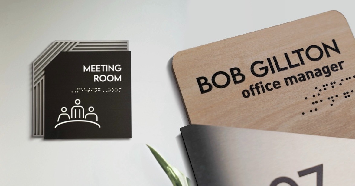
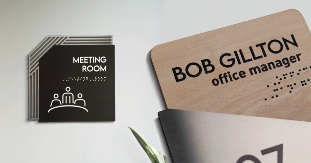
Modular sign systems resolve this by separating the permanent element (the frame, mounting plate, and design vocabulary) from the variable element (the name, title, or room function). The corridor keeps its visual rhythm. The individual sign gets updated in minutes. ADA compliant modular formats with tactile and Braille elements exist too, so accessibility isn’t sacrificed for flexibility.
How Door Signs Reinforce Brand Identity Every Day
A company logo appears in the lobby once. A mission statement lives on one wall. But office door signs repeat on every single door, every single day, in front of every person who walks the corridor. No other brand element in a physical workspace gets that kind of exposure. When that element is thoughtfully designed, it turns ordinary hallways into a continuous, quiet expression of who the company is. When it’s generic, it quietly says the opposite.