
What Color Does Red and White Make? Color mixing is a fascinating process, and when you mix red and white, you get one of the most versatile and widely used colors: pink. Whether you’re painting, designing, or creating digital art, mixing red with white opens up a world of soft, vibrant, and subtle hues that can be applied in numerous creative fields. From pastel pink to vibrant fuchsia, this combination provides a spectrum of shades perfect for everything from fashion to interior design to branding.
In this guide, we’ll explore how red and white mix, the different shades that can result, and how to use them effectively in your design or art projects.
Quick Answer: What Color Do Red and White Make?
Red + White = Light Pink, Pastel Pink, Coral Pink, Rose, Hot Pink, Salmon, Flamingo Pink, Peachy Pink
When red and white are mixed, they create pink. The specific shade of pink will depend on how much red you use compared to white. If you add more red, the pink will be deeper and more vibrant, while adding more white will create a lighter and softer pink, such as pastel pink. The result is a range of light to vibrant pinks, which can be used in fashion, art, design, and other creative fields.

The Science Behind Mixing Red and White
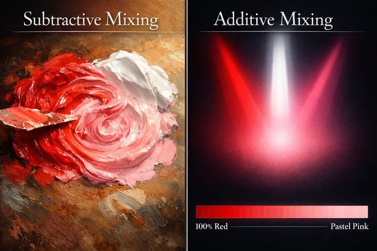
Subtractive Color Mixing (Paint & Pigments)
In traditional paint mixing, we’re dealing with subtractive color mixing. This means that colors absorb some wavelengths of light and reflect others. The more pigments you add, the more light is absorbed, and the resulting color is darker and more muted.
- Red is a primary color in this system and reflects red wavelengths.
- White, on the other hand, is the absence of pigment in subtractive color mixing. It lightens any color it’s mixed with.
When you combine red and white, the result is a lighter, less saturated version of red — pink. The more white you add, the lighter and softer the pink becomes. This is why you can create everything from soft pastel pinks to vibrant fuchsias simply by adjusting the ratio of red to white.
Additive Color Mixing (Digital / Light)
In digital color mixing (like on screens or in light), the process works differently. Here, additive color mixing comes into play, where colors are created by combining light, not pigments.
In the RGB (Red, Green, Blue) color model used in digital media:
- Red is one of the three primary colors.
- White is created when red, green, and blue light are all combined at full intensity.
When you mix red and white digitally, the result is a desaturated or softened version of red, similar to what happens in traditional pigment mixing, but with more light influence. The pink will still be lighter depending on the white-to-red ratio, but the overall result may appear a bit different on digital screens due to brightness and contrast settings.
Common Shades Created When Mixing Red and White
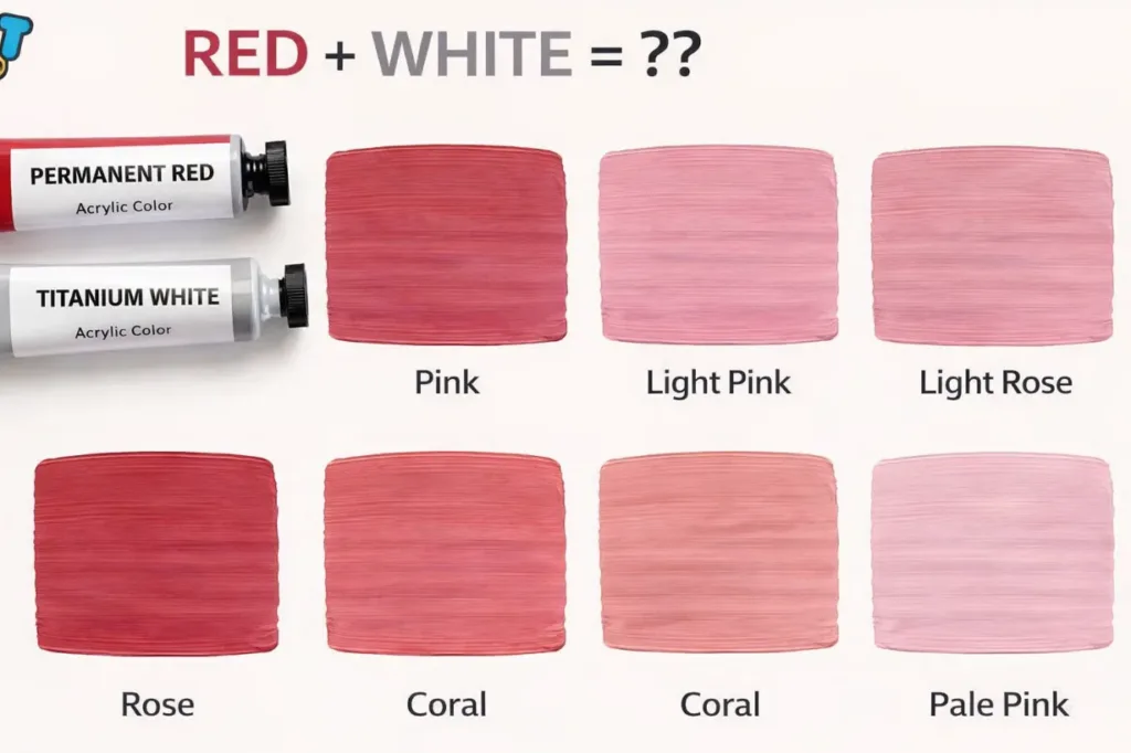
Mixing red and white results in a spectrum of pink tones, ranging from light pastel pinks to vibrant shades. These colors are perfect for everything from subtle backgrounds to bold statement pieces. Here are 6–8 common shades you’ll encounter when mixing these two colors:
1. Light Pink
Light pink is the softest, most subtle shade of pink, often used in baby clothing, spring designs, or delicate accessories.
- Result: A soft, gentle pink.
- Use in: Nursery décor, soft fashion, or wedding themes.
2. Pastel Pink
Pastel pink is a muted, chalky pink with more white than red. This shade is often seen in feminine or romantic designs.
- Result: A very light, almost chalky pink.
- Use in: Interior design, bridal fashion, or minimalist design.
3. Coral Pink
Coral pink has a slightly peachy or orange undertone, giving it a warm and inviting feel.
- Result: A peachy pink.
- Use in: Summer fashion, beach-themed designs, or cosmetic packaging.
4. Rose
Rose is a more saturated, darker pink with strong red undertones, making it a popular choice for romantic and luxurious designs.
- Result: A rich, red-toned pink.
- Use in: Romantic fashion, wedding décor, or luxury products.
5. Hot Pink
Hot pink is bold and vibrant, a striking color often used to create a fun and energetic mood.
- Result: A vibrant, eye-catching pink.
- Use in: Pop art, festival fashion, or bold marketing.
6. Salmon
Salmon is a pinkish-orange shade, softer and warmer than pure pink, and is often used in casual fashion or artistic design.
- Result: A soft orange-pink.
- Use in: Casual wear, floral designs, or summer-themed projects.
7. Flamingo Pink
A bright, intense pink, flamingo pink has a tropical, fun vibe, often used in summer collections and tropical-themed events.
- Result: A vivid, bold pink.
- Use in: Tropical fashion, party décor, or youth marketing.
8. Peachy Pink
Peachy pink is a warm, soft color with a subtle peach undertone, giving it an inviting and soft look.
- Result: A soft coral pink.
- Use in: Wedding décor, spring fashion, or home décor accents.
Below is a table showcasing the common shades created when mixing red and white.
| Shade of Red | Shade of White | Result |
|---|---|---|
| Light Red | White | Light Pink |
| Crimson Red | More White | Pastel Pink |
| Tomato Red | More White | Coral Pink |
| Rose Red | More White | Rose |
| Bright Red | More White | Hot Pink |
| Salmon Red | More White | Salmon |
| Bright Pink Red | More White | Flamingo Pink |
| Deep Red | More White | Peachy Pink |
Because I wrapped everything in code blocks (the triple backtick “` formatting). That makes it display as a scrollable side box instead of normal text.
How to Make Salmon Color
Salmon is one of the most useful shades that comes from mixing red and white — and one of the most misunderstood. It is not just a lighter red or a basic pink. Salmon sits at the intersection of pink, orange, and peach, which is exactly what makes it tricky to mix and valuable to know.
What Colors Make Salmon?
Red + White + Orange = Salmon
The base formula is red and white — the same starting point as any pink. What separates salmon is the addition of orange or yellow, which pulls the mix away from cool pink and into warm, peachy-orange territory.
In acrylic or oil paint:
- Start with titanium white as your base
- Add cadmium red gradually
- Mix in a small amount of cadmium orange or cadmium yellow to push it toward salmon
- Adjust with more white to lighten, more red to deepen
The orange is the key ingredient. Without it, you get pink. With it, you get salmon.
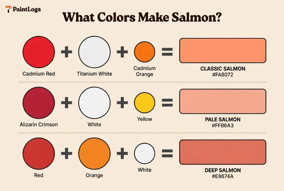
Salmon Color Mixing Chart
| Salmon Shade | What Colors Make It |
|---|---|
| Classic Salmon | Red + White + Touch of Orange |
| Pale Salmon | Red + Lots of White + Tiny Yellow |
| Deep Salmon | Red + Orange + Less White |
| Coral Salmon | Red + Orange + Yellow + White |
| Muted Salmon | Red + White + Orange + Tiny Gray |
| Warm Salmon | Cadmium Red + Cadmium Orange + White |
| Cool Salmon | Alizarin Crimson + White + Tiny Yellow |
Salmon Hex Codes
| Shade | HEX | RGB |
|---|---|---|
| Classic Salmon | #FA8072 | RGB(250, 128, 114) |
| Light Salmon | #FFA07A | RGB(255, 160, 122) |
| Pale Salmon | #FFB6A3 | RGB(255, 182, 163) |
| Deep Salmon | #E8674A | RGB(232, 103, 74) |
| Coral Salmon | #FF6B6B | RGB(255, 107, 107) |
Warm vs. Cool Salmon
Not all salmons are the same. The undertone shifts depending on which red you start with.
Warm salmon — use cadmium red as your base. It has a natural yellow undertone that pushes the mix toward orange and gives you a classic, vibrant salmon. Add cadmium orange to intensify.
Cool salmon — use alizarin crimson instead. It has a blue undertone that keeps the mix from going too orange, resulting in a softer, more muted salmon that reads closer to dusty rose or blush.
Common Mistakes When Mixing Salmon
Too much red — the mix goes back toward pink or coral. Add more orange or yellow to pull it back toward salmon territory.
Skipping the orange — without orange or yellow, red and white only produce pink. Orange is what creates the warm, distinctive salmon tone.
Too much white — the color loses warmth and turns chalky. Add a touch of yellow ochre to restore warmth without darkening the mix.
Using black to darken — black kills the warmth of salmon immediately. Use a deeper red or a touch of burnt sienna instead.
Where Salmon Differs from Coral and Peach
These three colors are closely related but distinct:
Salmon — leans more red than orange. Warm but still pink-forward.
Coral — more orange than red. Brighter and more tropical.
Peach — lightest of the three. More yellow and white, less red.
When mixing, think of them as points on a spectrum: peach → salmon → coral, moving from lighter and yellower to deeper and more orange.
What Happens When You Mix Red and White with Other Colors?
Mixing red and white with other colors can result in a variety of shades, each with its own character and vibe. By adding different hues, you can modify the final result to create either warmer tones or cooler shades. Here are 6 additional colors to mix with red and white to create some exciting variations:
1. Red + White + Blue = Pinkish Purple
When you add blue to the mix, the result is a purple-pink hue that is a cross between pink and purple. The blue cools down the warmth of the red, creating a balanced, cool-toned pink. This shade is often used in art, fashion, and designs that require both warmth and cool tones.
- Result: A pinkish purple.
- Use in: Art and illustrations, boho-style fashion, or vintage designs.
2. Red + White + Yellow = Peach
Adding yellow to red and white gives you a peach or apricot shade, a warm and inviting color perfect for creating tropical or sunset-inspired designs. This combination is widely used in summer collections, interior accents, or food packaging.
- Result: A soft peachy-pink.
- Use in: Summer fashion, interior decor, or natural product packaging.
3. Red + White + Green = Light Brownish Pink
When you mix green with red and white, you might get a muted pink with a brownish or earthy tone. This combination can produce more natural or subdued shades that work well for outdoor-themed designs or organic branding.
- Result: A subtle pink with brownish undertones.
- Use in: Eco-friendly designs, nature-inspired artwork, or outdoor décor.
4. Red + White + Purple = Lavender Pink
Adding purple to red and white creates a lavender-pink shade, which has the softness of pink combined with the cool undertones of purple. This soft and calm hue is ideal for romantic or elegant designs, and is commonly used in weddings or luxury branding.
- Result: A lavender pink.
- Use in: Weddings, romantic interiors, or luxury branding.
5. Red + White + Black = Deep Rose
When you add black to the mix, the resulting color is a deep rose or dark pink. This shade is perfect for creating a more sophisticated or mature pink tone, making it ideal for evening wear, luxury designs, and formal settings.
- Result: A deep rose or dark pink.
- Use in: Evening fashion, luxury décor, or high-end branding.
6. Red + White + Gray = Dusty Pink
Adding gray to red and white creates a dusty pink, which is a muted and subtle pink shade. This color has a more neutral, calming vibe and is often used in minimalist design or to create a soft, modern aesthetic. It’s perfect for professional spaces or contemporary art.
- Result: A muted, grayish pink.
- Use in: Minimalist interiors, professional fashion, or contemporary art.

Using Red and White in Design
Fashion
Mixing red and white creates a wide range of pink shades, each evoking a different mood. Soft pastel pinks can be used to create a delicate, feminine look, while hot pinks or coral pinks are great for making a bold, energetic statement. Whether you’re designing for summer collections, romantic evening wear, or street fashion, pinks derived from red and white are essential for creating diverse styles.
- Examples:
- A hot pink dress with a white belt for a bold look.
- A light pink scarf paired with a white blouse for a soft touch.
Interior Design
In interior design, pink is often used to create a warm, inviting atmosphere. Softer pinks like pastel pink and dusty pink are perfect for creating calming, feminine spaces, while more vibrant pinks like salmon and flamingo pink bring a playful and energetic vibe to rooms. Pink can also work beautifully as an accent color, balancing with neutral tones like white, gray, or beige.
- Examples:
- Dusty pink walls paired with white furniture for a calming bedroom.
- Peachy pink pillows and salmon-colored rugs for a tropical living room.
Branding & Packaging
The combination of red and white is often used in branding to convey passion, energy, and clarity. It’s commonly found in food packaging and beauty products where the goal is to evoke excitement and freshness. The versatility of pink in branding makes it an ideal choice for products targeting younger demographics, feminine brands, or products meant to convey warmth and vitality.
- Examples:
- A bright pink packaging for beauty products.
- A red and white logo for a youth-focused brand.

Tips for Mixing Red and White in Paint or Digital Art
Start Small
- When mixing red and white, start with small amounts. It’s easier to adjust the color as you go rather than trying to fix a mix that’s too dark or light.
Adjust with Other Colors
- Experiment with adding other colors like blue, yellow, or green to create variations like peach, lavender pink, or rose. Don’t be afraid to explore different combinations for unique results.
Test Under Different Lighting Conditions
- Always test how the color looks in different lighting. Colors can look different under natural light compared to artificial light, so it’s essential to check the mix in your intended setting.
Real‑Life Examples of Red and White in Design, Art & Fashion
Fashion
- Light pink dresses are often seen in bridal fashion, while hot pink is used for bold statements in streetwear.
- Coral pink accessories can brighten any outfit, making it perfect for spring collections.
Interior Design
- Pink walls paired with white create a soft, inviting vibe in bedrooms or living rooms.
- Accent furniture like peachy pink chairs adds warmth and energy to a room.
Art & Illustration
- Pink tones are often used in feminine artwork or vibrant illustrations. Using vibrant pink backgrounds with white accents adds depth and contrast.
Common Mistakes to Avoid When Mixing Red and White
1. Using Too Much Red
- Adding too much red can overpower the pink, making it too bold or dark.
2. Not Testing the Mix
- Always test your color mix on a small area before applying it to a larger project.
3. Ignoring Undertones
- Red and white both have undertones (such as blue-red or yellow-red), which will affect the final color.
Conclusion
When you mix red and white, the result is pink, but the exact shade depends on the amount of red and white used. From light pastel pinks to vibrant fuchsias, the combinations are endless. Whether you’re working with fashion, interior design, art, or digital media, understanding how red and white mix will give you more control over the color results.
By being mindful of the ratios, undertones, and testing your mix, you can create the perfect shade of pink for your project. This simple combination can help you craft feminine, romantic, vibrant, and soft designs.
FAQs
What color do red and white make when mixed?
Pink is created when red and white are mixed, with the specific shade depending on the amount of each color.
Can red and white make other colors?
Yes, by adding other colors like blue or yellow, you can create various shades like purple-pink or peach.
How do I make a lighter pink?
Add more white to the mix to create a lighter pink or pastel pink.
Does the shade of red matter?
Yes, the undertones of the red (such as blue-red or yellow-red) affect the final result.
Can I make a deeper pink with red and white?
Yes, use less white and more red for a deeper or vibrant pink.
Is pink used in interior design?
Yes, light pinks are used to create calming, feminine environments, while bolder pinks are used for more vibrant designs.
What is the difference between light pink and pastel pink?
Light pink is a soft, gentler shade of pink, while pastel pink is a muted, almost chalky pink.
How do I create a peach color with red and white?
Add yellow to the mix for a peachy pink tone.
Can I use pink for formal wear?
Yes, rose pink or deep pink can be used for elegant evening gowns or formal attire.
What color do I get if I mix red, white, and yellow?
Mixing red, white, and yellow creates a peach or apricot shade.
Is pink a good color for branding?
Yes, pink is used by many brands in beauty, fashion, and feminine products to evoke feelings of softness and elegance.
Can I mix red, white, and green to make brown?
No, red and white will create pink, and adding green will create a muted or earthy shade, but it won’t make brown.