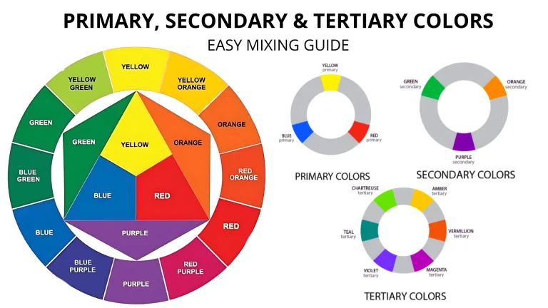

What Color Do Red and Orange Make? When red and orange are mixed, they create a vibrant, warm color that’s typically a burnt orange, coral, or red-orange/vermilion shade. The exact result depends on the ratio of red to orange and the specific shades used, with a higher proportion of red leaning towards deeper tones and a higher proportion of orange creating a brighter, lighter hue.
In this guide, we’ll explore what color red and orange make, how different color models like RYB, RGB, and CMYK influence the mix, and the best ways to use these colors in art, design, and fashion. Whether you’re mixing paint or working in a digital medium, this guide will give you all the insights you need to achieve the perfect red-orange hue.
Quick Answer: What Do Red and Orange Make When Mixed?
Red + Orange = Burnt orange, Coral, or Red-orange/vermilion shade
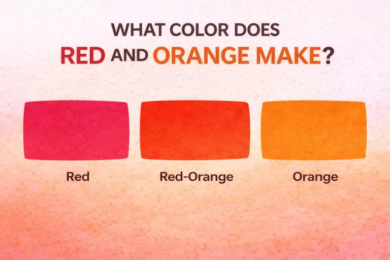
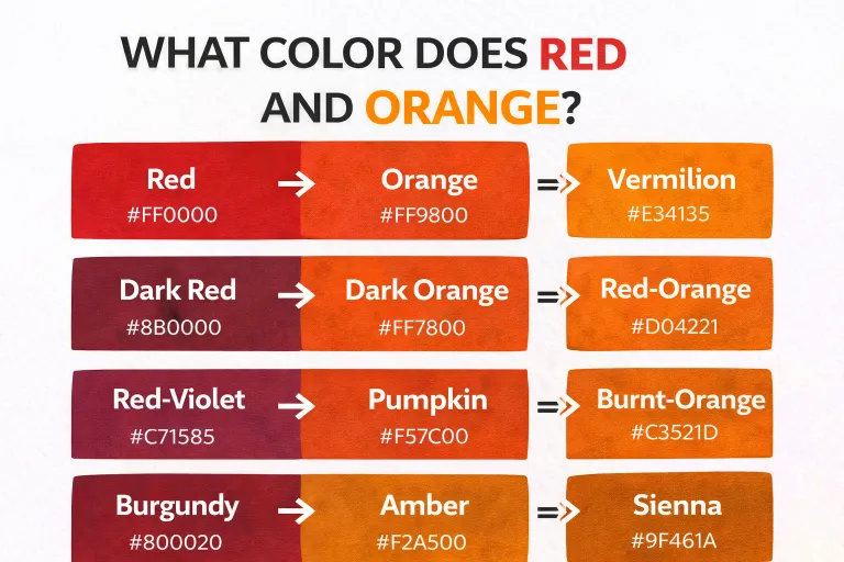
When red and orange are mixed, the result is typically a reddish-orange color, sometimes referred to as vermilion, scarlet, or coral, depending on the exact shades of red and orange used. Red, being a primary color, and orange, being a secondary color, create a warm and vibrant mix. The exact shade will depend on whether more red or more orange is used.
Why Do Red and Orange Make This Color?
Red is a primary color, and orange is a secondary color made by mixing red and yellow. When you mix these two colors, the result is essentially a mix of two versions of red, which leads to a vibrant reddish-orange.
This combination results in a color that maintains the intensity of red, while being warmer and brighter due to the presence of orange. The more red you add, the deeper and more intense the color will be, while more orange will create a softer, brighter hue.
What Happens When You Mix Different Shades of Red and Orange?
The mix of red and orange can vary greatly depending on the specific shades of each color. Here’s how different combinations can affect the final result:
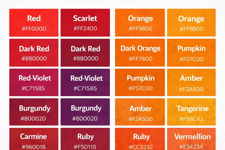
| Red Shade | Orange Shade | Mixed Color Result |
|---|---|---|
| Bright Red | Light Orange | Coral |
| Scarlet Red | Tangerine Orange | Vibrant Vermilion |
| Crimson Red | Deep Orange | Burnt Orange |
| Rose Red | Peach Orange | Warm Peachy Coral |
| Cherry Red | Blood Orange | Rich Red-Orange |
| Ruby Red | Golden Orange | Amber |
| Dark Red | Cantaloupe Orange | Rust |
| Fire Engine Red | Pumpkin Orange | Bold Vermilion |
| Tomato Red | Orange-Red | Fiery Red |
| Pale Red | Mandarin Orange | Soft Peach |
Each variation results in a slightly different red-orange shade. The lighter reds and oranges will produce softer, peachy tones, while darker reds create more deep, intense colors like vermilion or burnt orange.
Red and Orange in Paint: RYB (Red, Yellow, Blue) Color Model
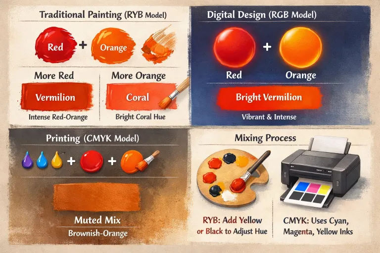
In the RYB color model, used in traditional painting, red and orange are both warm colors. Mixing these two usually results in a brighter or darker variation of red-orange, depending on the proportion of each color.
- More Red: If you use more red, the mix will lean toward a deeper, intense red-orange like vermilion.
- More Orange: Adding more orange will create a lighter, brighter mix, often resulting in a shade similar to coral.
Quick Tip for Paint Mixing:
- To adjust the hue, you can also add small amounts of yellow to lighten the mix, or black to darken it.
Red and Orange in Digital Media: RGB vs. CMYK
When it comes to digital design, red and orange behave differently in RGB and CMYK models.
RGB Model (Additive Mixing):
In digital art and design, red and orange mixed in the RGB (Red, Green, Blue) model will create a bright, warm color leaning toward vermilion. Because RGB is an additive color model, combining red and orange results in an intense, bright color.
CMYK Model (Subtractive Mixing):
In printing (using the CMYK model), red and orange mixed together will result in a more muted or earthy tone, closer to a brownish-orange. The use of cyan, magenta, and yellow inks subtracts light and results in more dull colors compared to the bright vibrancy of the RGB model.
How the Ratio of Red to Orange Affects the Final Color
The ratio of red to orange significantly impacts the outcome. By adjusting this ratio, you can create a wide range of reddish-orange hues, from soft and warm to intense and deep.
- More Red: More red leads to a darker, richer color like vermilion or burnt orange.
- More Orange: More orange will produce a lighter, more peachy or coral-like result.
| Red % | Orange % | Mixed Color Result |
|---|---|---|
| 100% Red | 0% Orange | #FF0000 (True Red) |
| 75% Red | 25% Orange | #FF4F00 (Vibrant Vermilion) |
| 50% Red | 50% Orange | #FF7F00 (Burnt Orange) |
| 25% Red | 75% Orange | #FFA500 (True Orange) |
| 0% Red | 100% Orange | #FF8000 (Bright Orange) |
Artistic Uses of Red and Orange Together
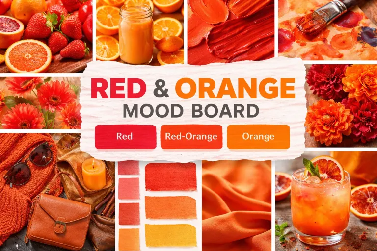
In art and design, red and orange can be used to create bold, warm, and energetic compositions. Here’s how they can be applied:
In Art:
- Abstract Art: The vibrant red-orange tones are used for creating dynamic compositions in abstract or expressionist art.
- Portraits: These colors are often used in warm skin tones or for creating dramatic shading.
- Landscapes: Burnt orange or vermilion is commonly used in sunsets or to create vivid foliage in autumn landscapes.
In Fashion:
- Bold Statements: Orange and red are often used in high-fashion collections to create striking, energetic looks.
- Bohemian Styles: These colors also pair well with earthy tones, making them ideal for boho or retro-inspired outfits.
In Interior Design:
- Warm Interiors: Use vermilion, rust, or burnt orange to create a cozy, welcoming atmosphere in living rooms or dining spaces.
- Autumnal Vibes: Combining red and orange creates a rich, autumnal color scheme for any room needing warmth and energy.
How to Adjust the Mix: Add White, Black, or Yellow
By adding other colors, you can adjust the lightness, darkness, or warmth of your red-orange mix.
- Add White: Adding white to red and orange makes the color lighter, resulting in a peach or soft coral.
- Add Black: Adding black will give you a darker, more earthy tone like burnt orange or vermilion.
- Add More Yellow: If you add more yellow, you’ll get a brighter orange hue, resembling golden orange.
Mixing Red and Orange with Other Colors
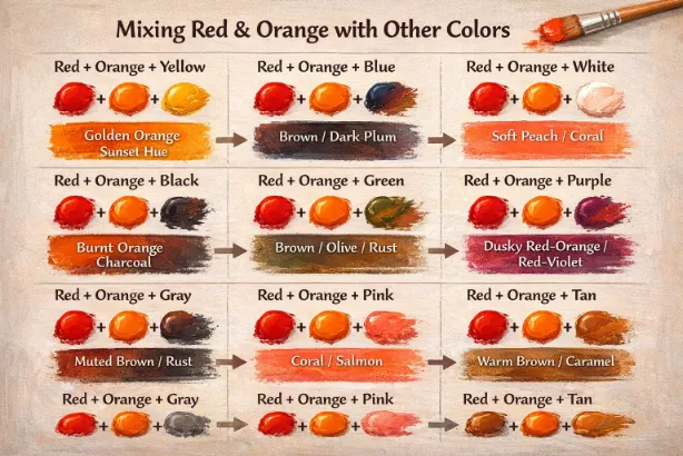
Combining red and orange with other colors expands the possibilities, resulting in a wide range of hues. By adjusting the ratio or adding specific colors, you can create subtle variations or even entirely new shades. Here’s how red and orange interact with other colors:
Red + Orange + Yellow
Adding yellow to red and orange creates a brighter, warm-toned mix, often resulting in a golden orange or a sunset-like hue. This combination enhances the overall warmth, giving a rich, energetic feel.
Red + Orange + Blue
When blue is added to red and orange, it results in a darker, more muted color, shifting towards brown or purple tones, depending on the ratio. The coolness of blue contrasts with the warm tones of red and orange.
Red + Orange + White
Adding white to the mix lightens the color, creating a soft pastel or peachy coral tone. This combination is perfect for creating a gentler, subtle effect in designs or artwork.
Red + Orange + Black
When you mix black with red and orange, you get a darker, more earthy tone like burnt orange or charcoal-like shades. The black adds depth and intensity, making the color appear richer.
Red + Orange + Green
The result of mixing red, orange, and green depends on the proportions used, but it typically creates muted earth tones such as brown, olive, or rust. The green acts as a balancing element, neutralizing the vibrant warmth of the red and orange.
Red + Orange + Purple
Adding purple to red and orange can create dusky red-oranges or deep plum-like colors. The purple tones cool down the mix, resulting in a more balanced, neutral brown or a vibrant red-violet.
Red + Orange + Gray
Mixing gray with red and orange gives a muted, subdued tone. The result is typically a grayish brown or rust-like shade. This combination is ideal for creating neutral, modern looks.
Red + Orange + Pink
By combining red, orange, and pink, you get a vibrant coral or a soft salmon color. The pink adds a touch of brightness, creating a fresh, feminine feel.
Red + Orange + Tan
Mixing tan with red and orange results in a warm, earthy tone that is more muted than other combinations. The tan acts as a neutralizer, producing warm browns or caramel shades perfect for rustic or vintage themes.
Conclusion
Mixing red and orange results in a beautiful blend of warmth and energy, often creating hues that are perfect for making a bold, eye-catching statement. By adjusting the ratio of red to orange, you can achieve everything from soft peach to deep, intense burnt orange. Whether you’re using the RYB, RGB, or CMYK color models, understanding how these two colors combine allows you to create a range of vibrant tones for use in art, design, fashion, and beyond.
With the knowledge gained from this guide, you’ll be able to confidently mix red and orange to create stunning effects, whether you’re looking for a lively, fiery hue or a more muted, earthy tone. This versatile color pairing is perfect for any project, making it an essential tool in any artist’s or designer’s palette.
FAQs – Red and Orange Color Mixing
What color do red and orange make when mixed?
Answer: Red and orange typically create a reddish-orange color, like vermilion or burnt orange.
Can I create a vibrant red-orange color from red and orange?
Answer: Yes, mixing red and orange results in vibrant reddish-orange hues, which are bright and full of energy.
How does adding white affect the red and orange mix?
Answer: Adding white creates a lighter mix, resulting in a peach or soft coral color.
How can I make the color darker?
Answer: Adding black or more red will deepen the color, turning it into burnt orange or vermilion.
Can I make a bright, golden color with red and orange?
Answer: Yes, adding yellow to the mix will give you a bright golden orange or sunset orange.
What’s the difference between vermilion and scarlet?
Answer: Vermilion tends to be a deeper, more intense red-orange, while scarlet is a bright, pure red-orange color.
What do I get if I mix red, orange, and blue?
Answer: Mixing red, orange, and blue usually creates a muted brown or purple tone.
How do I make a more vibrant, fiery orange?
Answer: Increase the orange in the mix and add a touch of yellow to intensify the warmth.
Can I use red and orange in interior design?
Answer: Yes, red and orange are great for creating bold, warm spaces, especially in living rooms or dining rooms.
How do red and orange mix in digital design?
Answer: In RGB design, red and orange create a vibrant, fiery color perfect for web designs and branding.
Can I create a deep, rich orange with red and yellow?
Answer: Yes, adding more yellow to your mix will deepen the orange and create a golden, rich tone.
What’s the best way to use red and orange together in fashion?
Answer: Combine warm reds with oranges for fall fashion, creating earthy, autumnal looks.