
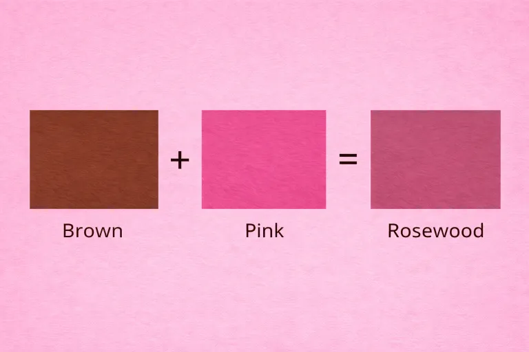
What Color Does Brown and Pink Make? When you mix brown and pink, the result isn’t a bright or bold new color; instead, you typically get muted, warm, earthy tones with soft, rosy or dusty undertones. The final shade depends heavily on the exact tones of brown and pink you use and the proportions in which you mix them. In most cases, the outcome falls somewhere between dusty rose, mauve brown, blush brown, or taupe‑rose, all of which feel warm, grounded, and rich.
Understanding what color brown and pink make together is useful in a wide range of creative contexts, from paint mixing and digital design to fashion coordination and even hair color blending. These soft yet deep tones are celebrated in design because they evoke warmth, sophistication, and comfort, while still maintaining a subtle, elegant vibe.
This guide will walk you through the science behind the mix, the common shades produced when brown and pink are combined, how to reproduce them in different mediums (like paint vs digital), and how to use these colors effectively in art, design, and styling.
Quick Answer: What Color Do Brown and Pink Make?
The basic color equation looks like this:
Brown + Pink = Muted Rosy Earthy Tones
Here’s how the mix typically works:
- If you add more pink to brown, the result leans toward a softer rosy tone — like dusty rose or blush brown.
- If you add more brown to pink, the outcome becomes a deeper, earthier rosy tone — like mauve brown or taupe‑rose.
- If the brown is darker or cooler, the final shade will appear more muted and deeper.
- If the pink is lighter or warmer, the shade will feel brighter and gentler, though still earthy.
These resulting hues are often used in interior palettes, brand design, fashion collections, and art pieces where a sophisticated, grounded look is desired.
The Science Behind Mixing Brown and Pink
To fully understand what color brown and pink make, it helps to know what’s happening when these two colors mix:
Subtractive Color Mixing (Paint & Pigments)
When you mix brown paint and pink paint together, you’re using subtractive color mixing — meaning pigments absorb light rather than emit it. Brown is typically made from a combination of primary pigments (often red, yellow, and blue) and white, which gives it a neutral, earthy base. Pink, on the other hand, is essentially a tint of red (red mixed with white).
When these two meet:
- The vibrancy of pink is toned down by the neutrality of brown.
- Brown’s absorbing qualities mellow out pink’s brightness.
- The result is a muted tone that sits somewhere between the original hues.
This is why brown + pink often results in dusty, earthy, or muted rosy shades rather than bright pastels or bold earth tones.
Additive Color Mixing (Digital / Light)
In digital mediums (like screen design or digital art), mixing happens through additive color mixing, which blends light rather than pigments. However, since both brown and pink are colors derived from light wavelengths, the result still relies on the balance of red, green, and blue (RGB) values.
- Brown has higher red and green values with lower blue.
- Pink has high red and moderate blue/green values.
When mixed digitally, the average of these RGB values creates a muted, medium‑light tone similar to traditional paint mixes — often represented as dusty rose or taupe tones.

Common Shades Created When Mixing Brown and Pink
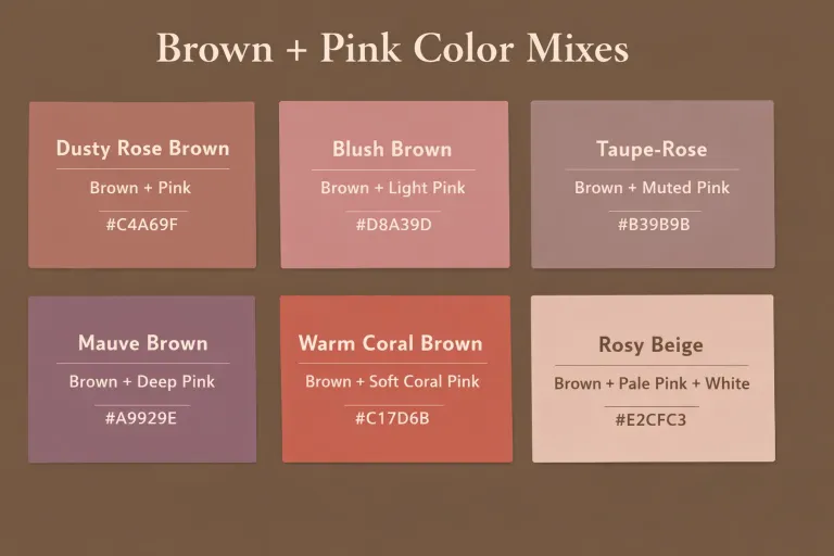
Depending on the ratio and undertones of each color, brown and pink mixes can produce a variety of warm, earthy tones. Below are six of the most common results, including color equations and HEX codes you can use for digital design.
| Shade | Mix Equation | HEX Code |
|---|---|---|
| Dusty Rose Brown | Brown + Pink (balanced) | #C4A69F |
| Blush Brown | Brown + Light Pink (more pink) | #D8A39D |
| Taupe‑Rose | Brown + Muted Pink | #B39B9B |
| Mauve Brown | Brown + Deep Pink (cooler undertone) | #A9929E |
| Warm Coral Brown | Brown + Soft Coral Pink | #C17D6B |
| Rosy Beige | Brown + Pale Pink + White | #E2CFC3 |
1. Dusty Rose Brown
- Mix: Brown + Pink
- Color Notes: A warm earthy tone with gentle rosy highlights. Great for designs that need richness without brightness.
- Visual Feel: Warm, grounded, with a soft elegant quality.
2. Blush Brown
- Mix: Brown + Light Pink
- Color Notes: Slightly lighter and more vibrant than dusty rose brown, with a gentle, romantic hue.
- Visual Feel: Soft and warm, ideal for feminine palettes and cozy interior tones.
3. Taupe‑Rose
- Mix: Brown + Muted Pink
- Color Notes: A perfectly muted neutral with a rosy tint. Looks elegant and subdued.
- Visual Feel: Neutral base with delicate warmth.
4. Mauve Brown
- Mix: Brown + Deep Pink (cooler)
- Color Notes: Cooler and deeper than dusty rose brown, close to mauve with earthy undertones.
- Visual Feel: Sophisticated and restrained.
5. Warm Coral Brown
- Mix: Brown + Soft Coral Pink
- Color Notes: A slightly warmer, coral‑leaning brown that feels cozy and inviting.
- Visual Feel: Warm, vibrant, and cheerful without being bright.
6. Rosy Beige
- Mix: Brown + Pale Pink + White
- Color Notes: A light, soft rosy neutral. Great for backgrounds, subtle accents, and gentle palette themes.
- Visual Feel: Calm, airy, and warm.
How to Control the Outcome
To achieve a specific shade, keep these tips in mind:
- Add white: lightens the mix and emphasizes the pink’s warmth.
- Add more pink: softens brown and creates rosier tones.
- Add more brown: deepens the hue toward earthy, muted tones.
Each adjustment moves the shade through a warm, neutral, or cool spectrum depending on the undertones in your original pigments or digital swatches.
Brown and Pink in Paint: RYB, CMYK & Digital Color Models
Understanding how brown and pink interact in different color systems helps explain why the mixed results look the way they do. The results vary slightly based on whether the mix happens in traditional paint, print, or digital light.
RYB Color Model (Paint – Subtractive Mixing)
The RYB (Red–Yellow–Blue) model is used for traditional painting and pigment mixing. In this model:
- Brown is typically a mix of primary colors plus black — a very saturated, earthy tone.
- Pink is a tint of red, created by adding white to red.
When you mix brown with pink in paint:
- The brightness of pink is subdued by brown’s darker, earthier base.
- Brown tends to absorb light, while pink reflects light, so the result is a muted, warm tone.
- The exact shade depends on how light or warm either original color is:
- Light pink + light brown → soft rosy neutrals
- Deep pink + dark brown → rich dusty rose or mauve brown
In RYB paint mixing, the result stays earthy and muted because the colors are absorbing more light than they reflect.
CMYK Color Model (Print – Subtractive Mixing)
The CMYK model (Cyan, Magenta, Yellow, Key/Black) is used in printing. Pink is essentially high magenta plus white space (no ink), and brown is created with a mix of cyan, magenta, and yellow inks.
- Brown + pink in print → soft, muted rosy browns
- The more magenta (pink tones) you add, the redder the mix tilts
- The more yellow/black (brown influence), the deeper or earthier the tone
Print tends to produce rich muted tones because cyan/magenta/yellow layer and absorb light differently than paint.
RGB Color Model (Digital – Additive Mixing)
The RGB model blends red, green, and blue light. Since both brown and pink are light‑based in digital art:
- Brown typically has strong red and green values, lower blue
- Pink has high red and moderate green/blue
When mixed digitally:
- You get a muted rose‑brown tone that depends on brightness values
- Increasing white (light) brightens the RGB mix
- Increasing black (lack of light) darkens it — producing deeper dusty tones
RGB mixes can appear softer or slightly brighter than their paint counterparts.
What Happens When You Mix Brown and Pink with Other Colors?
Adding a third color to the brown + pink mix can dramatically shift the resulting shade. This is useful when you want more control over the tone or emotional feel.
Brown + Pink + White = Blush or Rosy Beige
- Equation: Brown + Pink + White = Rosy Beige / Blush
- Result: A soft, light, warm tone ideal for subtle backgrounds or gentle palettes.
- Use: Interior design, wedding palettes, gentle fashion tones
This creates a color with more lightness and less depth, often seen in soft neutrals or blush palettes.
Brown + Pink + Black = Mahogany Rose / Deep Mauve Brown
- Equation: Brown + Pink + Black = Deep Mauve Brown / Mahogany Rose
- Result: A rich, deep tone perfect for contrast and dramatic effects.
- Use: Branding, accent walls, sophisticated fashion accents
Adding black darkens the mix, giving it a moody, refined look.
Brown + Pink + Red = Dusty Rosewood
- Equation: Brown + Pink + Red = Dusty Rosewood
- Result: A warm, reddish earthy tone with more depth and warmth than blush.
- Use: Rustic or autumn palettes, natural branding
The addition of red brings back some warmth and saturation, but brown keeps it grounded.
Brown + Pink + Yellow = Coral Taupe
- Equation: Brown + Pink + Yellow = Coral Taupe / Peach Brown
- Result: A warm, slightly orangey muted tone.
- Use: Cozy interiors, autumn fashion lines
Yellow adds warmth and richness, making the result feel earthy yet lively.
Brown + Pink + Blue = Mauve Taupe / Dusty Lavender
- Equation: Brown + Pink + Blue = Dusty Lavender Brown / Mauve Taupe
- Result: A cool earthy tone with grayish or lavender undertones.
- Use: Sophisticated branding, calm interior spaces
Blue pulls the tone toward cooler grays or purples, creating a muted but elegant result.

Using Brown and Pink in Design
The warm rosy tones from mixing brown and pink are popular across many creative fields. Here’s how you can use them effectively:
Fashion
- Fall/Winter Collections: Earthy rosy browns like dusty rose brown or mauve brown add warmth and sophistication.
- Streetwear: Muted tones paired with neutrals like beige or olive create balanced, stylish looks.
Interior Design
- Neutral Accent Walls: Rosy taupes and blush browns create cozy, inviting spaces.
- Textiles: Rugs, pillows, and upholstery in muted rose/brown tones add warmth without overpowering.
Branding & Packaging
- Luxury & Beauty Brands: Dusty rose and mauve brown convey elegance and subtle sophistication.
- Natural & Organic Brands: Blush beige or rosy taupe works well with earthy imagery.
Tips for Mixing Brown and Pink in Paint or Digital Art
To achieve the shade you want, follow these practical tips:
Start with Small Additions
Always begin by adding small amounts of pink to brown (or vice versa). It’s easier to deepen or mute the color gradually than to fix it afterwards.
Test on a Palette or Sample Area
Colors can look different once they dry or render, so test the mix on a white surface (or digital swatch) first.
Adjust with White or Black for Lightness or Depth
- Add more white to soften and brighten
- Add more black for depth and mood
Consider Lighting Conditions
Lighting affects how muted or warm a color can appear, especially in interiors or photography.
Use High‑Quality Pigments or Digital Calibration
Quality paints mix more predictably, and accurate RGB calibration helps in digital design.
Real‑Life Examples of Brown and Pink in Design, Art & Fashion
Brown and pink combinations aren’t just theoretical — they’re widely used in real creative fields. These muted, earthy rosy tones add warmth and sophistication to many styles.
Fashion
Earthy rose and blush brown tones have become a staple in modern fashion:
- Autumn/Winter Collections: Shades like dusty rose brown and mauve brown appear in jackets, sweaters, boots, and scarves, giving outfits a cozy yet refined look.
- Streetwear & Casual Style: Muted tones often replace bold brights, especially in layered looks or monochrome outfits.
- Accessories: Rosy neutrals are popular for bags, belts, hats, and leather goods, pairing well with cream, olive, and charcoal.
Example: A taupe‑rose trench coat over cream knits creates a stylish neutral palette.
Interior Design
In interiors, brown + pink mixes work beautifully as grounding, warm tones:
- Accent Walls: Blush brown or rosy beige walls bring warmth without loud color.
- Furniture & Fabrics: Sofas or throw pillows in dusty rose add softness and balance when paired with wooden furniture.
- Soft Furnishings: Rugs, cushions, and curtains in taupe‑rose or warm coral brown make spaces feel inviting and calm.
Example: A living room with slate gray walls and blush brown textiles feels balanced, contemporary, and soothing.
Branding & Packaging
Muted earthy pink‑brown tones are trending in branding — especially for beauty, lifestyle, and luxury:
- Cosmetics Packaging: Rosy neutrals convey softness and elegance.
- Lifestyle & Boutique Brands: Blush brown or dusty rose tones in logos and websites feel modern and feminine without being overpowering.
- Food & Organic Products: Earthy pink browns complement natural imagery and sustainable messaging.
Example: A wellness brand using dusty rose brown as a secondary brand color evokes warmth and approachability.
Art & Illustration
Artists often combine brown and pink to achieve subtler emotional tones:
- Portraits: Warm earthy rosy tones enhance skin tones and create depth.
- Still Life & Landscapes: Muted rosy browns represent shadows, dried leaves, sunset light, and weathered textures.
- Abstract Works: Rosy neutrals help balance stronger hues, adding sophistication.
Example: A landscape painting with mauve brown shadows and warm peach highlights feels atmospheric and grounded.

Common Mistakes to Avoid When Mixing Brown and Pink
While brown and pink usually mix beautifully, a few common pitfalls can make results less appealing:
1. Using Too Much Bright Pink
If you start with a highly saturated hot pink, brown will mute it significantly. Rather than ending up with vivid rosy tones, you might get a dull, muddy result.
Tip: Begin with soft or muted pinks for predictable results.
2. Ignoring Undertones
Both brown and pink have warm and cool variants. Mixing cool pink with warm brown can create grayish, less vibrant tones.
Tip: Match undertones — warm pink with warm brown, cool pink with cool brown — for harmonious colors.
3. Not Testing the Mix
Colors often change once dry or on different surfaces. A rosy blend that looks great on paper may look darker once it dries on canvas or fabric.
Tip: Always test small swatches first.
4. Forgetting Lighting Effects
Rosy earthy tones look different under natural, fluorescent, or warm indoor lighting. A rosy brown might look blush in sunshine but muddy indoors.
Tip: View samples in multiple lighting conditions.
Conclusion
Mixing brown and pink creates a range of muted earthy tones, from soft blush brown and dusty rose to deeper hues like mauve brown and taupe‑rose. These colors are valued for their warmth, sophistication, and versatility. They work well in paint, fashion, interior design, branding, and digital art.
The final shade depends on the proportion of each color and their undertones. Light pink softens brown into gentle rosier neutrals, while deeper pinks combine with brown for richer earthy tones. Adding white lightens and brightens the mix, while black darkens it for deeper, moodier shades.
Understanding how brown and pink interact gives you greater creativity when choosing palettes for your projects — whether you’re designing clothes, crafting interiors, or developing branding.
FAQs
What color do brown and pink make when mixed?
Mixing brown and pink usually creates muted rosy tones such as dusty rose brown, blush brown, or taupe‑rose.
Does brown and pink make what color in hair dye?
Yes — mixing brown and pink hair dyes often yields rose gold, blush brown, or mauve brown shades.
Can brown and pink make beige?
Yes — when you add enough white to the mix, brown and pink can create rosy beige or blush beige.
What happens if I mix brown, pink, and white?
The result is typically a lighter, soft tone like rosy beige or blush brown.
Is brown and pink used in interior design?
Yes — brown + pink blends create warm, cozy spaces and are widely used in textiles, walls, and decor accents.
Can I mix brown and pink digitally?
Yes — in digital design, blending brown and pink RGB values creates soft muted tones ideal for backgrounds and UI elements.
What shade is best for wedding design?
Blush brown, dusty rose brown, and rosy beige are popular in wedding color palettes.
Does the undertone matter?
Yes — warm undertones produce warm rosy shades, while cool undertones produce more muted, subtle tones.
What color does brown + pink + yellow make?
This mix often results in coral taupe or peach brown.
Can brown and pink mix to a cool tone?
Yes — with cool pinks and cool browns, you can get dusty lavender brown or taupe with a cool hint.
How do I achieve a deeper rosy brown?
Add a touch of black to brown + pink for a deeper, richer mauve brown or mahogany rose.
Are brown and pink good for branding?
Absolutely — these muted rosy tones convey warmth, sophistication, and gentle elegance.