
What Color Do Blue and Gray Make? Mixing blue and gray produces a wide range of cool, muted, and sophisticated shades that are perfect for creating calming, modern, and industrial designs. The combination results in tones ranging from stormy blue to slate blue, depending on the proportions of blue and gray used. This mixture is popular in fashion, interior design, art, and branding because of the calming, yet elegant atmosphere it creates.
Understanding the science behind this mix and knowing the different shades and their uses can help you choose the perfect blue-gray for your project. Whether you’re aiming for a deep navy or a subtle dusted slate, mixing blue and gray gives you the flexibility to experiment with various designs.
Quick Answer: What Color Do Blue and Gray Make?
Blue + Gray = Slate Blue, Stormy Blue, Steel Blue, Dusty Blue, Pewter Blue, Ice Blue, Midnight Slate, Cloud Blue
When blue and gray are mixed together, the resulting color is typically a cool, muted blue. The precise tone can vary depending on the ratio of blue to gray:
- More blue will result in a richer, deeper shade of blue.
- More gray will create a softer, more subdued tone, such as slate blue or stormy blue.
This blend creates a more neutral and subtle shade of blue compared to the vibrant blues commonly seen in other color mixes. The result is often used for creating calming, modern, and sophisticated atmospheres in various design applications.

The Science Behind Mixing Blue and Gray
Subtractive Color Mixing (Paint & Pigments)
When you mix blue and gray in physical mediums like paint or pigments, you’re engaging in subtractive color mixing. In this process, colors are combined by subtracting (absorbing) light, leading to the creation of a new hue.
- Blue, a primary color, reflects blue light and absorbs other wavelengths.
- Gray, on the other hand, is created by mixing black (the absence of light) with white. When mixed with blue, gray helps to soften the vibrancy of blue, resulting in a muted, subdued shade.
The more gray you add, the more the blue will appear muted and closer to a grayish blue. This is why you can create anything from a soft slate blue to a deep stormy blue by adjusting the proportion of gray.
Additive Color Mixing (Digital / Light)
In digital art or when mixing colors on a screen, the process follows additive color mixing, where colors are created by adding light. In this model, blue is a primary color, and gray is typically created by combining black and white in varying proportions.
When mixing blue and gray in the RGB (Red, Green, Blue) system, the result is a darker, muted blue, similar to the subtractive mixing but influenced by the brightness and contrast on a screen. The mixture might look like a deep blue or a grayish blue depending on the screen’s settings and how much black and white is used.
While digital color mixing is different from physical pigments, the general outcome is still a cool, subdued blue, making it suitable for digital art, web design, and graphic illustrations.

Common Shades Created When Mixing Blue and Gray
Mixing blue and gray results in a variety of cool, muted tones, each of which can create a calming or dramatic effect, depending on the desired atmosphere. Here are some of the most common shades that are created when these two colors are mixed:
1. Slate Blue
- Slate blue is one of the most popular results when mixing blue and gray. It’s a grayish blue that’s often used in modern and minimalist designs because of its subtle, neutral tone. It is cool, calming, and works well as a background color or for creating a contemporary look.
- Result: A cool grayish-blue.
- Use in: Interior design, fashion, corporate branding, and art.
2. Stormy Blue
- Stormy blue is a darker and moodier version of blue that’s mixed with gray. It evokes the feeling of storm clouds, which is perfect for creating dramatic or contemplative designs. This color is ideal for creative projects where you want to convey a serious, reflective mood.
- Result: A dark, moody blue with gray undertones.
- Use in: Abstract art, moody fashion, and darker interior accents.
3. Steel Blue
- Steel blue has a metallic feel due to its grayish tones. This shade has a cool, industrial appearance, making it great for designs that require a modern, sophisticated look. It’s often used in corporate branding or industrial-style interiors.
- Result: A muted, metallic blue with a hint of gray.
- Use in: Industrial design, modern fashion, corporate branding.
4. Dusty Blue
- Dusty blue is a softer, faded blue that leans heavily on gray, giving it a more vintage or retro feel. It’s perfect for creating subtle, romantic atmospheres in designs, especially when used in wedding décor or vintage-inspired art.
- Result: A light, faded blue with gray undertones.
- Use in: Vintage interiors, bridal fashion, and romantic artwork.
5. Pewter Blue
- Pewter blue is a slightly darker shade of blue mixed with gray. It has a metallic, muted look that’s great for adding depth and sophistication to designs. It’s often used in formal fashion or for creating a sleek, elegant vibe in interiors.
- Result: A dark, metallic blue-gray.
- Use in: Luxury interiors, formal fashion, and high-end branding.
6. Ice Blue
- Ice blue is a very pale, almost frosted blue that heavily leans on gray. This color evokes a cool, wintery feel, making it perfect for designs that need a fresh, crisp appearance.
- Result: A pale, frosted blue with gray undertones.
- Use in: Winter-themed fashion, cool interiors, and minimalist designs.
7. Midnight Slate
- Midnight slate is a very dark, almost charcoal blue with a slight greenish tint. This color is deep and sophisticated, making it great for creating a luxurious, intense atmosphere in both fashion and interior design.
- Result: A very dark grayish-blue with a greenish hue.
- Use in: Luxury fashion, nighttime designs, and elegant décor.
8. Cloud Blue
- Cloud blue is a light, airy blue with a soft gray tint, giving it a gentle, frosted look. This color is perfect for creating calm, relaxed environments in both home décor and fashion.
- Result: A soft grayish-blue.
- Use in: Minimalist interiors, relaxed fashion, and calming art.

Below is a table showcasing the common shades created when mixing blue and gray.
| Shade of Blue | Shade of Gray | Result |
|---|---|---|
| Slate Blue | Light Gray | Slate Blue |
| Navy Blue | Charcoal Gray | Stormy Blue |
| Cobalt Blue | Steel Gray | Steel Blue |
| Sky Blue | Pewter Gray | Dusty Blue |
| Royal Blue | Dark Gray | Pewter Blue |
| Ice Blue | Ash Gray | Ice Blue |
| Midnight Blue | Slate Gray | Midnight Slate |
| Light Blue | Cloud Gray | Cloud Blue |
What Happens When You Mix Blue and Gray with Other Colors?
Mixing blue and gray with other colors can yield a variety of exciting and nuanced shades, depending on the additional colors used. By adjusting the proportions, you can tweak the final result to suit your creative vision, whether you’re working on art, design, fashion, or branding. Here are 6 other colors that, when combined with blue and gray, create unique and versatile tones:
1. Blue + Gray + White = Light Dusty Blue
When you add white to the mix of blue and gray, the result is a softer, lighter version of blue. This creates a dusty navy or pale blue-gray, perfect for subtle designs or creating a calm atmosphere. Lighter shades of blue-gray are often used in minimalist design, contemporary art, or light interior decor.
- Result: A muted pale blue.
- Use in: Interior design, wedding decor, and vintage designs.
2. Blue + Gray + Yellow = Olive Gray
Adding yellow to the mix will give you a more earthy, greenish blue-gray that evokes the natural tones found in earthy landscapes. This color is often used to convey a sense of nature or outdoor vibes in designs. It’s perfect for eco-friendly branding, rustic interiors, or outdoor apparel.
- Result: A grayish-blue with olive undertones.
- Use in: Outdoor decor, eco-friendly designs, and rustic fashion.
3. Blue + Gray + Red = Purple Gray
When you add red to the blue-gray mix, the result is a grayish purple that’s deep and moody. This combination is perfect for creating a luxurious, rich tone, often used in high-end fashion, luxury branding, and bold art pieces. It adds a touch of elegance while maintaining the calm and neutral feel of gray.
- Result: A grayish purple.
- Use in: Luxury fashion, high-end branding, and bold art.
4. Blue + Gray + Green = Teal Gray
Mixing green with blue and gray will give you a muted teal gray, which is perfect for creating earthy, calming designs. This shade is often used in nature-inspired projects, spas, or calming interior designs. It’s great for creating a relaxed and cool atmosphere without being too vibrant.
- Result: A muted teal gray.
- Use in: Nature-inspired designs, calming spaces, and eco-conscious branding.
5. Blue + Gray + Black = Charcoal Blue
If you add black to the mix of blue and gray, the result is a dark, charcoal blue that’s perfect for modern and industrial designs. This color works well for creating a moody, sophisticated vibe, especially in corporate branding or interior design for more masculine or minimalist spaces.
- Result: A dark, muted blue.
- Use in: Corporate branding, modern interiors, and formal wear.
6. Blue + Gray + Brown = Warm Slate
When you mix brown with blue and gray, you get a warmer version of slate blue, which has an earthy, grounded feel. This combination is ideal for creating rustic, bohemian, or natural designs. It’s great for spaces or projects that need a touch of warmth and earthiness, without straying too far from the cool tone of blue.
- Result: A brownish-gray blue.
- Use in: Rustic interiors, boho-style fashion, and earth-toned designs.

Using Blue and Gray in Design
Blue and gray are commonly used in various design fields like fashion, interior design, and branding. These colors create sophisticated and calming effects that work well in different design contexts.
Fashion
The mix of blue and gray is a staple in fashion for creating subtle, sophisticated looks. Slate blue, stormy blue, and dusty blue are all perfect for business wear, casual outfits, and formal attire. The soft tones of blue and gray can be used to create a polished and calming aesthetic, suitable for both men’s and women’s wear.
- Examples:
- Slate blue blazers paired with gray trousers for a polished professional look.
- Stormy blue skirts and dusty blue blouses for a soft, elegant outfit.
Interior Design
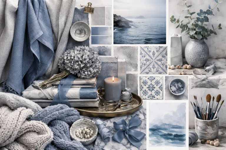
In interior design, blue-gray tones like slate blue or dusty blue help create calming, modern, and sophisticated spaces. These colors are ideal for bedrooms, living rooms, and offices where you want to create a serene and stylish atmosphere. Darker shades like stormy blue or charcoal blue can be used for accent walls or statement furniture, while lighter blues work great for wall colors and soft furnishings.
- Examples:
- Stormy blue walls with gray sofas to create a dramatic and modern living room.
- Pewter blue curtains paired with light gray walls for a subtle, soothing bedroom design.
Branding & Packaging
Blue and gray are frequently used in corporate branding to convey trust, professionalism, and luxury. Navy blue, slate blue, and stormy blue are often used in logos, business cards, and product packaging to give a reliable, elegant impression. These colors help businesses convey a sense of stability, calm, and sophistication.
- Examples:
- Navy blue logos paired with gray packaging for luxury brands.
- Dusty blue and gray elements for a clean, modern look in technology products.
Tips for Mixing Blue and Gray in Paint or Digital Art
When mixing blue and gray, it’s important to experiment with the proportions to get the right shade. Start small, adjust with white or black, and test the color in different lighting conditions.
Start Small
When mixing blue and gray, always start with small amounts. Since gray is a dominant color, it’s easy to end up with a shade that’s too muted. Starting with smaller amounts of gray lets you maintain better control over the final result.
Adjust with White or Black
- If you want a lighter, pastel version of the blue-gray, add white.
- If you want a darker, more dramatic shade, add black.
Test Under Different Lighting Conditions
Color can appear differently under natural light versus artificial light. Always test your mix in the environment where it will be used to make sure it looks as expected.
Use High-Quality Materials
When using digital art tools or physical paint, ensure you’re using high-quality materials to achieve consistent and accurate results. Poor-quality materials can lead to inconsistent mixing or faded colors.
Real‑Life Examples of Blue and Gray in Design, Art & Fashion
Here are some examples of how blue and gray are used in real-world applications, including fashion, interior design, and art.
Fashion
- Slate blue blazers paired with gray trousers create a timeless, elegant look for business settings or formal events.
- Stormy blue accessories can add a bold statement to a modern outfit or casual ensemble.
Interior Design
- Blue-gray walls with gray sofas create a sophisticated yet calm living room. Adding stormy blue pillows or slate blue rugs can enhance the modern look.
Art & Illustration
- In abstract art, blue and gray are often used together to create calming, neutral tones for backgrounds or focal points. These colors can also be used to represent stormy or serene landscapes.
Common Mistakes to Avoid When Mixing Blue and Gray
While mixing blue and gray is relatively simple, there are a few common mistakes that can result in undesirable shades. Understanding these mistakes can help you avoid ending up with a color that doesn’t fit your vision.
1. Using Too Much Gray
One of the most frequent mistakes when mixing blue and gray is adding too much gray. Gray is a neutral tone, and it can quickly mute the vibrancy of the blue, turning it into a dull or flat color. If you add too much gray, you might end up with a color that looks more like grayish blue or even gray rather than a vibrant or deep blue.
- Solution: Start with a larger amount of blue than gray. You can always add more gray, but it’s harder to fix if you’ve added too much. Test your mix gradually until you get the right shade.
2. Not Testing the Mix
Since blue and gray can appear quite differently depending on the medium, it’s important to test the color before using it for large areas or projects. Digital screens, paint, and fabric can all give different results for the same color combination, so it’s crucial to ensure that the final color matches your expectations.
- Solution: Always test your color mix on a small surface, or try out a sample swatch before applying it to a larger project. This will give you a better idea of how the color will appear in the final design or setting.
3. Ignoring Undertones
Both blue and gray have undertones that can shift the final result. For example, blue can have cool undertones (like green or purple), and gray can lean toward a cool (blue-gray) or warm (brownish-gray) undertone. If you don’t pay attention to these undertones, you might end up with a color that doesn’t work well in your design.
- Solution: Pay attention to the undertones of both the blue and gray you’re mixing. For a cooler mix, choose cool-toned blue and cool-toned gray. For a warmer look, go for warm-toned blue and warm-toned gray.
4. Not Considering Proportions
The ratio of blue to gray is essential in determining how dark or light the final color will be. Adding too much blue can result in a vibrant, almost pure blue, while too much gray will result in a darker, muted tone. Finding the right balance is key to getting the desired effect.
- Solution: Start by adding more blue and less gray, and adjust gradually based on how dark or light you want the final mix to be. If you want a soft, muted blue-gray, you’ll need more gray than blue, but if you want a richer blue, keep the proportion of blue higher.
Conclusion
Mixing blue and gray can yield a wide variety of muted, cool, and calming shades that are perfect for modern designs, sophisticated looks, and dramatic effects. Whether you’re working with slate blue, stormy blue, dusty blue, or any of the other shades, understanding how the proportions of blue and gray affect the outcome can help you achieve the perfect color for your project.
By paying attention to the undertones, ratios, and testing your mixes, you’ll be able to create the ideal shade of blue-gray for any creative endeavor. Whether you’re working in fashion, interior design, or art, the combination of blue and gray offers a range of possibilities for your designs.
FAQs
What color do blue and gray make when mixed?
Blue and gray create a cool, muted blue, often referred to as slate blue, stormy blue, or dusty blue.
Can blue and gray make other colors?
Yes, adding other colors like yellow, red, or green can create shades like olive gray, purple-gray, or teal gray.
How do I make blue and gray more vibrant?
Add more blue to the mix to keep it more vibrant and true to its blue hue.
Does blue and gray result in a dark color?
Yes, mixing blue and gray generally results in a dark, muted blue, often called navy, midnight blue, or charcoal blue.
Can I lighten the blue and gray mix?
Yes, you can lighten the mix by adding white to create a softer, pastel version of blue-gray.
What happens when I mix blue, gray, and white?
Adding white will lighten the mix and create a softer, muted blue, such as a dusty navy or pale blue-gray.
Can I create a more vibrant blue with blue and gray?
Yes, by adding less gray and more blue, you can achieve a brighter and more vibrant blue.
Is midnight slate the same as navy?
Midnight slate is darker and closer to black compared to navy, which has a more distinct blue undertone.
Is blue and gray used in interior design?
Yes, these colors are widely used in luxurious, modern, and calming interiors, especially for bedrooms and living rooms.
What is the difference between stormy blue and slate blue?
Stormy blue is a darker, moodier tone, while slate blue is a more subdued, grayish-blue.
How do I create teal by mixing blue and gray?
You can add green to the mix to create a muted teal gray, which gives a more earthy feel.
Can I use blue and gray for casual wear?
Yes, these colors are great for creating casual, cool outfits, such as blue-gray jeans, slate blue shirts, or stormy blue jackets.