Warm vs Cool Neutrals: How to Choose for Your Space
Standing in the paint aisle with three shades of “greige” in your hand, it’s easy to assume neutral just means neutral. It doesn’t. Every beige, taupe, or gray has an undertone, and that undertone decides whether a color reads warm or cool once it’s on your wall.
Pick the wrong temperature for your room and even a perfectly good neutral can look muddy, cold, or strangely yellow by 3pm. Here’s how to tell the difference and choose with confidence.
What Makes a Neutral Warm or Cool?
Neutrals aren’t truly colorless. Underneath the beige, gray, or white, there’s a trace of a stronger color (called an undertone) that pulls the shade in one direction.
- Warm neutrals carry undertones of yellow, red, or orange. Think sand, honey, or terracotta hiding just beneath the surface.
- Cool neutrals carry undertones of blue, green, or violet. Think of a gray that leans slightly toward slate or a white with a whisper of blue.
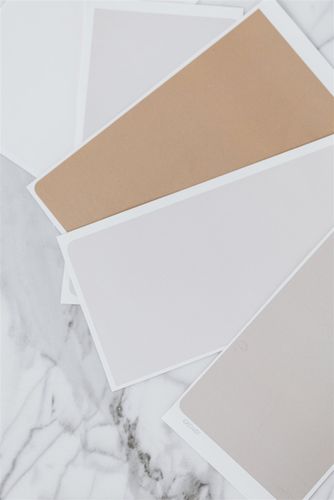
The easiest way to spot an undertone is to compare a paint chip against a true white sheet of paper in daylight. If it looks slightly pink, peach, or golden, it’s warm. If it looks slightly blue, green, or purple, it’s cool.
Quick Tip: Paint stores often display swatches under warm indoor lighting, which flatters warm neutrals and makes cool ones look drab. Always check a sample at home, in the light your room actually gets.
Warm Neutrals Explained
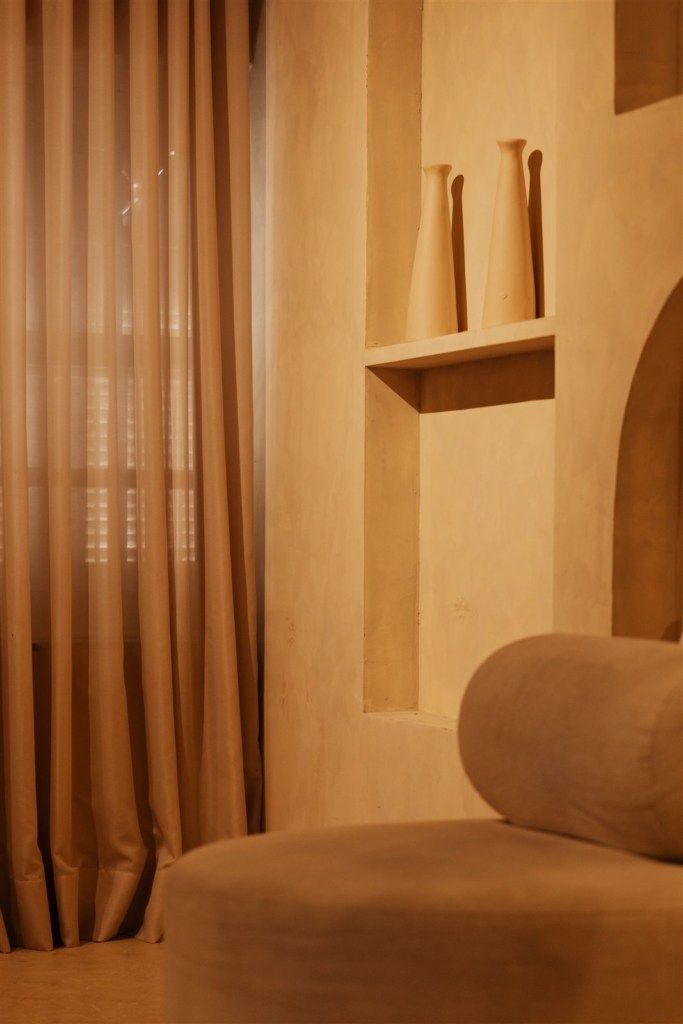
Warm neutrals bring coziness and depth. They tend to work well in rooms that get cooler, more limited natural light, since the warmth balances out that cooler daylight rather than fighting it.
- Beige – the classic warm neutral, soft and versatile
- Taupe – a deeper, brown-gray blend with warmth in the undertone
- Hazelnut – richer and more saturated, good for adding depth without going dark
- Warm brown – grounding, works well as an accent or in low-traffic rooms
Warm neutrals pair naturally with wood tones, brass hardware, and warm-toned textiles like rust, mustard, or terracotta accents.
Cool Neutrals Explained
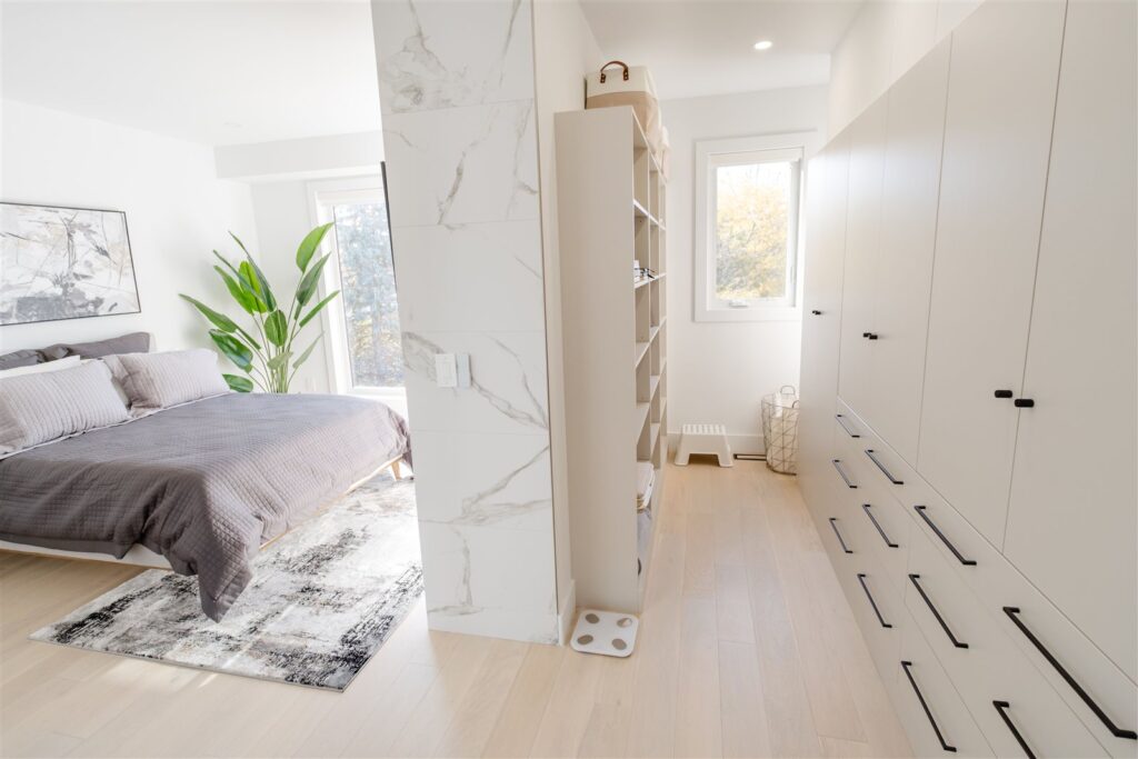
Cool neutrals feel crisp, calm, and a little more formal. They’re a strong choice in rooms that already run warm, whether from strong afternoon sun or warm-toned wood floors, since they balance rather than amplify the heat.
- Greige – the gray-beige hybrid, one of the most popular cool-leaning neutrals of the last decade
- Linen – a pale, slightly cool off-white with a soft, almost fabric-like quality
- Mist – a light gray-blue, good for a calm, airy feel
- Fog – a muted gray with just enough blue to keep it from feeling flat
Cool neutrals pair well with black or chrome hardware, marble textures, and cooler accent colors like navy, sage, or icy blue.
How Lighting Changes Warm vs Cool Neutrals
The same paint chip can look like two different colors depending on the light hitting it, and this is where most neutral-color mistakes happen.
- North-facing rooms get cooler, bluer natural light. Warm neutrals help offset this; cool neutrals can look flat or gray under it.
- South-facing rooms get warmer, yellower light most of the day. Cool neutrals hold their color better here; warm neutrals can start to look overly golden.
- LED bulbs (especially “daylight” or “cool white” bulbs) push everything cooler. Warm neutrals soften under LED but cool neutrals can look sterile.
- Incandescent or warm LED bulbs push everything warmer. Cool neutrals stay balanced under this light; warm neutrals can edge toward orange.
Quick Tip: If a room gets a mix of natural and artificial light throughout the day, test your swatch at a few points in the day (morning, midday, and evening) before committing.
Warm vs Cool Neutrals at a Glance
| Warm Neutrals | Cool Neutrals | |
|---|---|---|
| Undertones | Yellow, red, orange | Blue, green, violet |
| Feel | Cozy, grounded, inviting | Crisp, calm, formal |
| Best light conditions | North-facing, low natural light | South-facing, bright natural light |
| Pairs well with | Wood, brass, rust and mustard accents | Marble, chrome, navy and sage accents |
| Common shades | Beige, taupe, hazelnut, warm brown | Greige, linen, mist, fog |
How to Choose for Your Space
Once you know your room’s light, matching it to a temperature is mostly about where you’re standing in the house:
- Living rooms and bedrooms that get limited natural light usually benefit from a warm neutral to avoid feeling cold or gray.
- Kitchens and bathrooms with strong overhead lighting can handle cool neutrals well, since the crispness reads as clean rather than sterile.
- Open-plan spaces with mixed light exposure often do best with a neutral that sits close to the middle, leaning only slightly warm or cool, so it doesn’t shift dramatically from one end of the room to the other.
- Small rooms generally read larger with cool neutrals, while large rooms feel more intimate with warm neutrals.
Quick Tip: Finish affects undertone too. Matte finishes soften undertones slightly, while satin and semi-gloss reflect more light and can make undertones, especially cool ones, more noticeable.
Beyond Paint: Neutral Tones in Wallpaper
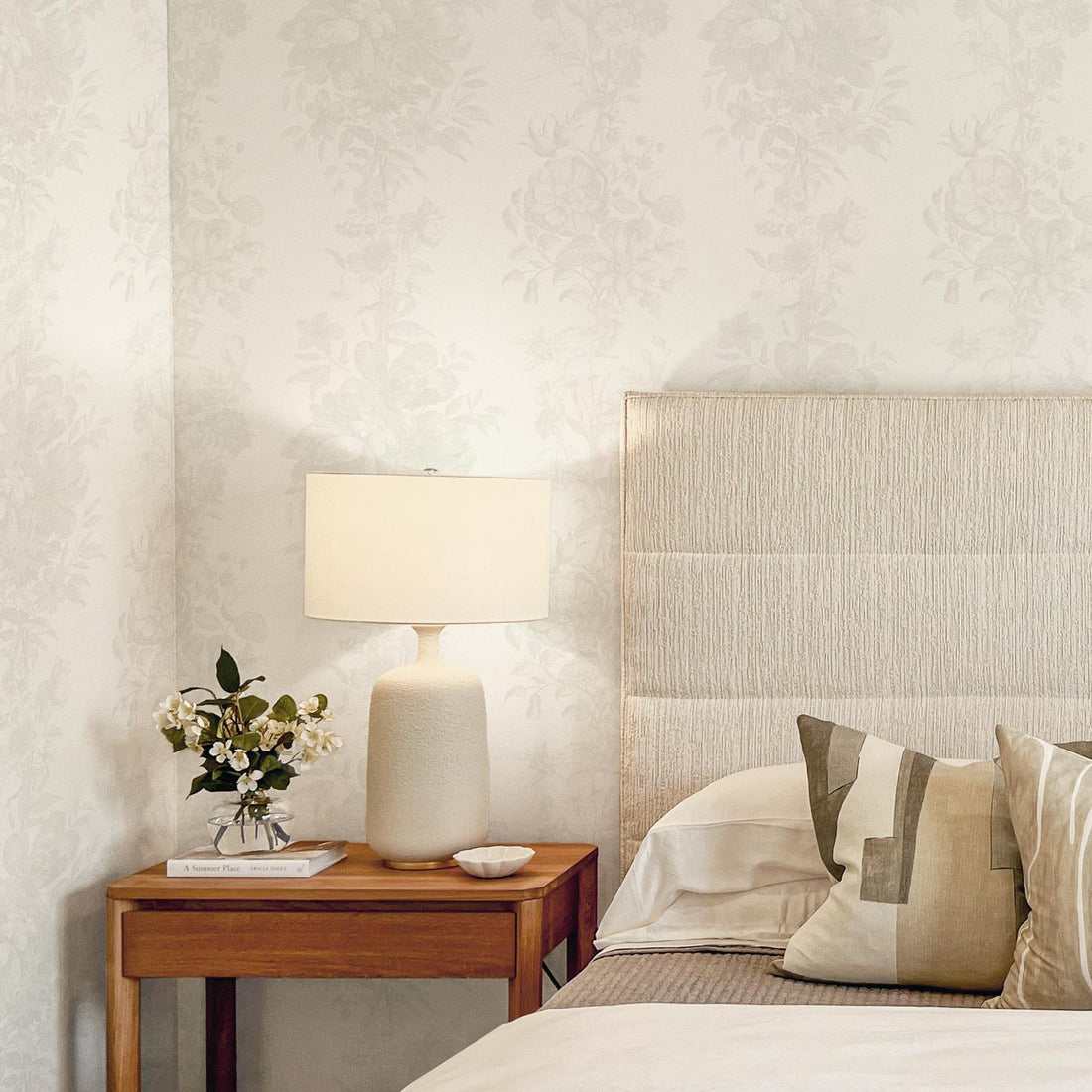
Paint is the fastest way to test a neutral palette, but it isn’t the only way to bring warm or cool tones into a room. If you like the idea of a neutral base with more texture or pattern than a flat wall can offer, wallpaper is worth a look.
Livette’s neutral wallpaper collection spans both temperatures, from warmer taupe and hazelnut designs to cooler greige and linen tones, so the same undertone logic above applies when picking a pattern instead of a paint can. Most designs are also available in custom colors, so once you’ve settled on your undertone, you don’t have to compromise on shade to get it in a pattern too.
FAQ
Can I mix warm and cool neutrals in the same room?
Yes, but keep one temperature dominant. Use the second as an accent, such as a cool gray throw pillow in an otherwise warm-toned room, rather than splitting the room evenly.
Which is more resale-friendly, warm or cool neutrals?
Cool neutrals like greige have been the safer resale choice over the last several years, but this shifts with trends. A true mid-tone neutral with a barely-there undertone tends to age best.
How do I fix a neutral that turned out too warm or too cool?
If a warm neutral reads too yellow, adding a small amount of a cool accent color elsewhere in the room (art, textiles, hardware) can balance it visually without repainting. The reverse works for a cool neutral that feels too flat.
The Bottom Line
Choose warm neutrals if your room gets limited or cool natural light, you want a cozy feel, or you’re pairing with wood and brass.
Choose cool neutrals if your room gets strong warm light, you want a crisp and calm feel, or you’re pairing with marble and chrome.
Either way, test before you commit. A five-minute check with a paint chip against white paper, in your own room’s light, will save you from a repaint down the line.