
Black is one of the most powerful colors in art and design, but it’s also one of the trickiest to mix. Ask “What colors make black?” and the answer depends on your medium.
In paint, combining primaries like red, blue, and yellow—or complementary pairs like blue and orange—can produce deep blacks.
In printing, black has its own dedicated ink, while on screens it’s the absence of light.
This guide explores how to mix black using different methods, why some attempts turn muddy, artist-approved recipes, and what black symbolizes in culture and psychology.
Quick Answer: What Colors Make Black?
If you’re looking for a fast answer:
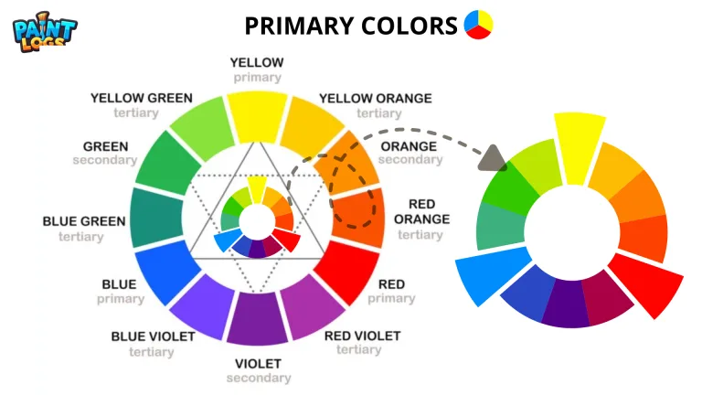
- In paint (RYB subtractive mixing), these three colors make black:
Red + Blue + Yellow = Black
or complementary pairs (two colors) like:
Blue + Orange
- In light (RGB Additive mixing):
Black is simply the absence of light.
- In printing (CMYK):
True black comes from the dedicated K ink, since cyan + magenta + yellow alone only give a muddy dark.
That’s the simple version. But in practice, the pigments you choose, the transparency of your colors, and how you balance warm and cool undertones all affect the black you create.

How to Mix Black Paint Using Primary Colors
We all learned in art class that red + blue + yellow = black. In reality, the mixture often turns out closer to a dark brown. Why? Because no paint pigment is a “perfect” primary.
- Warm vs. cool bias: Alizarin crimson leans cool toward blue, while cadmium red leans warm toward orange. Ultramarine blue shifts purple, while phthalo blue tilts green.
- These subtle biases steer the final mix, sometimes giving you a black with red or blue undertones—or a muddy neutral if the pigments fight each other.
Still, experimenting with your primary set is worthwhile. By adjusting ratios and choosing transparent pigments, you can create a black that feels natural and integrates smoothly with the rest of your palette.
Mixing Black with Complementary Colors
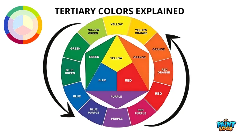
Another classic way to make black is by combining complementary colors—the opposites on the color wheel. Because they cancel each other’s brightness, the result is a deep, neutral tone.
Blue and Orange = Warm Black
A strong blue like Prussian or Ultramarine paired with a rich orange produces a dark, slightly warm black.
Red and Green = Earthy Black
Mixing alizarin crimson with viridian green is a time-tested recipe. The resulting black is earthy and transparent, often used in watercolors. Mixing red and green also makes brown.
Yellow and Purple = Blackish Brown
This mix of yellow and purple tends toward a muted blackish-brown. While it may not be the deepest black, it’s useful for softer, less intense darks.
These blends create blacks that feel alive, especially in watercolor and oils. For example, Prussian blue with burnt sienna makes a dynamic black with subtle color shifts, avoiding the flat look of tube black.

Artist-Approved Recipes for Chromatic Black
Many professional artists avoid premixed tube blacks because they can look flat or lifeless. Instead, they create chromatic blacks by mixing carefully chosen pigments. These mixtures inherit the depth, transparency, and character of the original colors.
Ultramarine Blue + Burnt Umber
This is a classic recipe. Ultramarine, with its violet bias, combines beautifully with the earthy warmth of burnt umber to create a deep, natural black. The result is rich and balanced—perfect for shadows in landscapes or portraits.
Alizarin Crimson + Viridian Green
Impressionist painters like Monet favored complementary blends, and this pairing is one of the best. Alizarin crimson is a transparent cool red, while viridian is a cool green. Together, they produce a dark black that can lean slightly warm or cool depending on the ratio.
Ultramarine Blue + Burnt Sienna
Jenny Buchanan from Blue Beach House Art swears by this mix for acrylics. Burnt sienna’s reddish undertone keeps the black lively, while ultramarine ensures it doesn’t look dull. It’s a great all-around choice for a strong, versatile dark.
Ultramarine Blue + Raw Umber
This creates a warmer, softer black that’s ideal for natural shadows or muted palettes. It doesn’t go as inky as burnt umber, but it works beautifully for atmospheric effects.
Phthalo Turquoise + Napthol Crimson
A modern alternative. Phthalo turquoise is intense and transparent, while napthol crimson is strong and warm. Together, they make a bold, slightly inky black that’s excellent for high-contrast work.
These recipes all share one thing in common: they’re customizable. By shifting the ratio of each pigment, you can create warmer or cooler blacks, transparent washes, or opaque layers that suit your painting style.

Tube Black vs. Mixing Your Own: Which Is Better?
Every artist eventually faces this choice: should you grab black straight from the tube, or mix it yourself?
Premade black paints, like Mars Black or Ivory Black, are convenient. They save time, deliver consistent results, and are perfect if you’re just starting out.
But they also have drawbacks. Many tube blacks are opaque and heavy, which can make a painting look flat. They often dominate rather than blend, leading to shadows that feel lifeless instead of nuanced.
Mixed blacks, on the other hand, are more flexible. By combining pigments like ultramarine and burnt umber, or alizarin and viridian, you create a black that’s alive with subtle undertones.
Because you control the ingredients, you can decide whether your black should lean cooler (blue-toned) or warmer (brownish-red). Watercolorists especially love mixed blacks, since they retain transparency and flow, unlike the dense opacity of tube blacks.
Think of it this way: tube black is efficient, but mixed black is expressive. Beginners may start with premade black for ease, but as your skills grow, mixing your own opens a world of depth and harmony in your work.

Warm Black vs. Cool Black: Adjusting Temperature and Undertones
Not all blacks are equal. Depending on the pigments you use, your black can carry a subtle temperature—either warm or cool. This undertone makes a big difference in how shadows and details read in your artwork.
Warm Blacks
When your mix contains more red, orange, or brown, the black leans warm. For example, ultramarine blue with burnt sienna creates a slightly reddish-black that feels earthy and natural. Warm blacks are excellent for skin tones, autumn scenes, or anywhere you want shadows to feel soft and alive.
Cool Blacks
Add more blue or green, and the black becomes cool. Alizarin crimson with viridian green, when tilted toward the green, creates a bluish-black that feels crisp and sharp. Cool blacks are great for night skies, steel, shadows in snow, or anything that requires a sense of coldness and clarity.
Testing Undertones
A quick way to see the bias in your black is to mix a little white into it. The resulting gray will instantly reveal whether it’s warm or cool. Artists often do this swatching test before committing to large areas, ensuring their blacks harmonize with the rest of the painting.
Warm or cool, the key is balance. By deliberately choosing the undertone of your black, you gain more control over the mood and harmony of your entire palette.

Pro Tips from Reddit Artists
Sometimes the best advice comes straight from other artists experimenting with color. On Reddit’s watercolor forums, painters often share their struggles and solutions when mixing black. A few key lessons stand out.
One recurring tip is that not all primaries work together. As one artist put it, “You need to have the right red, yellow, and blue to get the black you want. Otherwise, you just get mud.” This highlights the importance of pigment choice. Using biased or opaque paints will usually result in a dull gray-brown instead of a clean dark.
Another common theme is the value of mixing your own black. Many watercolorists avoid tube black, noting that custom blacks are more transparent and dynamic. Because you know exactly which pigments went into the mixture, you can steer the undertone warm or cool depending on the mood of the piece. This makes shadows blend more naturally with the surrounding colors.
Artists also mention the creative effects of not fully mixing the pigments. For example, leaving streaks of blue or red visible within a black wash can add depth and interest, especially in watercolor where granulation shows through. Some even prefer mixed blacks because they work better in limited palettes, keeping the painting cohesive.
In short, the consensus is clear: premade black is fine in a pinch, but if you want depth, harmony, and flexibility, it pays to learn how to mix your own.
Avoiding Muddy Colors: Transparency, Pigment Codes, and Swatching Tips
One of the biggest frustrations for beginners is ending up with a dull, muddy mix instead of a rich black. The good news? A few simple techniques can keep your blacks clean and intentional.
Choose Transparent Pigments
Opaque paints often contain white or fillers that lighten the mix and rob it of depth. Transparent colors, on the other hand, layer beautifully and let your black retain richness. For example, alizarin crimson and viridian both have transparency that makes their blend lively rather than flat.
Check Pigment Codes
Two paints that look similar on the tube may behave very differently. Professional artists often check the pigment code printed on the label (like PB29 for Ultramarine or PR83 for Alizarin). This ensures you’re working with pure pigments rather than mixtures that can muddy your results.
Swatch Before You Commit
Always test your black mixture on scrap paper. By adding a touch of white, you’ll immediately see whether the undertone is warm or cool. Creating a small swatch grid with different pigment ratios can also help you find the perfect balance before applying it to your painting.
By focusing on transparency, pigment purity, and swatching, you’ll avoid the dreaded mud and end up with blacks that are dynamic, balanced, and tailored to your palette.
Monet and the Impressionists: Why Artists Preferred Mixed Black
By the late 19th century, many Impressionist painters abandoned tube black altogether. Claude Monet is one of the most famous examples. Around 1886, he stopped using black pigment on his palette, choosing instead to mix his own chromatic blacks from complementary colors.
The reasoning was simple: premade blacks looked flat and unnatural compared to the vibrant outdoor scenes the Impressionists wanted to capture. By mixing colors like alizarin crimson with viridian green or ultramarine with burnt umber, they could create deep shadows that still shimmered with subtle hints of color.
This approach gave their paintings greater harmony. A black mixed from the same pigments already used elsewhere in the canvas would naturally blend into the scene. Shadows in Monet’s water lilies, for example, don’t feel like lifeless voids—they carry the mood of the surrounding light and color.
For modern artists, the Impressionists’ lesson is clear: black isn’t just an absence of color. When mixed with care, it becomes an active part of the palette, capable of reinforcing atmosphere, mood, and cohesion.

Black in Printing: Why CMYK Uses ‘K’ for True Black
If you’ve ever sent a design to print, you’ve probably seen the CMYK model: cyan, magenta, yellow, and key (black). At first glance, it might seem like you could just combine cyan, magenta, and yellow to get black. In theory, yes—but in practice, the mix produces a muddy, dark brown instead of a pure black.
That’s why printers rely on a separate K channel. The “K” stands for Key, referring to the key plate used in traditional printing that provided detail and contrast. By adding true black ink, printers achieve crisp edges, richer shadows, and consistent depth that three-color mixing alone can’t deliver.
Designers often distinguish between two types of black in print:
- Standard Black (K=100%) – Pure black ink, good for text and fine lines.
- Rich Black (C=60, M=40, Y=40, K=100) – A layered black with more density, often used for large backgrounds or areas that need extra depth.
So while painters build black from color, printers ensure accuracy and efficiency by giving black its own dedicated ink.
Black in Light: How RGB Creates or Removes Black
When we move from pigments to screens, the rules of color change.
Digital displays use the RGB color model—red, green, and blue light mixed together in varying intensities. Unlike paint, which works by subtracting light, RGB works by adding light.
Here’s the key difference:
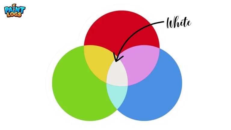
- At full strength, red + green + blue light combine to make white.
- At zero strength (0,0,0 in RGB values), all light is removed, and the result is black.
In other words, black on a screen isn’t a mixture at all—it’s the absence of light. This is why OLED displays, which can turn off individual pixels completely, produce a truer, deeper black than traditional LCD screens that always leak a little backlight.
From a perception standpoint, our eyes interpret this lack of light as darkness. Cones and rods in the retina simply receive no stimulation in those areas, so what we “see” is black.
In contrast to the painter’s palette or the printer’s inks, in RGB systems black isn’t something you build—it’s what you get when you take everything away.
The Meaning of Black in Art, Design, and Culture
Black isn’t just a technical color—it carries centuries of cultural weight and artistic symbolism. In almost every tradition, it represents both power and mystery.
In fashion and design, black suggests elegance and sophistication. Think of the classic black suit or the “little black dress”—symbols of timeless style. Luxury brands often use black in their logos because it conveys authority and refinement.
In art and storytelling, black is the color of depth and mystery. It hides details, suggesting the unknown. At the same time, it can embody mourning and grief, since many cultures associate black with funerals and loss.
Psychologically, black has a grounding effect. It feels protective, shielding, and strong. But overused, it can feel heavy, isolating, or oppressive. That’s why designers often pair black with lighter tones to balance its intensity.
What’s fascinating is how black shifts meaning depending on context. In minimal design, it’s sleek. In gothic art, it’s dark and dramatic. On a screen, it represents the void. Black is never neutral—it always speaks.

Conclusion: Mixing Black the Right Way
When it comes to what colors make black, the answer depends on your medium. In paint, mixing ultramarine blue with burnt umber or alizarin crimson with viridian creates rich, dynamic blacks that tube paint can’t match. In printing, CMYK relies on the dedicated “K” for sharp black, while in light (RGB), black is simply the absence of color.
Beyond the technical side, black carries powerful symbolism—elegance, mystery, authority, and even mourning. Whether you’re an artist seeking depth, a designer working with digital color, or simply curious, experimenting with your own black mixtures will give you more control, nuance, and harmony in your work.
FAQs
Q1. What two colors make black?
You can mix blue + orange, red + green, or yellow + purple (complementary pairs) to create black. The result varies depending on pigment strength and transparency.
Q2. How do you make black paint with ultramarine and burnt umber?
Combine equal parts ultramarine blue and burnt umber for a deep, natural black often used by professional artists. Adjust ratios for warmer or cooler undertones.
Q3. What is chromatic black?
Chromatic black is a black created by mixing complementary colors (like alizarin crimson + viridian green) instead of using pre-made tube black. It looks richer, more transparent, and harmonizes better with other colors.
Q4. Why does my black paint look muddy?
If yur black looks muddy, you may be using opaque pigments or the wrong primaries. Stick to transparent colors and check pigment codes for cleaner mixes.
Q5. What is the meaning of black in art and culture?
Black symbolizes elegance, sophistication, mystery, power, and mourning. In design, it creates contrast and focus, while in art it often adds depth and balance.
Q6. Can you make black with RGB colors?
In RGB (light mixing), black is created by the absence of red, green, and blue light (0,0,0). Unlike paint, you can’t mix light to get black—it’s simply the lack of illumination.
Q7. Why do printers use ‘K’ for black in CMYK?
Mixing 100% cyan, magenta, and yellow gives a muddy dark shade, not pure black. That’s why printers use a dedicated K (black ink) for crisp, strong black.