
Have you ever dipped your brush into yellow, added a touch of white, and watched the color soften like butter melting on toast? Yellow and white together don’t just make a lighter yellow—they create an entire world of warm, creamy, glowing shades. Depending on how you mix them, the result can lean pastel, golden, creamy, or barely there.
In this guide, we’ll explore the tinting magic of yellow and white through real paint mixing, digital hex codes, symbolic meanings, and hands-on tips from the studio. Let’s swirl some color and see where it takes us.
Quick Answer – What Color Does Yellow and White Make?
When you mix yellow and white, the most common result is a tint of yellow—often described as light yellow, cream, or butter. Because yellow is already a light color, adding white doesn’t transform it dramatically but rather shifts its energy—making it calmer, brighter, or softer.
With just a dash of white, yellow becomes more pastel. With lots of white, it leans into off-white, sometimes barely recognizable as yellow. The results are warm, comforting, and often nostalgic.

Understanding Yellow and White in Color Theory
In the RYB color model (used in paint), white is a neutral that tints—never changes hue. It lifts the yellow without overpowering it. But how it lifts depends entirely on the base yellow.
Lemon yellow, for instance, is sharp and cool. Add white, and you get a glowing citrus tint—like pale lemonade or sunlit petals.
Cadmium yellow is warmer and earthier. Mix it with white and it shifts toward buttercream, banana, or even a soft sunrise.
And then there’s yellow ochre. Mix it with white and you’re in the territory of antique parchment, faded ivory, or a cozy, buffed linen.

How to Make Different Yellow Pigments with Paint
Not all yellows are created equal. Each yellow pigment—from the cool crispness of lemon yellow to the warm, earthy hue of yellow ochre—has a unique identity. Below, we break down how to mix these iconic yellows using other paints in your kit. This is perfect for artists who don’t have the exact tube color or want to customize shades from scratch.
How to Make Lemon Yellow
To get lemon yellow, mix 2 parts Hansa Yellow Light with 1 part white and a small dab of phthalo green. This combo creates a cool, citrusy yellow that feels fresh and zesty—great for highlights or spring scenes.
How to Make Cadmium Yellow
Mix equal parts warm yellow (like medium yellow) and a touch of red-orange. Add a little white to soften if needed. Cadmium yellow should feel bold, rich, and slightly warm without tipping into orange.
How to Make Yellow Ochre
Start with 2 parts raw sienna, add 1 part medium yellow, and finish with a pinch of white. Yellow ochre is earthy and muted—ideal for landscapes, skin tones, or antique palettes.
How to Make Naples Yellow
Use 1 part yellow ochre, 1 part white, and a tiny hint of red. The result is a muted, creamy yellow with soft warmth—perfect for portraits and classical-style painting.
How to Make Hansa Yellow Light
Mix lemon yellow + a touch of white + a dab of green. Hansa Yellow Light is clean, cool, and slightly transparent. It’s a favorite in modern watercolor and design work.
How to Make Golden Yellow
Blend 2 parts medium yellow with 1 part orange and a touch of brown. You’ll get a vibrant, sun-kissed shade—perfect for autumn leaves and golden hour lighting.
How to Make Medium Yellow
If you don’t have it straight from the tube, mix equal parts cadmium yellow and lemon yellow. This creates a balanced yellow that’s neither too warm nor too cool—great for base mixes.
How to Make Indian Yellow
Combine 2 parts warm yellow (cadmium) with 1 part burnt sienna or quinacridone gold. Indian Yellow is deep, radiant, and slightly transparent—historically used in glowing glazes and golden skies.
How to Make Pastel Lemon
Mix 3 parts white with 1 part lemon yellow. This gives you a soft, airy yellow that feels like sunlight through sheer curtains. It’s ideal for spring scenes, baby palettes, or floral highlights.
How to Make Butter Tint
Use 2 parts cadmium yellow + 1 part white + a tiny touch of orange. This mellow yellow is creamy and rich, like whipped butter—great for cozy kitchen themes or soft interiors.
How to Make Cream Ochre
Blend yellow ochre + white in a 1:1 ratio, then add a touch of Naples yellow if you want extra warmth. This color feels vintage, earthy, and soft—perfect for rustic color palettes.
How to Make Antique Ivory
Start with 2 parts Naples yellow, 1 part white, and a hint of raw sienna. This creates a muted, elegant cream tone with historical charm—often used in traditional oil paintings.
How to Make Soft Glow
Mix Hansa yellow light + 2 parts white, with a tiny dab of warm yellow. The result is a barely-there yellow with a golden glow—great for airy backdrops or subtle sunrise washes.
How to Make Banana Color
Combine golden yellow + white + a dash of orange. The goal is a ripe, sweet yellow that’s smooth and golden—like banana pudding or sunlit curtains.
How to Make Warm Sunlight
Use medium yellow + a pinch of orange + a touch of white. This shade radiates cozy brightness, like early morning sun. Use it for cheerful accents or warm backgrounds.

Yellow and White Mixing Chart: Real Shade Outcomes
Let’s paint a visual. Here’s a guide to what happens when you mix different yellows with varying amounts of white:
| Yellow Pigment | White Added | Resulting Shade | Visual Description |
|---|---|---|---|
| Lemon Yellow | 30% | Pastel Lemon | Bright, citrusy pale yellow |
| Cadmium Yellow | 50% | Butter Tint | Soft, warm yellow like whipped cream |
| Yellow Ochre | 60% | Cream Ochre | Earthy beige with yellow undertones |
| Naples Yellow | 70% | Antique Ivory | Elegant, muted cream |
| Hansa Yellow Light | 80% | Soft Glow | Almost off-white with golden warmth |
| Golden Yellow | 40% | Banana | Deep tint with sweet vibrancy |
| Medium Yellow | 20% | Warm Sunlight | Gentle but still golden |
You can test these combinations at home using a palette knife or brush—start with yellow, add white slowly, and mix thoroughly until the color no longer streaks.
Mixing Yellow and White in Acrylics, Watercolor, and Oils
Different mediums react differently to the same colors.
In acrylic paint, mixing yellow and white produces bold pastels quickly. Use titanium white for high-opacity blends, or zinc white for softer, layered glazes.
In oil painting, the result is richer and creamier. You can add linseed oil to stretch the blend and let the light yellow glow slowly build over underpainting.
In watercolor, you don’t always add white—you lift with water or let the white of the paper shine through. But a bit of Chinese white can be used for cream accents or pale washes when desired. Be sparing, or it can go chalky.
What to Expect at Each Tinting Stage
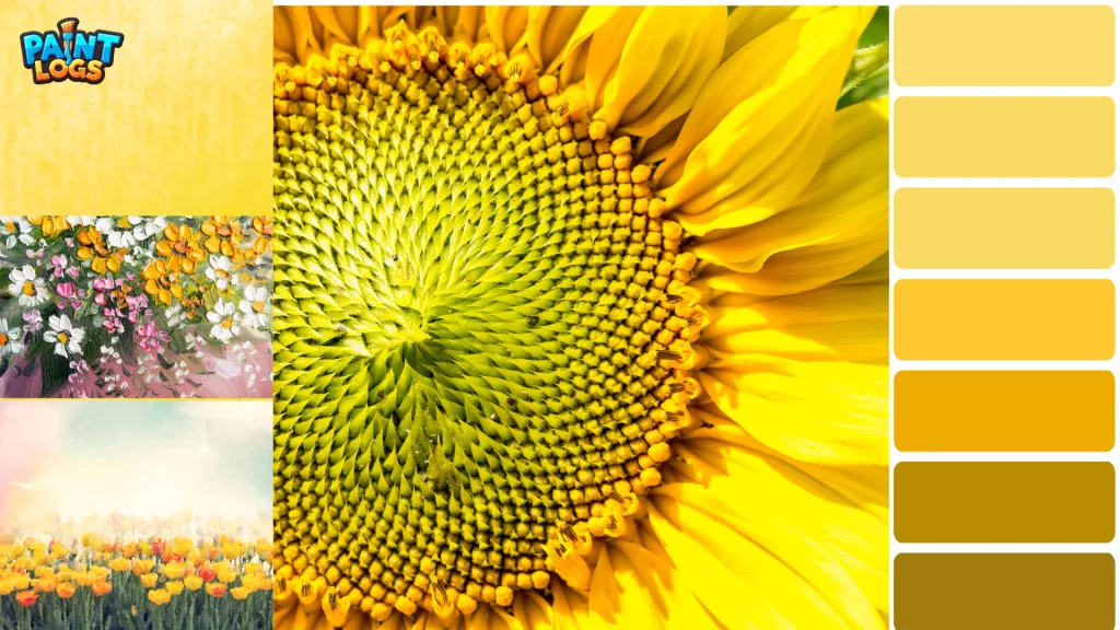
Imagine laying out 5 dabs of lemon yellow across your palette. In the first, you add only 10% white—it’s still bold, just softer. In the second, 30% white—it becomes pastel and delicate. By the fourth and fifth, you’re looking at a color so light it feels like spring sunlight—barely yellow at all.
With cadmium yellow, the journey is warmer. From sunflower to custard to candlelight.
With yellow ochre, you move from golden earth to buff parchment to warm stone.
Troubleshooting Yellow + White Mixing Issues
“My yellow looks grayish.”
Check your white—it may be old, dirty, or slightly cool-toned. Always use clean white paint, and consider using titanium white for brighter tints.
“It’s too pale too fast!”
Start slow. White has strong lightening power. A little goes a long way, especially with lemon or light yellows.
“I wanted cream but got something chalky.”
Try switching to a warmer yellow, like Naples or ochre. Add a touch of red or beige if needed, and don’t overmix.
“Can I make it darker afterward?”
Yes—but not with white. Add a drop of burnt sienna or raw umber to tone it back toward a creamy ochre or buff.
Symbolic Meanings of Light Yellow Shades
Each version of yellow carries its own emotional undertone. When you add white, you change the mood as well as the color.
- Pastel yellow feels youthful, innocent, and spring-like
- Buttercream tones bring nostalgia, softness, and homey warmth
- Ivory or cream suggests elegance, tradition, or a soft glow
In branding, lighter yellows evoke friendliness and approachability. In artwork, they often represent sunlight, softness, or subtle hope.
What About Yellow and White in Digital Color?
In RGB (used for screens), yellow is made from red + green at full brightness. White is all three (red, green, and blue at 255).
Adding white digitally lightens yellow toward pale versions like:
- #FFFFE0 — Light Yellow
- #FFFACD — Lemon Chiffon
- #FAFAD2 — Light Goldenrod Yellow
- #F5F5DC — Beige/Ivory
These are great for web design, Canva layouts, or soft UI themes where you want brightness without harshness.
Can You Make Yellow or White Paint from Other Colors
In short, not really.
Yellow is a primary color in RYB and CMYK, so you can’t create it by mixing other paint colors. Some people try orange + white, but it results in a muted peach—not a vibrant yellow.
White paint is also not mixable from other pigments. The more you mix, the darker your paint becomes. You need to start with actual white pigment.
Designing with Yellow and White: Real-Life Pairing Tips
Yellow and white create a clean, bright, summery vibe—but because they’re both light, they need contrast to really shine.
Try combining them with:
- Navy for classic contrast
- Pink for softness and playfulness
- Brown or gray for grounded, earthy palettes
- Muted purple for an elegant, complementary pairing
Used alone, yellow and white feel airy and youthful. Used with others, they become more dynamic.

Conclusion: The Gentle Alchemy of Yellow and White
Yellow and white are a gentle mix—more whisper than shout. From lemon zest to soft cream, the range of shades they offer can light up a room or quietly warm a painting.
Whether you’re crafting a glowing floral wash, designing a logo that feels sunny, or painting cozy walls, this combo is endlessly versatile.
Let your palette explore. Add a dab of white to your yellow and see what unfolds.
You Might Also Like:
- What Colors Make Pink?
- How to Make Brown: Complete Mixing Guide
- What Color Does Red and Green Make?
- What Color Does Blue and Orange Make?
FAQs
Do yellow and white always make light yellow?
Yes, in pigment. You’ll always end up with a tint unless you introduce another color like gray or red to change direction.
Can I make cream from yellow and white?
Yes—use warm yellow (Naples or ochre), lots of white, and possibly a touch of red or brown for depth.
Can I use water instead of white in watercolor?
Yes—water dilutes and lightens yellow without pigment. White paint can be used sparingly to add body.
Can I use black to darken the mixture?
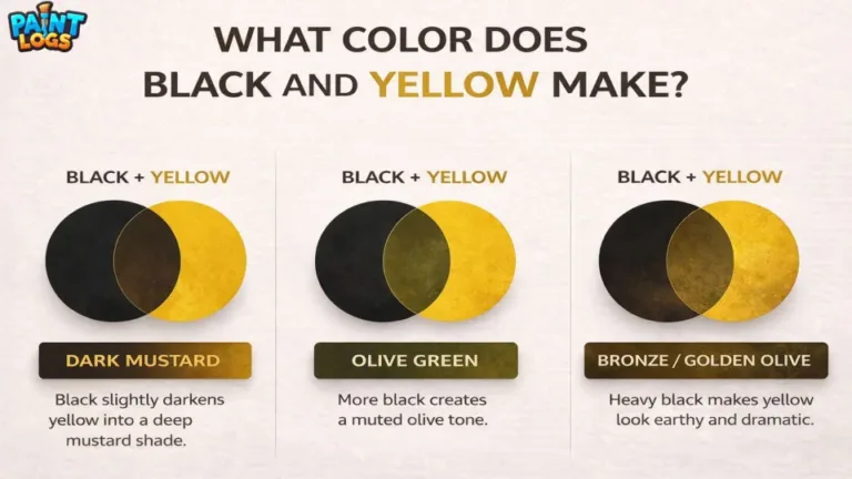
Only with caution. Black + yellow often leads to olive tones. Instead, try burnt umber or a warm gray.
Can I use yellow and white to make skin tones?
Yes, especially in stylized or cartoon-style art. Start with yellow and white, then gently add red or peach tones to balance the warmth. It’s a good base for sunlit or glowing skin under warm light.
What’s the best white paint to use for tinting yellow?
Titanium white is the most common choice because it’s opaque and bright, giving bold tints. Zinc white is more transparent and works well in layers—ideal for watercolor or subtle glazing.
Why does my yellow turn green when I add white?
This usually happens if your yellow has a slight green undertone or you’re mixing on a dirty palette. Always clean your brush and palette first, and avoid contaminated paints.
Can yellow and white ever make a neutral color?
Not by themselves. Yellow and white will always stay within the warm, bright spectrum. To reach a neutral like beige or buff, you need to add gray, brown, or even a touch of violet.
Is it better to mix on the palette or directly on the canvas?
It depends on your style. Mixing on the palette gives you more control. Mixing directly on the canvas can create spontaneous textures and gradients—especially in oil or acrylic.
Does the type of brush affect the yellow and white blend?
Yes! Soft brushes (like filberts or mops) create smoother, creamier blends. Stiff brushes may leave visible streaks or texture, which can be useful in expressive or textured